Curated eCommerce Newsletter Landing Page Template
Dispatch is a single-column editorial landing page template built for curated e-commerce newsletters. It opens with a newspaper masthead, flows through annotated past-issue cards and subscriber discovery pull quotes, then leads visitors into a three-step visual quiz. The result is a personalized curation profile that frames the email sign-up as a natural next step rather than a cold ask.
by Rocket studio
Quick summary
Dispatch is an editorial landing page template for a weekly curated product newsletter. It combines a broadsheet-style masthead, scrollable past-issue cards, and a three-question visual quiz to turn curious visitors into engaged subscribers. The design is luxe minimal, rooted in a Japanese Zen color palette, and built for design-conscious readers who appreciate intention over noise.
Who this template is for
This template is built for newsletter creators who lead with taste and want their landing page to prove it before asking for an email address. It suits publishers who curate rather than broadcast.
- Curated e-commerce newsletter operators launching or refreshing their subscriber acquisition page
- DTC founders and creative directors who want a polished editorial presence to attract design-conscious readers
- Independent product curators building a weekly dispatch around emerging brands and under-the-radar shops
What problem this template solves
Most newsletter landing pages ask for a commitment before earning trust. A cold sign-up form meets a skeptical visitor with nothing to show for the ask. Dispatch solves this by letting the editorial work speak first.
- Visitors leave before subscribing because the page gives them no taste of the content
- Generic subscription forms feel impersonal and fail to signal a curator's point of view
- A mismatch between visual identity and editorial ambition undercuts credibility with design-savvy audiences
What you get with this template
Dispatch delivers a complete single-column landing page structured to demonstrate value at every scroll. Each section earns attention before the next one asks for anything.
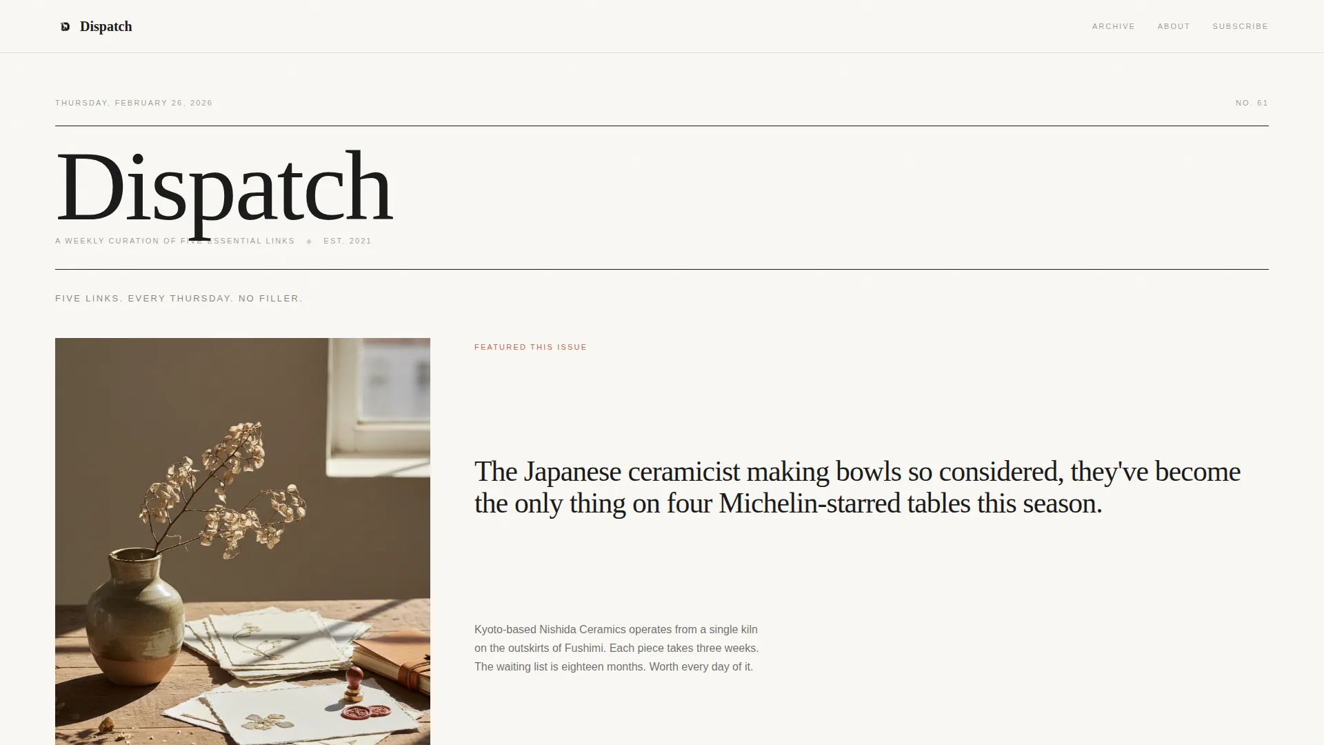
- A newspaper masthead hero section with a featured product still life and broadsheet-style lead story layout
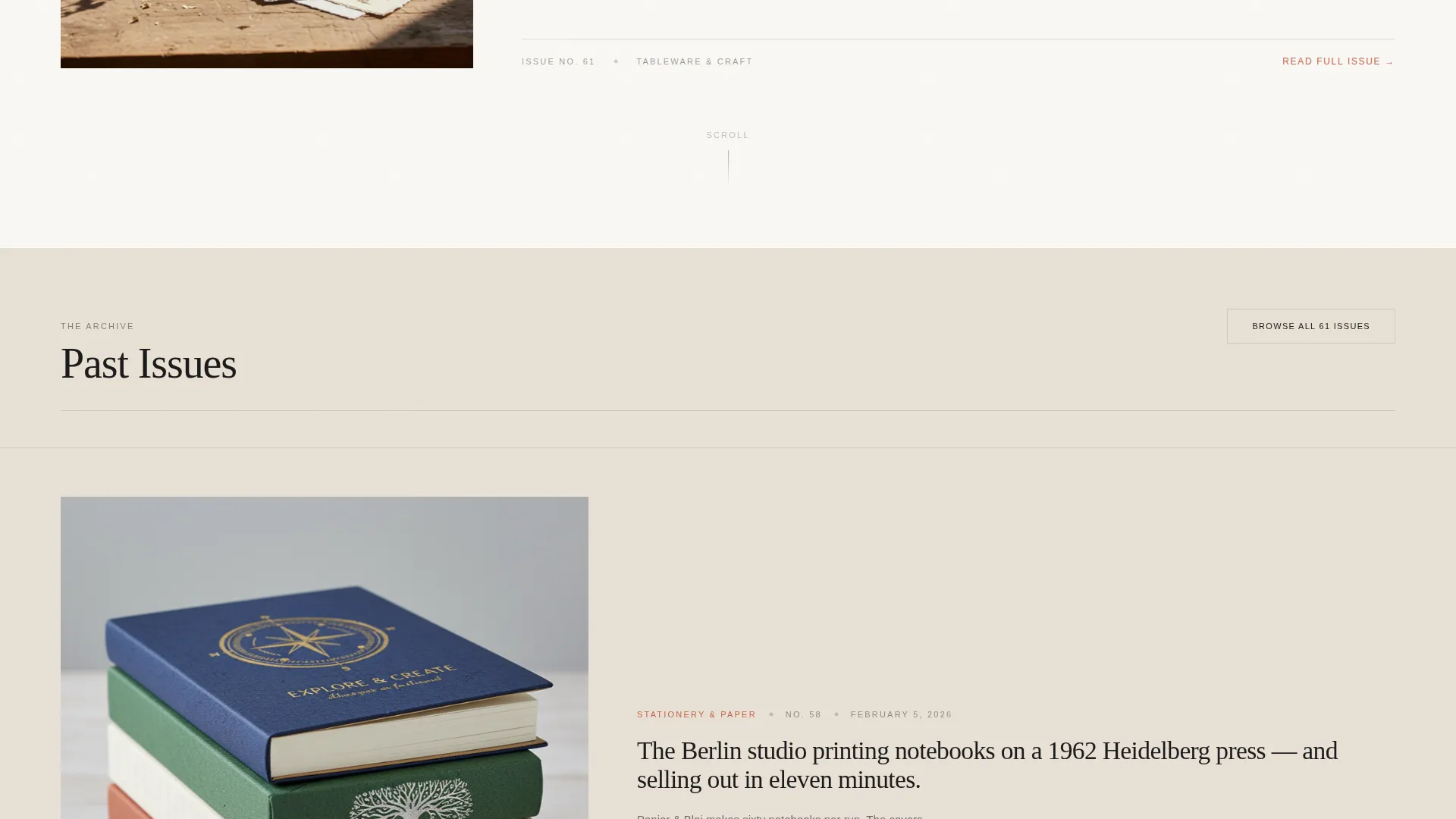
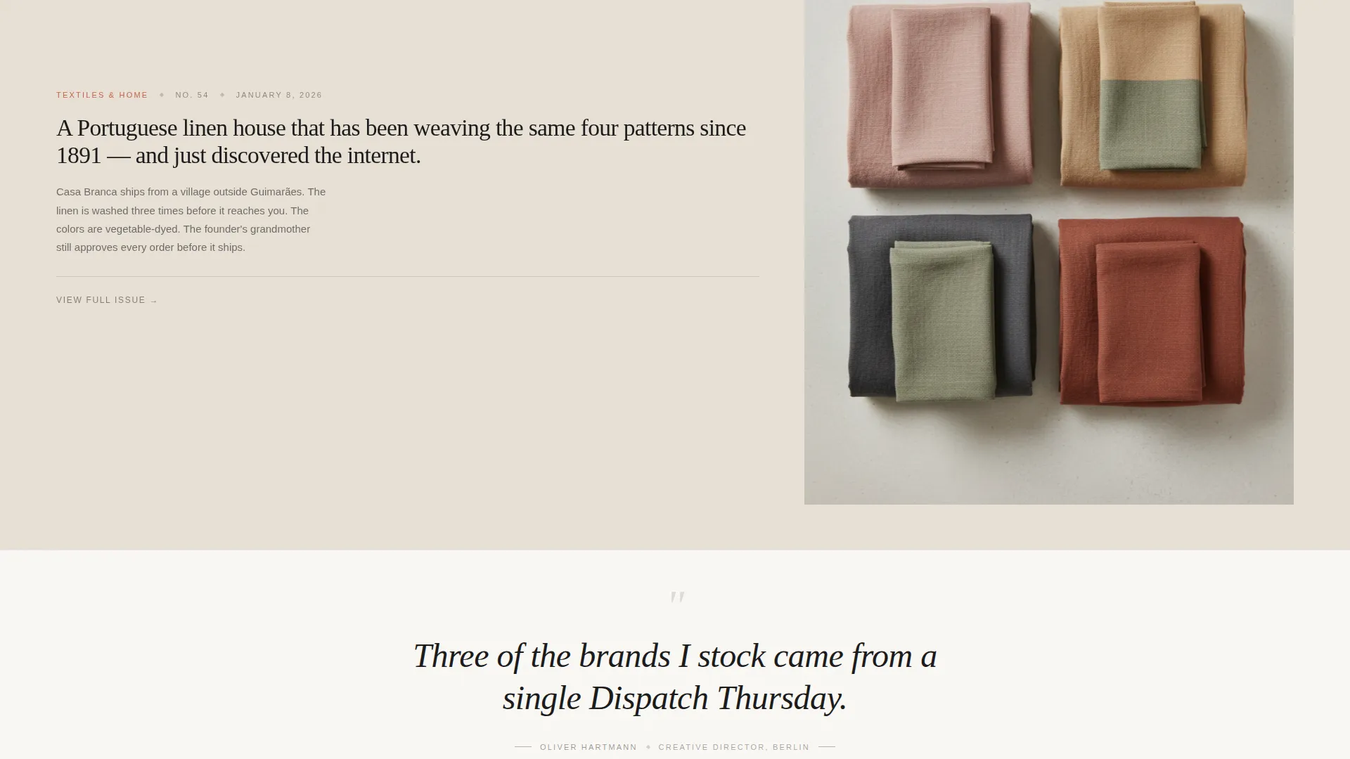
- Three annotated past-issue editorial cards with hero product imagery and curator-voiced two-sentence annotations
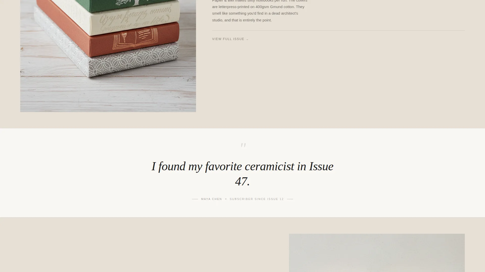
- Oversized italic pull quotes between issue cards, presenting specific subscriber discoveries rather than generic praise
- A three-step visual quiz ("Find Your Curation Style") with photo-based answer pairs, category selection, and frequency preference
- A post-quiz email capture framed around the reader's personalized curation profile
- A minimal horizontal-flow footer
Feature list
A single paragraph introduces the feature set: every feature in Dispatch is designed to reduce friction and build trust. Nothing is decorative without purpose, and nothing asks for commitment before delivering value.
Newspaper Masthead Hero
The header presents the newsletter name in a large editorial serif at broadsheet scale. A dateline shows the current issue number, and a featured product image is composed like a still life. A thin ink-black rule separates the masthead from a one-line subhead: "Five links. Every Thursday. No filler."
Annotated Past-Issue Cards
Three scrollable editorial cards each display a single hero product image alongside a two-sentence annotation written in the curator's voice. The rhythm alternates image, space, and text to let each piece breathe. This section teaches the reader what the newsletter feels like before they commit.
Subscriber Discovery Pull Quotes
Between issue cards, oversized italic serif pull quotes surface specific reader discoveries. These are not generic testimonials. Each quote references a real issue number and a specific find, such as a ceramicist or an independent brand, making social proof feel earned and precise.
Three-Step Visual Curation Quiz
The primary call to action opens a visual quiz with three steps: a photography-pair preference round (maximalist versus minimal, heritage versus emerging, function versus form), a shopping category selector, and a frequency comfort question. Each step uses imagery rather than text alone to keep the experience engaging and low-effort.
Personalized Curation Profile and Email Capture
After the quiz, a personalized curation profile is revealed based on the visitor's choices. The email field appears here, framed as "Get issues matched to your profile." This sequencing shifts the subscription from a cold ask into a natural follow-through on something the visitor already started.
Minimal Horizontal-Flow Footer
The footer uses a clean horizontal layout that keeps the page feeling finished without adding visual weight. It preserves the editorial atmosphere of the rest of the page.
Page sections overview
| Section | Purpose |
|---|---|
| Masthead Hero | Establishes editorial identity and features a lead product still life |
| Issue Number Dateline | Grounds the newsletter in active publication cadence |
| One-Line Subhead | Sets expectation with "Five links. Every Thursday. No filler." |
| Past Issues Cards | Shows three annotated editorial cards to demonstrate curatorial voice |
| Pull Quote Blocks | Surfaces specific subscriber discoveries between issue cards |
| Curation Style Quiz | Guides visitors through three visual preference steps |
| Profile Reveal | Delivers a personalized result before presenting the email field |
| Email Capture | Frames subscription around the visitor's curation profile |
| Minimal Footer | Closes the page with a clean horizontal-flow layout |
Design & branding system
The visual identity is built around a Japanese Zen color system that treats restraint as a design decision. Every color choice reinforces the editorial mood rather than competing with content.
- Four-color palette: shoji screen white (#FAF8F5) and warm stone (#E8E0D5) alternate as section backgrounds; sumi ink (#1A1A1A) carries almost all body text; muted persimmon (#C4654A) appears exclusively on interactive elements and hover states
- Typography pairing: Fraunces display serif for headlines and editorial pull quotes, DM Sans for body text and interface labels, creating a clear hierarchy between reading mode and navigation mode
- Alternating background sections reinforce the scroll rhythm without requiring additional graphic elements
Mobile & speed optimization
Dispatch is designed desktop-first, as its editorial card compositions and broadsheet masthead rely on horizontal width to read correctly. A graceful mobile adaptation is included to maintain usability across devices.
- Single-column flow scales naturally to narrower viewports without breaking the editorial card layout
- Quiz step transitions and image reveals are handled at a medium animation intensity to keep the experience smooth without overloading the interface
- Server-side rendering is used for static sections; the interactive quiz runs as a client component to keep the rest of the page fast
How this template helps you convert
Dispatch reverses the typical subscription funnel. Instead of leading with a form, it leads with proof. Each section of the page reduces a specific objection before the email field appears.
- The masthead and editorial cards establish taste and curatorial credibility immediately, so a first-time visitor understands the newsletter's standard within the first scroll
- The three-step visual quiz replaces the cold commitment of a sign-up form with an active, personal experience, turning passive browsing into an investment the visitor makes in seeing their own result
- The post-quiz profile reveal reframes the email capture as the logical conclusion of something the visitor already chose to start, removing the feeling of being sold to
Other information about this template
Dispatch is categorized under Blog and Editorial with a subcategory focus on e-commerce newsletters and curated product content. A few additional details worth knowing:
- The template is built as a single-column flow landing page, matching the reading cadence of a printed publication
- Localization is set for a United States audience, with date formatting in MM/DD/YYYY and currency in USD
- The intersection match score for this template's design and niche combination is 13, reflecting a precise alignment between the editorial creative direction and the curated e-commerce newsletter use case
- Animation intensity is set to medium: image reveals use an overlay wipe, scroll sections use parallax, and quiz step changes use smooth transitions
- The quiz component uses state management to track three answer steps and deliver a profile result before surfacing the email input
- The template style is Single Column Flow, which supports the unhurried, intentional reading experience described in the creative brief
Theme
Luxe Minimal
Creative direction
Curated Collection
Color system
Japanese Zen
Style
Single Column Flow
Direction
Quiz/Assessment
Page Sections
Newspaper Masthead Hero Section
Annotated Past-issue Editorial Cards
Subscriber Discovery Pull Quotes
Three-step Visual Curation Quiz
Personalized Profile and Email Capture
Minimal Horizontal-flow Footer
Related questions
What kind of newsletter is this template designed for?
Can I use this template without the visual quiz feature?
Who is the target audience this landing page is designed to attract?
Does the template include real product images or newsletter content?
What typography does this template use?



