HR Newsletter Landing Page Template | Ink & Paper
Dispatch is a single-page landing page template built for HR and people ops newsletters. It uses an asymmetric 60/40 grid, a cinematic dark color palette, and an Ink and Paper typographic identity to turn editorial voice into subscriber growth. Three strategically placed calls to action guide VP People, HR generalists, and Chief People Officers from first impression to confirmed subscription.
by Rocket studio
Quick summary
Dispatch is a landing page template designed for HR and people ops weekly newsletters. It uses an asymmetric 60/40 grid, a cinematic dark visual system, and a curated editorial scroll experience to convert serious practitioners into subscribers. The page earns sign-ups by offering enough content taste to create genuine curiosity about the full issue.
Who this template is for
This template is built for editorial newsletter publishers serving a professional HR and people operations audience. It speaks directly to the kind of practitioner who reads with intent, not to scroll but to act.
- VP People at Series B startups managing high-volume hiring workflows
- Solo HR generalists at companies around 200 people, writing policy from scratch
- Chief People Officers preparing board-level culture metrics and org strategy decks
What problem this template solves
Most newsletter landing pages either oversell with vague promises or undersell by burying the content behind a generic subscribe form. Neither approach works for a discerning HR audience that has seen every growth-hack template before.
- Visitors leave before trusting the editorial voice, because the page never demonstrates it
- The subscription ask comes too early, before the reader has sampled enough to care
- Generic layouts make a carefully edited newsletter look like every other email list
What you get with this template
You get a fully structured single-page landing page that leads with editorial authority and closes with a clean subscribe action. Every section is designed to give away just enough to make the full issue feel worth subscribing for.
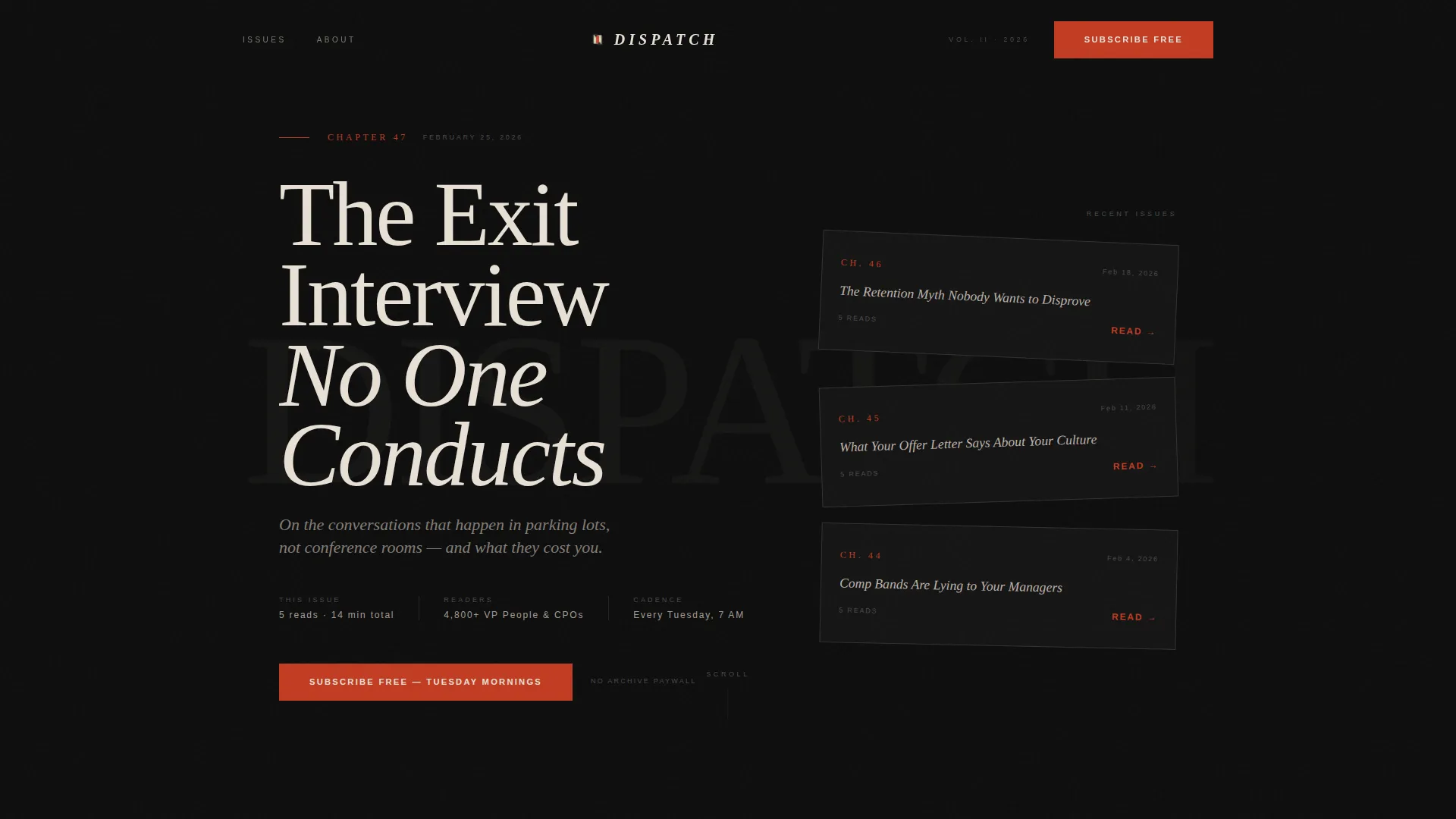
- An oversized typographic hero with a Chapter and Book concept, styled like a book's title page
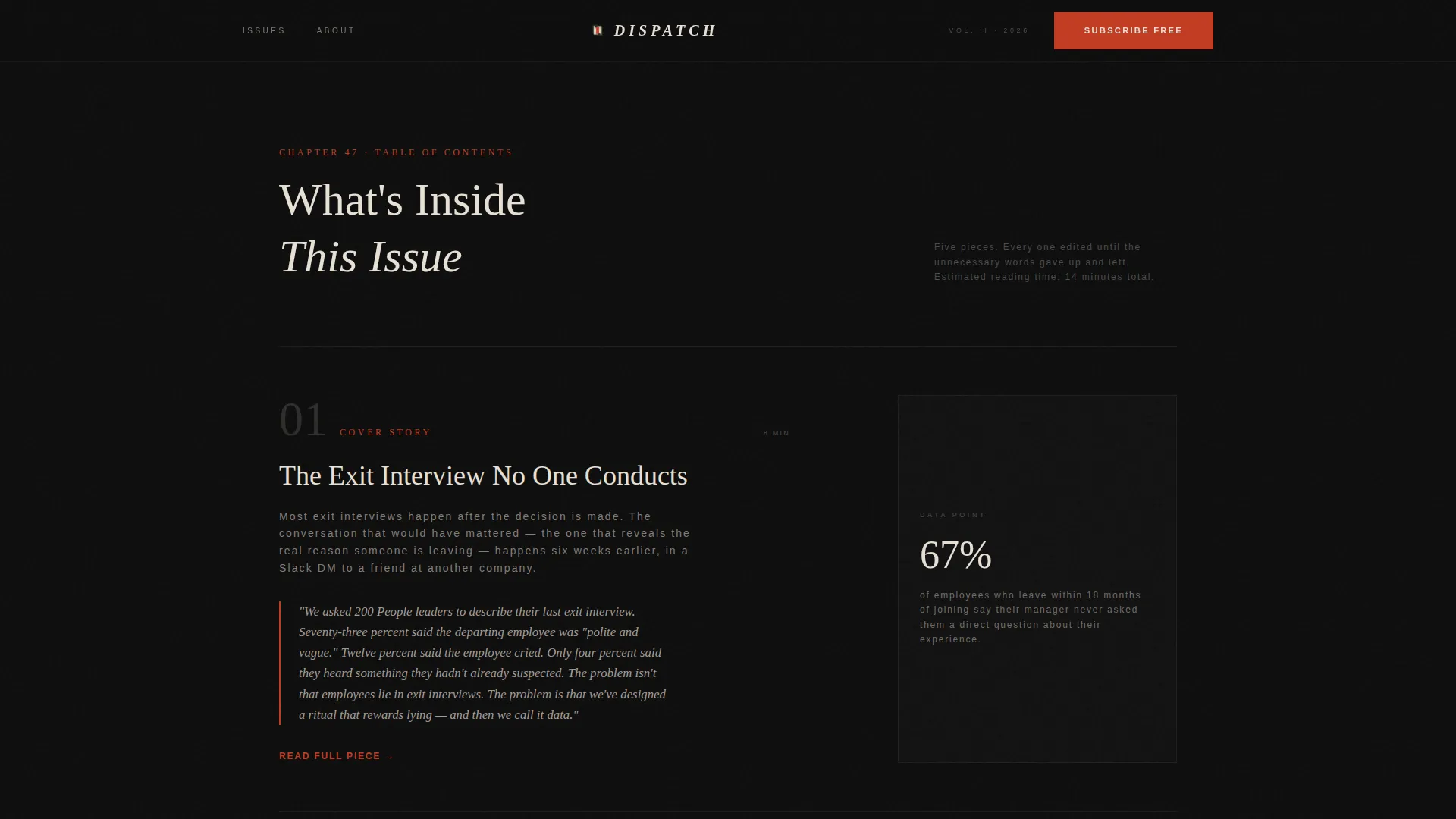
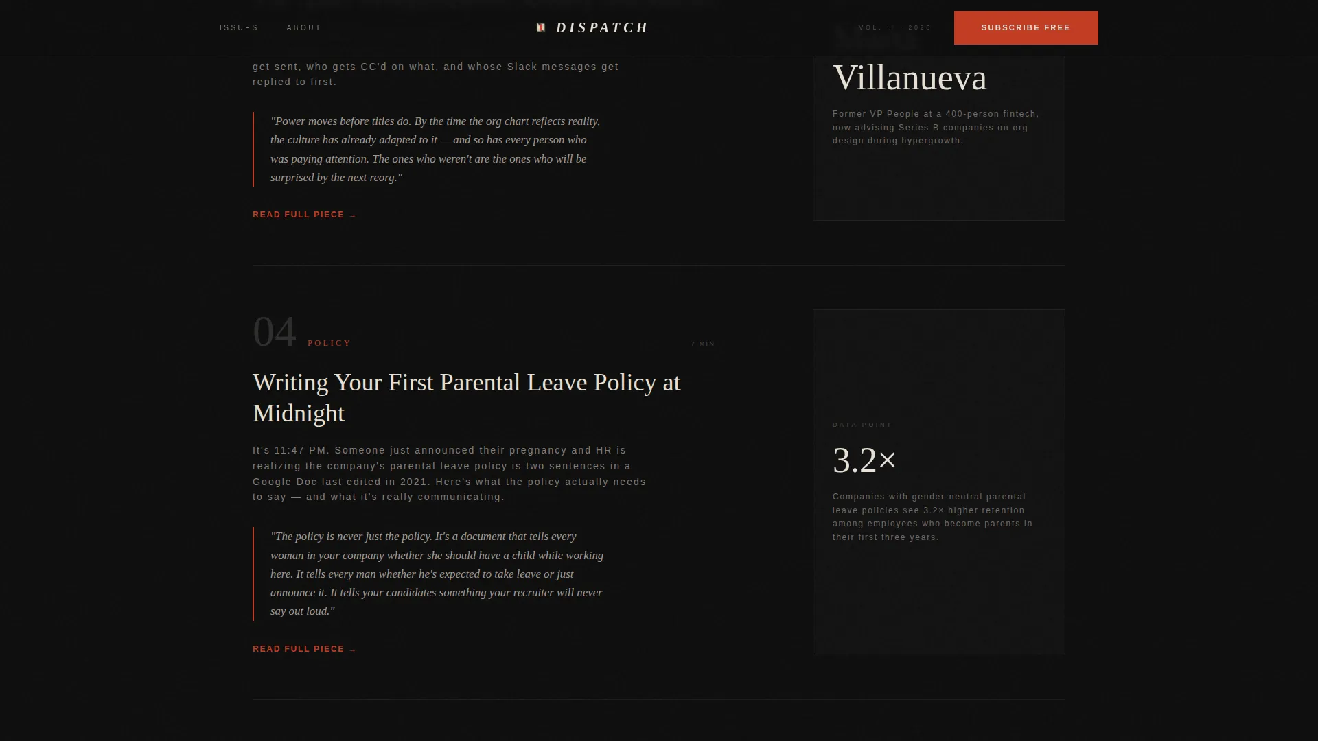
- A scrollable table of contents with numbered issue entries, alternating 60/40 excerpt and sidebar rhythm
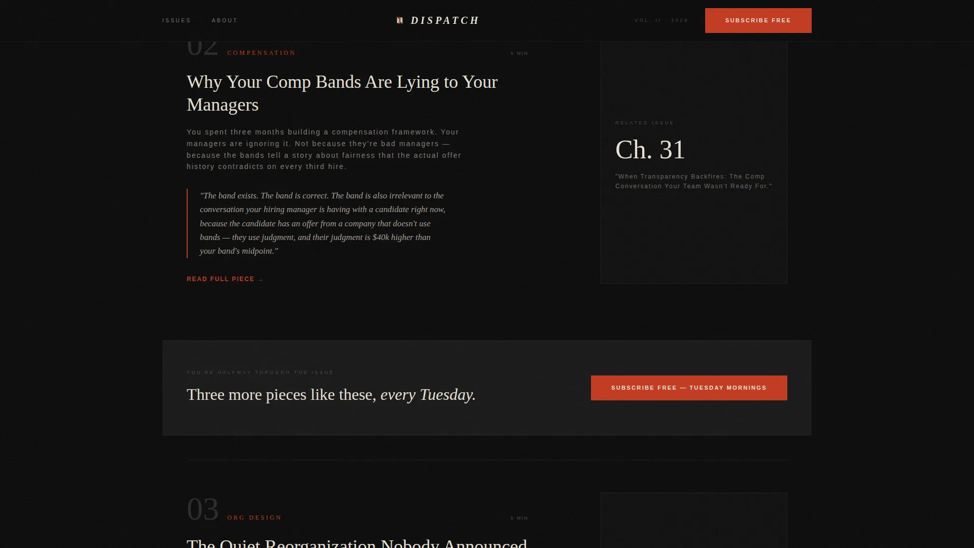
- Three subscribe call-to-action placements: post-header, mid-scroll strip, and anchored footer with email input
Feature list
This template includes purposefully sequenced components that match how a senior HR professional actually reads and decides.
Asymmetric 60/40 Grid Layout
The page uses a 60-column and 40-column split throughout. The wider column carries long-form previews and the primary editorial voice. The narrower column holds sidebar context like contributor notes, related past issues, and single data points pulled from each piece.
Chapter and Book Hero Section
The viewport opens on a typographic spread that resembles a hardcover book's title page. It includes a chapter number, a sharp serif headline styled as a book title, and an italic subhead that reads like a dust-jacket blurb. The 40-column displays a vertical stack of three previous issue covers, slightly rotated, like volumes arranged on a shelf.
Numbered Table of Contents Scroll
Scrolling past the hero reveals the current issue structured as a numbered table of contents. Each entry includes a provocative title, a two-sentence abstract, and a Read link. The scroll rhythm accelerates as sections progress, with abstracts becoming sharper toward the end.
Three-Point Call-to-Action System
The primary call to action reads "Subscribe Free, Tuesday Mornings" and appears at three distinct scroll positions. Each placement is timed to the reader's growing familiarity with the editorial voice, reducing friction at the moment of highest intent.
Editor's Note Credibility Section
A dedicated section establishes the editorial voice and explains who reviews every word before the issue reaches the reader. This section functions as a trust signal for an audience that values curation over volume.
Cinematic Dark Color System
The color palette uses deep manuscript black for backgrounds, aged parchment for body text and pull quotes, muted graphite for metadata and secondary labels, and editorial red used sparingly for links, issue numbers, and the subscribe button.
Page sections overview
| Section | Purpose |
|---|---|
| Hero Title Page | Opens on a typographic book-title spread with rotated past issue covers in the 40-column |
| Table of Contents | Presents current issue entries as numbered rows with abstracts and Read links |
| Mid-Scroll call to action Strip | Places the subscribe call to action between issue entries at peak engagement |
| Editor's Note | Builds credibility by introducing the editorial voice and curation standard |
| Subscribe Footer | Anchors the final call to action beside a single email input field with minimal surrounding elements |
Design & branding system
The visual identity follows an Ink and Paper theme drawn from 1970s newsroom cinema. Typography is the primary visual element; there is no photography anywhere on the page.
- Color palette: deep manuscript black (#0D0D0D) for backgrounds, aged parchment (#E8E0D5) for body copy, muted graphite (#4A4A4A) for labels, and editorial red (#C23B22) used only for links, issue numbers, and the subscribe button
- Typography: Cormorant Garamond serif handles headlines and pull quotes; DM Sans handles metadata and interface labels
- Interactivity: hover states on issue entries and a magnetic subscribe button bring tactile response to key conversion moments
Mobile & speed optimization
The template is built desktop-first to match how VP People and HR practitioners read on-screen during working hours. A clean mobile fallback ensures the layout holds on smaller viewports without losing editorial character.
- GSAP ScrollTrigger powers reveal animations and a marquee element, keeping motion purposeful rather than decorative
- Rotated issue cover cards and scroll-based pacing are handled client-side to keep static sections lightweight
- The single email input in the footer keeps the subscribe form simple and fast to complete on any device
How this template helps you convert
The page is built around a click-through strategy that rewards reading before asking for commitment. Each scroll layer adds trust before the next call to action appears.
- The hero establishes editorial authority immediately through typographic confidence, before any subscription ask appears
- The table of contents and partial excerpts create a content gap, giving readers enough taste to want the full issue
- Three timed call-to-action placements catch readers at different levels of intent, from curious to convinced
Other information about this template
This template sits in the Blog and Editorial category under the HR and People Ops Newsletter subcategory. It is suited for publishers who want their landing page to feel like a natural extension of the newsletter itself.
- The template style is Asymmetric Grid (60/40), with a Curated Collection creative direction and a Click-Through landing page direction
- Social proof elements such as subscriber counts, named reader roles, and pull quotes from past issues are included as positioned components
- The page uses English copy, United States date formatting, and a USD pricing context out of the box
- The confirmation page destination, reached after subscribing, unlocks the full current issue as an immediate content reward
Theme
Ink & Paper
Creative direction
Curated Collection
Color system
Cinematic Dark
Style
Asymmetric Grid (60/40)
Direction
Click-Through
Page Sections
Asymmetric 60/40 Grid Layout
Chapter and Book Hero Section
Numbered Table of Contents Scroll
Three-point Call to Action Placement
Editor's Note Credibility Block
Cinematic Dark Visual System
Related questions
Who is this landing page template designed for?
Does this template require me to write all the content from scratch?
Can I adjust the color palette or typography to match my own brand?
How does the three-part call-to-action placement work?
What happens after someone clicks the subscribe button?



