No-Code Newsletter Editorial Landing Page Template
Dispatch is a heritage-editorial landing page template built for no-code and low-code interview newsletters. It pairs a literary magazine aesthetic with a click-through structure designed to pull readers into your latest issue. Warm Stone typography, woodcut-style illustration, and anthology-style profile excerpts give every visit the feeling of opening a well-made book.
by Rocket studio
Quick summary
Dispatch is a single-page editorial template for a weekly no-code and low-code interview newsletter. It opens with a literary magazine cover, scrolls through an anthology of builder profiles, and closes with a persistent subscribe nudge. The layout is built to move readers toward your latest issue and earn their subscription through depth, not urgency.
Who this template is for
This template was designed for independent publishers who treat their newsletter as a serious editorial product. If you profile builders, founders, or operators, and your readers expect substance over speed, this layout fits.
- Solo founders and independent creators running a weekly interview newsletter in the no-code and low-code space
- Agency owners and operations leads who want a landing page that reflects the editorial quality of their content
- Newsletter publishers moving away from generic email signup pages toward a proper reading destination
What problem this template solves
Most newsletter landing pages ask visitors to subscribe before they have earned any trust. Dispatch flips that. It gives readers real excerpts, real voice, and a real sense of what they are joining before it asks for an email address.
- Generic signup pages fail to communicate editorial depth or audience specificity
- Visitors leave without subscribing because the page does not show them what they are actually getting
- Founders building in public need a page that reflects the quality of the work they are documenting
What you get with this template
You get a fully structured single-page layout with every section already designed, sequenced, and styled. Nothing needs to be invented from scratch.
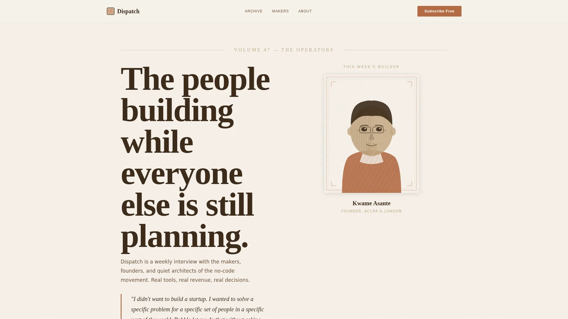
- A literary magazine hero section styled as a collected-volume opening, complete with a woodcut-style illustrated portrait and an italicized pull quote
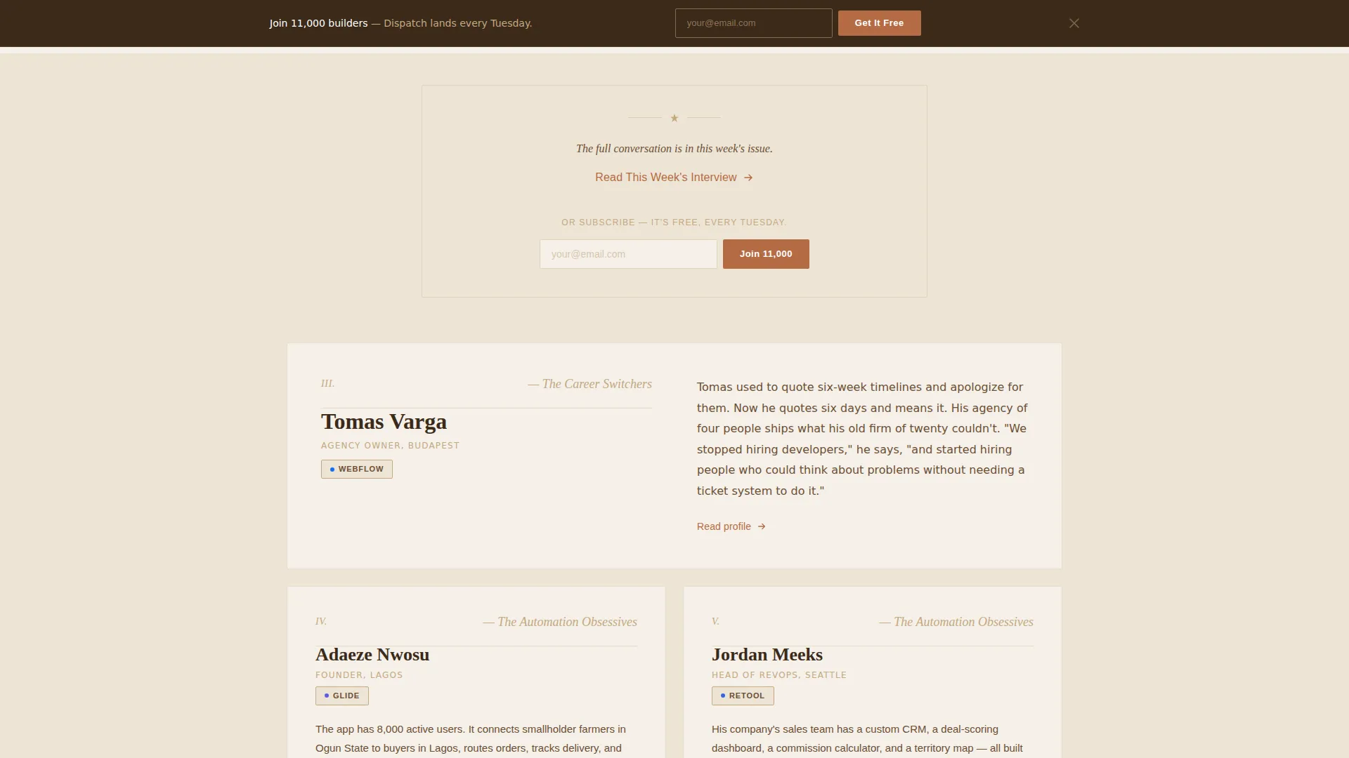
- An anthology-scroll profile archive with roman numerals, tool badges, and chapter-excerpt rhythm that alternates between single-column deep reads and side-by-side pairings
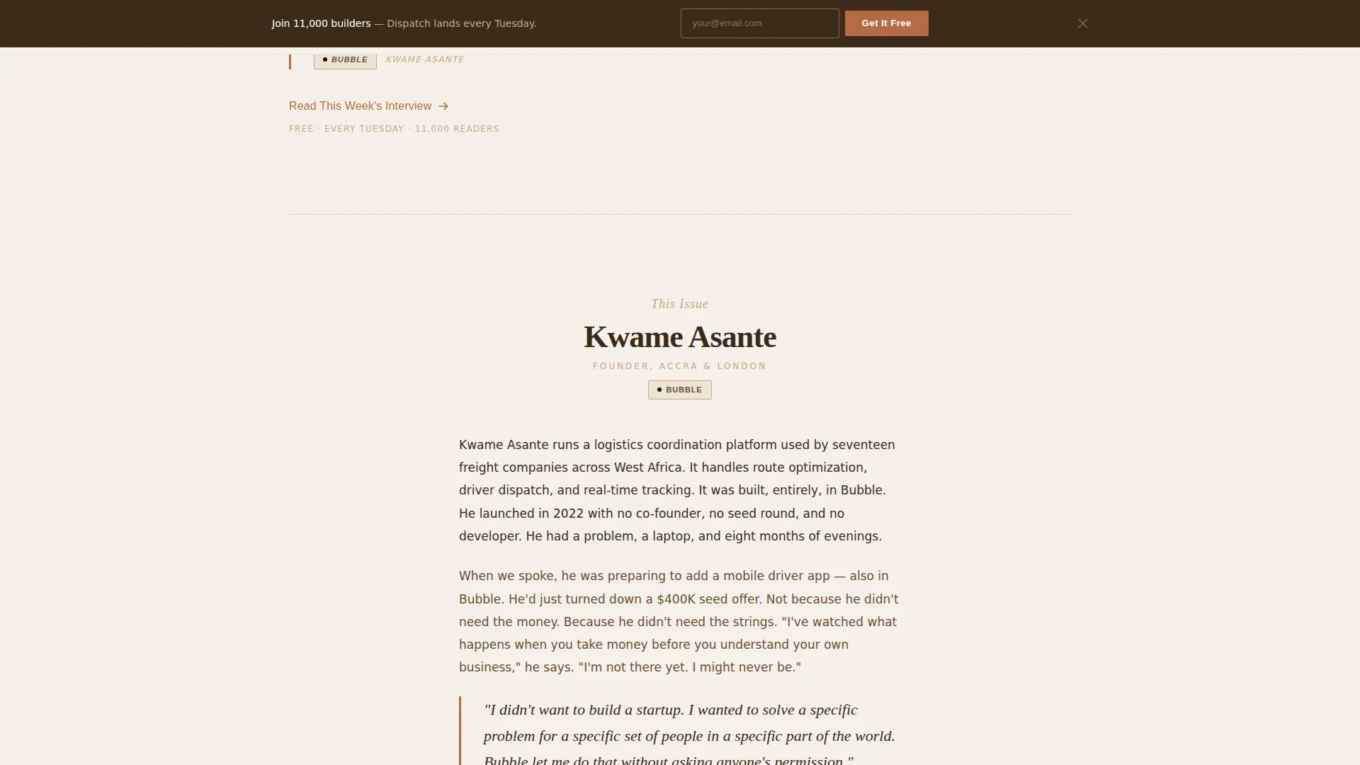
- A persistent top-bar subscribe form that appears after the visitor scrolls past the header, keeping conversion accessible without interrupting the reading experience
Feature list
The template includes the following built-in capabilities:
Literary Magazine Hero Section
The header opens as a large-format typographic spread styled like the opening page of a collected volume. A woodcut-style illustrated portrait sits beneath the volume title, rendered in single-color terracotta ink. A one-sentence pull quote in italics, attributed with the builder's name and tool of choice, anchors the composition. No photography, no gradients.
Anthology Profile Archive
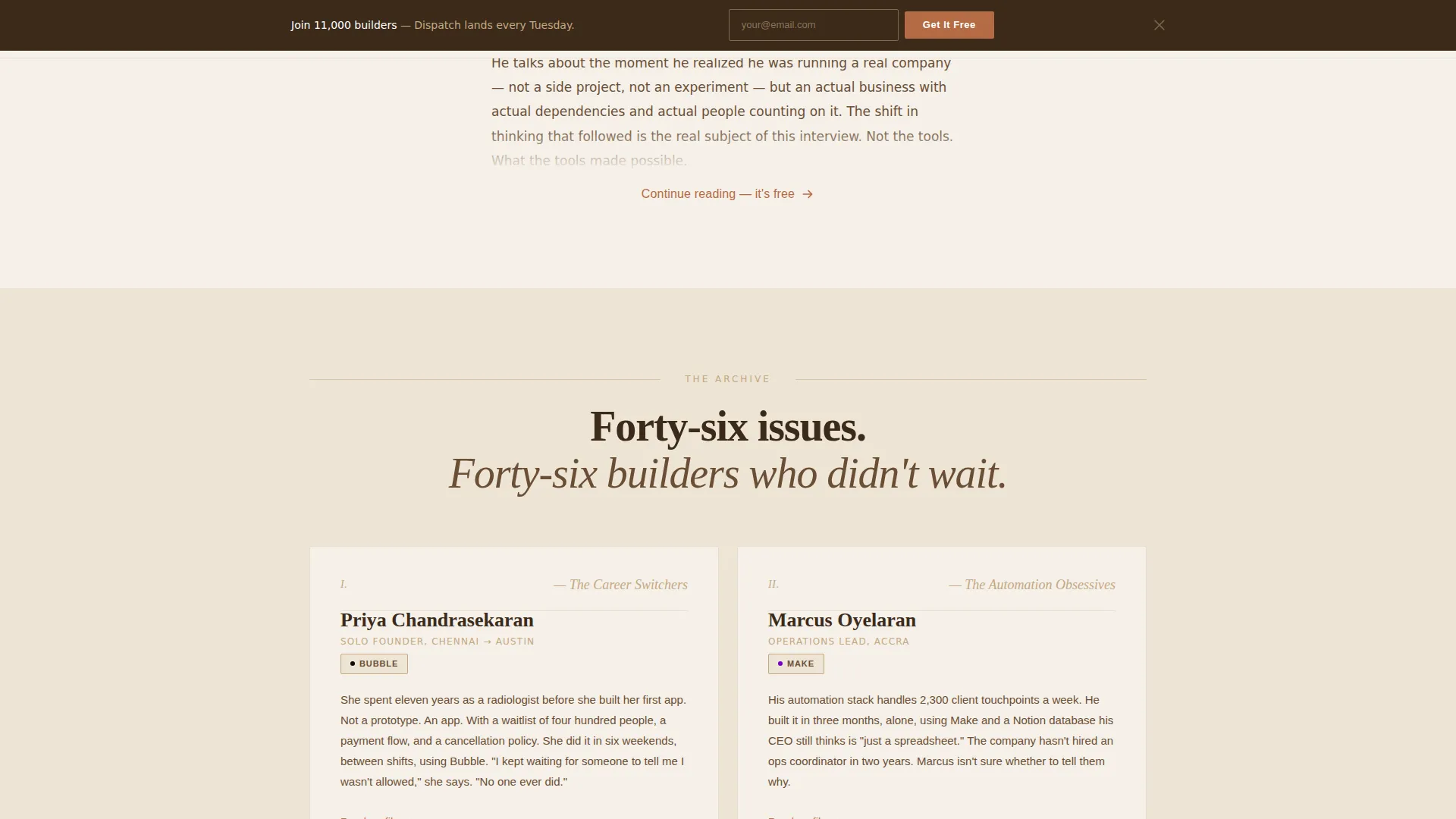
Each builder profile is presented as its own short chapter. A small roman numeral, a name, a tool badge, and a two-line excerpt open each entry. The rhythm alternates between single-column deep reads and side-by-side paired profiles grouped under thematic headings. Stakes build through accumulation across multiple profiles.
Asymmetric Makers Bento Grid
A featured builder grid uses an asymmetric card layout to present themed groupings of profiles. Cards have hover states and are organized under editorial theme headings. The grid reads as a curated collection rather than a generic content feed.
Persistent Subscribe Bar
A top bar containing a single email field drops down after the visitor scrolls past the header. It stays accessible throughout the reading experience without blocking content. This provides a low-friction secondary conversion path alongside the inline subscribe nudges.
Inline Click-Through calls to action
The primary call to action, styled as a terracotta text link with an arrow, appears first beneath the header portrait and then again after every third profile excerpt. The format prioritizes editorial flow over aggressive button placement, keeping the reading experience intact.
Pull Quote and Credibility Section
A large italic testimonial block paired with a subscriber count and press or community mentions provides social proof mid-page. This section signals scale and legitimacy without breaking the editorial tone.
Page sections overview
| Section | Purpose |
|---|---|
| Hero Volume Header | Opens as a literary magazine cover with illustrated portrait and pull quote |
| Profile Archive Scroll | Presents builder profiles as anthology chapters with roman numerals and tool badges |
| Makers Bento Grid | Asymmetric featured builder cards grouped under editorial themes |
| Pull Quote Credibility | Large italic testimonial with subscriber count and press mentions |
| Latest Issue Preview | Two-column interview excerpt with an inline subscribe nudge |
| Persistent Subscribe Bar | Email capture bar that appears on scroll for continuous conversion access |
| Minimal Footer | Horizontal footer with essential links, no visual clutter |
Design & branding system
The Warm Stone color system gives this template its defining character. Every color choice was made to feel tactile, unhurried, and earned through substance.
- Four-color palette: parchment cream (#F5F0E8) for backgrounds, weathered sandstone (#C4A882) for alternate section washes, deep bookbinding brown (#3B2A1A) for body text, and a quiet terracotta (#B56B45) reserved for links, pull quotes, and subscribe buttons
- Typography uses Fraunces as the serifed display face for headings and volume titles, paired with DM Sans for body text and interface elements, giving the page both editorial weight and clean readability
- The Heritage and Story visual theme is carried through ink-on-paper composition, woodcut-style illustration, generous line spacing, and alternating parchment and sandstone section backgrounds
Mobile & speed optimization
The template is built desktop-first because wide editorial layouts show the anthology rhythm at its best. Mobile is fully considered and the layout adapts cleanly.
- Desktop-first layout with responsive breakpoints that preserve the reading experience on smaller screens
- Server Components handle static editorial content, with minimal JavaScript reserved for scroll behavior such as the persistent subscribe bar reveal and profile card stagger animations
- Page-turn scroll reveals and subtle ink-draw SVG animations are implemented at medium intensity, keeping motion purposeful rather than distracting
How this template helps you convert
Dispatch earns the conversion before it asks for it. Every section is sequenced to build confidence in the reader, not push them toward a hasty decision.
- The hero pull quote and woodcut portrait establish editorial voice immediately, giving first-time visitors a reason to keep reading before any subscribe prompt appears
- Real interview excerpts across the profile archive demonstrate depth and specificity, so by the fifth profile entry the reader understands the archive is genuinely worth following
- The persistent subscribe bar and inline terracotta text-link calls to action keep the conversion path visible without interrupting the editorial experience, reducing friction at the moment of decision
Other information about this template
This template is part of the Curated Collection creative direction series, which is designed specifically for scroll-based editorial experiences where the content itself is the primary persuasion mechanism.
- The template uses FAQ-style chapter toggles as an optional interactivity layer, giving publishers the option to expand profile excerpts without navigating away from the page
- The footer follows a minimal horizontal pattern, keeping the end of the page clean and focused on the subscribe action rather than cluttering it with secondary navigation
- This template is well suited to newsletter publishers building in the no-code and low-code space using tools such as Webflow, Bubble, or similar no-code platforms for their own sites
- The visual identity is fully customizable: the Warm Stone palette, Fraunces and DM Sans pairing, and woodcut illustration style are all starting points, not fixed constraints
Theme
Heritage & Story
Creative direction
Curated Collection
Color system
Warm Stone
Style
Editorial/Magazine
Direction
Click-Through
Page Sections
Literary Magazine Hero Section
Anthology Profile Archive
Asymmetric Makers Bento Grid
Persistent Scroll Subscribe Bar
Inline Click-through Ctas
Pull Quote Credibility Block
Related questions
Who is the Dispatch template designed for?
Can I use this template if my newsletter covers a different topic?
What is the primary conversion goal of this template?
Does the template include the subscriber count or social proof content?
How does the profile archive section work?



