SaaS & Cloud Newsletter Landing Page Template
Dispatch is a coming-soon landing page template for a weekly SaaS and cloud newsletter. It pairs a cinematic ink-and-paper visual identity with a gallery-walk scroll structure, earning email signups by showcasing editorial depth before asking for anything. The "Hold My Seat" waitlist flow and "Preview Edition Zero" path turn curious visitors into committed early subscribers.
by Rocket studio
Quick summary
Dispatch is an editorial landing page template built for a weekly SaaS and cloud newsletter. It uses a film noir pressroom aesthetic, a gallery-walk scroll structure, and two conversion paths to collect early subscribers. The design proves editorial quality first, then asks for the email.
Who this template is for
This template is built for newsletter creators who take their editorial voice seriously. It suits independent writers, founding engineers, and product-focused founders launching a SaaS or cloud-focused weekly publication.
- Newsletter operators launching a waitlist before their first send
- SaaS and cloud writers who want a landing page that reflects publication-grade craft
- Indie builders and solo founders who need a coming-soon page that earns trust quickly
What problem this template solves
Most newsletter landing pages ask for an email before giving any reason to hand it over. That approach fails with a technical audience that values depth and signal. Dispatch flips that order.
- Visitors read specimen content and editorial examples before seeing any form
- The waitlist collects emails only after the page has established voice and credibility
- Two conversion paths serve different reader readiness levels without friction
What you get with this template
The template delivers a complete single-page layout organized into deliberate sections, each designed to build conviction as the reader scrolls. Every visual and interaction choice reinforces the broadsheet-publication feeling.
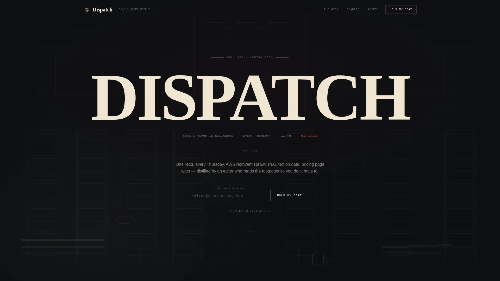
- A hero section with a cross-hatched newsroom illustration, a heavy serif headline, and a typewriter-style email input field
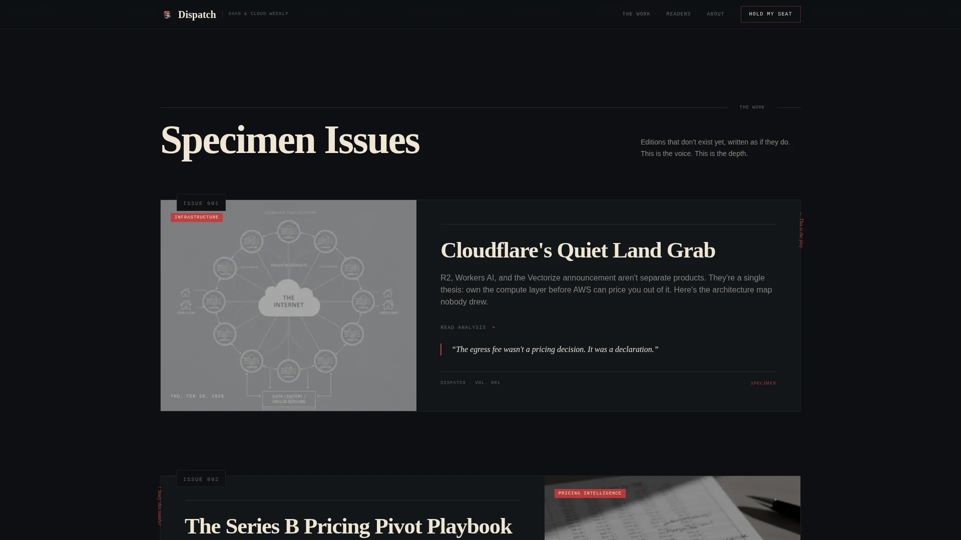
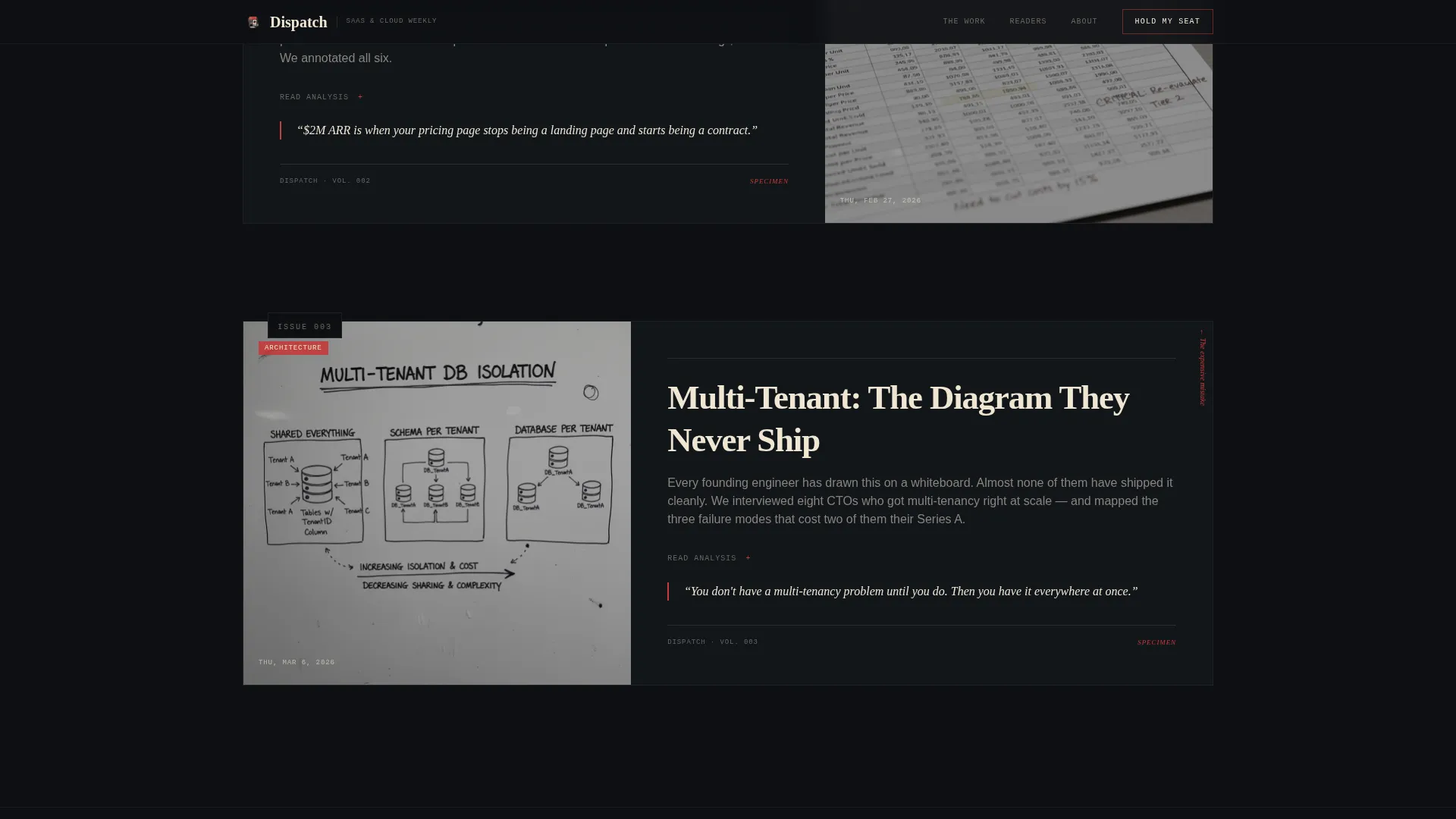
- Three gallery-walk edition frames with mock front pages, annotated teardowns, and architecture diagrams that demonstrate newsletter depth
- A fixed bottom bar that resurfaces the "Hold My Seat" call to action after the third gallery frame
Feature list
This template is built around a focused set of purpose-designed components. Each one serves the waitlist goal without adding clutter.
Parallax Newsroom Hero Illustration
The header features a detailed pen-and-ink cross-hatched newsroom scene. Server racks replace filing cabinets, terminal windows glow where typewriters sat, and a chalkboard wall shows architecture diagrams. Subtle parallax layers make the foreground desk drift as the cursor moves, creating depth without distraction.
Typewriter Email Input
The primary call-to-action field is styled as a monospace typewriter input with a blinking cursor. It appears first beneath the hero illustration and again in the fixed bottom bar after scroll. The interaction reinforces the editorial aesthetic while keeping the signup mechanic clear and familiar.
Gallery Walk Edition Frames
Three scroll-reveal edition frames mount specimen content on the dark wall like framed exhibits. Each frame contains a mock newsletter front page, a margin-annotated teardown, or a hand-illustrated architecture diagram. Visitors experience the newsletter's voice and depth before committing their email address.
Fixed Bottom Bar Call to Action
After the third gallery frame, a fixed bar anchors to the bottom of the viewport. It keeps the "Hold My Seat" prompt visible without interrupting the scroll. The bar activates on scroll position and stays unobtrusive until the reader is ready.
Preview Edition Zero Path
A secondary conversion path invites visitors to download a PDF sample issue. This path captures an email in exchange for a real specimen of the newsletter. It serves readers who want proof of quality before joining the main waitlist.
Reader Identity Section
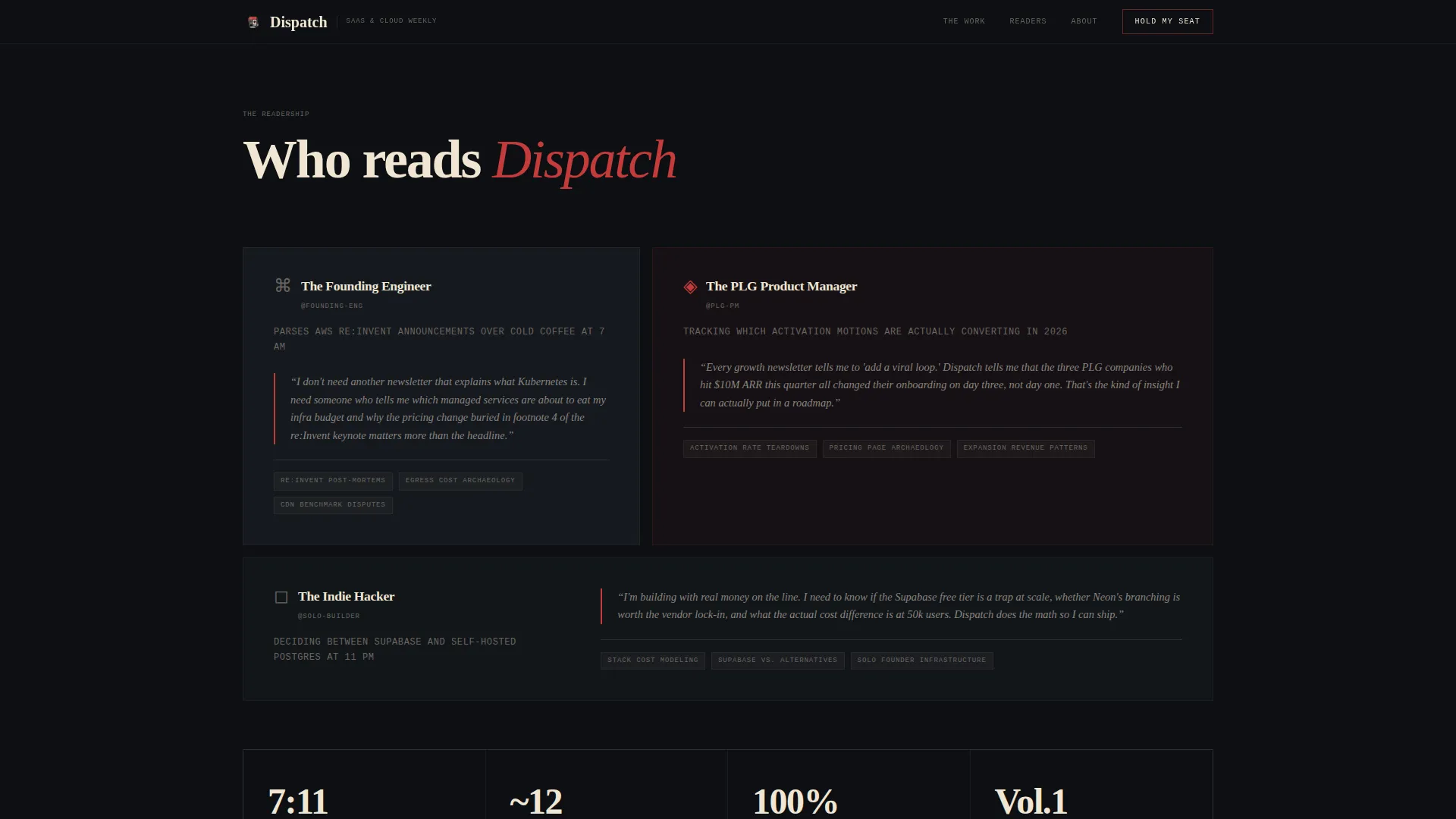
Three reader archetype blocks with pull-quotes show exactly who the newsletter is written for. Founding engineers, product managers, and indie hackers each get a short profile. This section validates fit and increases signup confidence for the right audience.
Page sections overview
| Section | Purpose |
|---|---|
| Hero with illustration | Introduce the newsletter identity and collect the first waitlist email |
| Marquee ticker strip | Scroll topics and beats covered to signal editorial range |
| Gallery frame one | Display a mock front page as editorial proof |
| Gallery frame two | Show a margin-annotated pricing teardown |
| Gallery frame three | Present a hand-illustrated architecture diagram |
| Reader identity block | Profile three reader archetypes with pull-quotes |
| Final call-to-action frame | Full-width "Hold My Seat" section with Preview Edition Zero path |
| Footer row | Single-row linear footer with minimal links |
Design & branding system
The visual identity follows an Ink and Paper theme built on a Cinematic Dark color system. Every color choice, type choice, and layout decision references a film noir pressroom environment.
- Color palette: pressroom black (#0D0F12) dominates backgrounds, warm newsprint cream (#F0E6D3) appears in content cards and pull-quotes, editor's red (#C43B3B) marks hover states and annotations, and typeset gray (#6B6560) handles secondary text and ruled lines
- Typography trio: Fraunces handles the display serif headlines, DM Mono drives typewriter inputs and labels, and DM Sans carries body copy for readability
- Visual language: cream surfaces resemble torn broadsheet clippings pinned to a dark wall; red appears only where attention is required, never decoratively
Mobile & speed optimization
The template is designed desktop-first for founding engineers on large screens. It scales responsively to mobile without losing the editorial feel.
- Parallax and scroll-reveal animations are handled by client-side components, keeping static structural content server-rendered for fast initial load
- The fixed bottom bar, accordion gallery frames, and marquee ticker adapt to narrower viewports without breaking layout rhythm
How this template helps you convert
The page earns signups by building editorial conviction across every scroll position. By the time a visitor reaches the final frame, they already feel like a reader.
- The hero section leads with illustration and dateline before any form, so visitors absorb the publication identity first and the ask comes second
- The gallery frames accumulate social proof through specimen depth rather than testimonial counts, which resonates with a technical audience that can smell generic marketing
- Two conversion paths (waitlist and PDF download) meet readers at different readiness levels, increasing total capture without adding cognitive load
Other information about this template
This template is organized into one continuous page with eight distinct sections. It is suited for editorial newsletter concepts across the SaaS and cloud vertical, but the design system and layout pattern work for any knowledge-focused publication with a strong voice.
- The Cinematic Dark color system and Ink and Paper theme are built into the template as a cohesive set, not as loose swatches
- The Gallery Walk creative direction means each edition frame is designed to stand alone as a visual specimen, making the page feel like a curated exhibit rather than a product sheet
- The Waitlist and Coming Soon landing page direction is the primary conversion model; the template does not include a post-launch content feed or subscription management layer
- Typography is set with Fraunces for display use, DM Mono for interactive and label elements, and DM Sans for all body reading text
Theme
Ink & Paper
Creative direction
Gallery Walk
Color system
Cinematic Dark
Style
Editorial/Magazine
Direction
Waitlist/Coming Soon
Page Sections
Parallax Newsroom Hero Illustration
Typewriter-style Email Input
Gallery Walk Edition Frames
Fixed Bottom Bar Waitlist Prompt
Preview Edition Zero Download Path
Reader Archetype Identity Block
Related questions
What conversion paths does this template include?
Is this template suitable for a newsletter that has not launched yet?
How does the gallery walk scroll structure work?
What is the fixed bottom bar and when does it appear?
Can this template be adapted for a different newsletter niche?



