Complete Travel Blog & Media Blog & Content Website Template
Dispatch is a masonry-style travel newsletter landing page built for writers and editors who want their subscription offer to feel like a piece of publishing. The template combines a broadsheet masthead header, a personal origin story, a Pinterest-style archive grid, and a telegram-blank subscription form into one cohesive, editorial landing page.
by Rocket studio
Quick summary
Dispatch is a single-page travel newsletter template designed around editorial quality and accumulated trust. It opens with a full-width newspaper masthead and one cinematic photograph, then unfolds into a founder narrative, a breathing masonry archive grid, and a minimal subscription form. The layout rewards curious readers and converts them through value, not pressure.
Who this template is for
This template suits anyone building a subscription-based travel letter who wants the page itself to feel like part of the editorial product. It is built for voices with a distinct point of view and a body of past work worth showing.
- Independent travel newsletter writers publishing weekly or monthly issues
- Design-minded founders launching a curated travel publication for a niche audience
- Remote workers and frequent travelers turning their itineraries into a subscriber community
What problem this template solves
Most newsletter landing pages either over-explain or under-deliver. They rely on urgency, social-proof widgets, and generic hero copy that sounds like every other subscription offer. Dispatch solves a different problem: it makes the work visible so that trust builds naturally through accumulated editorial quality.
- Visitors leave without subscribing because the page never shows them what the letter actually feels like
- Generic templates cannot hold the tone of a personal, voice-driven travel letter
- Single-input subscription forms buried below generic hero sections fail to convert deep scrollers
What you get with this template
You get a complete, section-led landing page structured around editorial storytelling and a single clear subscription path. Every section has a defined role, and the visual system keeps the reading experience warm and focused.
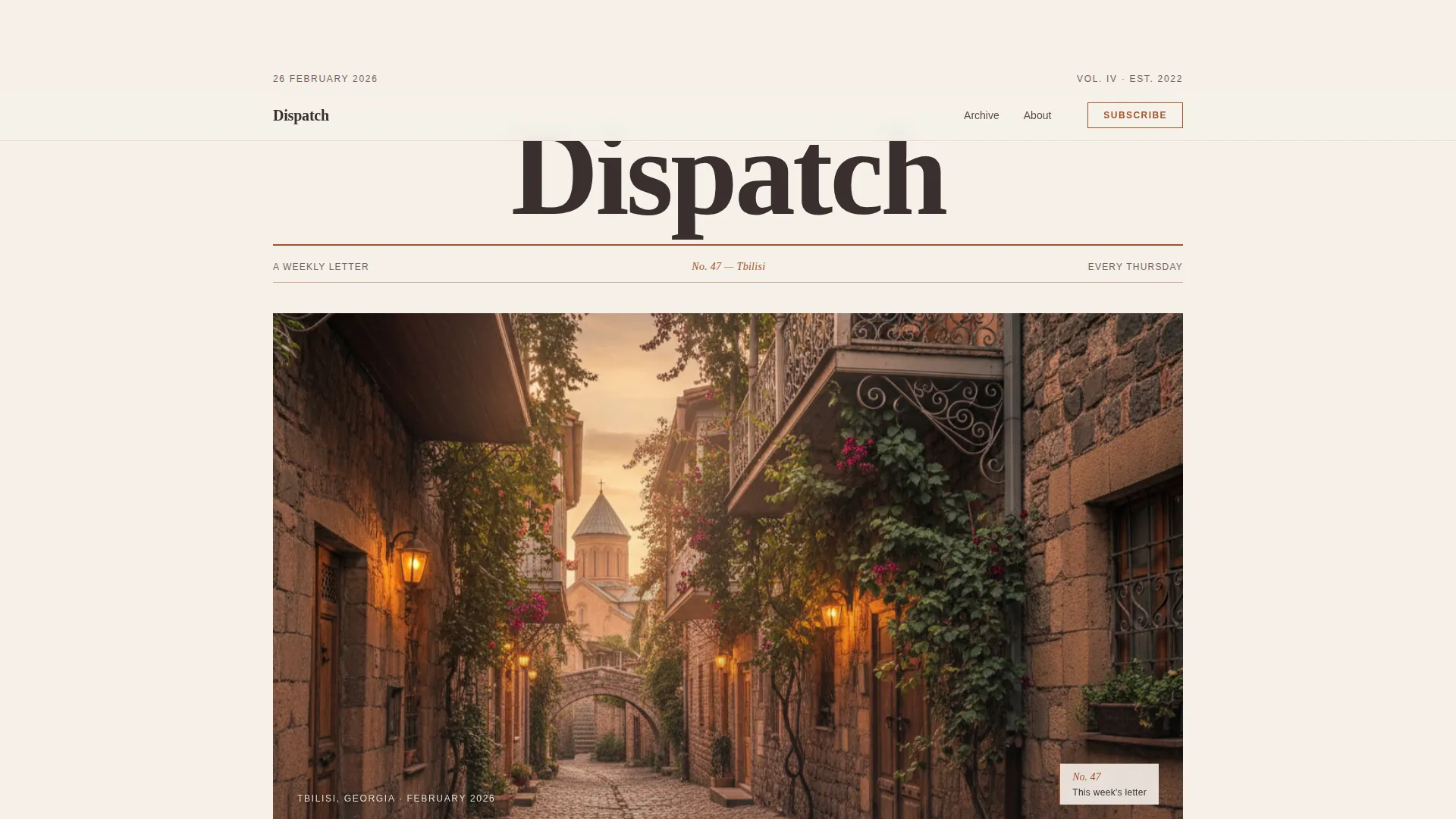
- A full-width newspaper masthead with issue dateline, a cinematic hero photograph, and a clear content hierarchy
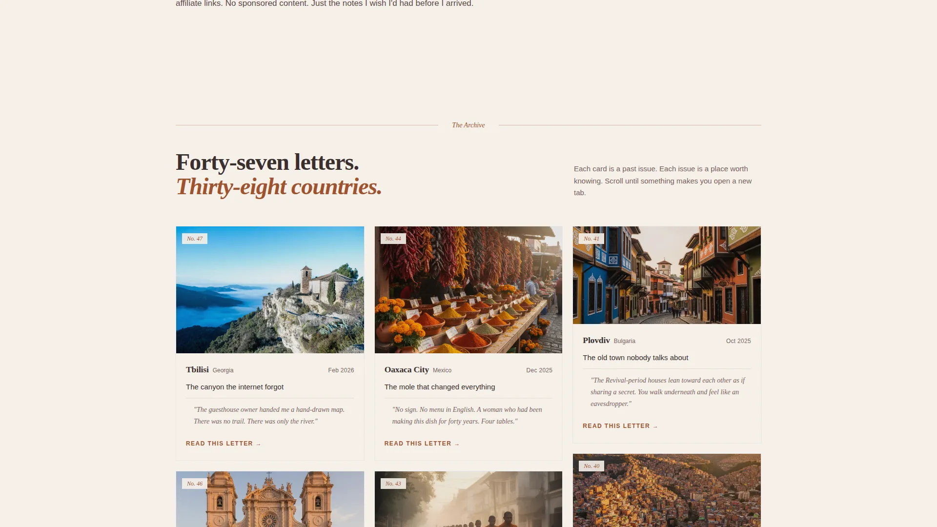
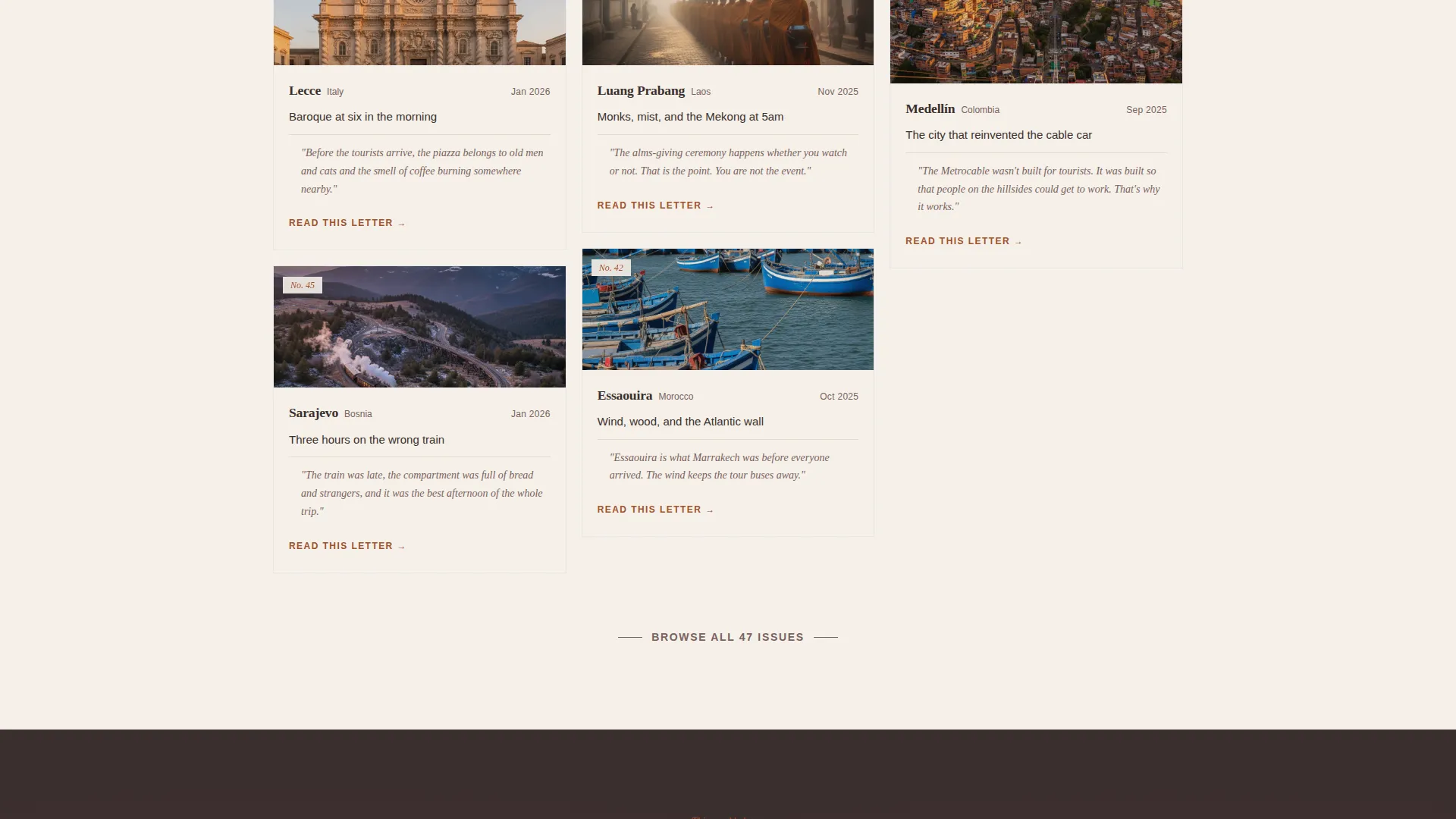
- A masonry archive grid where each card shows a destination photograph, subject line, and pull-quote from a past issue
- A telegram-styled email subscription form with a rust-colored call-to-action button and a secondary region-filterable archive browse section
Feature list
This template is built around five distinct functional components that work together to tell the story of a newsletter, not just sell it.
Broadsheet Masthead Header
The header sets the publication's identity at full viewport width. It includes the newsletter name in a large serif, a thin rust rule, an issue dateline referencing a specific city and issue number, and one atmospheric photograph framed with generous white space. No carousel, no stacked imagery.
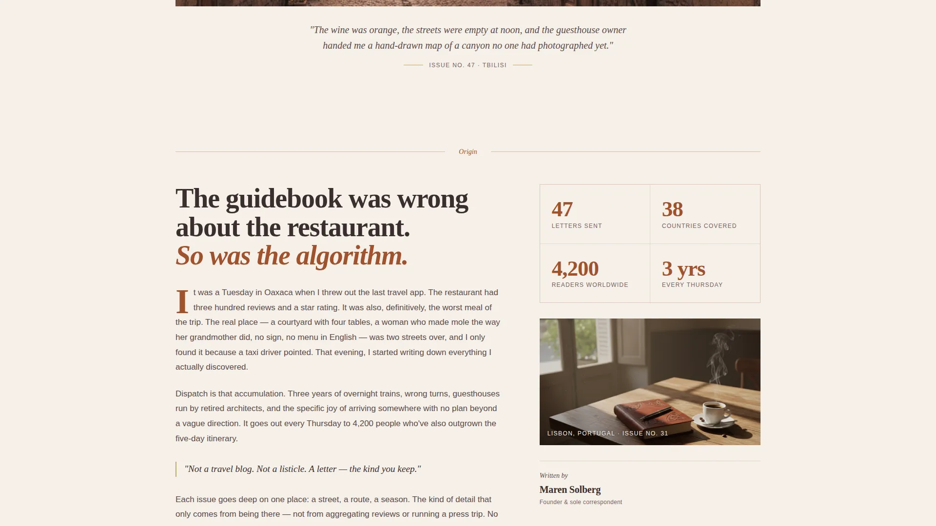
Origin Story Narrative Section
Directly below the fold, a short founder paragraph anchors the reader in a personal travel moment. This section also surfaces key social proof figures: total issues sent, countries covered, and active subscriber count. It reads like the opening of a letter, not a marketing pitch.
Masonry Archive Grid
The Pinterest-style card grid renders past issues as miniature editorial spreads. Each card holds a destination photograph, a one-line subject line, and a pull-quote from the letter itself. Cards vary in proportion to mimic a pinboard, and staggered scroll reveals make each entry feel discovered rather than loaded.
Telegram-Blank Subscription Form
The primary call to action asks only for an email address, styled as a telegram input field. The submit button reads "Send It Over" in terracotta rust. The form delivers the most recent full issue directly to the inbox, converting curiosity into commitment through immediate value.
Region-Filterable Archive Browse
A secondary section below the subscription form lets visitors search and filter the issue archive by geographic region. This rewards deep scrollers who want proof before they commit, giving them a browsable body of work rather than a paywall or a teaser list.
Page sections overview
| Section | Purpose |
|---|---|
| Masthead and hero | Establishes editorial identity with broadsheet header, issue dateline, and single hero photograph |
| Origin story | Delivers founder narrative and surfaces subscriber count, issue count, and country coverage |
| Masonry archive grid | Displays past issues as editorial cards with photograph, subject line, and pull-quote |
| Subscription call to action | Captures email via telegram-blank input with "Send It Over" rust button |
| Searchable archive browse | Lets visitors filter past issues by region before committing to subscribe |
| Minimal footer | Closes the page with a clean horizontal flow layout |
Design & branding system
The visual identity follows a Luxe Minimal editorial theme built on a Parchment and Rust color system. The palette reads warm and tactile, like a leather journal left open on a café table. Every color has a specific role and the system is intentionally restrained.
- Parchment (#F5F0E8) covers the dominant background; aged ink brown (#3B2F2F) handles all body text; terracotta rust (#A0522D) concentrates in headlines, drop caps, section dividers, and the masthead rule
- Dusty gold (#C2A66B) appears only on hover states and pull-quote lines, used sparingly so the eye knows where to linger
- Typography pairs Fraunces, a variable serif, for all headlines and the masthead, with DM Sans for body copy and interface elements
Mobile & speed optimization
The template is built desktop-first to serve a reading-oriented audience, but the layout adapts cleanly to smaller screens without losing its editorial character.
- The masonry grid reflows into a single-column view on mobile, preserving card hierarchy and pull-quote legibility
- Scroll reveal animations use a custom cubic-bezier timing curve, with staggered card entries that feel intentional rather than mechanical
- Static content sections use server-rendered components while the masonry grid and region filter run as client-side components, keeping the initial page load light
How this template helps you convert
The conversion strategy is built on earned trust rather than manufactured urgency. Every section of the page does one job and does it well, pulling the visitor forward through the content before asking for anything.
- The masonry archive grid builds the case for the newsletter's quality before the subscription form appears, so by the time a visitor reaches the call to action, they already understand the body of work behind it
- The primary call to action delivers the most recent full issue to the inbox rather than a promise of future value, which removes the risk a new reader feels before subscribing
- The region-filterable archive gives skeptical or detail-oriented visitors a second path to commitment by letting them explore past issues on their own terms
Other information about this template
Dispatch is designed as a content and resource destination, not a lead-generation funnel. The page works equally well for launching a new newsletter and for giving an existing publication a home that matches its editorial ambition.
- The template is built for the Blog and Editorial category within the Travel Newsletter niche, specifically for the Travel Blog and Media subcategory
- The Masonry and Pinterest grid layout is the structural backbone of the archive section and is built as a high-interactivity client component
- The header concept follows a Newspaper and Publication editorial pattern, distinct from hero-image-first or feature-carousel formats
- The creative direction is Origin Story, meaning the founder's voice and personal narrative drive the scroll experience rather than feature lists or pricing tiers
- The footer follows a minimal horizontal flow layout that keeps the editorial tone consistent through the last element on the page
Theme
Luxe Minimal
Creative direction
Origin Story
Color system
Parchment & Rust
Style
Masonry/Pinterest
Direction
Content/Resource
Page Sections
Broadsheet Masthead with Issue Dateline
Founder Origin Story Section
Masonry Archive Grid with Pull-quotes
Telegram-blank Subscription Form
Region-filterable Archive Browse
Related questions
Can I use this template if I am just starting my newsletter?
Does the subscription form connect to an email delivery service?
Can I edit the issue number and city name in the masthead?
How do I add new issues to the masonry archive grid?
Does the region filter require an external search tool?



