Venture Capital Newsletter Landing Page Template
Dispatch is a venture capital jobs and opportunities newsletter landing page template built on an asymmetric 60/40 grid. It follows an Ink and Paper editorial aesthetic with a Day-in-the-Life scroll flow. The template is designed to convert career-minded visitors into email subscribers through editorial storytelling, a mocked inbox preview, a featured role card, and a persistent call-to-action.
by Rocket studio
Quick summary
Dispatch is a single-page newsletter landing page template for a weekly curated venture capital jobs publication. It uses a broadsheet-inspired Ink and Paper design, an asymmetric 60/40 grid layout, and a Day-in-the-Life scroll narrative. Every section is built to earn the email subscription by showing readers exactly what arrives in their inbox.
Who this template is for
This template is built for newsletter founders and solo editors who publish curated venture capital career content. It suits anyone launching or relaunching a weekly jobs-and-opportunities newsletter targeting career-driven professionals.
- MBA candidates positioning for a post-graduation move into venture capital
- Startup operators and junior finance associates pivoting toward venture roles
- Independent newsletter creators who want an editorial-grade landing page without starting from scratch
What problem this template solves
Most newsletter landing pages describe what the publication does rather than showing it. That approach loses visitors before they ever subscribe. Dispatch solves this by walking readers through a full day with the newsletter, making the value feel immediate and real.
- Generic job boards feel noisy and impersonal; this template presents roles in editorial voice
- Visitors leave without subscribing when they cannot preview the product before committing
- A flat hero-plus-form layout rarely builds the trust needed for a career-focused audience
What you get with this template
The template delivers a complete single-page layout structured across five thematic scroll sections plus a footer. Each section serves a distinct purpose in the subscriber journey, from first impression to final call to action.
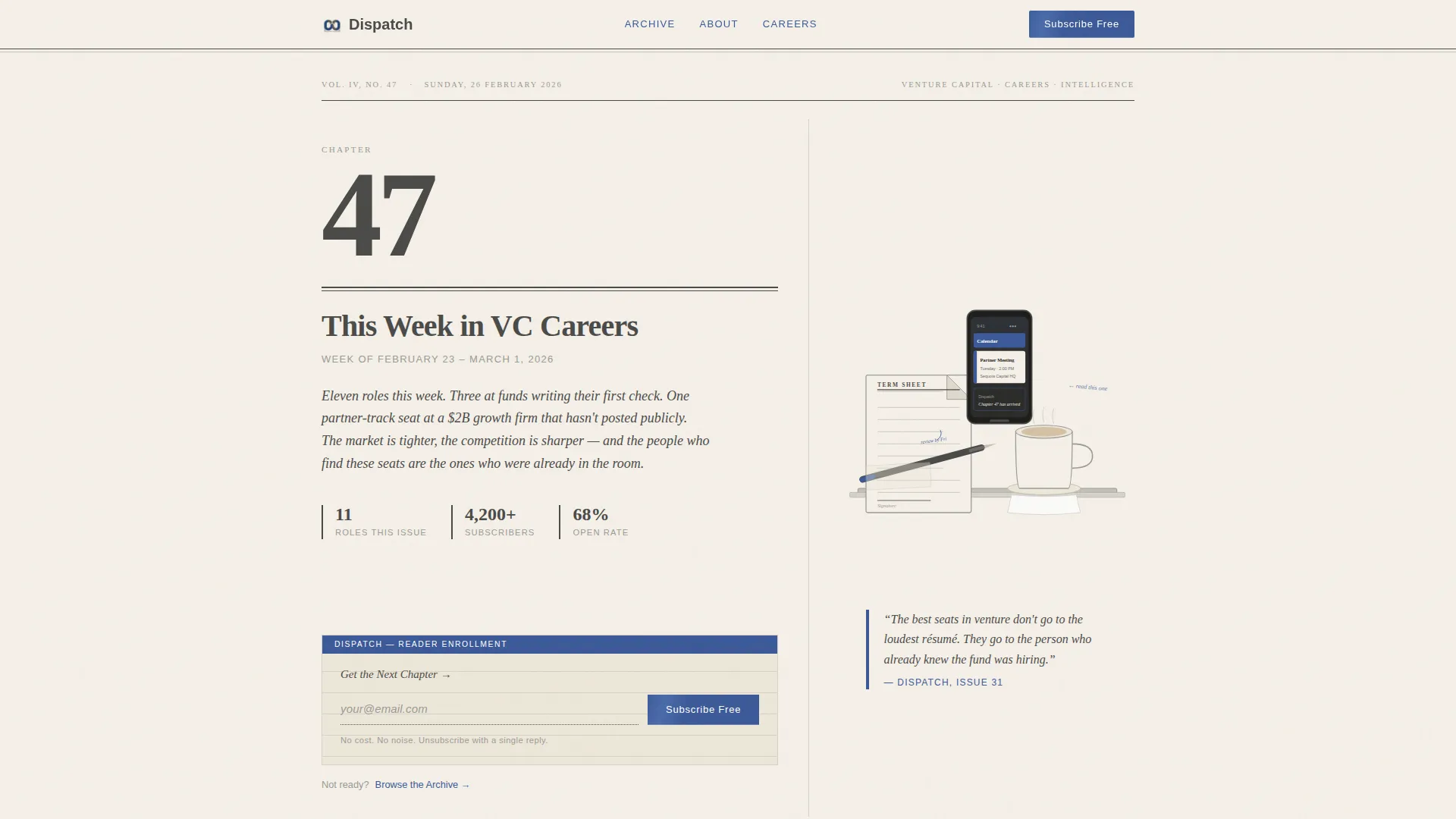
- A 60/40 Chapter spread hero with an illustrated desk scene and an inline email subscribe form
- A Day-in-the-Life scroll narrative covering Morning, Midday, Afternoon, and Evening sections
- A sticky footer call-to-action bar and an archive preview showing three past issues as book spines
Feature list
This template packages editorial design and lead-generation mechanics into one cohesive layout. Every feature listed below comes directly from the template brief.
Asymmetric 60/40 Chapter Hero
The hero section splits into a 60 percent left column and a 40 percent right column. The left displays a large serif chapter heading, a dateline, and a one-sentence editorial lede. The right shows a torn-edge illustrated desk scene alongside the primary email subscribe form styled as a library index card.
Day-in-the-Life Scroll Narrative
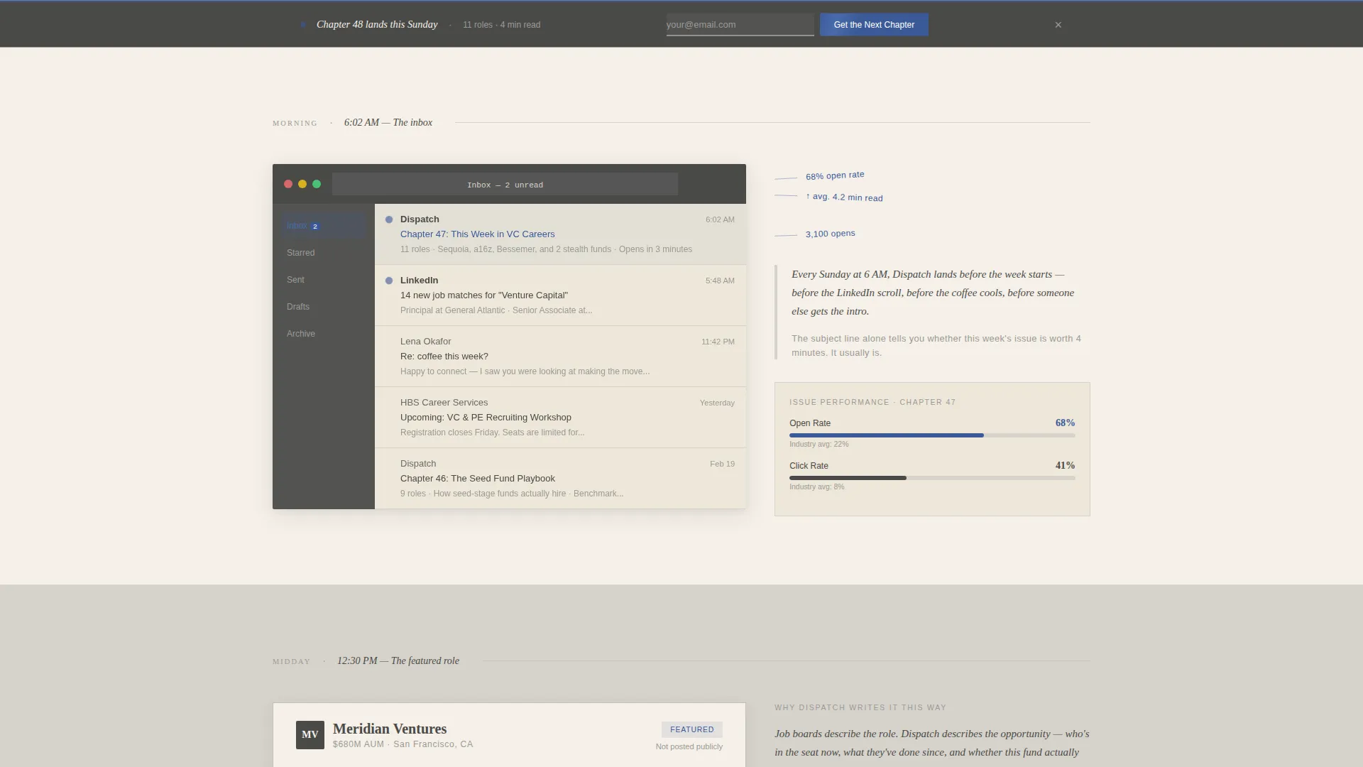
The page unfolds as a single day in the life of a subscriber. Morning introduces a mocked inbox drop with open-rate statistics shown as marginalia. Midday expands a featured role card in editorial voice. Afternoon presents a subscriber testimonial formatted as a handwritten letter with a scanned signature. Evening surfaces a "What We're Reading" ecosystem intel section.
Editorial Role Card
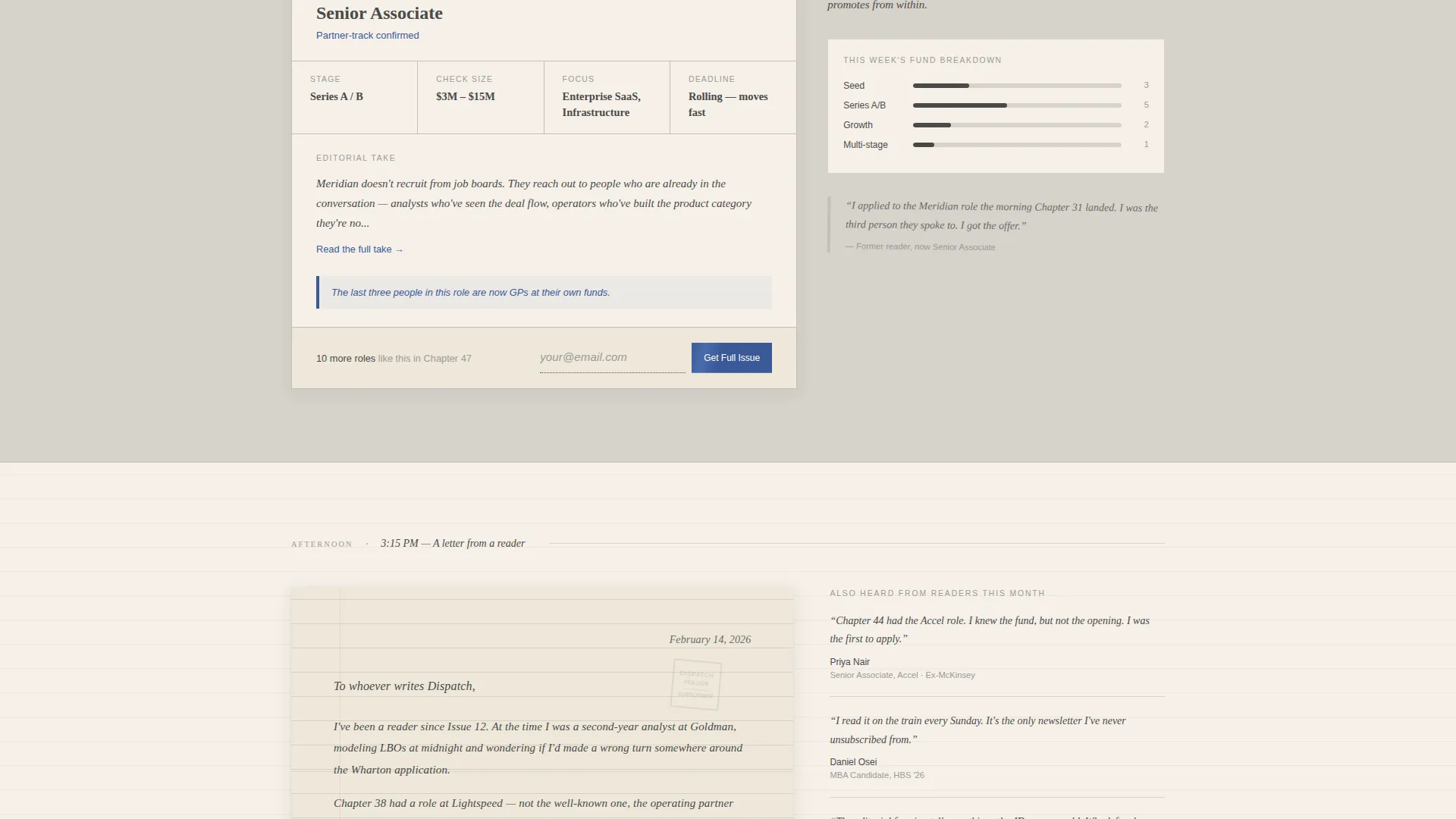
The Midday section features a rich role card that displays fund name, stage, check size, and an editorial write-up explaining why the seat matters. This format replaces standard job-board copy with a voice that fits the publication's tone.
Archive Book Spine Preview
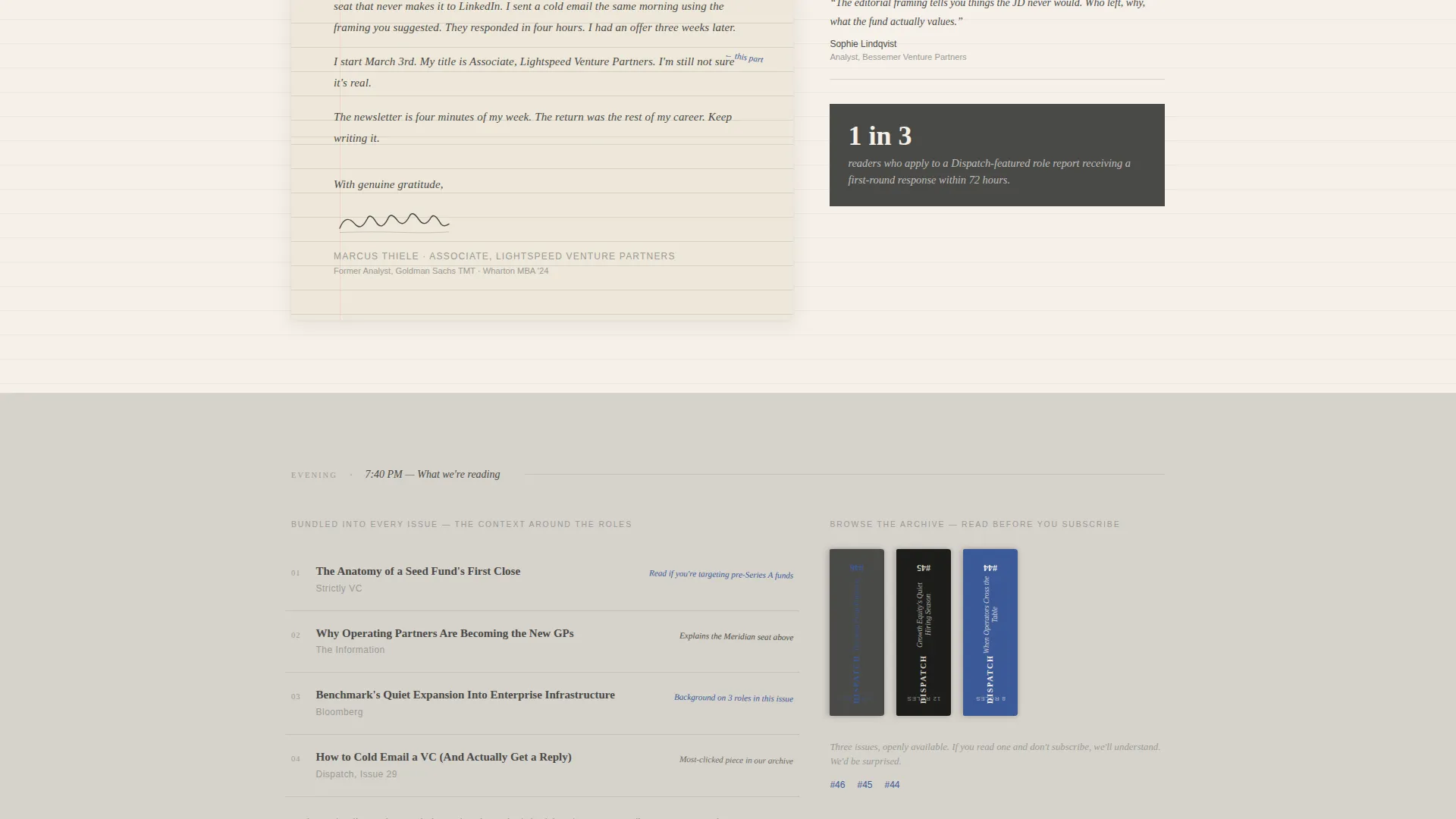
Three past issues are displayed as book spines in the Evening section. This lets skeptical visitors browse real content before subscribing, lowering the commitment barrier without adding a separate page.
Persistent Subscribe Call to Action
The primary call to action, "Get the Next Chapter," appears three times: in the hero column, after the Midday role preview, and as a sticky footer bar on the final scroll. The email input is styled as a dotted-line library index card for visual consistency.
Page-Turn Parallax Transitions
Scroll transitions between sections use a soft shadow effect that shifts like a page being turned. The animation is subtle and reinforces the broadsheet metaphor without distracting from the content.
Page sections overview
| Section | Purpose |
|---|---|
| Chapter Hero Spread | Introduces the newsletter with editorial heading, dateline, illustrated desk scene, and primary subscribe form |
| Morning Inbox Drop | Shows a mocked newsletter inbox preview with open-rate stats displayed as marginal notes |
| Midday Role Card | Presents a featured venture capital role in editorial voice with fund details and a second subscribe prompt |
| Afternoon Testimonial | Builds trust with a handwritten subscriber letter and scanned signature from someone who landed a role |
| Evening Reading Section | Delivers ecosystem intel preview and archive book spines for pre-subscription browsing |
| Sticky Footer Bar | Anchors a persistent final call to action across the bottom of the page on scroll |
Design & branding system
The visual identity uses an Ink and Paper theme built around the Soft Mist color system. Every color choice reinforces a deliberately analog, literate feeling that matches the editorial voice of the newsletter.
- Warm parchment (#F5F0E8) and mist gray (#D6D2CB) alternate as section backgrounds; graphite (#4A4A48) carries all body text with generous line spacing
- Fountain-pen blue (#3B5998) appears sparingly and only on links, calls to action, and pull quotes, functioning like marginal notes in a well-read book
- Display type uses a serif face (Fraunces) for headings and chapter numbers; body text uses DM Sans for clean, legible reading at all sizes
Mobile & speed optimization
The template is built desktop-first to match the professional desktop browsing habits of its target audience. It is also fully responsive for mobile readers.
- Server Components handle static content to keep JavaScript minimal and page weight low
- Scroll-linked shadows and reveal-text animations are implemented at a medium intensity, balancing visual richness with smooth performance
- The sticky footer subscribe bar adapts cleanly to smaller screens, keeping the call to action accessible without crowding the layout
How this template helps you convert
Every structural decision in this template moves a visitor closer to subscribing. The approach is show-first, ask-second.
- The mocked inbox preview and open-rate marginalia let visitors experience the newsletter before they commit, reducing the hesitation that kills most sign-up forms.
- The featured role card in editorial voice demonstrates the quality difference between Dispatch and a standard job board, giving career-focused readers a concrete reason to subscribe.
- The three-point call-to-action placement (hero, mid-page, sticky footer) keeps the subscribe prompt visible across every stage of the scroll without feeling aggressive.
Other information about this template
This template is categorized under Blog and Editorial with a Venture Capital Newsletter subcategory. It is built for the Venture Capital Jobs and Opportunities Newsletter niche and carries an intersection match score of 13, indicating strong alignment between the design system, creative direction, and audience intent.
- The template is localized for English-language audiences in the United States and uses USD currency context where relevant
- The footer follows a horizontal flow pattern suited for editorial publications
- The illustrated desk scene in the hero is ink-drawn and SVG-based, requiring no photography assets to launch
- The "Browse the Archive" secondary path links to three past issues and provides an alternative conversion route for readers who prefer to evaluate before subscribing
Theme
Ink & Paper
Creative direction
Day-in-the-Life
Color system
Soft Mist
Style
Asymmetric Grid (60/40)
Direction
Lead Generation
Page Sections
Asymmetric 60/40 Chapter Hero
Day-in-the-life Scroll Flow
Editorial Venture Capital Role Card
Handwritten Testimonial Letter
Archive Book Spine Preview
Persistent Three-point Call to Action
Related questions
What kind of newsletter is this template designed for?
Do I need photography or stock images to launch this template?
How many times does the subscribe call to action appear on the page?
Can I use this template for a newsletter that is just launching?
What design system and typography does this template use?



