Creator Economy Newsletter Landing Page Template
Dispatch is a masonry-style newsletter landing page built for creator economy morning briefings. It features a looping cinematic header, a staggered masonry grid of sample digest cards, a full-width data strip, testimonials styled as handwritten margin notes, and a waitlist sign up form with a live subscriber counter. The design follows a warm Atelier Studio palette.
by Rocket studio
Quick summary
Dispatch is the Dispatch Early Morning Creator Economy Newsletter Landing Page Template. It turns a single focused page into a waitlist conversion engine for a daily digest aimed at YouTubers, newsletter operators, and talent managers. Every section is designed to show editorial value before asking for an email, so potential subscribers arrive at the sign up form already convinced.
Who this template is for
This landing page is built for newsletter publishers and independent creators who want to grow a morning briefing audience. It fits anyone launching a curated daily digest in the creator economy space and needing a high-quality newsletter sign up page fast.
- Mid-tier YouTubers (roughly 50K to 500K subscribers) who track CPM trends and algorithm shifts between uploads
- Newsletter operators and talent managers who need to monitor brand deal benchmarks, sponsorship rate cards, and platform migration signals
- Independent media publishers and small team operators building a direct to consumer audience before launch day
What problem this template solves
Growing a newsletter audience is hard when your landing page fails to communicate the value of subscribing in the first few seconds. Most newsletter sign up pages either bury the value proposition under too much copy or show no proof of editorial quality at all. Potential subscribers leave before they see enough to commit.
- Visitors cannot judge content quality from a plain opt in form alone, so this template gives them real sample digest cards to read before deciding
- There is no compelling reason to sign up early when there is no visible social proof, so the live waitlist counter and margin-note testimonials fill that gap
- A generic sign up form with no audience segmentation collects undifferentiated leads, so the optional "I'm a..." dropdown lets you tag creators, managers, brands, and operators from the first interaction
What you get with this template
This template delivers a fully designed, section-led landing page ready to customize and launch. It handles the entire user journey from the first visual impression to the confirmed sign up, giving visitors a clear path without unnecessary details slowing them down.
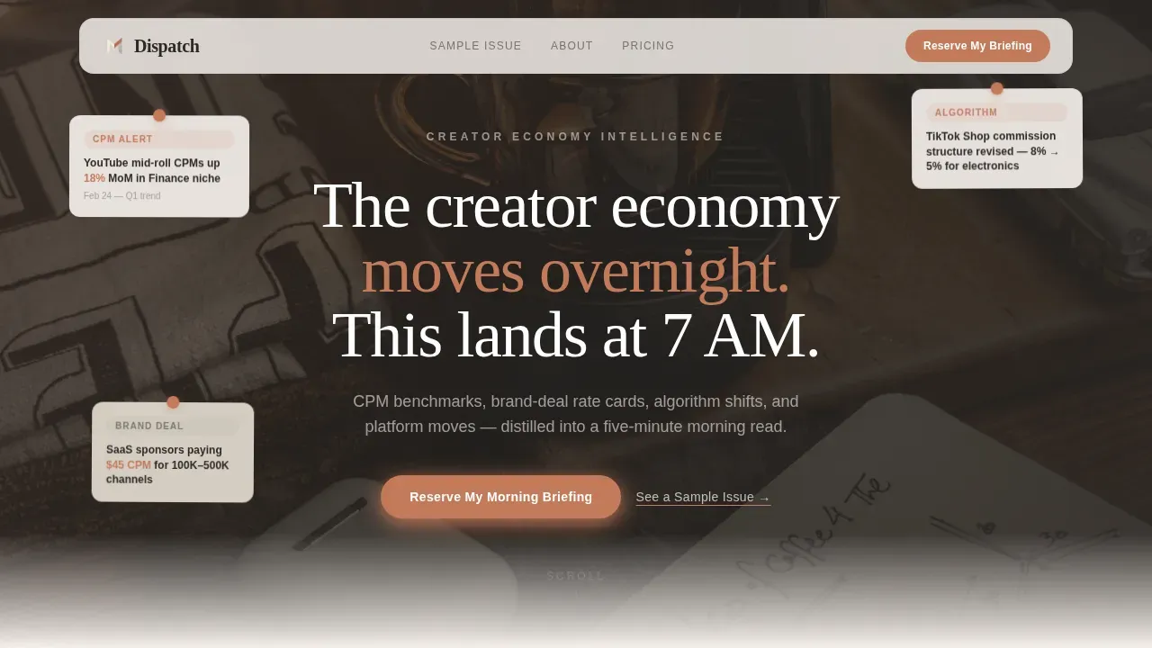
- A looping cinematic header video composited as a stop-motion desk scene, with a serif overlay line and a primary call-to-action button placed immediately beneath it
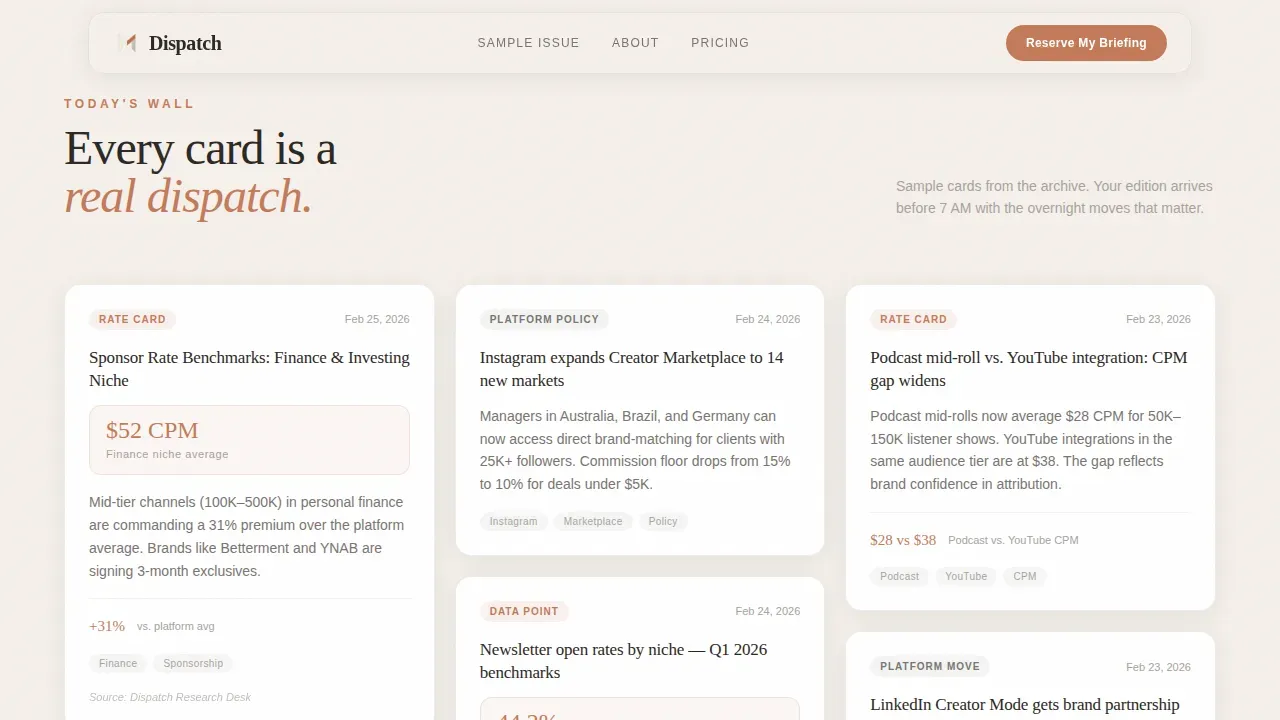
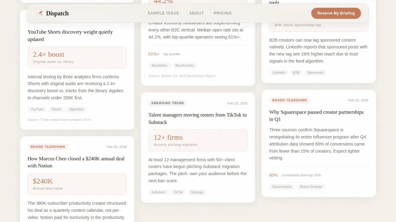
- A staggered masonry grid of sample digest cards covering rate-card comparisons, algorithm-change alerts, brand-deal teardowns, and platform policy summaries, all revealing progressively as the visitor scrolls
- A waitlist subscription form with a single email field, an optional role-segmentation dropdown, a live subscriber count for social proof, and a secondary lightbox call-to-action that opens a real sample issue
Feature list
This landing page packs several carefully considered components into one cohesive layout. Each feature below is drawn directly from the template brief and reflects what is built into the design.
Cinematic Looping Header with Serif Overlay
The header plays a sound-off, looping vertical video styled as a stop-motion desk scene. Hands pin headline cards, a pencil underlines a stat, and a coffee cup enters frame. A single serif line fades in over the footage to deliver the clear headline and value proposition immediately.
Staggered Masonry Card Grid
The masonry grid functions as a live-feed-style wall of sample newsletter content. Cards reveal in a staggered sequence as the visitor scrolls, using Intersection Observer for the reveal timing. Each card is a real-format preview: rate-card comparisons, algorithm alerts, brand-deal teardowns, and policy summaries. This approach is one of the most effective newsletter landing page examples of showing content before asking for commitment.
Full-Width Data Strip
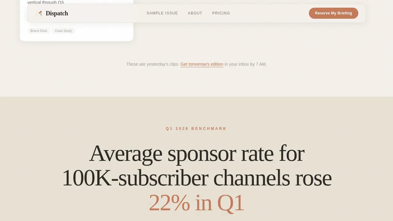
A full-width section breaks the masonry grid at the midpoint. It displays a single oversized stat in serif type on a vellum cream background, grounding the page in hard numbers. The bold headline treatment makes this strip a natural stopping point that reinforces the newsletter's editorial credibility.
Segmented Waitlist Sign Up Form
The subscription form uses a single email field paired with an optional "I'm a..." dropdown covering creator, manager, brand, and operator segments. A live subscriber count sits directly below the input, providing visible social proof. A secondary micro-call-to-action opens a lightbox with a previously published newsletter edition so skeptical visitors can preview quality content before signing up.
Handwritten Testimonial Section
Three testimonials from creator-economy voices appear styled as handwritten margin notes beside printed cards. This format converts plain quotes into engaging visuals that feel editorial rather than promotional. Testimonials from existing subscribers enhance credibility and encourage potential subscribers to join, and this layout uses that principle to full effect.
Warm Atelier Studio Visual System
Typography pairs Fraunces (serif) with DM Sans (sans-serif). The color palette runs from linen white to vellum cream for backgrounds, pencil-sketch gray for body type, and dried-ink terra as a sparingly used accent on calls-to-action, pull quotes, and data highlights. Visual consistency across every card, strip, and form element creates a cohesive, trustworthy impression.
Page sections overview
| Section | Purpose |
|---|---|
| Cinematic Hero Header | Establishes editorial tone and delivers the primary call-to-action above the fold |
| Masonry Digest Grid | Shows real sample cards to demonstrate content quality before the sign up ask |
| Full-Width Data Strip | Anchors credibility with a single oversized stat in bold headline treatment |
| Margin-Note Testimonials | Provides social proof through three creator-economy voice quotes styled editorially |
| Waitlist Sign Up Form | Collects emails, segments subscribers by role, displays live counter, and links lightbox |
| Horizontal Flow Footer | Closes the page with consistent branding and secondary navigation |
Design & branding system
The design language follows an Atelier Studio theme that feels like a designer's worktable in a quiet Paris apartment at dawn. Every color, typeface choice, and layout decision reinforces the newsletter's editorial identity. Consistent branding across every element creates a sense of quality that potential subscribers notice even before they read a single card.
- Colors: linen white (#F5F0EB) and vellum cream (#E8E0D4) for all backgrounds; pencil-sketch gray (#A8A29E) for body typography; dried-ink terra (#C47A5A) reserved strictly for calls-to-action, pull quotes, and data highlights to keep every instance feeling intentional
- Typography: Fraunces serif for headlines, pull quotes, and the hero overlay; DM Sans for body copy, card labels, and form elements; the pairing creates visual hierarchy without sacrificing readability
- Motion and layout: high-animation staggered card reveals, scroll-linked transitions, floating elements, and a masonry grid that populates like a live feed being assembled in real time
Mobile & speed optimization
The template is designed desktop-first, reflecting the primary habit of creators checking industry numbers between uploads on a larger screen. Strong mobile support is also built in, recognizing that many readers check newsletters on their phones immediately after waking, which aligns with standard newsletter landing page best practices for responsive design.
- CSS scroll-behavior handles smooth scrolling transitions without heavy JavaScript overhead, keeping the page feeling fluid
- Intersection Observer manages the staggered masonry card reveals, triggering animations only when elements enter the viewport rather than loading all effects at once
How this template helps you convert
The template is engineered to convert visitors into waitlist sign ups by earning trust through content before making the ask. This approach reflects what the best newsletter landing page designs do: they show, rather than describe, and they remove friction at every step of the subscription process.
- The cinematic header immediately captures attention with motion and a clear, concise headline, then places the primary call-to-action button right beneath it so the first conversion opportunity appears before the visitor scrolls at all
- The masonry card grid acts as a sneak peek into the digest, giving visitors real editorial content to evaluate before they reach the subscription form, so by the time they arrive at the sign up form they have already read enough to feel confident
- The live waitlist counter, role-segmentation dropdown, and lightbox sample issue work together to deliver social proof, clear expectations about who the newsletter serves, and a final taste of quality content, all layered into one sign up section that makes the decision easy
Other information about this template
This section covers additional context that helps you understand the broader landscape this template sits within and how it relates to newsletter landing page best practices across the industry.
This landing page operates as a focused page built specifically for waitlist conversion, rather than a general-purpose site. Landing page creation with this level of editorial specificity is relatively rare in newsletter template libraries. The template draws on principles visible in successful newsletter landing page examples from across the industry.
Pages like Trends.vc's newsletter sign up page prominently display subscriber numbers as social proof, a tactic the live counter in this template mirrors directly. The Publish Press uses a clear headline and sets clear expectations in its subheadline, and Dispatch uses the same strategy in its hero overlay copy. Milk Road's landing page communicates a concise value proposition to potential subscribers in its opening line. Demand Curve keeps its newsletter page clean and focused on a specific target audience's interests. Semafor's newsletter landing page categorizes covered topics clearly. The GIST and The Perfect Loaf both lean on testimonials for social proof, while Trends.vc and Payload use multiple calls-to-action and prominent subscriber count displays. The Atlantic and Unicorn Club both set clear expectations for the reader upfront.
Beyond individual newsletter landing page examples, there are broader dynamics worth noting. Newsletters have become a significant driver of paid subscriptions, with the direct to consumer model enabling independent writers to build subscription revenue without relying on a media company or traditional news media infrastructure. The newsletter economy has seen a resurgence as readers seek curated digital content and quality content over algorithm-driven feeds. Traditional publishers and any established media company that once ignored newsletters are now adapting by offering writers more autonomy. Newsletters feature personality-driven editorial voices that build loyal subscribers over time.
For operators thinking about the business side of this template, a few additional points are relevant:
- The optional role-segmentation dropdown supports a subscription model built on audience intelligence from day one, giving you actionable insights into who is signing up without requiring complex tooling
- The lightbox sample issue functions as a preview of previously published newsletters, allowing subscribers to verify quality before committing, which supports both conversion rates and longer-term retention
- The double opt in process can be connected downstream after the waitlist form collects emails, keeping the subscription process clean and compliant without adding friction on the landing page itself
- The newsletter page is built to support ongoing testing, as the layout makes it straightforward to swap headline copy, adjust the bold headline in the data strip, or test a new concise value proposition in the hero without restructuring the whole layout
- The live counter, margin-note testimonials, and lightbox call-to-action all serve as social proof layers that reduce hesitation and encourage newsletter sign ups by creating a mild but genuine sense of urgency and community
- For operators curious about newsletter landing page examples beyond the creator economy niche, well-known pages from The New York Times newsletter offerings, The Daily Bite, Arnold's Pump Club, HeyOrca, Homescreen, and Fantasy Life each demonstrate that an effective newsletter landing page earns trust through strong visual identity, a clear value proposition, and a frictionless opt in form
- This template supports an e commerce or paid tier upgrade path, as the waitlist segmentation and subscriber count infrastructure can be extended to manage paid subscriptions or live events offers once the newsletter launches
- Concise copy, an effective newsletter landing, and a clear value proposition work together in Dispatch to keep the page from overwhelming potential subscribers with unnecessary details
Theme
Atelier Studio
Creative direction
Industry Report
Color system
Soft Mist
Style
Masonry/Pinterest
Direction
Waitlist/Coming Soon
Page Sections
Cinematic Stop-motion Header Video
Staggered Masonry Card Grid
Full-width Vellum Cream Data Strip
Segmented Waitlist Subscription Form
Handwritten Margin-note Testimonials
Atelier Studio Warm Color and Type System
Related questions
Can I customize the sample digest cards in the masonry grid?
How does the live waitlist counter work?
Can I add a lightbox sample issue from my own archive?
Does the page support mobile visitors?
Can this template support a paid subscription tier later?



