Creator Economy Newsletter Professional Website Template
Dispatch is a cinematic dark landing page built for a creator economy weekly newsletter. The asymmetric 60/40 grid layout, full-bleed photo header, and gold-accented email form work together to convert visiting creators into Tuesday subscribers. It is designed for one purpose: capturing the email address of someone who already knows the algorithm is not their friend.
by Rocket studio
Quick summary
Dispatch is a single-page newsletter landing page built on a Luxe Minimal, Cinematic Dark design system. It uses a 60/40 asymmetric grid, a full-bleed cinematic photo header, and three strategically placed email capture forms. The page is built to convert mid-tier creators into weekly subscribers with zero friction and maximum credibility.
Who this template is for
This template is built for newsletter operators in the creator economy space. It suits anyone running a high-signal weekly briefing who needs a landing page that feels as premium as the content inside.
- Mid-tier YouTubers, Substackers, and TikTok creators building owned email lists
- Creator managers, brand-deal negotiators, and talent agents who publish curated weekly intelligence
- Independent media operators launching a paid or free weekly newsletter in the creator niche
What problem this template solves
Most newsletter landing pages feel generic. They rely on promises instead of proof, and they ask visitors to imagine value rather than feel it. Creators and their teams are skeptical readers. They need to see the editorial voice, the subscriber count, and real creator results before they hand over an email address.
- Generic templates bury the subscribe form and lose mobile visitors before the first scroll
- Weak social proof sections fail to show the specific metrics that creator audiences respect
- Flat single-column layouts miss the visual tension that pulls attention downward and keeps readers moving
What you get with this template
You get a complete, ready-to-customize single-page layout designed around one conversion goal: the email sign-up. Every section earns its place on the page.
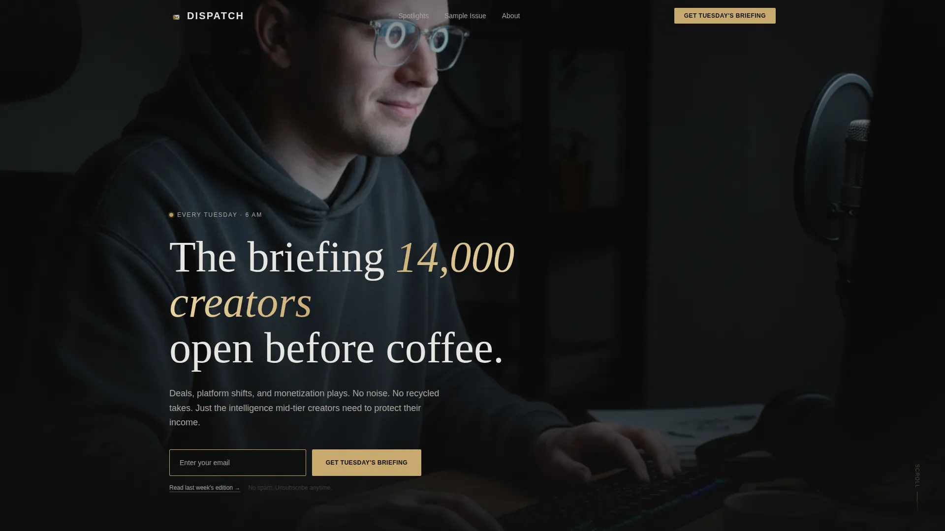
- A cinematic full-bleed photo header with an oversized platinum headline and an embedded gold-border email form
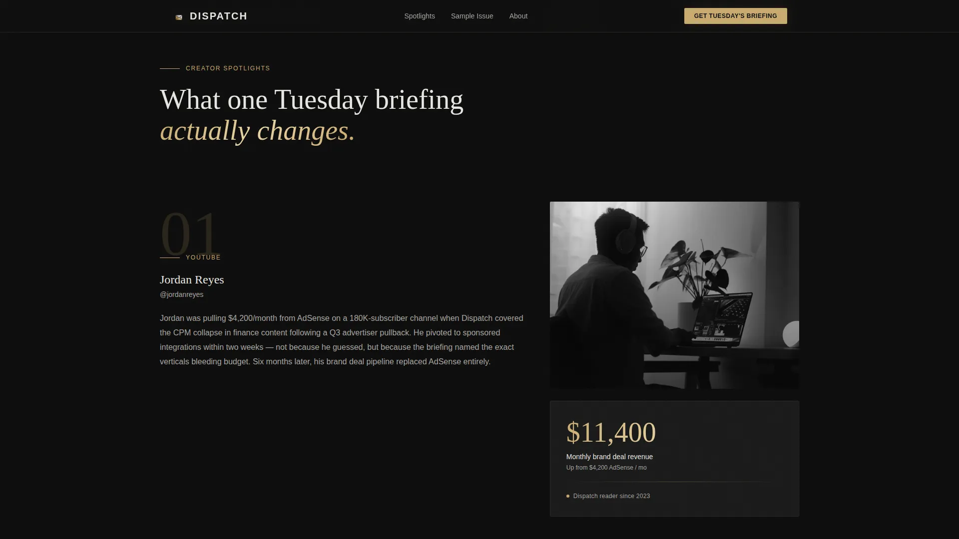
- An asymmetric 60/40 Creator Spotlight section with escalating social proof, pull quotes, and data cards
- A dark-mode sample edition mockup, a live subscriber count display, a sticky subscribe bar, and a final anchoring call-to-action section
Feature list
This template is built with purpose-driven components. Each one is designed to move a skeptical creator reader toward a single action.
Full-Bleed Cinematic Header
The header uses a shallow-depth-of-field portrait of a creator at a desk lit by monitor glow. An oversized platinum headline fades in over the image. A minimal email input field with a gold border sits directly on the photograph so visitors can subscribe without scrolling.
Asymmetric 60/40 Creator Spotlight Grid
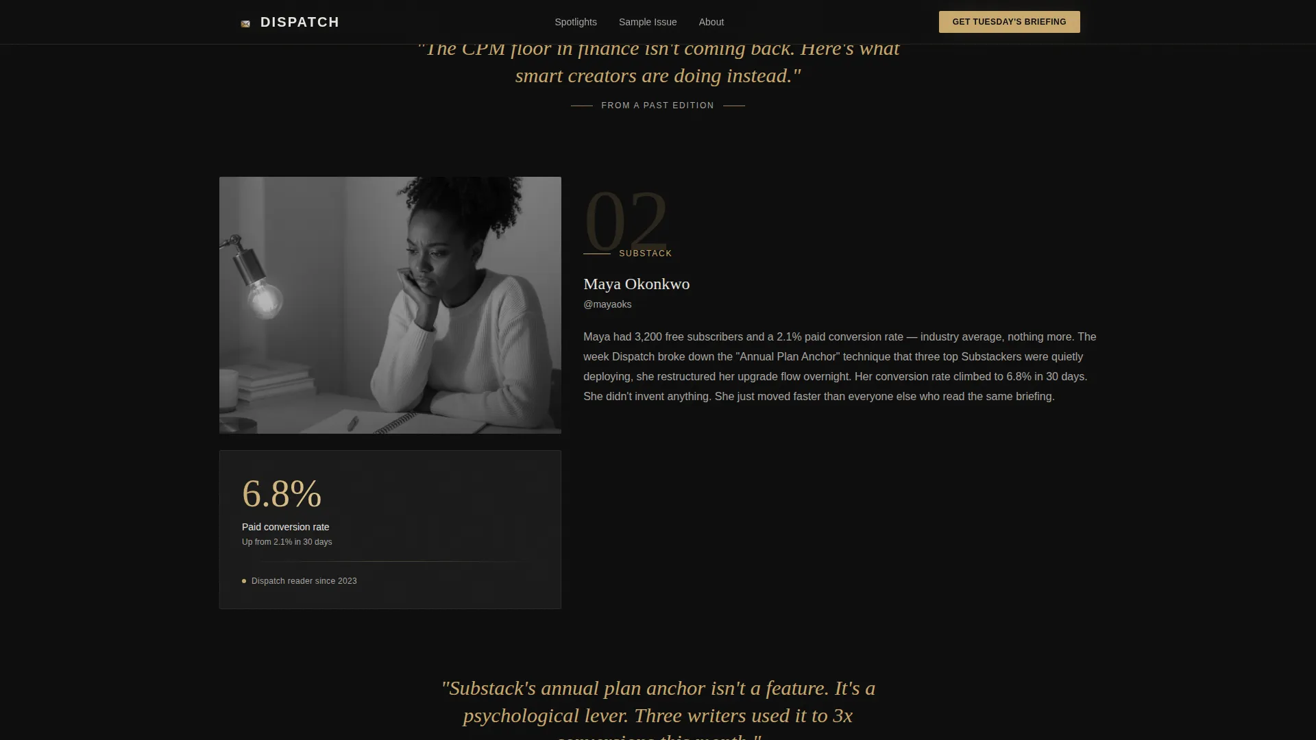
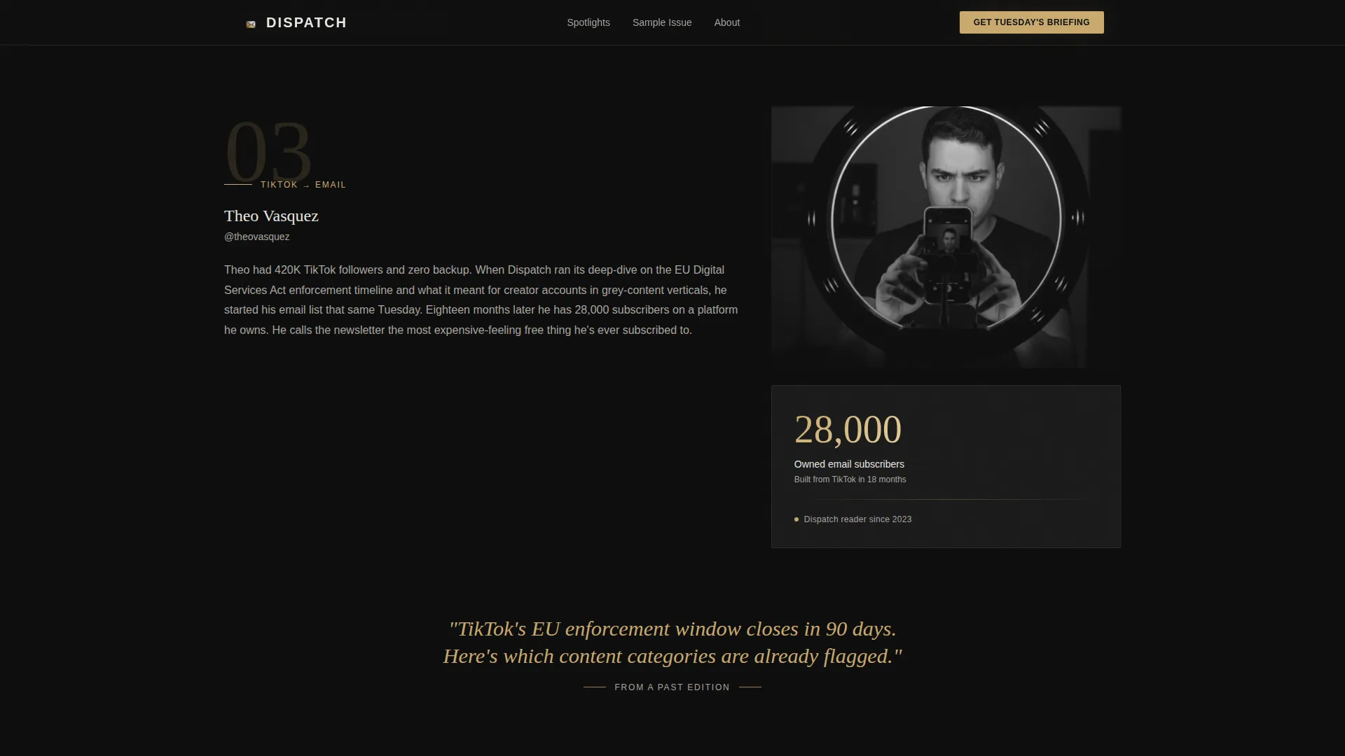
Each spotlight section places a creator's inflection story in the wider 60% column beside a stark data card in the 40% column. The layout creates natural visual tension that pulls the eye downward. Spotlights escalate from emerging to established creators, building layered proof.
Oversized Gold Pull Quotes
Between spotlight sections, single-line pull quotes from real past editions appear in oversized gold italic type. These give visitors a direct taste of the editorial voice before they subscribe.
Triple-Placement Email Capture
The primary call-to-action, "Get Tuesday's Briefing," appears three times: in the header photo, as a slim sticky bar after the first scroll, and anchoring the final section. Each instance uses a single email field with no name field, no dropdown, and no extra steps.
Dark-Mode Sample Edition Preview
The final call-to-action section renders a dark-mode email mockup showing real headline previews from past editions. Visitors see the actual product before subscribing, which removes doubt and builds trust.
Live Subscriber Count Display
A live-feel animated subscriber number gives the page a sense of real momentum. It pairs with creator testimonials that include specific revenue metrics, turning abstract credibility into concrete proof.
Page sections overview
| Section | Purpose |
|---|---|
| Cinematic Hero Header | Captures attention and drives immediate email sign-up |
| Creator Spotlight Grid | Builds escalating social proof through real creator stories |
| Gold Pull Quote Breaks | Delivers editorial voice samples between proof sections |
| Sample Edition Preview | Shows the real product via a dark-mode email mockup |
| Subscriber Count Block | Reinforces momentum with a live-feel animated number |
| Creator Testimonials | Validates newsletter value with specific creator metrics |
| Final call to action Section | Anchors the page with the subscribe form and secondary read link |
| Ultra-Minimal Footer | Closes the page cleanly without distraction |
Design & branding system
The visual identity is built around a matte-black envelope aesthetic. Every color decision is deliberate. Nothing on this page shouts.
- Color palette: true dark (#0D0D0D) canvas, soft platinum (#E8E6E1) body text, muted gold (#C9A96E) for accent lines and hover states, and deep charcoal (#1A1A1A) for card surfaces
- Typography: DM Sans handles body text and user interface elements while Fraunces serves as the display serif for pull quotes, creating a contrast between utility and editorial warmth
- Animation system: GSAP scroll reveals, staggered text fades, sticky bar entrance animation, and a floating number animation bring the page to life without distracting from the core message
Mobile & speed optimization
The template is designed desktop-first, matching how creators typically consume content during working sessions. It remains fully responsive across screen sizes.
- Sticky subscribe bar adapts cleanly to mobile viewports so the email capture is never out of reach
- Server Components handle static sections to keep page load lean, while Client Components are scoped to animations and interactive elements like the sticky bar and live counter
How this template helps you convert
Every layout and copy decision on this page points toward a single conversion: the email address. The page earns that conversion by showing proof before asking for anything.
- The header embeds the subscribe form directly in the hero image so the most motivated visitors can convert instantly, before they read a single word of supporting content.
- The escalating Creator Spotlight grid and real edition preview build trust through specificity, so by the time a visitor reaches the final call-to-action section they have already seen real results and real content, not just promises.
Other information about this template
This template is built specifically for the creator economy newsletter space. It is a strong fit for operators who want a premium first impression that matches the quality of their editorial product.
- The secondary conversion path, "Read Last Week's Edition," appears as an underlined platinum text link in the final section, giving skeptical visitors a low-friction way to sample the content before subscribing
- The footer follows an ultra-minimal horizontal flow pattern that keeps the page closing cleanly without adding visual noise
- The asymmetric grid structure and cinematic dark palette make this template well suited for newsletter brands targeting professional creator audiences who value signal over spectacle
- This template can support a creator economy newsletter brand that publishes on a consistent weekly schedule with an established archive of past editions to draw from for the sample preview and pull quotes
Theme
Luxe Minimal
Creative direction
Creator Spotlight
Color system
Cinematic Dark
Style
Asymmetric Grid (60/40)
Direction
Lead Generation
Page Sections
Full-bleed Cinematic Header
Asymmetric 60/40 Spotlight Grid
Triple-placement Email Capture
Gold Pull Quote Typography
Dark-mode Edition Mockup
Live Subscriber Counter Animation
Related questions
Do I need an existing subscriber base to use this template?
How many email form placements does this template include?
Can I replace the creator spotlight stories with my own content?
What typography does this template use?
Is the sticky subscribe bar always visible while scrolling?



