Startup Fundraising Newsletter Blog Website Template
Dispatch is a Heritage and Story landing page template built for a startup fundraising daily digest. It uses a masonry grid layout to recreate a founder's fundraising day as cascading digest cards. The Parchment and Rust color system, editorial serif typography, and a Quote/Manifesto header make the page feel earned, intelligent, and worth subscribing to immediately.
by Rocket studio
Quick summary
Dispatch is a single-page landing page template designed for a startup fundraising daily digest. It pairs a Quote/Manifesto header with a Pinterest-style masonry grid of real digest cards. The Heritage and Story visual identity, Parchment and Rust palette, and persistent email capture make every scroll feel like proof of value.
Who this template is for
This template is built for newsletter creators, independent media operators, and content-driven founders who publish daily intelligence for the fundraising community. If your audience opens their inbox before the market opens, this page was designed for them.
- First-time founders building pre-seed decks who need daily deal signals
- Solo general partners and micro-fund builders who shape thesis before Monday meetings
- Chief-of-staff operators who brief senior partners and need credible, dense sources
What problem this template solves
Most newsletter landing pages describe the product instead of proving it. Visitors read a feature list, scroll past a stock photo, and leave without converting. Dispatch flips that dynamic entirely.
- Generic landing pages hide value behind bullet points instead of showing real content
- Founders and investors distrust "daily digest" promises unless they see the actual depth
- Email capture forms lose visitors who cannot feel the intelligence before signing up
What you get with this template
You get a complete, conversion-focused landing page that earns trust through real editorial content. Every section serves the single goal of capturing an email address from a skeptical, high-context reader.
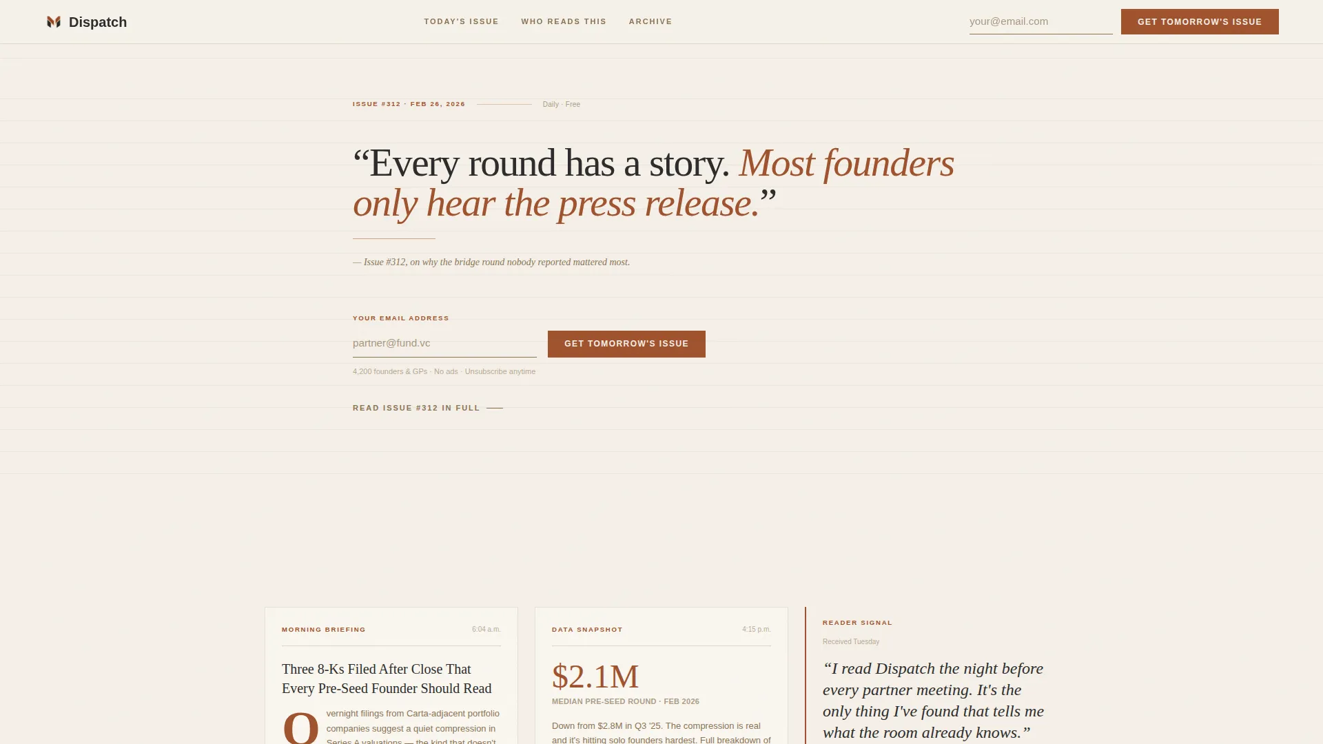
- A Quote/Manifesto hero with editorial epigraph, rust rule, and inline email capture
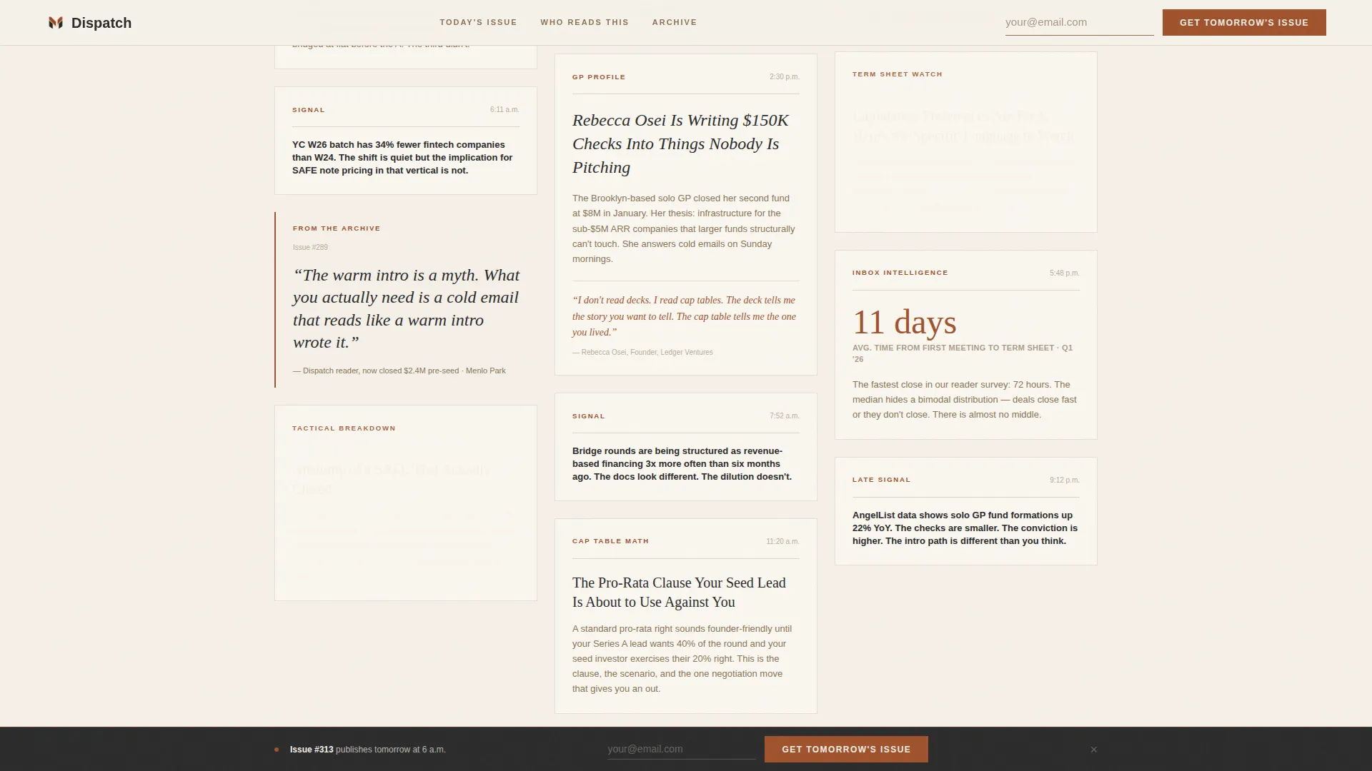
- A Day-in-the-Life masonry grid of varied digest cards spanning a full fundraising day
- A gated sample issue section, a Who Reads This persona block, and a sticky bottom email bar
Feature list
This template includes the following built-in sections and interaction patterns, all grounded in the source brief.
Quote/Manifesto Hero Header
The header opens with a single editorial sentence typeset in a large serif against bare parchment. A thin rust rule sits beneath it, followed by a small italic attribution line. The email capture field appears here first, beside the primary call to action: "Get Tomorrow's Issue."
Day-in-the-Life Masonry Grid
The masonry grid reconstructs a founder's fundraising day as a cascade of digest card excerpts. Cards vary in height and content density, from tight two-line signals to long-form pull-quotes with rust drop caps. The irregular rhythm mimics a real inbox, making visitors feel they are already subscribed.
Gated Sample Issue Section
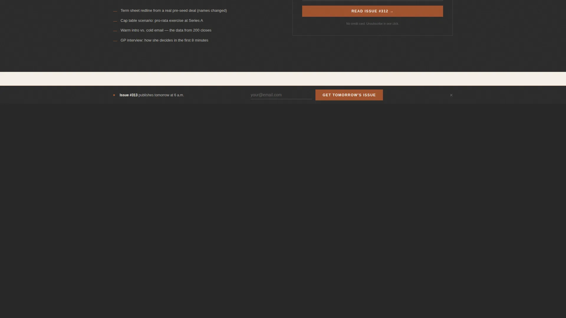
A secondary conversion path offers "Read Issue #312" as a full sample. The portable document format file sits behind the same email capture form. This section lets the content do the selling without a separate pitch.
Who Reads This Section
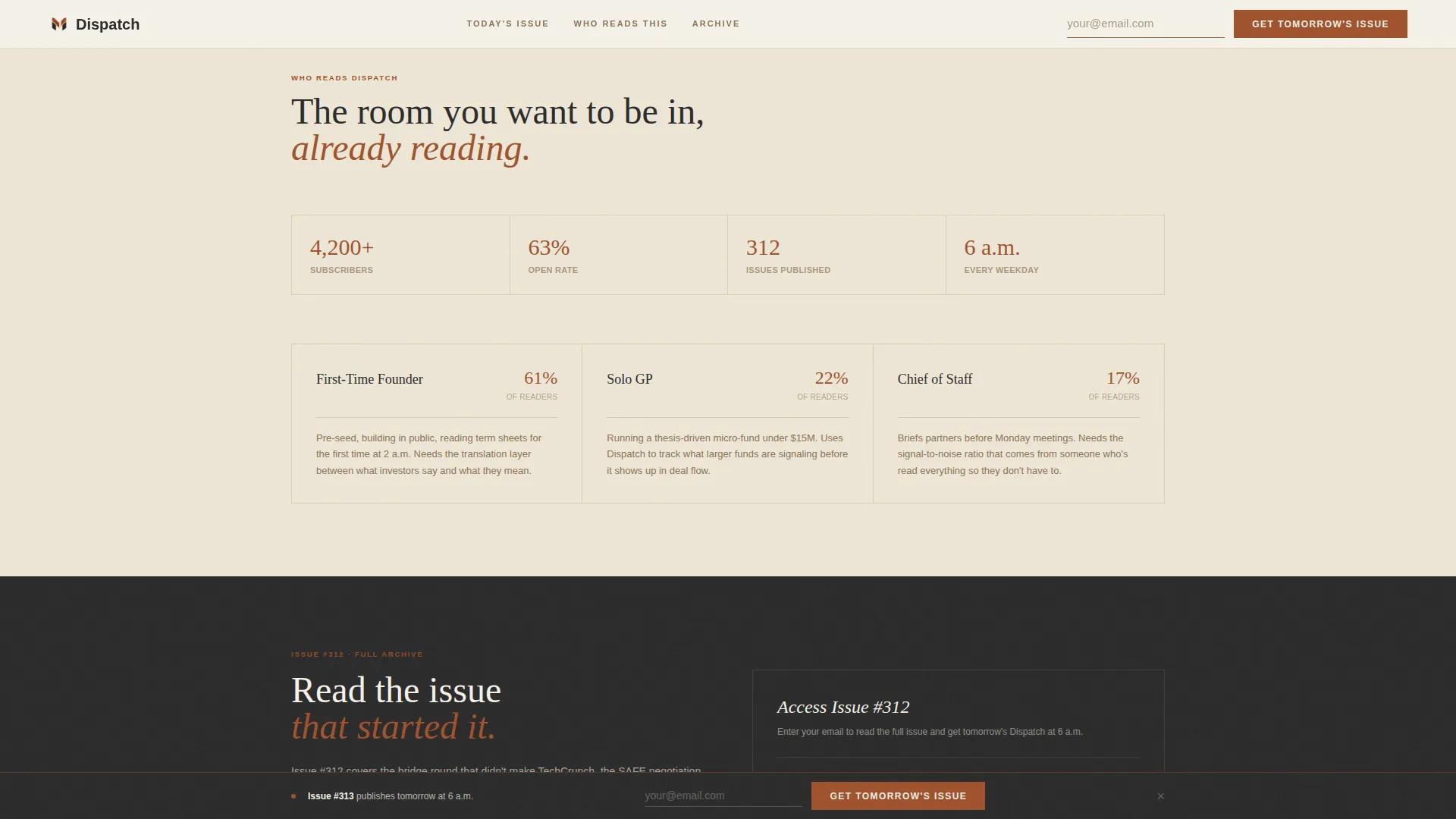
A dedicated persona block surfaces reader archetypes with social proof metrics and pull-quotes from representative reader types. It gives first-time visitors a quick mirror to confirm they belong here.
Sticky Bottom Email Bar
After the third scroll depth, a persistent bottom bar carries the email capture form throughout the rest of the page. Visitors who scroll past the hero without converting get a second low-friction path to subscribe.
Scroll Reveal and Stagger Animations
The template includes medium-intensity scroll reveal animations and stagger effects across the masonry grid. The manifesto section supports a parallax treatment on scroll for added editorial depth.
Page sections overview
| Section | Purpose |
|---|---|
| Quote/Manifesto Hero | Opens with editorial epigraph and primary email capture |
| Masonry Digest Grid | Shows real daily content across a full fundraising day |
| Who Reads This | Displays reader personas and social proof metrics |
| Sample Issue Gate | Offers Issue #312 behind a secondary email capture |
| Sticky Bottom Bar | Persists email capture form after third scroll depth |
| Footer | Closes with horizontal flow layout and supporting links |
Design & branding system
The visual identity follows a Heritage and Story theme. Every color and type choice references analog publishing: worn leather, broadsheet density, and handwritten annotations in the margins.
- Color palette: aged vellum (#F5F0E8) for backgrounds, deep rust (#A0522D) for headlines and pull-quotes, charcoal (#2B2B2B) for body text, and faded tobacco (#8B7355) for dividers and metadata
- Typography: Fraunces serif for editorial headlines and pull-quotes; DM Sans for body copy and user interface elements
- Visual texture references a stack of bundled handwritten letters in a mahogany drawer, warm, analog, and heavy with accumulated intelligence
Mobile & speed optimization
The template is built desktop-first, reflecting the core audience of founders reading at 2 a.m. on a laptop. Responsive behavior is included so the masonry grid and sticky bar adapt cleanly to smaller screens.
- Static sections use server components to keep the initial page load light
- Interactive elements, including the sticky bottom bar and email capture forms, are scoped to client components
- The masonry grid reflows for mobile viewports without losing the rhythm of varied card heights
How this template helps you convert
The conversion strategy here is show-first, ask-second. Every layout decision pushes a skeptical, high-context reader closer to sharing their email address.
- The manifesto hero earns attention immediately, placing the email capture beside a sentence that already sounds like something worth reading daily
- Real masonry card content proves the digest's depth before any explicit pitch, creating a "you're already behind" feeling that motivates subscription
- The sticky bottom bar and gated sample issue create two additional capture moments without interrupting the editorial scroll experience
Other information about this template
The Dispatch template is part of the Blog and Editorial category, specifically designed for the Startup Fundraising Newsletter subcategory and the Startup Fundraising Daily Digest niche.
- The template style is Masonry/Pinterest, suited for content-dense editorial products in the B2B media and newsletter space
- The creative direction is Day-in-the-Life, a layout approach that makes the reader feel immersed in a real founder's fundraising day before they have signed up
- The header concept is Quote/Manifesto, an editorial pattern that prioritizes a single authoritative sentence over imagery or illustration
- The landing page direction is Lead Generation, with every section oriented toward a single email capture goal
- The intersection match score for this template is 13, indicating a high-confidence alignment between the category, subcategory, and niche
- Content is localized for English-language audiences using United States date format and USD currency references where applicable
Theme
Heritage & Story
Creative direction
Day-in-the-Life
Color system
Parchment & Rust
Style
Masonry/Pinterest
Direction
Lead Generation
Page Sections
Quote/manifesto Hero with Email Capture
Day-in-the-life Masonry Grid
Gated Sample Issue Section
Who Reads This Persona Block
Sticky Bottom Email Bar
Scroll Reveal and Parallax Animations
Related questions
What type of newsletter is this template designed for?
Can I use this template with my existing email capture tools?
Does the template include real content or placeholder cards?
Is the masonry grid responsive on mobile devices?
What makes this landing page different from a standard newsletter signup page?



