Email Marketing Newsletter Landing Page Template
Dispatch is a single-page landing page template built for an obsessive email marketing data newsletter. It uses an asymmetric 60/40 grid, a warm letterpress editorial aesthetic, and a manifesto-style scroll to turn casual visitors into committed subscribers. Every section earns the sign-up by proving the newsletter's voice and rigor before the email field ever appears.
by Rocket studio
Quick summary
Dispatch is an editorial landing page template designed for a weekly email marketing intelligence newsletter. The layout uses an asymmetric 60/40 grid with a warm Ink and Paper visual identity. A manifesto-style scroll builds conviction section by section, and two strategically placed calls to action convert readers into subscribers without pressure.
Who this template is for
This template is built for newsletter creators and digital content publishers who take email data seriously. It suits professionals who need a landing page that proves editorial depth before asking for a subscription commitment.
- Solo email marketers running high-revenue launches who need real cohort data, not recycled industry averages
- Agency strategists and SaaS growth leads who live inside email automation platforms and want a resource that matches their analytical rigor
- Newsletter operators who want a landing page that reads like a published argument, not a generic sign-up form
What problem this template solves
Most newsletter landing pages either beg for the email address immediately or bury the value proposition under stock imagery and generic copy. Neither approach works for a sophisticated, data-driven audience. Dispatch solves this by letting the page itself demonstrate the newsletter's quality.
- Visitors leave before subscribing because they have no proof the content is worth their inbox
- Generic benchmark content feels hollow to professionals who already know the standard averages are misleading
- A bland sign-up page cannot communicate voice, rigor, or editorial personality to skeptical readers
What you get with this template
You get a fully structured single-page layout that guides a professional reader from curiosity to subscription through a sequence of editorial proof points. Every section is purposeful and designed to build trust before the call to action appears.
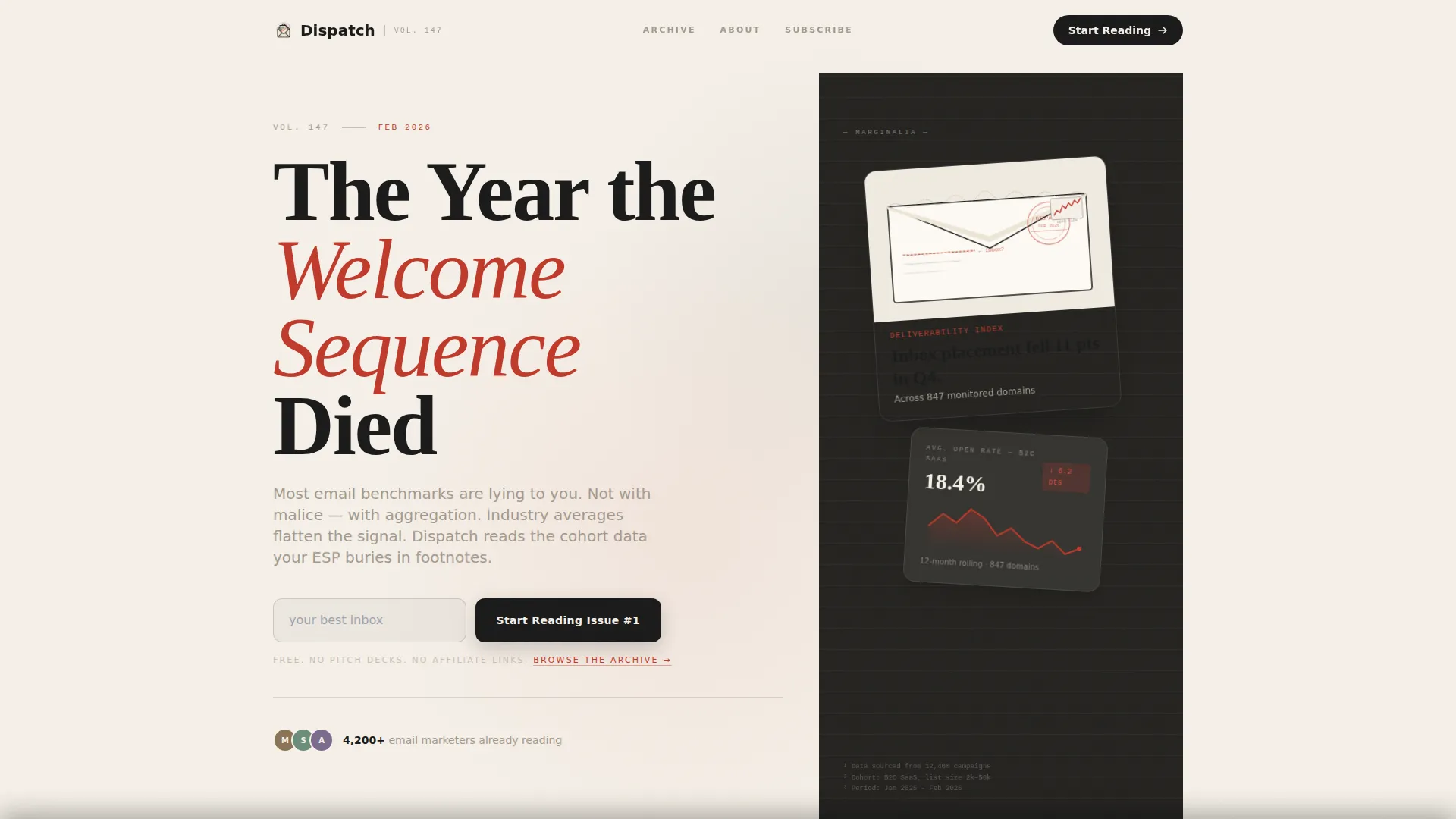
- A hero section with an asymmetric 60/40 grid, large serif editorial headline, volume number anchor, and a floating torn-paper envelope illustration with a data sparkline detail
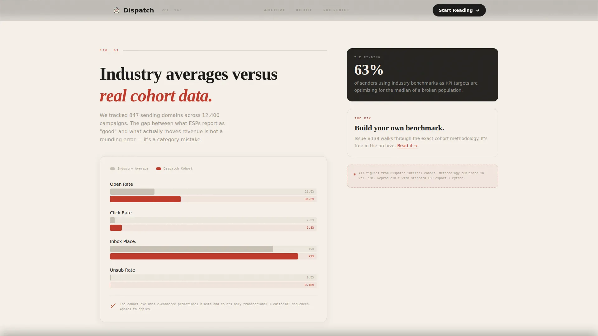
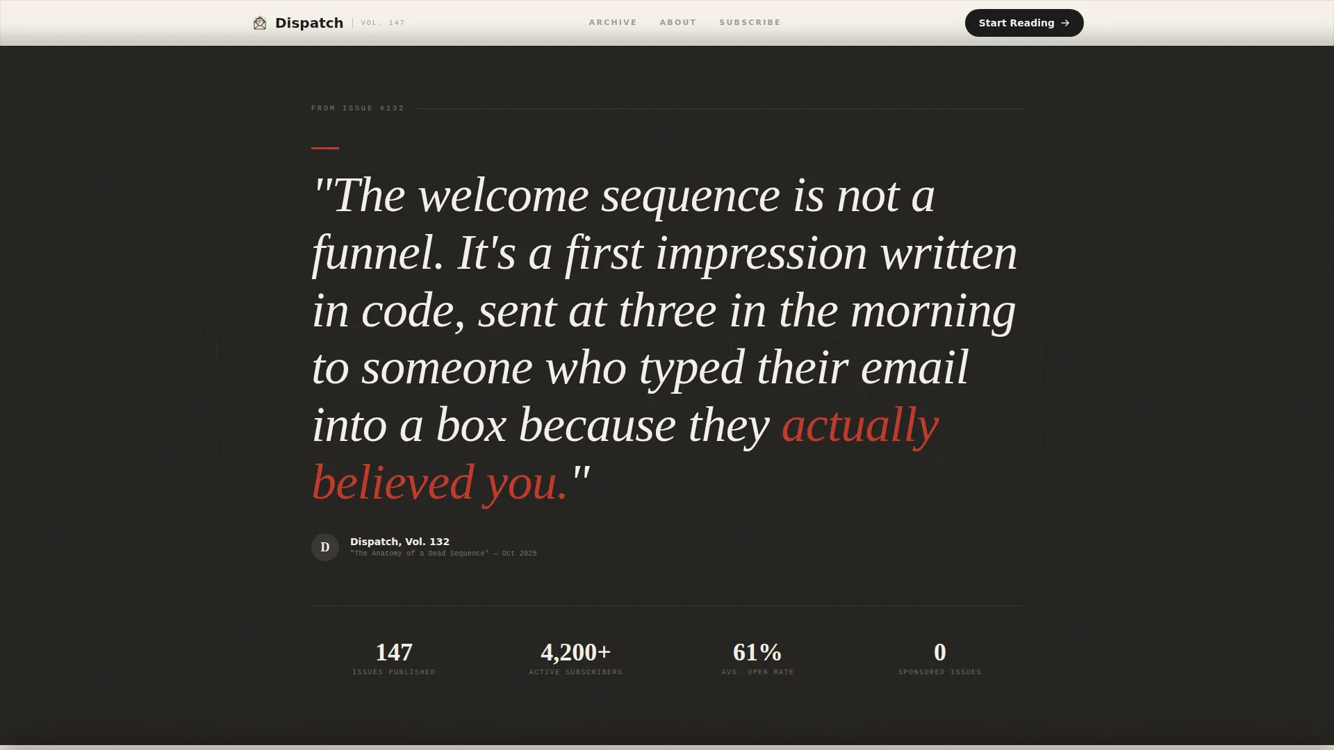
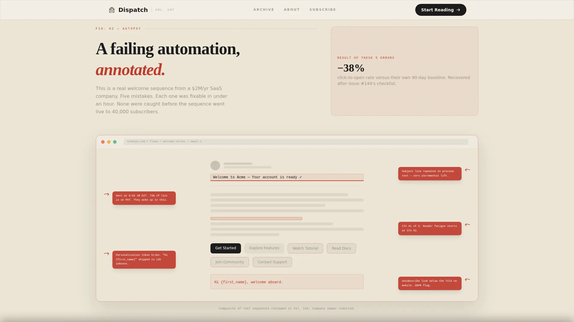
- A manifesto scroll covering a hand-drawn-style data chart, an oversized pull-quote block, a redlined automation screenshot with marginalia annotations, and three chapter-style issue previews
- Two lead generation call-to-action placements: one at the fold and one as a sticky ribbon, plus a secondary archive browse path for skeptical visitors
Feature list
A paragraph introducing this section: every feature in Dispatch is drawn directly from the source brief and designed to serve one goal, turning a passing reader into a loyal subscriber through editorial credibility and deliberate layout.
Asymmetric 60/40 Editorial Grid
The layout splits the page into a 60-column body and a 40-column sidebar. The wider column carries the main editorial content on a warm parchment ground. The narrower column uses a deeper charcoal tone to create the visual sensation of a book page sitting beside its endnotes.
Chapter-Style Hero Section
The hero opens with a large serif volume number ("Vol. 147") anchoring the upper left of the main column. An oversized editorial headline follows in bold serif type. The 40-column holds a torn-paper envelope illustration featuring a data sparkline in place of a stamp, with no photographs or gradients, only ink, type, and negative space.
Manifesto Scroll with Data Proof Points
The page builds its argument progressively. It opens with a provocative thesis, then deepens the case through a hand-drawn-style chart comparing industry averages with real cohort data, an oversized italic pull-quote from a past issue, and a redlined automation screenshot annotated in marginalia red.
Chapter Preview Section
Three recent newsletter issues are laid out as book chapters. Each entry shows a title, a publication date, and a one-sentence hook. This section lets first-time visitors sample the editorial voice and topic depth before committing to a subscription.
Dual Call-to-Action Placement
The primary call to action ("Start Reading Issue #1") appears beside a single email input field at the fold line. It resurfaces as a sticky ribbon after the redlined screenshot section. A secondary path ("Browse the Archive") links to three free back issues for readers who want to sample before subscribing.
High-Interactivity GSAP Animation Layer
The template includes GSAP-powered animations: cursor parallax, magnetic call-to-action buttons, section reveal transitions, and a marquee element. Floating card hover rotations and cursor tracking add tactile depth consistent with the letterpress editorial aesthetic.
Page sections overview
| Section | Purpose |
|---|---|
| Hero Editorial Grid | Anchor visitor attention with volume number, oversized headline, and envelope illustration |
| Hand-Drawn Chart | Prove data rigor by showing real cohort data versus industry averages |
| Pull-Quote Block | Demonstrate editorial voice with an oversized italic excerpt from a past issue |
| Redlined Screenshot | Show analytical depth through a failing automation annotated in marginalia red |
| Chapter Previews | Preview three recent issues as titled chapters with dates and one-sentence hooks |
| Sticky call to action Ribbon | Re-surface the subscribe call to action after the redlined screenshot section |
| Footer Flow | Close the page with a structured horizontal footer layout |
Design & branding system
The visual identity follows a Warm Artisan theme with an Ink and Paper color system. Every design decision references the physical feel of a letterpress broadsheet: tactile, deliberate, and intentional. Typography pairs Crimson Text serif headlines with DM Sans for body text and interface elements.
- Color palette: aged parchment (#F5F0E8) for the main background, fountain-pen black (#1A1A1A) for primary text, marginalia red (#C0392B) for annotations and accent links, and soft pencil gray (#A3998E) for secondary text and dividers
- The 60-column body sits on the warm parchment ground while the 40-column sidebar uses a deeper charcoal tone, reinforcing the book-page-beside-endnotes visual metaphor
- No photography, no gradients: the aesthetic relies entirely on ink, type, illustration, and negative space for visual weight and editorial authority
Mobile & speed optimization
The template is built desktop-first to serve its primary audience of professionals working at a desk. A mobile-responsive fallback ensures the page remains readable and functional on smaller screens. Animations use GSAP only for complex interactions, keeping lighter transitions in native CSS.
- Native CSS smooth scroll handles page flow without heavy scripting overhead
- GSAP is scoped to complex interactions: cursor parallax, magnetic buttons, section reveals, and marquee elements
- The desktop-first approach preserves the full asymmetric grid and editorial typographic hierarchy where the audience is most likely to engage
How this template helps you convert
Dispatch is built around a single conversion insight: a sophisticated audience will not hand over their email address until the page has proven it is worth their time. Every section is arranged to earn that trust before the ask arrives.
- The fold-line call to action captures readers who are immediately convinced by the editorial presentation, while the sticky ribbon re-engages readers who needed more proof before deciding
- The archive browse path gives skeptical visitors a low-commitment way to sample three free back issues, reducing the friction between curiosity and subscription
- The chapter preview section and redlined annotation section work as live demonstrations of the newsletter's analytical depth, so the final call to action feels like a natural next step rather than a cold transaction
Other information about this template
This template sits in the Blog and Editorial category under the Email Marketing Newsletter subcategory, targeting the Email Marketing Data and Trends Newsletter niche. It is designed as a B2C content subscription landing page for solo marketers and agency professionals.
- The creative direction is Manifesto: the scroll reads as a long-form argument that accelerates in pace and urgency as it nears the final call to action
- The header concept follows a Chapter and Book opening structure, using editorial print conventions such as volume numbers, chapter titles, and margin annotations
- Social proof is woven in through the issue count (Vol. 147), subscriber count placement, and specific past issue titles displayed as chapter headings
- The footer uses a Vercel Horizontal Flow pattern (Pattern 3) to close the page with a clean, structured layout
- The template style is classified as Asymmetric Grid (60/40) and the theme is Warm Artisan, both of which are expressed consistently across every section of the layout
Theme
Warm Artisan
Creative direction
Manifesto
Color system
Ink & Paper
Style
Asymmetric Grid (60/40)
Direction
Lead Generation
Page Sections
Asymmetric 60/40 Editorial Grid
Chapter-style Hero with Illustration
Manifesto Scroll with Data Proof Sections
Chapter Preview Issue Grid
Dual Call-to-action with Archive Path
GSAP Animation and Interactivity Layer
Related questions
Who is this landing page template designed for?
What sections are included in this template?
Does the template include more than one call-to-action placement?
Can the colors and fonts be customized?
Is this template suitable for a primarily desktop audience?



