Artisan Paid Newsletter Landing Page Template
Dispatch is a masonry-style paid newsletter landing page built for writers and curators who want to sell a weekly letter with warmth and craft. A scrapbook collage header, a Pinterest-style issue preview grid, and a sticky call-to-action bar work together to move curious visitors toward the subscription checkout without ever asking them to fill out a form.
by Rocket studio
Quick summary
Dispatch is a single-page template designed for paid newsletter creators. It pairs a handcrafted scrapbook aesthetic with a clear click-through path. Six readable issue previews build trust. A sticky bottom bar keeps the primary call to action visible at all times. The result is a landing page that earns subscriptions by showing readers exactly what they will receive each week.
Who this template is for
This template suits independent publishers who write with a distinct voice and want their landing page to reflect that same care. It works equally well for a solo creative launching a first paid letter and for an experienced writer moving readers from free to paid.
- Independent newsletter writers, essayists, and curators running a paid weekly letter
- Freelance writers and mid-career creatives looking to monetize a reading practice
- Slow-living content creators whose audience values editorial taste over algorithmic feeds
What problem this template solves
Most newsletter landing pages look like software sign-up forms. They list features, show a text box, and ask for an email. That approach undercuts writers who lead with voice and curation. Dispatch solves this by immersing visitors in the actual reading experience before they ever reach the checkout.
- Visitors leave before subscribing because the page fails to communicate editorial voice
- Generic templates flatten a distinctive writing identity into a plain sign-up strip
- No single template existed that combined a masonry issue grid, a scrapbook hero, and a click-through checkout flow for paid newsletter subscriptions
What you get with this template
The template delivers a fully composed single-page layout with every section ready to populate with real content. There is no form on the page itself. The primary call to action sends visitors directly to a checkout page that handles pricing, annual and monthly toggle, and payment.
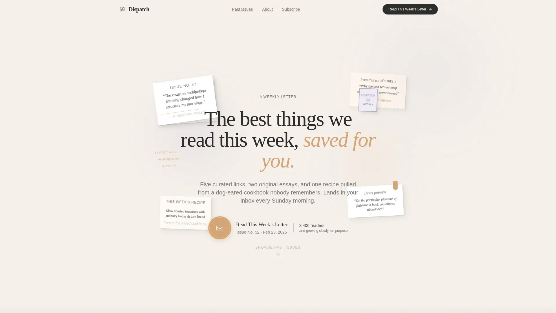
- A scrapbook collage hero with floating clippings, a coffee ring detail, a postage stamp element, and a wax-seal call-to-action icon
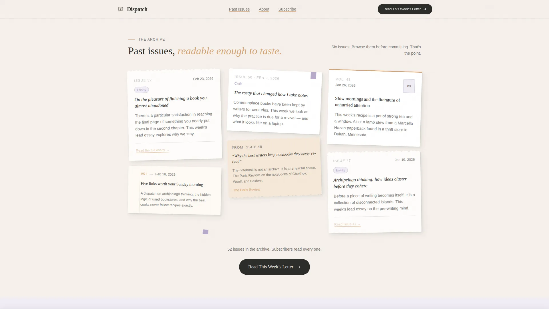
- A masonry issue preview grid showing six past issues styled as torn notebook pages and index cards
- A full-width handwritten testimonial break, a content breakdown section, a final subscription strip, and a linear single-row footer
Feature list
This section covers the core capabilities built into the Dispatch template as described in the source brief.
Scrapbook Collage Hero
The header is composed like a kitchen-table arrangement of found clippings. Elements overlap, rotate slightly, and cast faint paper shadows. A letterpress-style serif headline anchors the composition. The primary call-to-action button appears here as a wax-sealed envelope icon.
Masonry Issue Preview Grid
Six past issue cards fill the grid in varying sizes and orientations. Cards are styled as torn notebook pages, index cards, and bookmarked article clippings. No two cards share the same dimensions, which creates the feeling of flipping through a real commonplace book.
Sticky Call-to-Action Bar
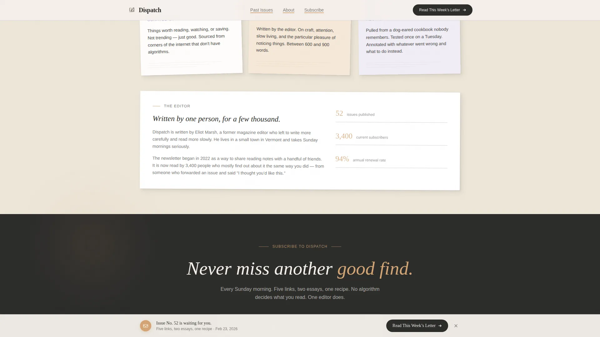
After the visitor scrolls past the third scroll-depth threshold, a sticky bottom bar appears with the "Read This Week's Letter" prompt. This keeps the conversion path visible without interrupting the reading experience at the top of the page.
Full-Width Testimonial Break
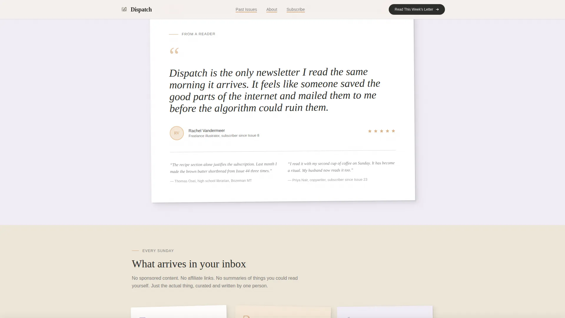
Midway through the page, a single full-width card breaks the masonry grid. It displays a reader's handwritten testimonial embedded as a scanned image, adding social proof in a format that matches the analog visual identity.
Content Breakdown Section
A dedicated section lays out exactly what arrives each week: five curated links, two original essays, and one recipe pulled from an obscure cookbook. Each element is presented on a paper card visual, making the value proposition concrete and tactile.
Scroll-Triggered Animations
Cards reveal with staggered entrance animations as the visitor scrolls. Hover states include a gentle rotation effect. Pull quotes shift to a warm tea-stain color on hover. The overall animation weight is medium, intentional rather than decorative.
Page sections overview
| Section | Purpose |
|---|---|
| Hero collage header | Establish editorial voice and show the primary call to action |
| Masonry issue grid | Display six readable past issue previews to build trust |
| Full-width testimonial | Break the grid with a scanned handwritten reader quote |
| What's inside breakdown | Show the weekly content structure across three card types |
| Final subscription strip | Close the page with an annual and monthly subscription prompt |
| Linear footer row | Provide navigation and legal links in a minimal single row |
Design & branding system
The visual identity follows a Warm Artisan direction built on a Soft Mist color palette. Every color choice references something found on a writing desk rather than a digital interface. Typography pairs a letterpress-style serif for headlines with a clean humanist sans-serif for body text.
- Color palette: linen white (#F5F0EB) backgrounds, pencil graphite (#4A4A48) body text, dried lavender (#B8A9C9) accent washes, and warm tea stain (#D4A574) for hover states, link underlines, and pull quote highlights
- Typography: Fraunces for serif display headlines and DM Sans for all body copy, captions, and interface labels
- Texture and detail: alternating linen white and faint lavender background sections, paper shadow effects on cards, torn-edge styling on issue previews, and a scanned aesthetic for the testimonial image
Mobile & speed optimization
The template is built desktop-first to match the desk-based reading habits of its target audience. Mobile breakpoints are handled gracefully so the layout remains readable and usable on smaller screens without losing the handcrafted feel.
- The masonry grid reflows for mobile viewports, preserving card variety while maintaining legibility
- Static content is handled by server components to keep JavaScript usage minimal and page loads lean
- The sticky call-to-action bar adapts to mobile bottom navigation conventions so the subscription prompt remains accessible throughout the scroll
How this template helps you convert
The entire page is structured as a click-through path. There is no friction from form fields. Visitors move from curiosity to subscription by reading real content, not by answering prompts.
- The scrapbook hero immediately signals editorial identity and places the call to action inside the most visually engaging element on the page, a wax-sealed envelope, before the visitor has scrolled at all.
- Six issue previews are readable enough to let visitors taste the voice and editorial rhythm before committing, converting skeptical readers through demonstrated quality rather than marketing copy.
- The sticky bottom bar ensures the "Read This Week's Letter" call to action is never more than a glance away, regardless of how deep into the issue grid the visitor has scrolled.
Other information about this template
This template is part of the Blog and Editorial category, sitting within the Newsletter and Publication subcategory. It is purpose-built for the paid newsletter niche and aligns with the Curated Collection creative direction and Collage and Scrapbook header concept.
- Template style: Masonry and Pinterest layout grid
- Landing-page direction: Click-Through, routing visitors to an external checkout for pricing and payment
- The checkout page, not this landing page, handles all pricing display including the annual and monthly subscription toggle
- Localization: English (United States) copy with no currency shown on the landing page itself
- Interaction details include scroll-triggered card reveals, rotation hover effects, parallax float on header elements, and card hover states
- Social proof elements include a subscriber count display area, the issue preview count, and the full-width handwritten testimonial card
Theme
Warm Artisan
Creative direction
Curated Collection
Color system
Soft Mist
Style
Masonry/Pinterest
Direction
Click-Through
Page Sections
Scrapbook Collage Hero Header
Masonry Issue Preview Grid
Sticky Subscription Bar
Full-width Testimonial Card
Weekly Content Breakdown
Scroll-triggered Card Animations
Related questions
Does this landing page include a subscription form?
Can I show real past issues in the masonry grid?
What typefaces does this template use?
Is this template suitable for a brand-new newsletter with no back issues?
Can I update the color palette to match a different visual identity?



