Email Marketing Newsletter Landing Page Template
Dispatch is a hub-and-spoke landing page template built for email marketing newsletters. It pairs a broadsheet editorial aesthetic with a sticky anchor navigation, rendered email previews, annotated campaign teardowns, and a repeated "Get Thursday's Issue" call to action. The design earns the subscribe by showing real content before asking for an address.
by Rocket studio
Quick summary
Dispatch is a single-page newsletter landing page template designed for email marketers who publish weekly. It uses a broadsheet editorial style, an anchor navigation bar, and a content-first layout that shows real issue previews, campaign teardowns, and subject line proof before the visitor ever sees a subscribe form.
Who this template is for
This template is built for newsletter publishers who already understand email marketing and want a landing page that reflects the quality of their content. It speaks to readers who are skeptical of hype and respond to evidence.
- Solo email marketers managing lists of 50,000 or more subscribers who need a professional home base for their newsletter
- E-commerce retention leads and agency copywriters who need to show clients real open-rate data and campaign results
- Newsletter creators in the email marketing vertical who want a content-first landing page that earns trust before asking for a sign-up
What problem this template solves
Most newsletter landing pages ask visitors to subscribe before showing them anything worth reading. That friction kills conversions, especially with professional audiences who can spot a thin value proposition instantly.
- It removes the "subscribe blind" problem by displaying three visible subject lines, two rendered email previews, and one full readable teardown before the form appears
- It gives agency copywriters and retention leads the kind of credible, data-forward presentation they need to justify recommending the newsletter to clients
- It replaces generic "join our list" pages with a curated reading-room experience that matches the editorial quality of the newsletter itself
What you get with this template
You get a complete, ready-to-customize hub-and-spoke landing page structured around five anchor-linked sections. Every section is built to demonstrate value rather than describe it.
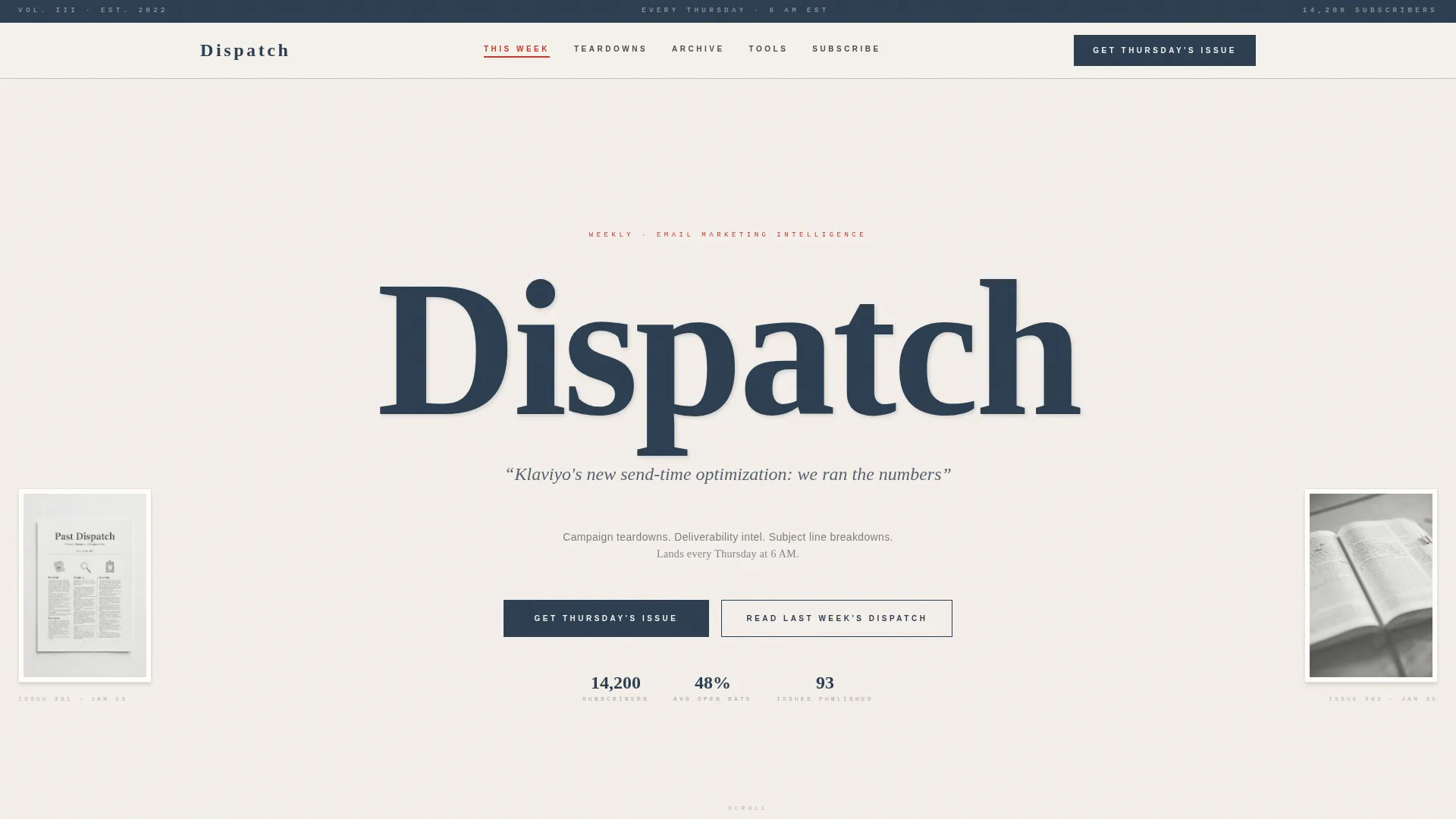
- A Type Over Image hero with a broadsheet masthead, a rotating subject line display, and flanking issue previews
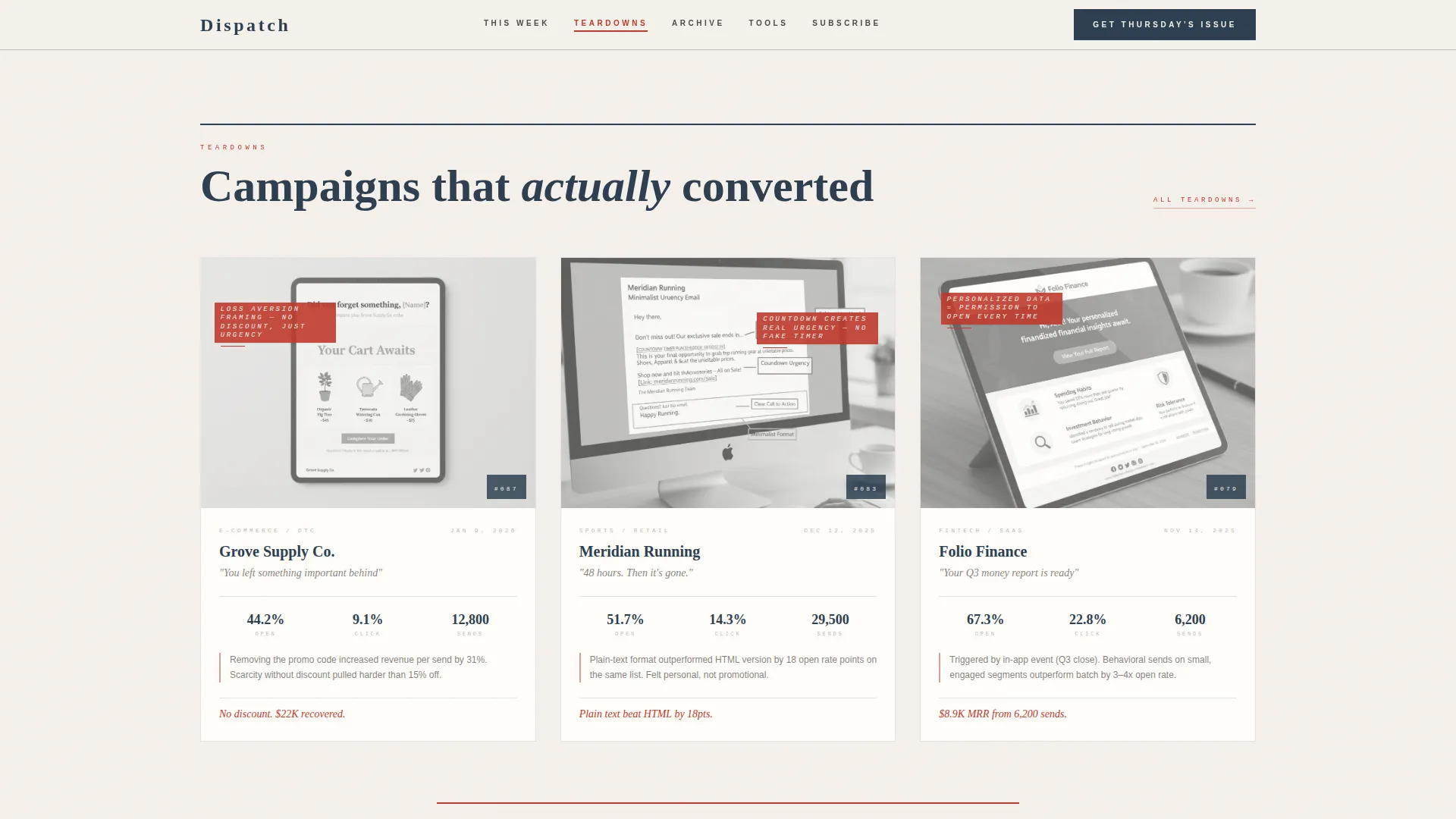
- Three annotated campaign teardown cards with red markup, a typeset archive inventory, a tools section in editorial list format, and a full-width subscribe section with social proof
- A sticky anchor navigation bar, a lightbox component for opening a full past issue, paper-unfold scroll reveal animations, and a ghost-button subscribe form repeated after every spoke
Feature list
This template includes purpose-built components for newsletter publishers. Each one is designed to show content credibility before the call to action.
Sticky Anchor Navigation Bar
A newspaper-style section index pins to the top of the page as you scroll. It links to five named spokes: This Week, Archive Highlights, Teardowns, Tools We Use, and Subscribe. Marginalia red highlights the active section.
Rotating Subject Line Display
A single italic subject line from a real past issue rotates in the hero area. It acts as both headline and live proof of value, showing visitors what kind of content they can expect each Thursday.
Rendered Email Preview with Lightbox
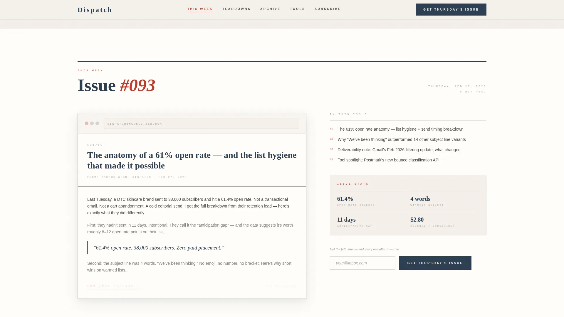
The "This Week" spoke displays the current issue as a rendered email preview. A "Read Last Week's Dispatch" link opens a full past issue inside a lightbox, letting visitors experience the product before committing to a subscription.
Annotated Campaign Teardown Cards
Three side-by-side campaign cards in the Teardowns spoke display annotated screenshots with red markup. This section makes the newsletter's analytical depth visible and tangible for professional readers.
Paper-Unfold Scroll Animations
Section transitions use a subtle paper-unfold motion as you scroll through the spokes. Entrance animations include word-by-word reveals in the hero. The effect reinforces the analog editorial texture without slowing the reader down.
Repeated Call to Action with Social Proof
The primary "Get Thursday's Issue" call to action, paired with a single email field and ghost-button submit, appears at the hub top and after every spoke. The subscribe section includes subscriber count, past open rates, and real subject lines as social proof.
Page sections overview
| Section | Purpose |
|---|---|
| Hero Broadsheet Masthead | Establishes editorial identity with oversized serif type, rotating subject line, and flanking issue previews |
| This Week Spoke | Shows the current issue as a rendered email preview with a lightbox link to last week's full issue |
| Teardowns Spoke | Displays three annotated campaign cards with red markup to demonstrate analytical depth |
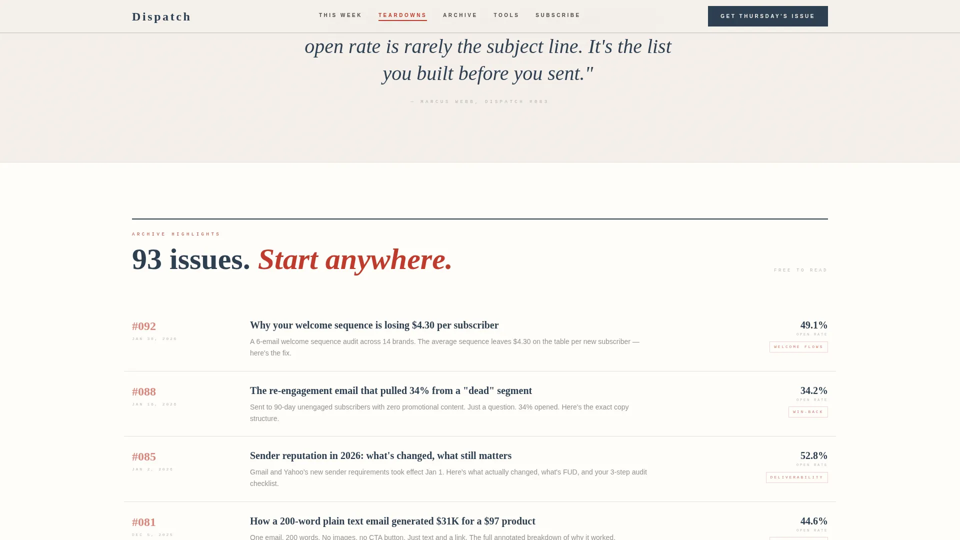
| Archive Highlights Spoke | Lists past issues in a typeset inventory layout to show newsletter history and range |
| Tools We Use Spoke | Presents tool recommendations in an editorial list format with honest, specific notes |
| Subscribe Section | Full-width call to action with email field, ghost-button submit, and social proof elements |
| Footer | Horizontal flow footer pattern completing the broadsheet page structure |
Design & branding system
The visual identity follows an Ink and Paper theme built around a Soft Mist color palette. Every color choice references analog print materials, giving the page a warm and quietly authoritative presence.
- Colors: unbleached stock (#F5F0EB) for backgrounds, pencil graphite (#4A4A4A) for body text, dried fountain ink (#2C3E50) for headings, and marginalia red (#C0392B) reserved for anchor navigation highlights and pull quotes
- Typography: Cormorant Garamond handles all editorial serif headings to deliver a broadsheet masthead feeling, while DM Sans provides clean, readable sans-serif body text
- Visual style: no gradients, no illustrations, type-confident layout with generous whitespace, a textured parchment photograph in the header, and ink-bleed character edges in the masthead letterpress treatment
Mobile & speed optimization
The template is built desktop-first, reflecting the professional workstation context of its target audience. It also delivers a solid mobile experience for readers who browse on the go.
- Desktop-first layout prioritizes the side-by-side teardown cards, the sticky anchor navigation, and the rendered email previews at comfortable reading widths
- Static sections use server components to keep page weight low, while the sticky navigation, lightbox, and rotating subject line rotator run as client components
- Paper-unfold scroll reveals and entrance animations are kept at a medium intensity to preserve the analog texture without introducing layout shifts or slow loads
How this template helps you convert
The page is designed as a content and resource destination. It earns the subscribe by showing, not just promising, which is the most effective conversion strategy for skeptical professional audiences.
- Visitors encounter real subject lines, rendered email previews, and a full readable teardown before they reach any subscribe form, removing the main friction point for professional readers
- The "Get Thursday's Issue" call to action is repeated at the top of the page and after every spoke, so the subscribe option is always one scroll away without feeling aggressive
- The "Read Last Week's Dispatch" lightbox link lets visitors sample a complete past issue before committing, turning the newsletter's own content into its strongest conversion argument
Other information about this template
This template is part of the Blog and Editorial category, specifically designed for the email marketing newsletter niche. It suits any weekly newsletter publisher who wants a landing page that feels as considered as the content it promotes.
- The Gallery Walk creative direction structures each spoke as a framed exhibit, making the scroll feel like moving through a curated reading room rather than a standard sales page
- The hub-and-spoke anchor navigation layout means every section is reachable in one click from anywhere on the page, reducing drop-off for readers who want to jump to teardowns or the archive first
- The template uses the Soft Mist color system and Ink and Paper theme, which are available across the broader template collection for consistent brand application
Theme
Ink & Paper
Creative direction
Gallery Walk
Color system
Soft Mist
Style
Hub & Spoke (Anchor Nav)
Direction
Content/Resource
Page Sections
Sticky Anchor Navigation Bar
Rotating Subject Line Display
Rendered Email Preview with Lightbox
Annotated Campaign Teardown Cards
Paper-unfold Scroll Animations
Repeated Call to Action with Social Proof
Related questions
Who is this template best suited for?
Can I swap in my own past issues and teardown examples?
What makes the subscribe flow different from a standard opt-in page?
How does the lightbox component work?
Is this template suitable for newsletters outside email marketing?



