Social Media Marketing Newsletter Portfolio Website Template
Dispatch is a sharp, editorial landing page template built for social media marketing newsletters. It uses an asymmetric 60/40 grid, an Ink and Paper visual theme, and a Gallery Walk scroll structure to showcase real data points before asking for a single email address. The design converts browsers into subscribers by letting the content speak first.
by Rocket studio
Quick summary
Dispatch is a single-page newsletter landing page template designed for social media marketing intelligence publications. It pairs a stop-motion hero reel with an editorial gallery scroll, delivering three live data points to prove value before any subscription ask. The Ink and Paper aesthetic gives the page warmth and authority in equal measure.
Who this template is for
This template is built for newsletter operators who need their landing page to do real persuasion work. It suits anyone producing data-driven social media content for a professional audience.
- In-house social media managers who need a credible home for a weekly briefing
- Agency strategists looking to publish a client-facing newsletter with a polished, editorial feel
- Direct-to-consumer founders running their own social accounts and publishing original trend analysis
What problem this template solves
Most newsletter landing pages ask for an email before giving any reason to subscribe. Visitors bounce because they never see the actual content. Dispatch flips that sequence entirely.
- The gallery scroll reveals real data points from the current issue before any call to action appears
- The editorial voice is communicated through layout and copy tone, not just a tagline
- The subscription form only appears after three framed content sections have already earned the reader's trust
What you get with this template
You get a fully structured, single-page layout that guides a first-time visitor from curiosity to confident subscription. Every section has a clear role in that journey.
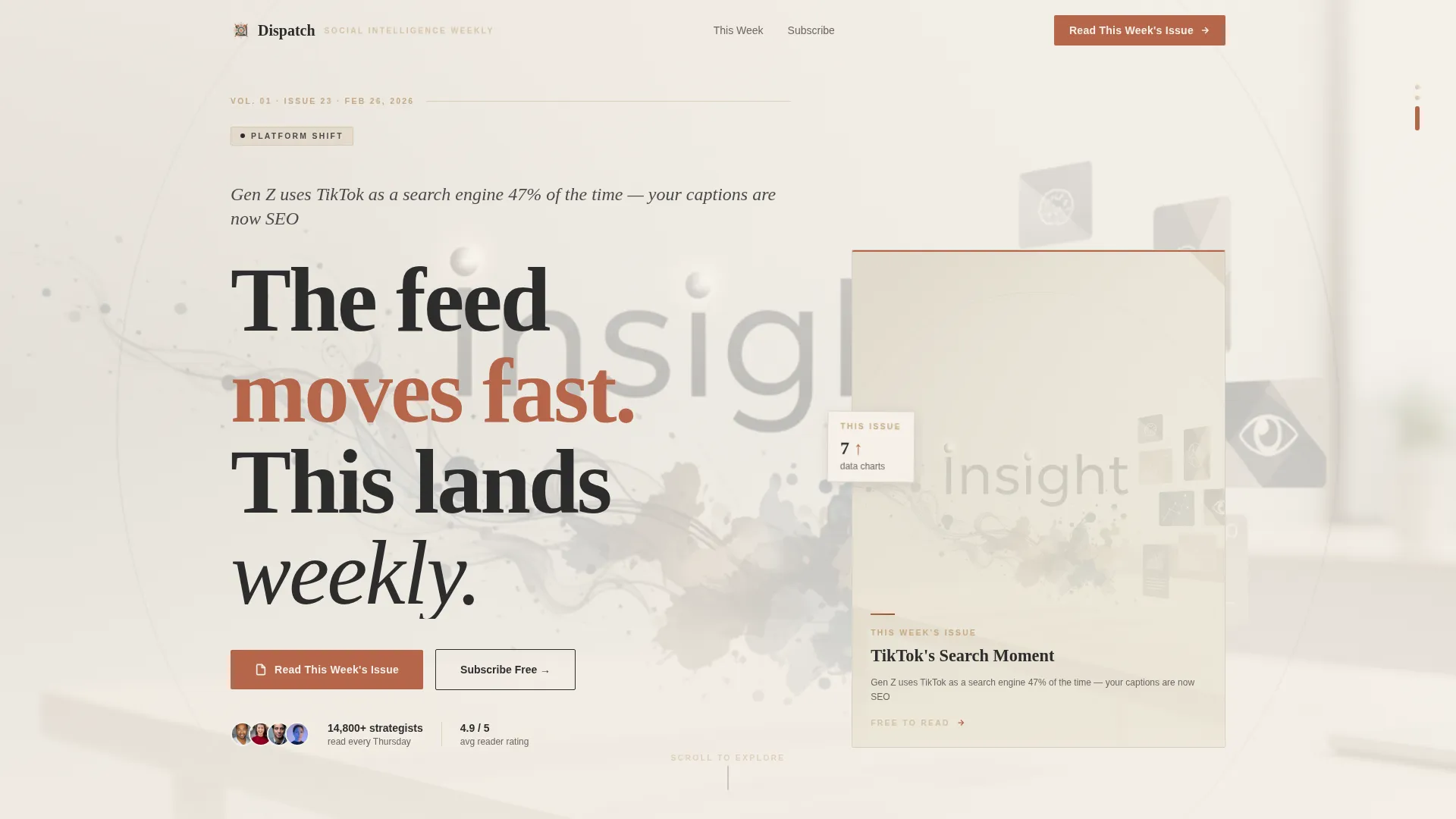
- A looping hero reel section with a stamped headline and a primary call-to-action button
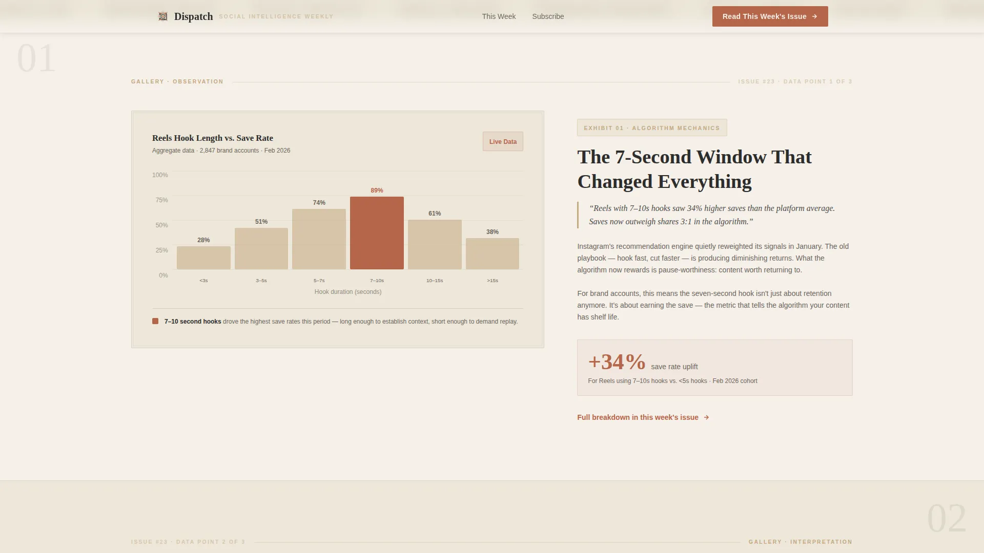
- Three asymmetric gallery frames that alternate visual weight and carry embedded data visualizations with editorial annotation columns
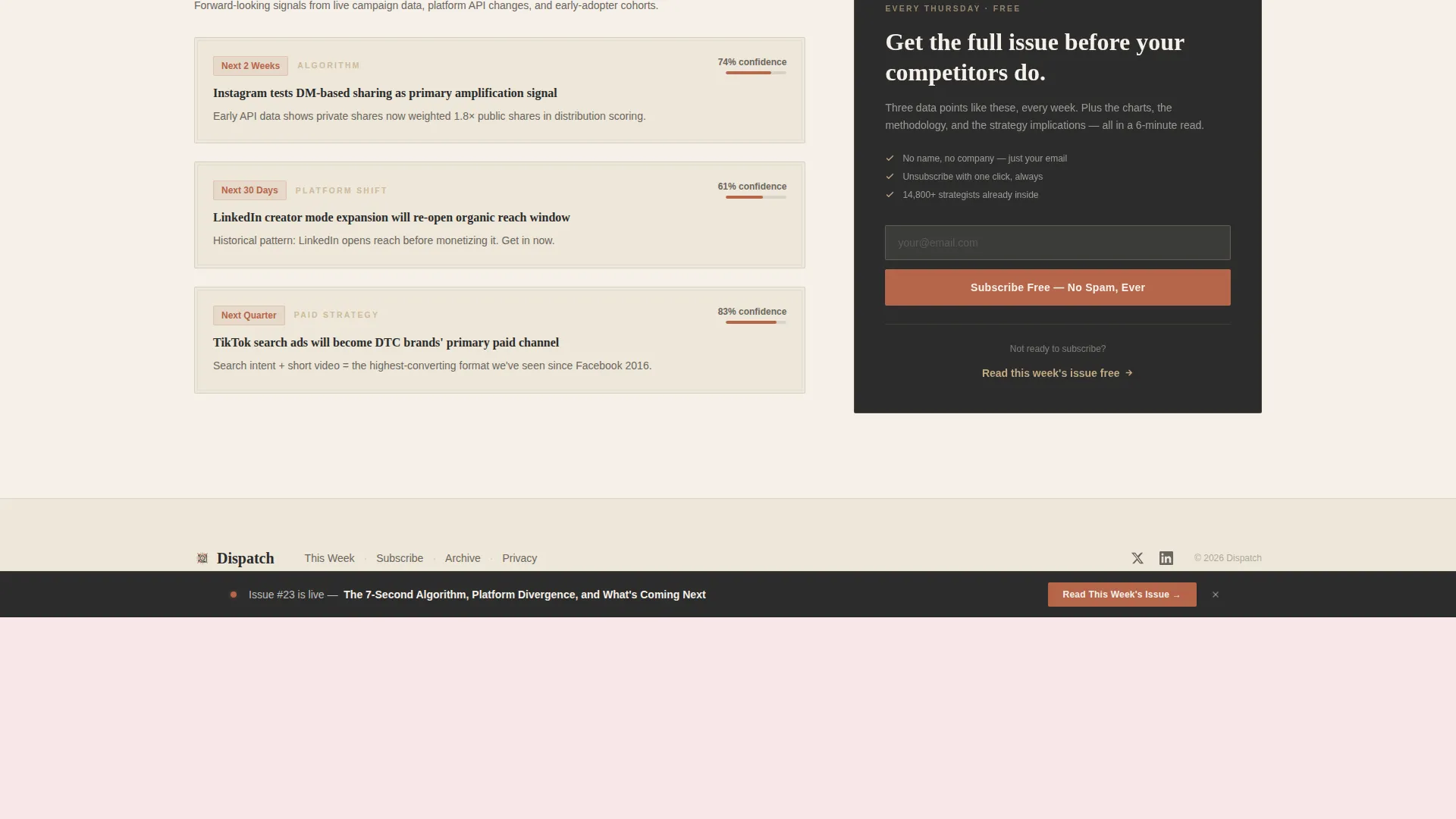
- A persistent sticky bottom bar with a repeat call to action, plus a final section with an inline email subscription field
Feature list
This template includes several purpose-built components that work together to move visitors toward subscribing.
Asymmetric 60/40 Grid Layout
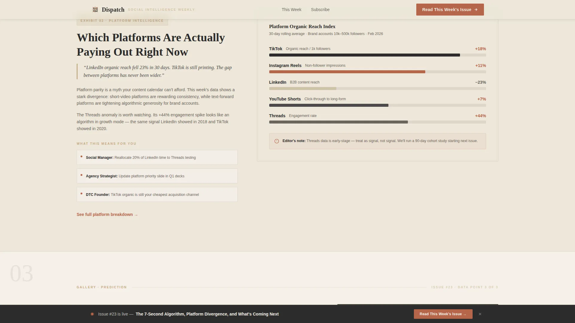
Each gallery frame uses a 60-column and a 40-column split. The wider column holds the data visualization or trend chart. The narrower column carries the editorial annotation, like a museum placard beside an exhibit. The two sides alternate left and right across frames to create a zigzag scroll rhythm.
Stop-Motion Hero Reel
The header features a looping fifteen-second animation styled as a stop-motion printing press sequence. Data charts stamp onto paper, trend headlines typeset letter by letter, and platform logos dissolve into ink blots before reforming as insight cards. The sequence ends with a bold woodblock-stamped headline and a terracotta call-to-action button.
Gallery Walk Scroll Structure
Three sequential gallery frames escalate the editorial narrative from observation to interpretation to prediction. Each frame is styled as a framed exhibit, and scroll reveals are powered by staggered GSAP animations. Hover states on each frame add interactivity without distracting from the content.
Persistent Sticky Bottom Bar
After the third gallery frame, a sticky bottom bar locks into view and repeats the primary call to action. This keeps the subscription prompt visible as visitors scroll back through the data sections without interrupting the reading flow.
Inline Subscription Form
The final gallery frame includes a minimal email field in the 40-column sidebar. The form collects only an email address, no name or company field. This low-friction entry point sits beside a forward-looking insight section that gives the reader one final reason to sign up.
CSS and GSAP Animation System
The template uses CSS keyframe stamp animations for the hero sequence and GSAP scroll reveals for each gallery frame. Headlines typeset with staggered letter animations. The animation system is high-fidelity but built with server components for static sections and minimal client-side JavaScript elsewhere.
Page sections overview
| Section | Purpose |
|---|---|
| Hero Reel Header | Introduces the newsletter with a looping stop-motion animation and stamps the core headline into view |
| Gallery Frame One | Displays a Reels hook-rate data chart in the 60-column with editorial annotation in the 40-column |
| Gallery Frame Two | Flips to a 40/60 layout for a platform shift trend breakdown with an annotated bar chart |
| Gallery Frame Three | Returns to 60/40 for a forward-looking prediction insight alongside the inline subscription sidebar |
| Persistent Bottom Bar | Sticky call-to-action bar that appears after frame three and stays visible during further scrolling |
| Minimal Footer | Ultra-minimal horizontal flow footer with essential links and no visual clutter |
Design & branding system
The visual identity follows an Ink and Paper theme rooted in a Warm Stone color system. Every color choice references physical print materials, giving the page a tactile, analog quality that stands apart from typical digital newsletter pages.
- Palette: unbleached parchment (#F5F0E8) for backgrounds, pressed charcoal ink (#2C2C2C) for body text, sandstone tan (#C4A882) for section dividers and pull-quote borders, and muted terracotta (#B5654A) for links, buttons, and data highlights
- Typography: Fraunces for editorial display headlines to reinforce the broadsheet newspaper tone, and DM Sans for body copy and interface elements for clean legibility
- Overall aesthetic: letterpress print shop, overhead desk surface photography direction in the hero, and framed gallery exhibit styling throughout the scroll sections
Mobile & speed optimization
The template is designed desktop-first, reflecting the primary use case of strategists building decks on a laptop. A solid mobile fallback ensures the layout remains usable on smaller screens.
- The asymmetric grid adapts gracefully so that stacked columns remain readable on mobile without losing the editorial hierarchy
- Server components handle static sections to reduce the client-side JavaScript load and keep the animation system from blocking page rendering
- The hero reel animation is lightweight by design, using CSS keyframes for the stamp sequences and GSAP only for scroll-triggered gallery reveals
How this template helps you convert
The entire page is structured around a Click-Through conversion model. Every design and copy decision supports one goal: getting a first-time visitor to read a free issue and then subscribe.
- The hero reel and stamped headline immediately communicate editorial voice, and the first call-to-action button routes directly to the latest free issue so the content closes the subscription on its own terms.
- Three gallery frames give away real data points from the current issue before any email field appears, building enough trust that the low-friction subscription form in the final frame feels like a natural next step rather than a demand.
Other information about this template
This template is categorized under Blog and Editorial and specifically targets the Social Media Marketing Newsletter niche. It is suited to both business-to-consumer and business-to-business hybrid newsletter models.
- The footer follows an ultra-minimal horizontal flow pattern, keeping the page exit clean and on-brand
- The template is built for English-language, US-centric social media platform data, though the layout and structure can support other markets with copy adjustments
- Issue count and subscriber statistics can be embedded in the hero section as social proof elements alongside the animation sequence
- The overall creative direction treats each scroll section as a curated gallery exhibit, making the editorial voice visible through layout before a single word of body copy is read
Theme
Ink & Paper
Creative direction
Gallery Walk
Color system
Warm Stone
Style
Asymmetric Grid (60/40)
Direction
Click-Through
Page Sections
Asymmetric 60/40 Gallery Grid
Stop-motion Hero Reel
Embedded Data Visualization Frames
Persistent Sticky Call-to-action Bar
Low-friction Subscription Form
GSAP and CSS Animation System
Related questions
Who is this landing page template designed for?
Does this template include an email subscription form?
What animation technology does this template use?
Can I display real data charts inside the gallery frames?
How does the persistent sticky bottom bar work?



