UX & Design Newsletter Blog Website Template
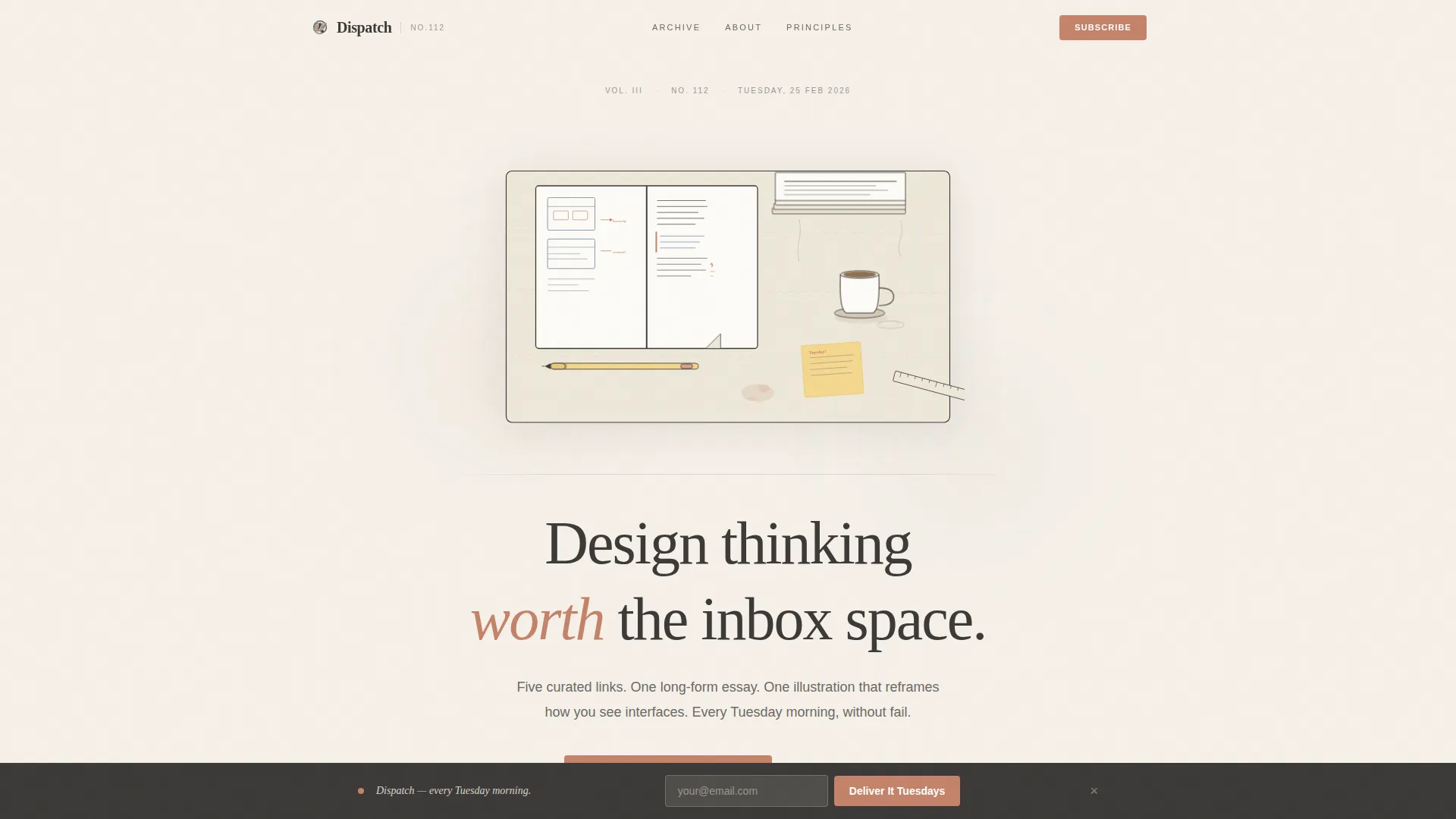
Dispatch is a heritage-editorial landing page template built for user experience and design weekly newsletters. It pairs a hand-illustrated animated desk scene with a slow, literary scroll that earns trust before asking for anything. The single-field subscribe form, a persistent bottom bar, and a "Read Last Tuesday's Issue" call to action make conversion feel like a natural next step, not a transaction.
by Rocket studio
Quick summary
Dispatch is an editorial landing page template for a weekly design newsletter. It opens with an animated custom illustration, unfolds like a founding letter, and closes with a single email field. Every section is built to let the writing do the persuading, trust comes first, the subscribe button comes after.
Who this template is for
This template is made for thoughtful newsletter creators who believe voice and craft should carry the conversion. It suits anyone publishing a curated weekly letter where the quality of the writing is the product.
- Mid-career product designers and design systems leads launching a personal or studio newsletter
- Junior user experience researchers and creative directors who want to build an audience around considered design discourse
- Independent writers and editorial teams publishing weekly design content who need a destination page that matches the tone of their work
What problem this template solves
Most newsletter landing pages rush the ask. They lead with a subscriber count and a subscribe button before the reader has any sense of what they are signing up for. Dispatch inverts that logic.
- Readers arrive at a page that feels like opening a well-worn journal, earning curiosity before presenting any call to action
- The scroll reveals the newsletter's identity layer by layer, reducing skepticism without relying on social-proof numbers alone
- A single email field at the end removes every friction point for a reader who is already sold on the voice
What you get with this template
Dispatch ships as a complete, ready-to-use editorial landing page. Every section is pre-built and matched to the Heritage and Story visual identity described below.
- An animated hero illustration section, a first-person origin story section, a broadsheet-style sample issue spread, editorial principles with pull quotes, a notable issues timeline, and a persistent subscribe bar
- A warm Soft Mist color palette, Fraunces serif editorial type, and DM Sans body type applied consistently across every section
- CSS keyframe animation on the desk illustration, GSAP scroll reveal effects on section entries, and a counter animation for social proof metrics
Feature list
This section covers the core built-in capabilities included in the Dispatch template.
Animated Heritage Illustration Header
The hero section features a hand-drawn desk scene rendered in single-weight ink line with selective terracotta watercolor washes. Three subtle CSS keyframe animations run on load: coffee steam rising, a pencil rolling slightly, and a page corner lifting. The masthead headline sits below the illustration in a large serifed editorial typeface.
Origin Story Scroll Section
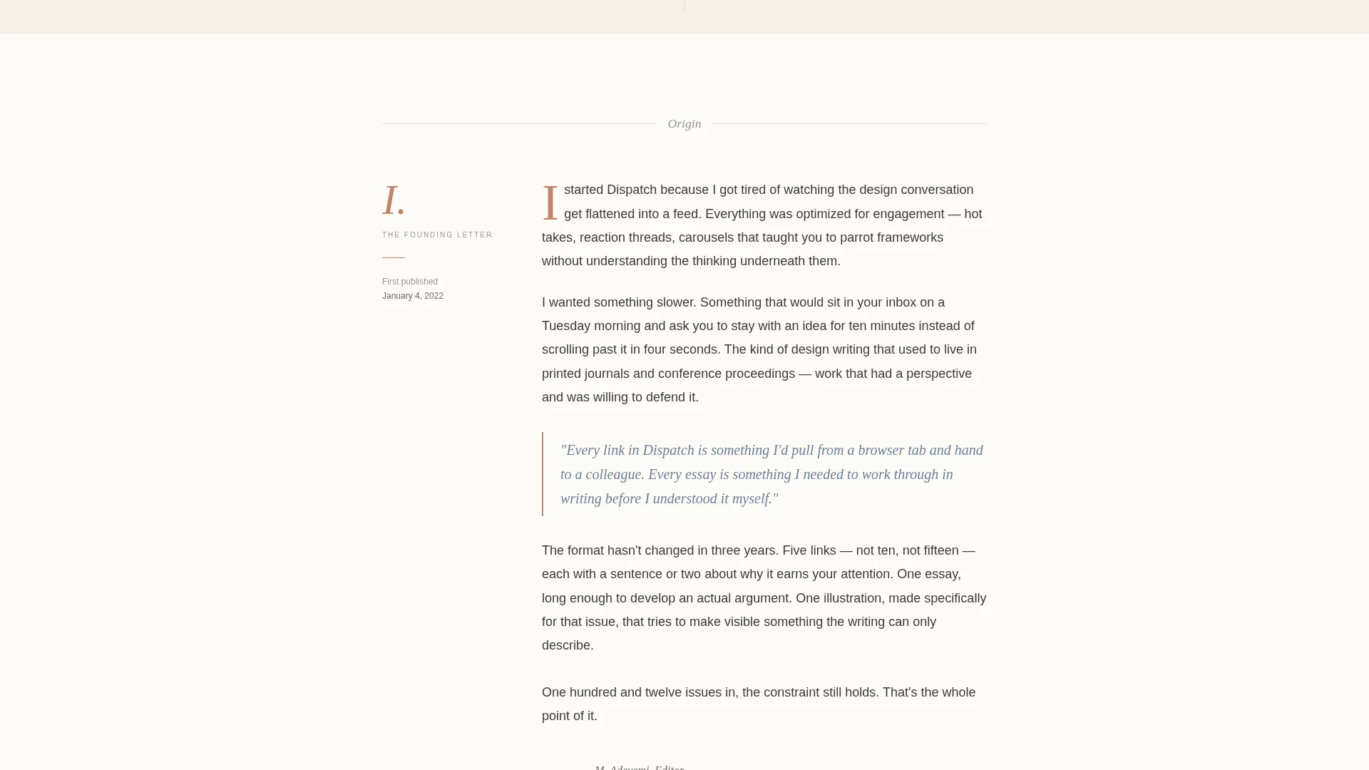
A first-person founding letter section opens the narrative beneath the hero. It is written in the voice of someone who chose curation over algorithm. Long paragraphs, generous whitespace, and italic pull quotes in faded ink blue (#6B7F99) set the literary rhythm that carries the reader downward.
Broadsheet Sample Issue Spread
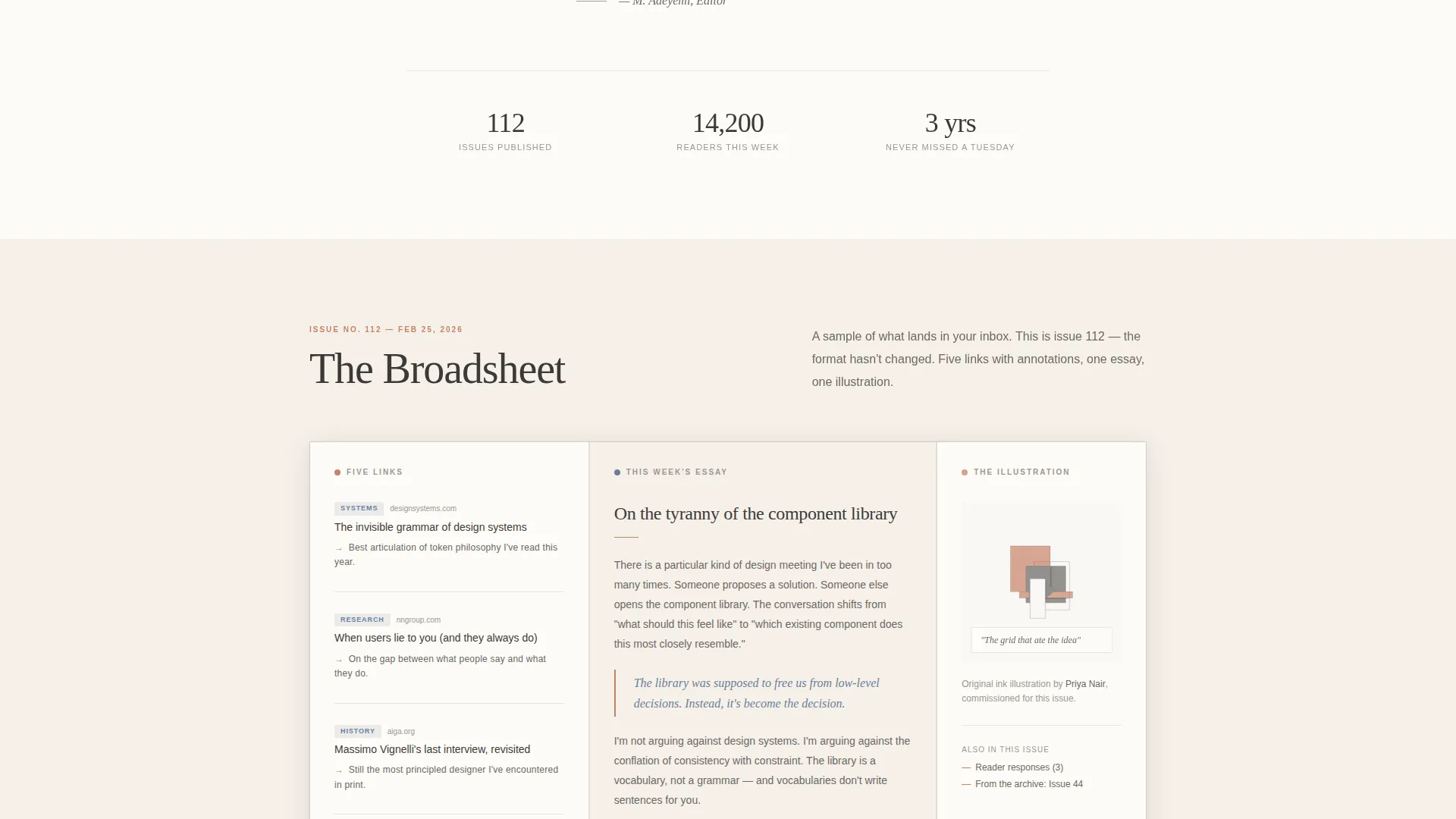
A bento-style asymmetric layout displays a complete sample issue as if spread across a broadsheet. Annotated callouts highlight the five curated links, the long-form essay, and the single illustration that structure every Tuesday issue. Readers see exactly what they are subscribing to before they commit.
Editorial Principles Block
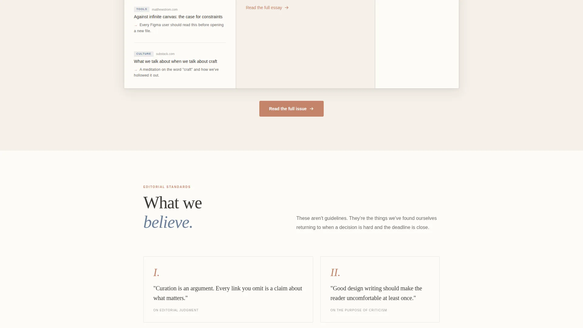
Hand-lettered maxims present the newsletter's editorial values as scannable statements. Each principle is supported by a short paragraph. Italic pull quotes in ink blue break the rhythm visually and reinforce the newsletter's point of view without using marketing language.
Notable Issues Timeline
A vertical timeline displays past issue titles alongside their cover illustrations. It functions as a living archive that demonstrates consistency and range. Readers can scan the timeline to judge editorial depth before deciding to subscribe.
Persistent Single-Field Subscribe Bar
A subscribe bar is pinned to the bottom of the viewport throughout the scroll. It contains one email input and a terracotta button reading "Deliver It Tuesdays." No name, no company field, no preference toggles. The primary call to action button reads "Read Last Tuesday's Issue" and leads to a full sample issue page.
Page sections overview
| Section | Purpose |
|---|---|
| Hero Illustration Header | Introduces the newsletter through an animated desk scene and masthead headline |
| Origin Story Letter | Builds trust with a first-person founding narrative |
| Sample Issue Spread | Shows readers exactly what a Tuesday issue contains |
| Editorial Principles Block | States the newsletter's values as hand-lettered maxims with pull quotes |
| Notable Issues Timeline | Demonstrates editorial history with cover illustrations and issue titles |
| Social Proof Metrics | Displays issue count and reader count with animated counters |
| Persistent Subscribe Bar | Keeps a single-field email form pinned to the bottom across all sections |
| Minimal Footer | Closes the page with a clean horizontal layout |
Design & branding system
Dispatch uses a Soft Mist palette inspired by a letterpress broadsheet left on a windowsill. Every color choice is deliberate: nothing demands attention, everything rewards it.
- Warm parchment (#F5F0E8) and barely-there warm white (#FDFBF7) alternate as section backgrounds; pencil graphite (#3D3A38) carries all body text with generous leading
- Faded ink blue (#6B7F99) appears only on elements that deserve to be followed, such as pull quotes and navigational cues; quiet terracotta (#C4836A) is reserved for links, pull quotes, and the subscribe button
- Fraunces is the serifed editorial typeface used for headlines and pull quotes; DM Sans handles body copy and user interface elements throughout
Mobile & speed optimization
Dispatch is designed desktop-first to honor the editorial reading experience, with a solid responsive layout for smaller screens.
- The animated desk illustration and GSAP scroll reveals are implemented using client-side components only, keeping static sections lean
- Section layouts reflow cleanly for mobile viewports, preserving the literary rhythm and generous whitespace that define the template's voice
- Server Components handle all static content rendering, while animations are isolated to client components to avoid unnecessary load on non-animated sections
How this template helps you convert
Dispatch converts by earning trust first. The page is structured so the reader spends time inside the voice before any subscribe prompt becomes prominent.
- The origin story and sample issue spread give readers a full picture of the newsletter's value before the call to action appears, making the subscribe decision feel informed rather than impulsive
- The persistent bottom bar keeps the subscribe form available at every scroll depth without interrupting the reading experience, so a reader who becomes ready at any point can act immediately
- The single email field removes every reason to hesitate, lowering the cost of subscribing to a single keystroke after the reader has already spent time inside the writing
Other information about this template
Dispatch is categorized under Blog and Editorial, within the user experience and design newsletter niche. It is suited for the global English-speaking design community and requires no localization changes for US or international audiences.
- The template style is Editorial and Magazine, consistent with heritage editorial and letterpress broadsheet aesthetics
- Creative direction follows an Origin Story arc, meaning the scroll is structured as a founding letter that reveals the newsletter's identity progressively
- The landing page direction is Content and Resource, prioritizing depth of content over immediate conversion pressure
- Social proof elements include an animated issue count and reader count metric, alongside reader pull quotes embedded in the scroll
Theme
Heritage & Story
Creative direction
Origin Story
Color system
Soft Mist
Style
Editorial/Magazine
Direction
Content/Resource
Page Sections
Animated Desk Illustration Hero
First-person Origin Story Section
Broadsheet Sample Issue Layout
Editorial Principles with Pull Quotes
Notable Issues Timeline
Persistent Single-field Subscribe Bar
Related questions
What kind of newsletter is this template designed for?
Do I need to write all the copy from scratch?
Can I use this template if my newsletter does not publish on Tuesdays?
Is the subscribe form connected to an email platform?
Why does the subscribe form ask for only an email address?



