Horizontal Scroll E-Commerce Newsletter Landing Page
Dispatch is a horizontal-scroll editorial landing page built for direct-to-consumer newsletter publishers who need to earn subscribers through credibility, not promises. Six tightly sequenced panels guide desktop readers from a bold editorial header to an embedded sample issue and a final terracotta call to action. The warm stone palette and broadsheet typography make every section feel like a publication worth opening.
by Rocket studio
Quick summary
Dispatch is a single-page, horizontal-scroll landing page template designed for e-commerce newsletter publishers. It pairs an editorial magazine aesthetic with a conviction-first content flow, moving readers from a bold photographic header through a manifesto, proof panels, and an embedded sample issue before reaching the subscribe call to action.
Who this template is for
This template is built for publishers and operators who want their newsletter landing page to match the quality of the content inside it. It suits confident voices with a real audience and real proof to show.
- Direct-to-consumer founders and brand operators launching or growing a weekly newsletter
- Growth leads and e-commerce agency principals who want a credibility-first subscriber acquisition page
- Editorial teams or solo writers with an established voice and past issues to showcase
What problem this template solves
Most newsletter landing pages make the same mistake: they list benefits and ask for the email before earning it. Readers who know the industry have seen every benefit bullet before. They leave without subscribing because nothing on the page proves the newsletter is worth their inbox.
- Generic templates do not create the sense of editorial depth that converts skeptical, informed readers
- Single-column opt-in pages hide the best asset, the actual content, behind a promise instead of showing it inline
- Standard layouts offer no natural path to social proof like reader replies, brand logos, or open-rate data
What you get with this template
You get a fully designed, six-panel horizontal-scroll landing page ready to fill with your editorial content, subscriber proof, and subscribe form. Every panel is purposeful and sequenced to build conviction before asking for the email.
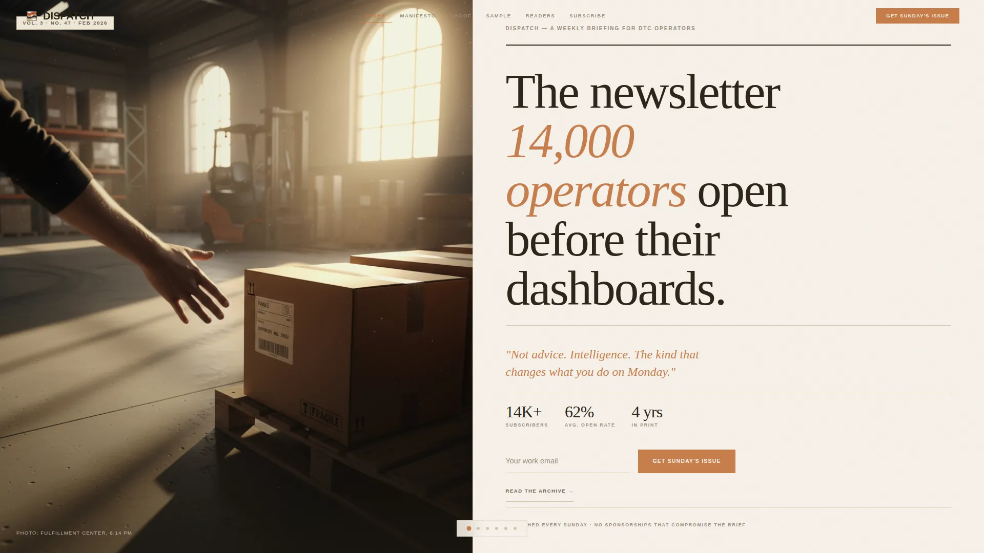
- Hero section with a half-page editorial photo layout and a large serif headline field
- Manifesto, proof, sample issue, and community panels that escalate reader conviction across the horizontal scroll
- A repeating "Get Sunday's Issue" call to action with a single email field and terracotta button, plus a secondary "Read the Archive" path
Feature list
The Dispatch template delivers six distinct structural and visual features grounded in editorial publishing and subscriber conversion.
Horizontal Scroll Panel Navigation
The page flows like a broadsheet being turned, not scrolled vertically. CSS scroll-snap locks each panel cleanly into view on desktop, giving every section its own stage. Mobile visitors receive a vertical fallback layout so no reader is excluded.
Half-Page Editorial Header
The hero splits the viewport into two equal halves. The left side holds an editorially lit warehouse photograph at golden hour. The right side presents a large Fraunces serif headline with no competing subhead. The composition communicates authority before a single word is read.
Embedded Scrollable Sample Issue
Panel three renders a full past issue as an inline magazine spread. Readers can scroll through the actual content without leaving the page. This single feature does more convincing than any benefit list because it shows the real product.
Proof Panel with Open-Rate Annotations
Panel two displays actual past issue subject lines alongside open-rate data. This turns newsletter performance into visible, scannable evidence. A secondary link to three archived issues extends the proof for readers who want more depth.
Community Mosaic Panel
Panel four assembles reader reply quotes, brand logos, and revenue screenshots in a mosaic layout. Consent badges accompany revenue figures to keep the proof credible. The panel answers the question every subscriber has: who else reads this?
Repeating Terracotta Call to Action
The subscribe prompt reappears at the end of every horizontal panel. Each repetition keeps a single email field and the terracotta button consistent. The repeated placement means the conversion opportunity is never more than one glance away.
Page sections overview
| Section | Purpose |
|---|---|
| Editorial Hero | Establish authority with photo and headline |
| Manifesto Panel | Declare position against recycled advice |
| Proof Panel | Show past subject lines with open-rate data |
| Sample Issue Panel | Render a full issue inline for reading |
| Community Mosaic | Display reader logos, quotes, and screenshots |
| Subscribe Call to Action | Final email capture with terracotta button |
| Minimal Footer | Close the page without distraction |
Design & branding system
The visual language is warm, analog, and deliberately authoritative. Every color and typeface choice reinforces the feeling of a trusted trade publication rather than a generic marketing page.
- Warm stone color system: parchment white (#F5F0E8) backgrounds, espresso ink (#2C2418) for primary text, quarried sandstone (#D4C5A9) for muted tones, and terracotta (#C67D4B) reserved for links, pull quotes, and subscribe buttons
- Typography pairing: Fraunces serif for all display headlines and pull quotes, DM Sans for body text and interface elements
- High animation fidelity with horizontal scroll snap, word reveal effects, counter animations, and smooth panel transitions driven by IntersectionObserver
Mobile & speed optimization
The template is designed desktop-first because horizontal scroll is a native desktop behavior. A thoughtful fallback ensures the experience holds on smaller screens without losing the editorial character.
- Mobile visitors receive a vertical single-column layout that preserves all six panels and every call to action
- CSS scroll-snap and IntersectionObserver power the animations without heavy JavaScript frameworks, keeping the interaction layer lean
How this template helps you convert
The page is structured so that each panel removes one more reason not to subscribe. By the time a reader reaches the final call to action, they have read a manifesto, seen proof, browsed a real issue, and reviewed community evidence.
- The embedded sample issue lets readers experience the actual newsletter before committing, replacing vague promises with direct evidence of editorial quality.
- The repeating single-field email form with a consistent terracotta button keeps the conversion path visible at every stage of the horizontal scroll, reducing friction to a single click.
Other information about this template
This template was built specifically for the e-commerce newsletter niche, where readers are informed professionals who are skeptical of marketing claims. The editorial magazine theme and broadsheet creative direction are intentional responses to that audience's high standards.
- Template style: Horizontal Scroll with desktop-first layout and a mobile vertical fallback
- Header concept: Half-Page Photo and Text composition
- Creative direction: Manifesto-led panel progression that escalates from introduction to conviction
- Landing page direction: Content and resource focused, optimized for subscriber acquisition through depth and proof
- Color system label: Warm Stone, referencing the quarried sandstone, espresso, parchment, and terracotta palette
- Footer pattern: Superhuman Extreme Minimal, keeping the close of the page distraction-free
- Localization: English language, United States date format, USD currency context



Theme
Editorial Magazine
Creative direction
Manifesto
Color system
Warm Stone
Style
Horizontal Scroll
Direction
Content/Resource
Page Sections
Horizontal Scroll Panel Layout
Half-page Editorial Hero
Inline Scrollable Sample Issue
Proof Panel with Annotations
Community Mosaic with Consent Badges
Repeating Single-field Subscribe Form
Related questions
Can I use this template for a newsletter outside of e-commerce?
How does the horizontal scroll behave on mobile devices?
Do I need to supply my own photographs and past issue content?
How many times does the subscribe call to action appear on the page?
What is included in the secondary archive path?



