Dispatch - Unified Contact Center Landing Page Template
Dispatch is a modular contact center landing page template built on a Tech Glass visual identity. It presents live-style performance metrics in a bold stats header, then builds platform trust through a layered card grid covering channels, intelligence features, and integrations. The design targets operations and customer experience teams who need to communicate platform capability at a glance.
by Rocket studio
Quick summary
Dispatch is a single-page contact center platform landing page template with a dark slate and sky-blue visual identity. The layout opens with a frozen-in-action metrics dashboard, then unfolds a modular card grid that maps out channels, intelligent features, and third-party connector support. It is built to push visitors toward a guided product tour with zero friction.
Who this template is for
This template speaks directly to the people accountable for contact center performance. It is built for teams who already understand the problem and need a page that matches their technical confidence.
- Operations directors managing fragmented toolsets across voice, chat, and ticketing systems
- Customer experience leaders at mid-market software companies who track first-call resolution as a core health metric
- IT managers who need a credible, deployable solution page ready to go live under tight timelines
What problem this template solves
Contact center platforms often struggle to communicate their value without overwhelming the visitor with feature lists or burying the proof in scrolling paragraphs. Dispatch solves the credibility gap by leading with live-style metrics and letting the card architecture do the explaining.
- Disconnected tooling makes it hard to present a unified platform story on a single page
- Visitors in technical or operations roles lose trust quickly when a page feels vague or marketing-heavy
- Most landing pages bury the call to action too deep, losing high-intent visitors before the click
What you get with this template
You get a fully structured, ready-to-customize landing page designed around the visual language of a working contact center control room. Every section has a defined role, and the layout guides the visitor from proof to product with deliberate pacing.
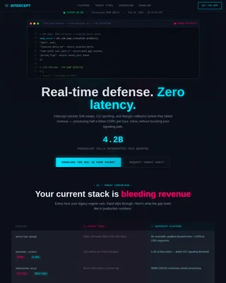
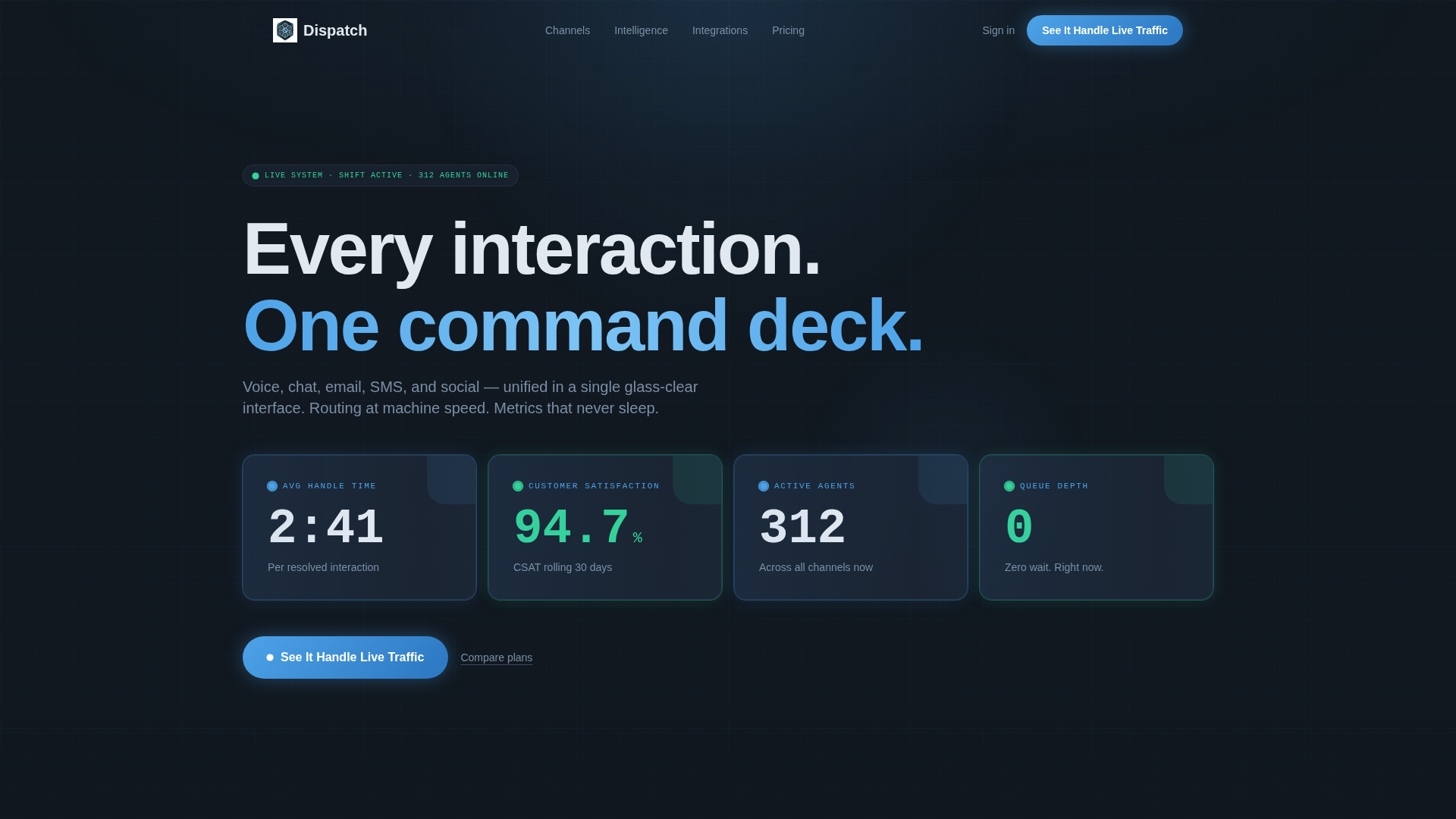
- A live-metrics header with four key performance indicators displayed in frosted-glass cards using monospaced typography at large scale
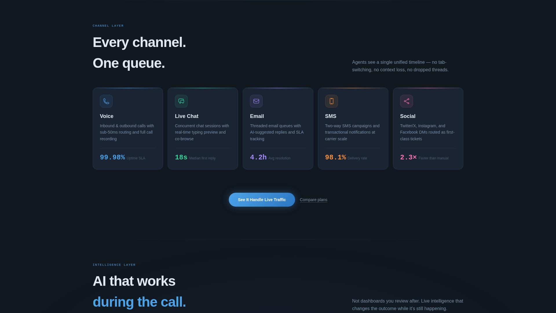
- A three-row modular card grid covering communication channels, intelligent platform features, and integration connectors
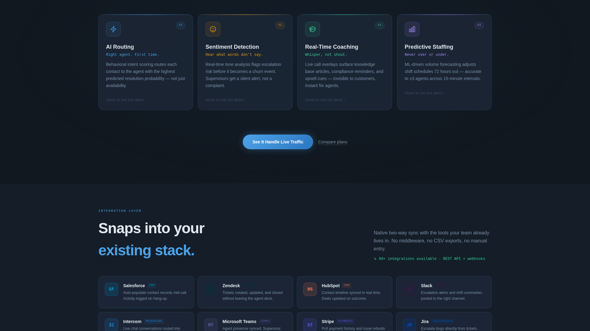
- A click-through conversion flow with a primary call-to-action button and a secondary plan-comparison text link repeated across the page
Feature list
This template is built from a small set of high-impact layout decisions. Each feature below reflects a direct choice made in the source design brief.
Live Metrics Header Dashboard
The header displays four performance indicators frozen mid-shift: average handle time at 2:41, customer satisfaction at 94.7%, active agents at 312, and queue depth at zero. Each metric sits in its own frosted-glass card with a faint sky-blue border glow and monospaced numerals at a scale that dominates the viewport.
Three-Row Modular Card Grid
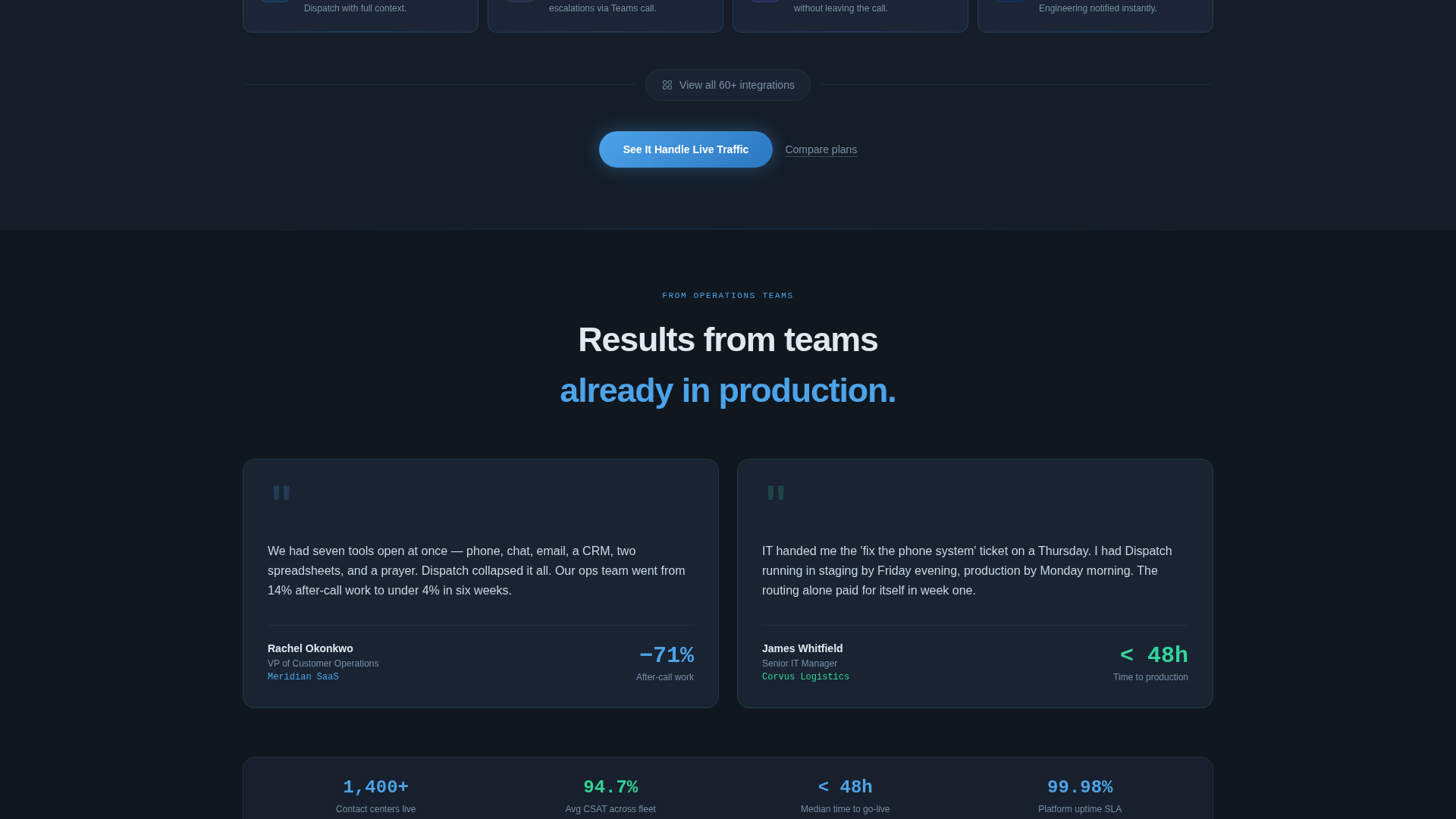
Below the header, the layout builds platform understanding row by row. The first row covers five communication channels. The second row covers four intelligent capabilities with hover-expand micro-demo behavior. The third row displays integration connector cards with recognizable product logos snapped into frame.
Hover-Expand Intelligence Cards
The second card row in the feature matrix responds to hover interaction. Each intelligence card expands to reveal a micro-demo view, giving visitors a sense of live platform behavior without leaving the page. This keeps high-intent visitors engaged at the moment their curiosity peaks.
Repeated Click-Through Call to Action
The primary call-to-action reads "See It Handle Live Traffic" and appears three times across the page. It first surfaces as a floating pill after the header metrics, then reappears anchored below each card row. A secondary text link reading "Compare plans" sits beneath it for visitors already past the discovery stage.
Tech Glass Visual System
The template uses a four-color palette applied with strict intent. Deep operations slate forms the background. Brushed panel gray defines card surfaces. Open-sky blue marks interactive states and highlights. Status-green appears only on live metrics and success confirmations, preserving its signal value throughout the layout.
No-Form Conversion Architecture
This page carries no lead capture form. The entire conversion path points toward a single destination: an interactive product sandbox. The design removes commitment friction by framing the click as curiosity rather than a sales handoff.
Page sections overview
| Section | Purpose |
|---|---|
| Metrics Header Dashboard | Opens the page with live-style performance proof using four key indicators |
| Channel Cards Row | Presents five communication channels, each in its own icon-and-caption card |
| Intelligence Cards Row | Covers four AI-powered capabilities with hover-expand micro-demo behavior |
| Integration Connector Row | Displays third-party product logos in connector-style card frames |
| Floating call to action Pill | Surfaces the primary call to action immediately after the header metrics |
| Anchored call to action Row | Repeats the primary button and secondary text link below each card row |
Design & branding system
The visual identity is built around the idea of a cockpit instrument panel at cruising altitude. The palette is dark enough to reduce eye fatigue during extended shifts, with blue accents that feel active without being aggressive.
- Four-color palette: deep operations slate (#1E2A3A) for backgrounds, brushed panel gray (#3B4A5C) for card surfaces, open-sky blue (#4DA3E8) for interactive highlights, and status-green (#34D399) reserved strictly for live metrics and confirmations
- Frosted-glass card treatment with faint sky-blue border glow creates depth without introducing photography or illustration
- Monospaced typeface used for all metric numerals at large display scale to reinforce precision and system credibility
Mobile & speed optimization
The modular card grid structure adapts naturally to smaller viewports. Each card is a self-contained unit, which means the layout can reflow without losing the visual hierarchy that makes the page readable at a glance.
- Card-based layout allows rows to stack vertically on mobile without disrupting the channel-to-intelligence-to-integration reading order
- Large monospaced metric numerals remain legible at reduced scale, preserving the header's impact on smaller screens
- Minimal use of decorative assets means fewer visual elements to load or reposition across breakpoints
How this template helps you convert
The page is engineered as a click-through funnel. Every layout decision builds toward a single action: clicking through to the interactive product sandbox. The page earns that click by establishing proof before it ever asks for anything.
- The metrics header front-loads credibility. Visitors see a system that is already performing before they read a single word of marketing copy.
- The card grid builds comprehension layer by layer. By the time the third call-to-action appears, the visitor has mentally assembled the full platform picture and the click feels like a natural next step rather than a cold commitment.
Other information about this template
Dispatch is categorized under Telecom and Connectivity, specifically within the Communication and Unified Communications subcategory. It is purpose-built for the contact center platform niche and reflects the intersection of that niche with a Tech Glass theme, Feature Matrix creative direction, and a Click-Through landing page strategy.
- The template style is Card Grid (modular), meaning each content block is independent and can be updated or reordered without restructuring the full page
- The Stats and Metrics header concept is a deliberate choice for this niche: operations and customer experience audiences respond to data before narrative
- The Slate and Sky color system is documented in the design brief with specific hex values, making brand alignment straightforward during customization
Theme
Tech Glass
Creative direction
Feature Matrix
Color system
Slate & Sky
Style
Card Grid (Modular)
Direction
Click-Through
Page Sections
Live Metrics Header Dashboard
Three-row Modular Card Grid
Hover-expand Intelligence Cards
Repeated Click-through Call to Action
Tech Glass Visual System
No-form Conversion Architecture
Related questions
Who is Dispatch designed for?
Does this template include a lead capture form?
Can I customize the metrics shown in the header?
How many card rows does the template include?
Is this template suitable for a SaaS product page?