Disrupt - Bold D2C Landing Page Template
Disrupt is a bold, brutalist direct-to-consumer landing page template built for founders who are done paying marketplace fees. It pairs a full-viewport metrics wall with modular comparison cards, a live margin calculator, and a relentless versus-style scroll to turn raw unit economics into a conversion argument your visitors make for themselves.
by Rocket studio
Quick summary
Disrupt is a single-page, card-grid landing page template designed for direct-to-consumer founders ready to cut out marketplace middlemen. It opens with a data-heavy stats wall, flows through modular comparison cards, and closes with a margin calculator that makes the financial case before the visitor ever hits a call-to-action button.
Who this template is for
This template was built for a specific kind of founder. One who already suspects the numbers are broken and just needs a page that proves it clearly.
- Bootstrapped founders comparing platform costs late at night and looking for a cleaner path to margin control
- Former brand managers who left corporate to build their own direct-to-consumer product line
- Small-batch makers who have outgrown peer-to-peer marketplaces but are not ready to hand over wholesale margin
What problem this template solves
Marketplace-dependent founders lose revenue on every sale to fees, lose customer data to platform rules, and lose brand control to algorithm changes. A generic landing page cannot make that argument with enough force to move a skeptical, numbers-driven audience.
- Founders struggle to communicate the real cost difference between marketplace selling and owning a direct channel
- Most startup templates feel aspirational rather than analytical, which fails a founder audience that thinks in unit economics
- There is no natural place on a standard page to let a visitor run their own numbers and arrive at the decision themselves
What you get with this template
You get a fully structured, single-page layout that reads like a competitive analysis deck. Every section is self-contained and modular, so the scroll builds a cumulative case without ever feeling like a pitch.
- A full-viewport stats and metrics header built around real D2C benchmark figures
- A card grid of modular comparison modules, each with a two-column versus structure showing the old model against the D2C alternative
- An interactive margin calculator intake and side-by-side 12-month projection card, plus a secondary email capture call-to-action
Feature list
This section covers the core built-in components and design capabilities the template delivers.
Full-Viewport Metrics Header
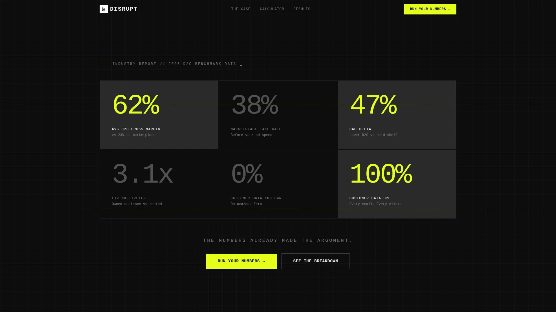
The header fills the entire screen with oversized monospaced numbers rendered in titanium gray and signal yellow against carbon black. Figures include average direct-to-consumer gross margin, marketplace take rate, and customer acquisition cost delta. No icons or illustrations appear here. Just data points that land with immediate weight.
Modular Comparison Card Grid
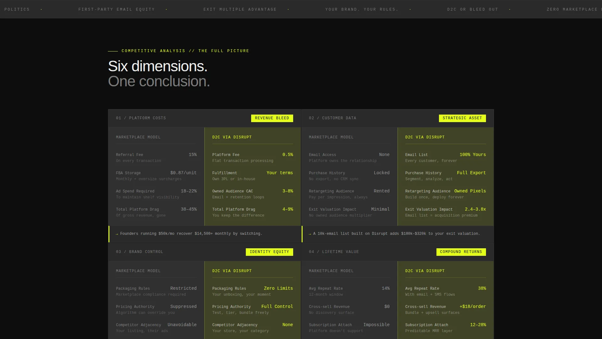
Each card in the grid is a self-contained versus module. The left column presents the current marketplace model in graphite. The right column presents the direct-to-consumer alternative highlighted in signal yellow. Topics escalate from obvious fee comparisons to deeper strategic advantages including first-party data, email list equity, and exit multiples.
Margin Recovery Calculator
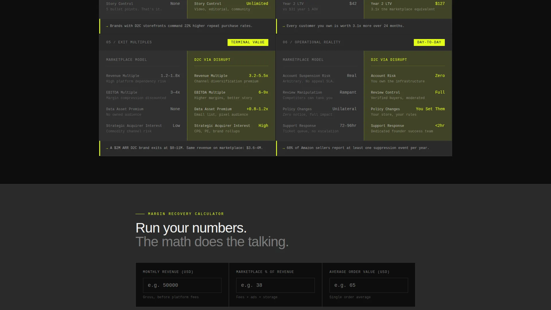
The primary call-to-action leads to a calculator-style intake form. Visitors enter their current monthly revenue, marketplace percentage, and average order value. The template instantly renders a side-by-side projection card showing estimated margin recovery over 12 months.
Email Capture with Category Context
Beneath the calculator result, a secondary call-to-action captures the visitor's email address and product category. This two-step conversion flow moves visitors from data-driven curiosity to a concrete launch commitment.
Bold Brutalist Visual System
The entire layout uses razor-edged cards with no border radius and no drop shadows. Hard-cut background blocks alternate between carbon black and machined graphite. Signal yellow is reserved exclusively for interactive elements, calls-to-action, and data highlights, making every actionable element unmissable.
Versus-Structure Scroll Rhythm
The page is architected to build conviction through repetition and escalation. Each scroll step delivers a new comparison that deepens the strategic argument, moving the visitor from obvious cost savings to long-term brand equity and lifetime value advantages.
Page sections overview
| Section | Purpose |
|---|---|
| Stats Metrics Header | Opens with full-viewport benchmark numbers to anchor the cost argument immediately |
| Marketplace Fee Cards | Compares platform fees against direct-to-consumer overhead in side-by-side modules |
| Customer Data Ownership | Shows the gap between renting a marketplace audience and owning first-party data |
| Brand Control Module | Contrasts algorithmic brand dependency with direct channel authority |
| Repeat Purchase Rates | Highlights lifetime value and repeat purchase differences between models |
| Exit Multiples Card | Escalates the argument to long-term brand equity and acquisition value |
| Margin Calculator Intake | Lets visitors enter their own figures for a personalized 12-month projection |
| Projection Result Card | Renders the side-by-side margin recovery output from the calculator |
| Launch Store call to action | Secondary email and product category capture beneath the calculator result |
Design & branding system
The visual identity is built around the Carbon Fiber color system. Every design decision serves clarity and industrial force over decoration.
- Core palette: deep carbon black (#0D0D0D) for primary backgrounds, machined graphite (#2A2A2A) for alternating blocks and card fields, titanium mid-gray (#7B7B7B) for body text on dark surfaces, and signal yellow (#E4FF1A) reserved exclusively for calls-to-action, interactive elements, and data highlights
- Typography uses oversized monospaced figures in the header, keeping numbers raw and unadorned; body copy remains legible on all dark surface combinations
- Cards use razor edges with zero border radius and no drop shadows, creating a dense, report-like information grid that feels engineered rather than styled
Mobile & speed optimization
The modular card grid is structured to reflow cleanly from a full desktop grid down to a single-column mobile scroll. The versus-column layout inside each card adapts so both columns remain readable at smaller widths.
- Hard-cut block backgrounds and flat card styles avoid render-heavy visual effects, keeping the layout lightweight on mobile devices
- The calculator intake and projection card are sized for touch input, with field targets and result display scaled for smaller screens
How this template helps you convert
The conversion strategy on this template is unusual. It does not ask visitors to trust a brand. It asks them to trust their own numbers.
- The metrics header creates immediate pattern recognition for cost-conscious founders, making the page feel credible before the first scroll
- The versus card grid builds cumulative conviction across multiple decision dimensions, so by mid-page the visitor has already agreed with the argument several times
- The calculator closes the loop by personalizing the case with the visitor's own revenue figures, turning the decision from emotional to arithmetic before the call-to-action appears
Other information about this template
This template sits inside the Startup and Launch category with a Startup Homepage subcategory focus, designed specifically for the direct-to-consumer and e-commerce startup niche. It is a strong fit for any founder-led brand that needs a high-conviction, data-forward page to support a platform launch or early customer acquisition push.
- The template style is a card grid modular layout, meaning sections can be reordered or extended to match a specific product story without breaking the visual system
- The creative direction follows an Industry Report format, which makes it appropriate for contexts beyond pure e-commerce, including any founder-facing pitch that benefits from a data-led comparison narrative
- The Bold Brutalist theme and Carbon Fiber palette make the template visually distinct from polished consumer brand templates, signaling analytical credibility to a founder audience

Theme
Bold Brutalist
Creative direction
Industry Report
Color system
Carbon Fiber
Style
Card Grid (Modular)
Direction
Comparison/Versus
Page Sections
Full-viewport Metrics Header
Modular Versus Card Grid
Margin Recovery Calculator
Two-step Email Capture Flow
Bold Brutalist Card System
Related questions
Can I customize the benchmark numbers in the metrics header?
Do I need a developer to set up the margin calculator?
Is this template suitable for a product that is not yet launched?
Can the versus card sections be reordered or removed?
What kind of businesses fit this template best?



