Gaming & Esports Blog Blog Website Template
Dojo is a masonry-layout landing page built for console gaming editorial blogs. It pairs a full-viewport manifesto header with scrolling editorial tiles, interstitial data cards, and a frictionless email sign-up for a weekly briefing called "The Teardown." The Atelier Studio visual identity uses Japanese Zen color values to make every section feel deliberate and obsessively curated.
by Rocket studio
Quick summary
Dojo is a single-page editorial landing page for console gaming blogs that take hardware seriously. The masonry grid arranges articles and data cards like evidence on a corkboard. A slim inline banner and a persistent bottom bar both push visitors toward "The Teardown," a weekly briefing sign-up that asks only for an email and a platform preference.
Who this template is for
This template is built for writers and editorial teams who cover console gaming at depth. It suits creators who want to position their blog as analysis-led, not review-driven.
- Console gaming bloggers who cover hardware, exclusives, and studio culture
- Independent editorial teams producing weekly briefings or newsletters
- Industry-adjacent writers such as developers or games journalists who need a professional content home
What problem this template solves
Most gaming blog templates borrow from news tickers and thumbnail grids designed for speed and volume. They feel interchangeable. Dojo solves the problem of looking like every other gaming site by building a visual identity around intentional emptiness, typographic weight, and editorial density.
- Generic templates bury the writer's voice under cluttered layouts and distracting widgets
- Standard blog pages lack a clear, low-friction mechanism for converting readers into newsletter subscribers
- Most gaming layouts signal entertainment, not deep analysis, which misrepresents what serious editorial work actually is
What you get with this template
You get a fully structured landing page with every section pre-designed and copy-ready to replace. The layout handles editorial content, data cards, and a lead generation flow without requiring custom components.
- A full-viewport hero section with manifesto typography and a vermillion rule
- A masonry grid with interstitial full-width data cards and category tags
- An inline call-to-action banner, a sample briefing preview, and a persistent scroll-triggered bottom bar
Feature list
The template ships with six purpose-built sections that work together as a complete editorial landing page flow.
Full-Viewport Manifesto Hero
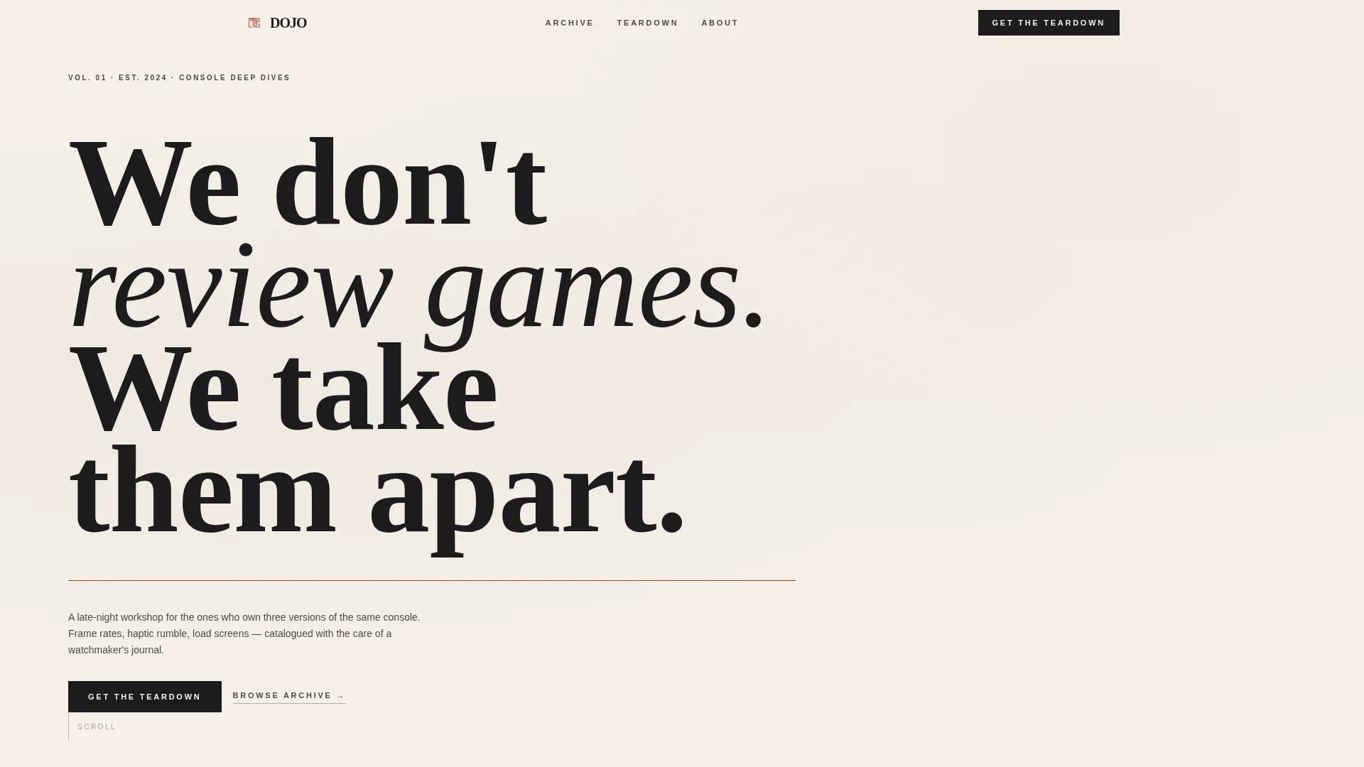
The hero occupies the entire screen with a tall condensed serif headline set in bamboo charcoal against shōji cream. A single thin vermillion horizontal rule sits below the text. An ink-absorption type reveal animation brings each line onto the screen with deliberate pacing. No photography, no background imagery. The negative space is the design.
Masonry Editorial Grid
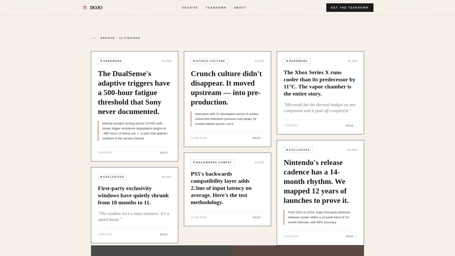
Cards are arranged in a Pinterest-style masonry layout. Each tile contains a thesis headline, a single supporting data point or pull quote, and a category tag chosen from Hardware, Exclusives, Backwards Compatibility, or Studio Culture. Tiles accumulate density as the visitor scrolls, creating a corkboard effect. Hover states reveal the vermillion accent color on card borders and tags.
Interstitial Data Cards
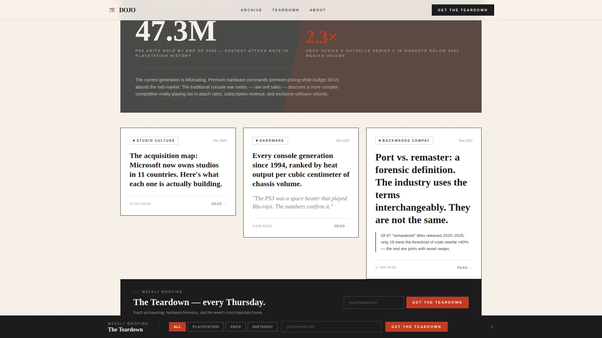
Periodic full-width cards break the masonry rhythm. These tiles present macro-level data visualizations styled as risograph prints using stone garden gray and torii vermillion. Topics include attach rates, generation timelines, and studio acquisition maps. They alternate the page's rhythm between intimate opinion and industry-scale analysis.
Infinite Scrolling Category Ticker
A marquee section beneath the hero scrolls category labels continuously. It signals editorial breadth at a glance and keeps the page feeling active without relying on video or heavy media assets.
"The Teardown" Lead Generation Flow
The sign-up mechanism appears twice: once as a slim inline banner between masonry rows three and four, and again as a persistent bottom bar that activates after sixty percent scroll depth. The form collects only an email address and a single platform toggle with four options: PlayStation, Xbox, Nintendo, or All. No name field, no password, no extra steps.
Sample Briefing Preview
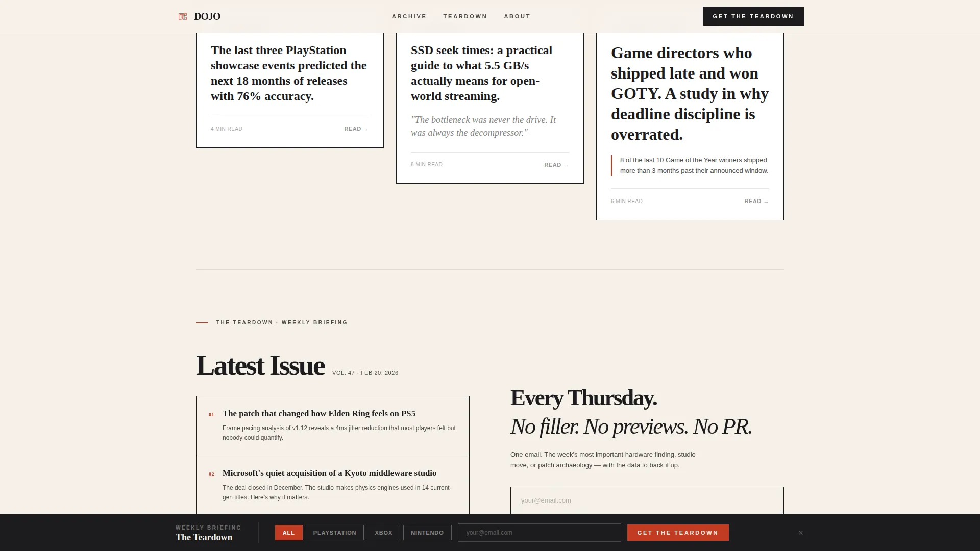
Directly above the final call-to-action, three headline-and-summary pairs from the latest edition of "The Teardown" are displayed. This preview demonstrates the briefing's value before asking for the visitor's email. It reduces hesitation by showing exactly what lands in the inbox.
Page sections overview
| Section | Purpose |
|---|---|
| Hero Manifesto | Sets editorial tone and brand voice with full-viewport typography and vermillion rule |
| Category Marquee | Scrolls category labels to signal editorial range without heavy media |
| Masonry Card Grid | Displays editorial tiles with headlines, pull quotes, and category tags in a density-building layout |
| Inline call to action Banner | Prompts email sign-up between masonry rows three and four with minimal friction |
| Interstitial Data Cards | Breaks grid rhythm with full-width data visualizations styled as risograph prints |
| Sample Teardown Preview | Shows three briefing headlines and summaries to prove value before the final ask |
| Final call to action Footer | Closes the page with the sign-up form and a persistent scroll-triggered bottom bar |
Design & branding system
The visual identity follows an Atelier Studio editorial theme built on a Japanese Zen color palette. Every color has an assigned role, and none of them drift from it.
- Shōji cream (#F5F0E8) covers backgrounds, giving the page the feel of handmade paper
- Bamboo charcoal (#1C1C1E) carries body text and card borders, while stone garden gray (#4A4A48) holds secondary labels and metadata
- Torii vermillion (#C23B22) appears only on hover states, active category tags, and notification pips, cutting through the neutral palette exactly when attention is needed
Typography pairs Fraunces as the condensed serif display face with DM Sans as the body typeface. The combination balances editorial weight with clean readability across long-form content tiles.
Mobile & speed optimization
The template is designed desktop-first, matching the reading habits of hardware-literate console enthusiasts who typically engage on large screens. Mobile layout is fully supported with responsive adjustments.
- Masonry columns reflow for smaller viewports, keeping card content legible without horizontal scrolling
- CSS-driven animations handle the type reveal, scroll observer reveals, and marquee to minimize render-blocking scripts
- Static content is prioritized in the layout structure, keeping the page fast to load before interactive elements initialize
How this template helps you convert
Every conversion element is positioned to reduce friction and build trust before the ask. The sign-up flow asks for almost nothing, and the preview section earns the request before it is made.
- The inline banner appears at the natural pause point between masonry rows three and four, catching readers while they are already engaged with the editorial content
- The sample briefing preview sits directly above the final call-to-action, letting the content speak for the newsletter before a visitor commits their email address
- The persistent bottom bar activates only after sixty percent scroll depth, targeting readers who have already demonstrated genuine interest rather than interrupting casual browsers
Other information about this template
This template is a strong fit for editorial teams who want their console gaming blog to feel like a publication, not a content feed. A few additional details worth knowing before you build with it.
- The footer follows the Vercel Horizontal Flow pattern (Pattern 3) for a clean, organized closing structure
- Social proof elements such as pull quotes, article counts, and reader statistics can be placed in card metadata fields throughout the masonry grid
- The page is localized for English-language, United States-centered gaming culture by default
- Color values, typefaces, and animation timing are all defined in the template and can be adjusted to match a different editorial brand if needed
- The platform toggle in the sign-up form supports four options out of the box: PlayStation, Xbox, Nintendo, and All
Theme
Atelier Studio
Creative direction
Industry Report
Color system
Japanese Zen
Style
Masonry/Pinterest
Direction
Lead Generation
Page Sections
Full-viewport Manifesto Hero
Masonry Editorial Grid with Hover States
Full-width Interstitial Data Cards
Dual-placement Lead Generation Flow
Sample Briefing Preview Block
Infinite Scrolling Category Ticker
Related questions
What kind of content works best in the masonry grid?
Can I change the color palette or typefaces?
How does the email sign-up form work?
Is this template suitable for mobile readers?
Do I need all my content ready before I can launch?



