Review & Comparison Site Reviews Website Template
Dossier is a single-column affiliate review landing page built for editorial credibility. It pairs a Cinematic Dark palette with warm amber accents, bold serif headlines, and a confession-then-evidence content rhythm. Every product section includes an editorial photo, an honest take, a pros and cons strip, a filling verdict bar, and a direct call-to-action button placed at peak conviction.
by Rocket studio
Quick summary
Dossier is an editorial-style affiliate review landing page that earns clicks by spending credibility first. It follows an Industry Report creative direction, using a Cinematic Dark color system and a single-column scroll flow. The page surfaces real testing data, admits product flaws, names what didn't make the cut, and guides readers toward a confident purchase click.
Who this template is for
This template is built for content creators and editorial publishers who monetize through affiliate links. It suits anyone whose audience arrives with research fatigue and needs one honest, definitive answer.
- Affiliate review writers and consumer product editors who want a page that reads like trusted editorial, not a sales pitch
- Budget-focused bloggers and hobbyist niche writers covering kitchen gear, photography equipment, or everyday essentials
- Independent publishers who want to build reader trust before asking for a click
What problem this template solves
Most affiliate pages look like what they are: commission-hungry lists with thin copy and generic superlatives. Readers with twelve tabs open learn to distrust them immediately. This template solves the credibility gap.
- It replaces vague "best of" framing with qualified verdicts, specific testing stats, and admitted flaws that signal real hands-on experience
- It removes friction from the click path by placing the call-to-action button directly beneath each verdict bar at the moment of maximum reader conviction
- It captures impatient readers with a sticky bottom bar that appears after the third product, letting them jump straight to the top pick without losing their place
What you get with this template
You get a complete, ready-to-adapt single-column landing page structured around seven product slots and an editorial confession-and-evidence rhythm. Every section is purposefully sequenced to build trust before it asks for a click.
- A moody Type Over Image hero with a bold serif headline, a methodology trust strip, three featured product review blocks, an Editor's Regret section, two splurge pick blocks, and an ultra-minimal footer
- Verdict progress bars animated with GSAP ScrollTrigger, staggered section reveals, a parallax hero effect, and a sticky bottom call-to-action bar
- The full Cinematic Dark design system using deep charcoal, smoked walnut, parchment cream, and warm amber, paired with Fraunces serif headlines and DM Sans body text
Feature list
This template is purpose-built for affiliate editorial work. Each feature below maps directly to a specific trust or conversion function in the page.
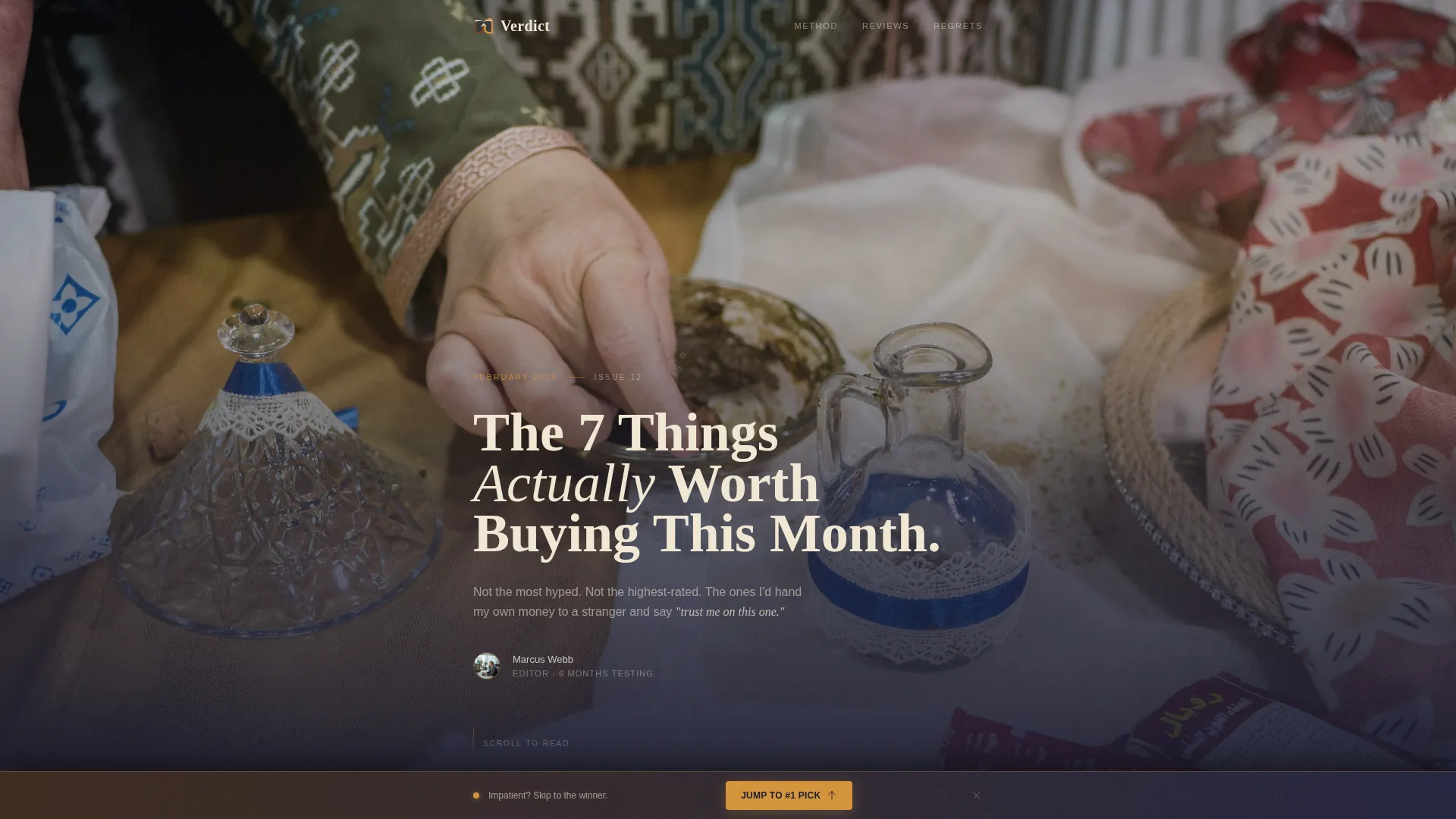
Type Over Image Hero Section
A moody, shallow-depth-of-field photograph of hands unpacking a product on a wooden desk anchors the hero. Bold Fraunces serif typography sits heavy across the frame, reading like a magazine cover that earns the reader's attention before the scroll begins.
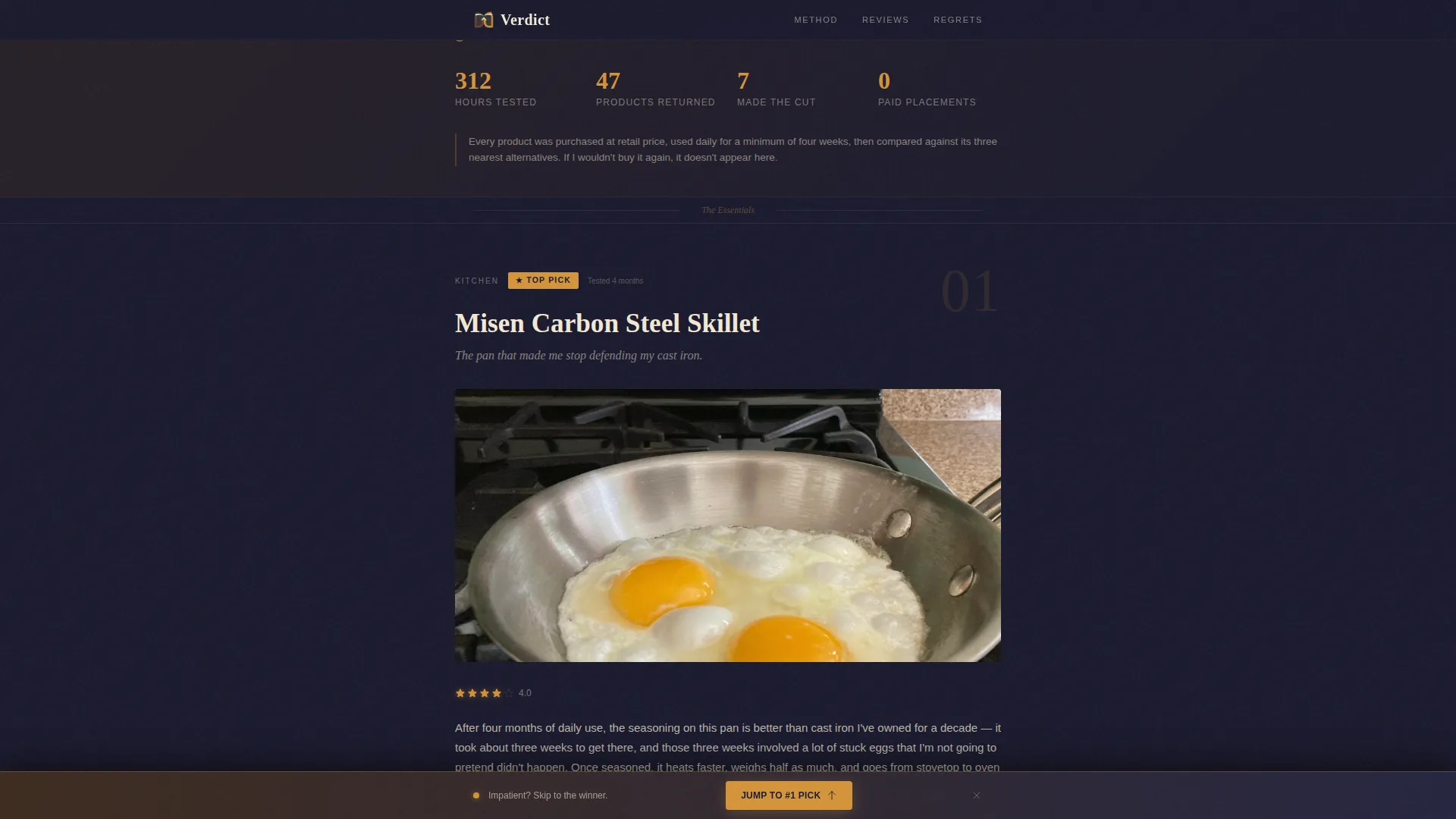
Methodology Trust Strip
A short statistics bar placed immediately after the hero states testing volume and return data in plain numbers. This section earns early credibility and signals to skeptical readers that the recommendations that follow are field-tested, not press-release sourced.
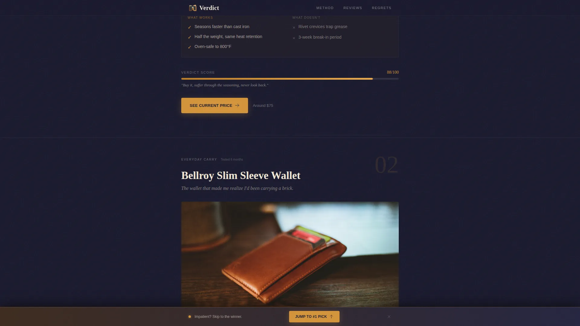
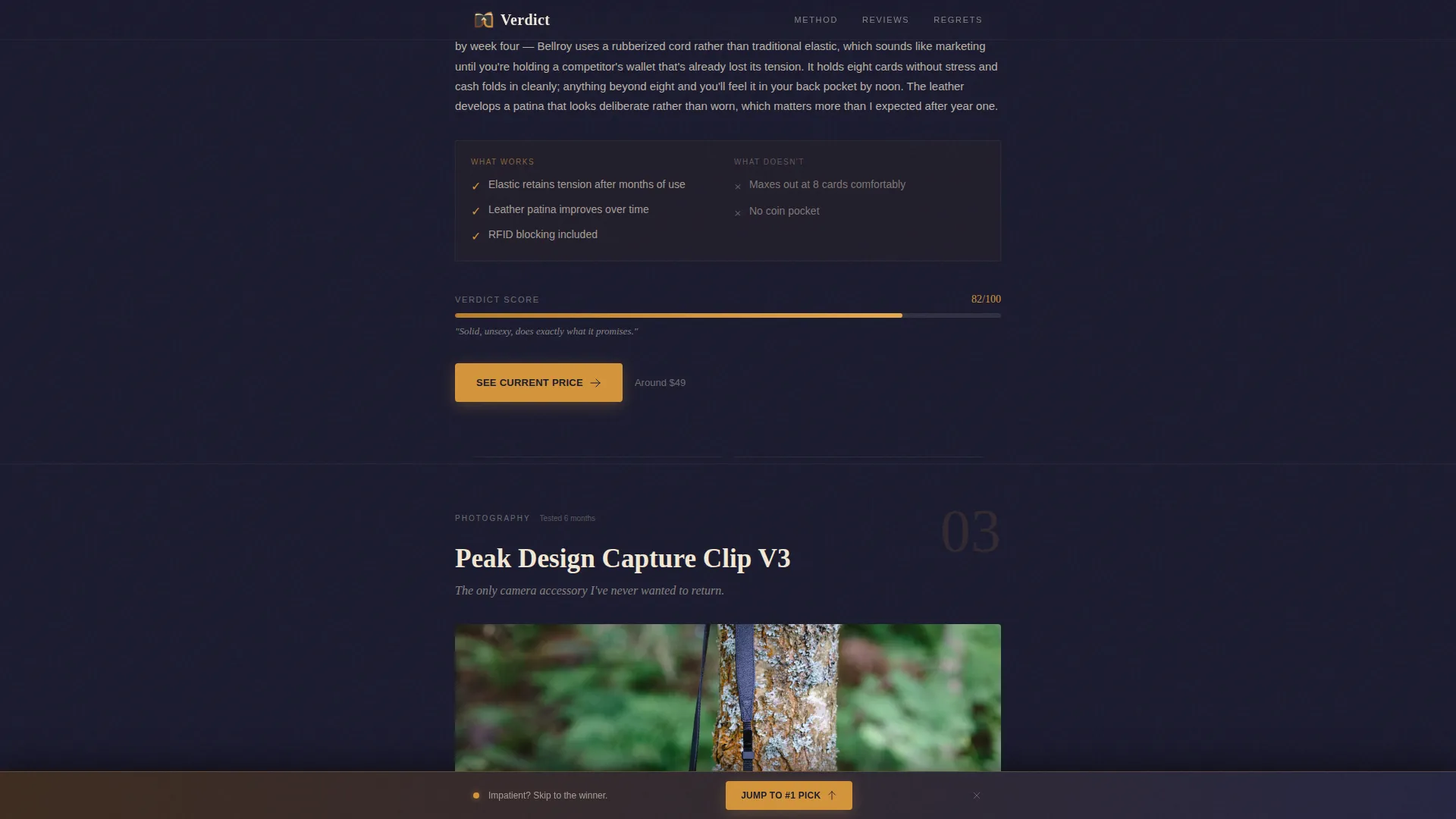
Product Review Blocks with Verdict Bars
Each of the five product blocks combines an editorial photograph, a three-sentence honest take, a pros and cons strip with handwritten-style checkmarks, and a verdict bar that fills like a progress meter on scroll. The warm amber call-to-action button labeled "See Current Price" sits directly beneath each verdict bar.
Editor's Regret Section
A dedicated sidebar-style section names the products that almost made the list and explains concisely why they were rejected. This section builds trust by showing the editorial process and signaling that inclusion is earned, not purchased.
Sticky Bottom Call-to-Action Bar
After the reader passes the third product block, a sticky bottom bar appears with a "Jump to #1 Pick" link. It serves impatient readers without disrupting the scroll experience for those reading through the full page.
Cinematic Dark Visual System
The full color palette of deep charcoal, smoked walnut, parchment cream, and warm amber is implemented across every section. Shadows are rich rather than harsh, highlights carry the warmth of tungsten film stock, and the amber accent is reserved strictly for star ratings, top-pick badges, and call-to-action buttons.
Page sections overview
| Section | Purpose |
|---|---|
| Hero image block | Opens with editorial authority and a bold serif headline |
| Methodology trust strip | Establishes credibility with real testing statistics |
| Featured product review #1 | Delivers first honest product take with verdict bar |
| Featured product review #2 | Continues confession-evidence rhythm, deepens trust |
| Featured product review #3 | Triggers sticky bar after this block loads |
| Editor's Regret section | Names near-misses and explains rejections openly |
| Splurge pick review #1 | Shifts stakes upward with higher-investment recommendation |
| Splurge pick review #2 | Closes the curated dossier before the footer |
| Ultra-minimal footer | Provides clean horizontal sign-off, no clutter |
Design & branding system
The visual identity follows a Warm Artisan theme expressed through a Cinematic Dark color system. The overall feel is a well-lit photograph taken in a candlelit workshop: shadows are deep and warm, never flat or cold.
- Color palette: deep charcoal (#1A1A2E) for backgrounds, smoked walnut (#3D2B1F) for layered surfaces, parchment cream (#F2E8D5) for body text and card backgrounds, and warm amber (#D4943A) reserved for star ratings, top-pick badges, and all call-to-action buttons
- Typography: Fraunces serif for all headlines, creating editorial weight and authority; DM Sans for body copy, keeping long-form reading comfortable and clear
- Animation layer: GSAP ScrollTrigger drives verdict bar fills, staggered section reveals, and a parallax effect on the hero image, adding cinematic motion without overwhelming the reading experience
Mobile & speed optimization
The template is built mobile-first, reflecting the primary audience of late-night shoppers browsing on their phones. Desktop layout adds editorial richness without sacrificing the core reading experience established at mobile breakpoints.
- Single-column flow keeps the content stack clean on small screens, with verdict bars, pros and cons strips, and call-to-action buttons all stacking naturally in reading order
- Server Components handle static content rendering, and client-side JavaScript is kept minimal so interactive elements like the sticky bar and verdict animations load without blocking the main content
- The sticky bottom call-to-action bar is designed to appear and dismiss cleanly on touch devices, avoiding interference with the scroll rhythm that drives engagement
How this template helps you convert
This template converts by earning trust before it asks for anything. The page never uses the word "best" without a qualifier, and it shows the rejection list openly. That editorial honesty is the conversion mechanism.
- Each product block places the warm amber "See Current Price" call-to-action button directly beneath the verdict bar, so the click arrives at the exact moment the reader has processed all the evidence and reached peak conviction
- The sticky bottom bar catches impatient readers who scroll fast, surfacing the top pick link after the third product block so no potential click is lost to scroll fatigue
- The Editor's Regret section functions as a conversion asset: naming rejected products removes buyer hesitation by pre-answering the "but what about..." question before the reader can open another tab
Other information about this template
This template is designed for the affiliate review site niche within the broader Blog and Editorial category. It fits naturally into the Review and Comparison Site subcategory and can serve any product vertical that benefits from editorial-format content commerce.
- The page structure supports a rolling monthly format, where the hero headline ("The 7 Things Actually Worth Buying This Month") and product slots can be updated each editorial cycle without rebuilding the layout
- No email gates or lead-capture forms are included by design; the entire conversion strategy is built around direct affiliate click-throughs, keeping the reader's path frictionless
- The footer uses an ultra-minimal horizontal pattern, keeping the end of the page clean and avoiding any visual noise that could distract from the final product blocks above it
Theme
Warm Artisan
Creative direction
Industry Report
Color system
Cinematic Dark
Style
Single Column Flow
Direction
Click-Through
Page Sections
Type Over Image Hero with Serif Headline
Methodology Trust Strip
Animated Verdict Bars Per Product
Pros, Cons, and Honest Take Format
Editor's Regret Rejection Section
Sticky Bottom Call-to-action Bar
Related questions
How many product review slots does this template include?
Can I update the product slots each month without redesigning the page?
Does this template include any forms or email sign-up gates?
What triggers the sticky bottom call-to-action bar?
Is this template suitable for product niches beyond kitchen gadgets or photography gear?


