Private Equity Newsletter Pre-Launch Website Template
Dossier is a private equity interview and profile newsletter landing page built for waitlist conversion. The asymmetric 60/40 grid, newspaper masthead header, and Ink & Paper color system create an editorial studio atmosphere. It proves content quality before asking for an email, guiding ambitious finance professionals toward a founding subscriber waitlist.
by Rocket studio
Quick summary
Dossier is a single-page waitlist landing page for a private equity interview newsletter. It uses an asymmetric 60/40 grid, a broadsheet masthead header, and a warm Ink & Paper palette to build editorial credibility. The page earns the reader's email by showcasing real interview excerpts and an editor's note before presenting any call to action.
Who this template is for
This template is built for newsletter founders and editorial teams who want to launch a finance publication with a waitlist-first strategy. It suits anyone who needs to demonstrate content quality to a skeptical, high-intent professional audience before asking for sign-ups.
- Associates at middle-market private equity firms who check their inbox early and demand substantive content
- MBA candidates and independent sponsors who want pattern recognition from candid practitioner conversations
- Emerging fund managers and newsletter creators launching a B2B finance media product with a founding subscriber model
What problem this template solves
Most finance newsletter pages lead with features or frequency. Dossier's template leads with the writing itself. It solves the trust gap between an unknown publication and a demanding professional audience by proving editorial quality first.
- Finance professionals distrust newsletters that aggregate deal announcements rather than offering original insight
- A generic sign-up page cannot convey editorial tone, voice, or depth to readers who have high standards
- Waitlist pages for niche publications often lack social proof mechanisms that feel credible without being fabricated
What you get with this template
You get a complete single-page layout that guides a reader from curiosity to conversion through a structured editorial narrative. Every section serves a specific trust-building role before the call to action appears.
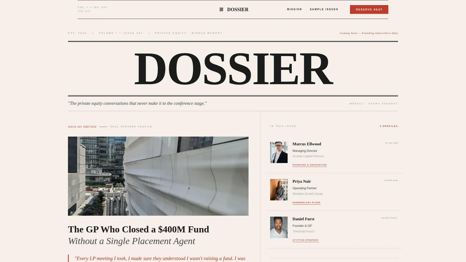
- A newspaper masthead hero with a 60/40 asymmetric grid featuring a featured interview excerpt and stacked editorial profile thumbnails
- Three formatted sample issue sections with typographic pull quotes, an editor's note section with photograph placeholder, and two waitlist form placements
- A live waitlist counter for social proof, a single email field with no multi-step friction, and a minimal footer using a horizontal flow pattern
Feature list
This template is built around a small set of purposeful components. Each one earns its place by moving the reader one step closer to subscribing.
Asymmetric 60/40 Hero Grid
The hero splits into a dominant 60-percent column for a featured interview excerpt and a 40-percent column for three stacked editorial profile thumbnails. Names, titles, and fund sizes are visible at a glance, creating immediate credibility.
Newspaper Masthead Header
"DOSSIER" renders in a high-contrast display serif at heroic scale. A dateline, volume number, and editor's note subhead frame the publication as a serious, recurring editorial product from the very first scroll position.
Sample Issue Sections with Pull Quotes
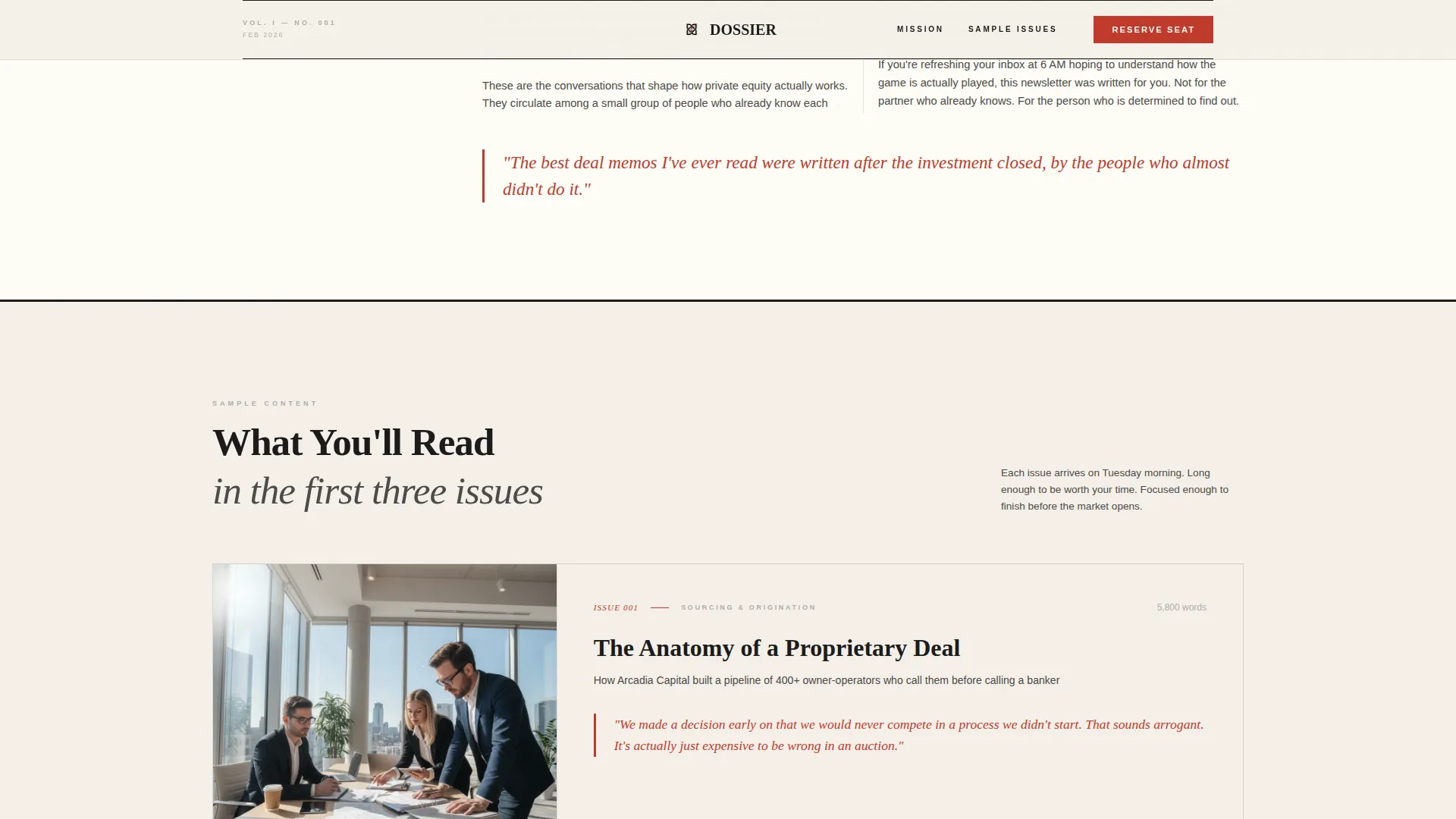
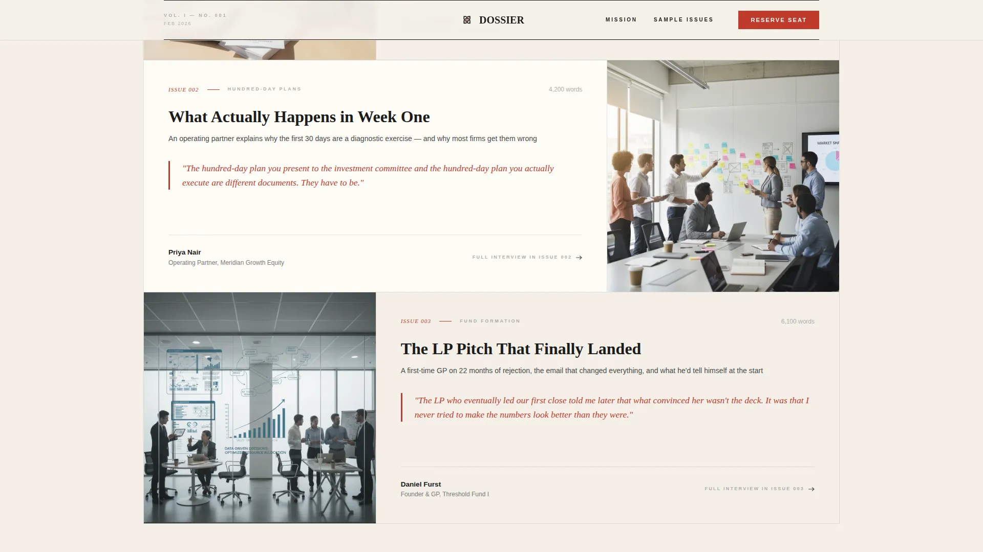
Three interview excerpt blocks are formatted as actual newsletter issues. Typographic hierarchy is maintained throughout, and pull quotes are highlighted in manuscript red to give readers a direct taste of the editorial voice.
From the Editor Section
A dedicated section holds a photograph placeholder and a personal note on access and editorial independence. This humanizes the publication and reinforces that the content comes from a real editorial relationship, not aggregation.
Dual Waitlist Form Placement
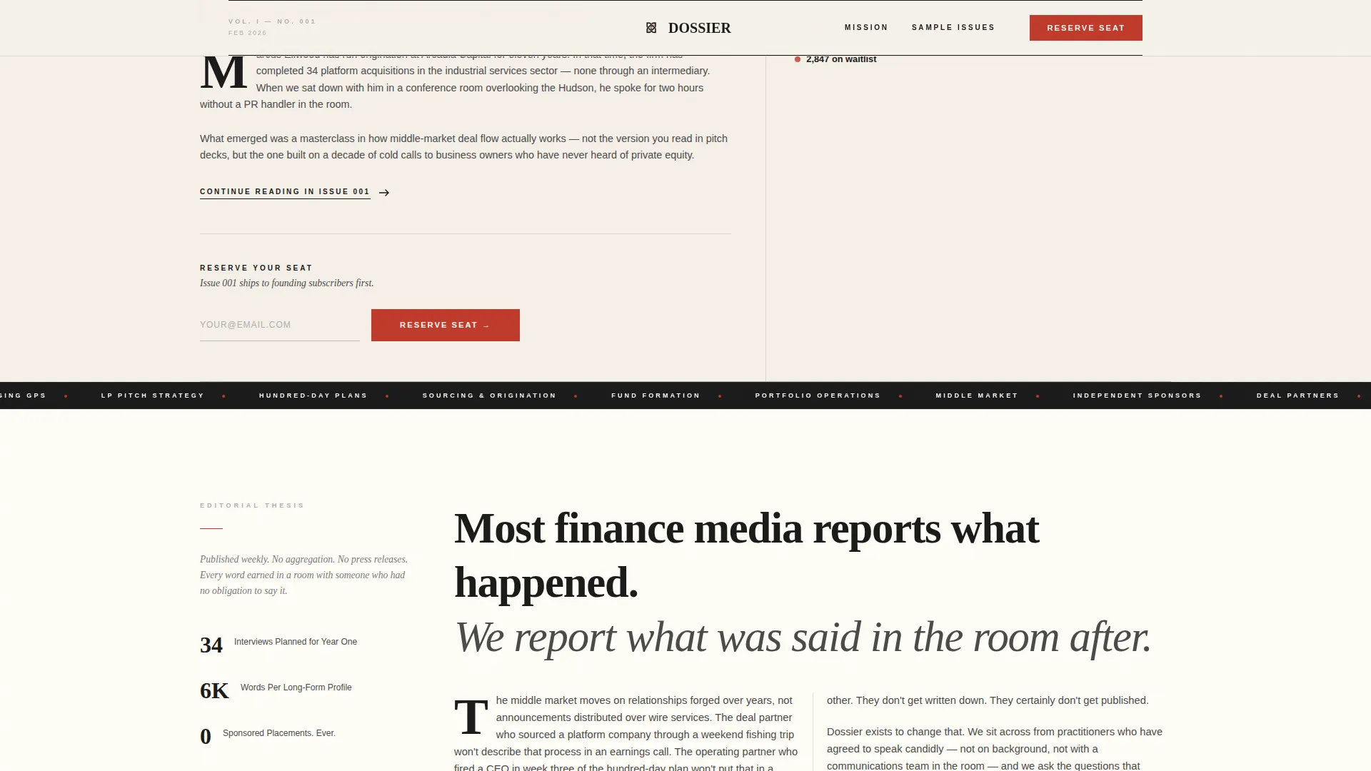
The email capture form appears twice: once below the masthead and once after the sample content. Each instance uses a single email field, a "Reserve Your Seat" call to action, and a secondary line noting that founding subscribers receive Issue 001 first.
Waitlist Counter Social Proof
A small counter displays the current waitlist number alongside the form. It creates urgency and community signal without requiring fabricated testimonials or invented statistics.
Page sections overview
| Section | Purpose |
|---|---|
| Newspaper Masthead Hero | Sets editorial tone and displays the 60/40 featured excerpt plus profile thumbnails |
| First Waitlist Form | Captures early email interest directly below the hero fold |
| Editorial Thesis | Explains why these conversations matter in a broadsheet column format |
| Sample Issue One | Showcases first interview excerpt with pull quote and typographic hierarchy |
| Sample Issue Two | Showcases second interview excerpt with pull quote and typographic hierarchy |
| Sample Issue Three | Showcases third interview excerpt with pull quote and typographic hierarchy |
| From the Editor | Photograph and personal note on access and editorial independence |
| Second Waitlist Form | Converts readers warmed by content with counter social proof |
| Minimal Footer | Horizontal flow footer pattern with essential navigation links |
Design & branding system
The design follows an Atelier Studio editorial direction. Every visual decision references the weight and warmth of print media rather than digital finance conventions. Generous whitespace does the structural work that most pages assign to gradients or photography.
- Color palette: editorial black (#1A1A1A) for headlines, warm parchment (#F5F0E8) and soft ivory (#FFFDF7) for alternating backgrounds, pencil graphite (#4A4A4A) for body text, and manuscript red (#C0392B) reserved exclusively for pull quotes, issue numbers, and the waitlist button
- Typography: Fraunces display serif for all headings and pull quotes, DM Sans for body text and form labels, maintaining a clear print-to-screen hierarchy
- Interactive details include hover states on editorial profile thumbnails, scroll-triggered GSAP reveals for staggered text, and pull quote animations that reward attentive reading
Mobile & speed optimization
The template is designed desktop-first to serve the primary audience of professionals reading at their desks early in the morning. It also provides full mobile support so the page remains readable across all screen sizes.
- The asymmetric 60/40 grid collapses gracefully into a single-column layout on smaller screens without losing the editorial hierarchy
- Server Components handle static content rendering, and JavaScript is scoped only to GSAP animations and the interactive waitlist form, keeping the page light
How this template helps you convert
The conversion strategy is built on earning trust before making any request. The page never presents a form without first proving the value of what the reader is being asked to join.
- The masthead and hero excerpt establish editorial credibility immediately, giving the reader a reason to keep scrolling rather than bouncing
- Three sample issue sections formatted as real newsletter content demonstrate voice and depth, removing doubt about whether the publication delivers on its promise
- The second waitlist form appears only after the reader has experienced the full editorial arc, so the "Reserve Your Seat" call to action lands at the moment of highest intent
Other information about this template
This template is categorized under Blog and Editorial, with a Private Equity Newsletter subcategory, and is purpose-built for the Private Equity Interview and Profile Newsletter niche. It is a strong fit for newsletter founders who want a launch page that reflects the seriousness of their editorial mission.
- The Intersection Match Score for this template is 13, indicating a tight alignment between the Blog and Editorial category and the private equity newsletter niche
- The footer uses a Pattern 3 Vercel Horizontal Flow layout, keeping the bottom of the page clean and minimal without sacrificing navigation utility
- Localization defaults are set to English, USD currency references, and US date format, matching the primary audience geography
- The template ships as an asymmetric grid layout under the Atelier Studio theme with the Ink & Paper color system, making it straightforward to identify in any template marketplace or library
Theme
Atelier Studio
Creative direction
Vision & Mission
Color system
Ink & Paper
Style
Asymmetric Grid (60/40)
Direction
Waitlist/Coming Soon
Page Sections
Asymmetric 60/40 Hero Grid
Newspaper Masthead Header
Sample Issue Sections with Pull Quotes
From the Editor Section
Dual Waitlist Form Placement
Waitlist Counter Social Proof
Related questions
Does this template include a working email capture form?
Can I customize the color palette and typography?
Who is the ideal person to use this template?
Is the waitlist counter connected to a live data source?
Does the page display well on mobile devices?



