Minimal Living Newsletter Landing Page Template
Downsize is a landing page template built for a tiny house living newsletter. It uses an asymmetric 60/40 grid and a manifesto-style editorial flow to build conviction before asking for a click. The Soft Mist color palette, oversized serif type, and scroll-triggered declarations create a calm, intentional reading experience that earns the subscription before requesting it.
by Rocket studio
Quick summary
Downsize is a click-through landing page template designed for a weekly newsletter about tiny house living. The layout follows an asymmetric 60/40 grid where manifesto declarations occupy the wide column and supporting artifacts fill the narrow one. The page earns the reader's trust through conviction and proof before presenting a single subscription button.
Who this template is for
This template suits newsletter creators, independent writers, and editorial brands in the lifestyle and minimalism space. It works best when the goal is to convert a skeptical reader through storytelling rather than feature lists.
- Newsletter writers covering tiny house living, minimalism, or intentional lifestyle topics
- Independent content creators launching or repositioning a weekly letter with a strong editorial voice
- Early-stage media brands that want a focused, philosophy-first landing page with zero friction at the conversion point
What problem this template solves
Most newsletter landing pages list features and ask for an email address before the reader feels anything. For a niche like tiny house living, that approach misses the point entirely. The reader needs to feel the philosophy before they commit.
- Generic newsletter pages fail to build emotional resonance, so readers bounce before they reach the call to action
- Multi-field sign-up forms create friction that kills momentum when a reader is finally ready to subscribe
- Standard grid layouts cannot carry the editorial weight of a manifesto-style voice without feeling cluttered or unbalanced
What you get with this template
You get a fully structured single-page layout with five clearly defined sections, a consistent design system, and a single call-to-action button wired for a one-click subscription flow. Every component is built to support the manifesto editorial rhythm described in the creative brief.
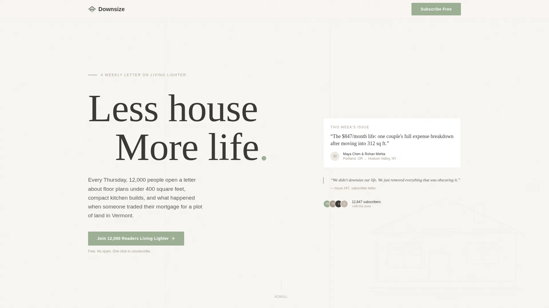
- A hero section with oversized serif type, a faint pencil-line illustration, and a primary call-to-action button placed immediately below the manifesto headline
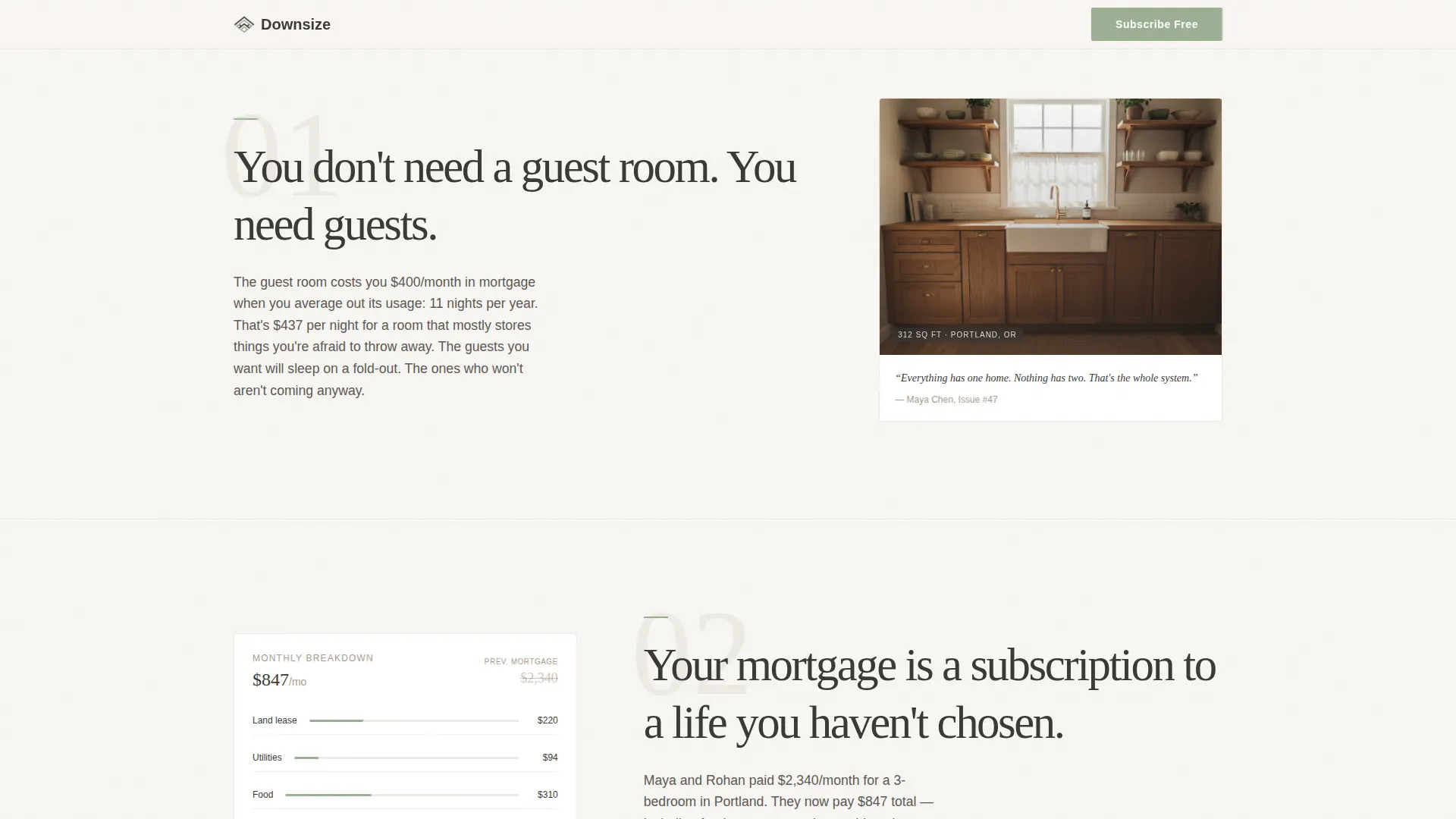
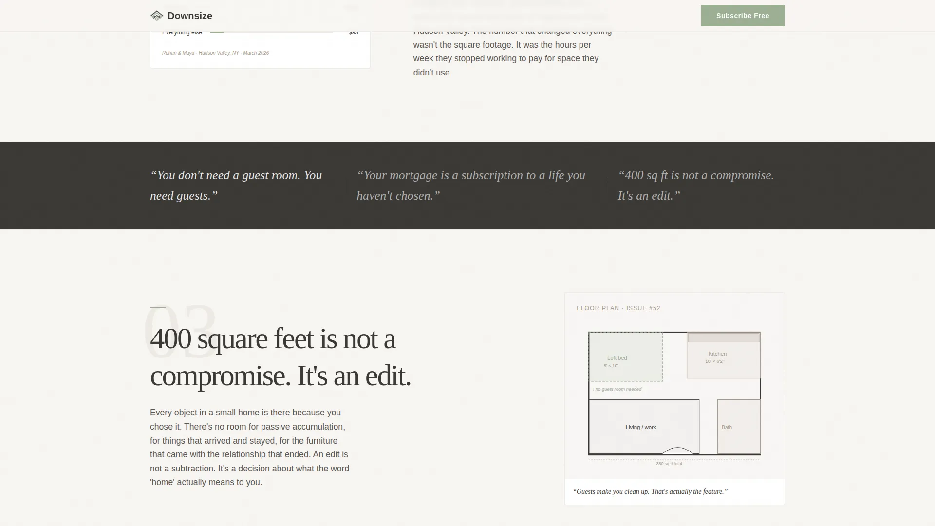
- Three declaration sections, each pairing a bold conviction statement in the 60-column with a visual proof artifact in the 40-column, covering a compact kitchen photo, a subscriber expense breakdown, and an annotated floor plan
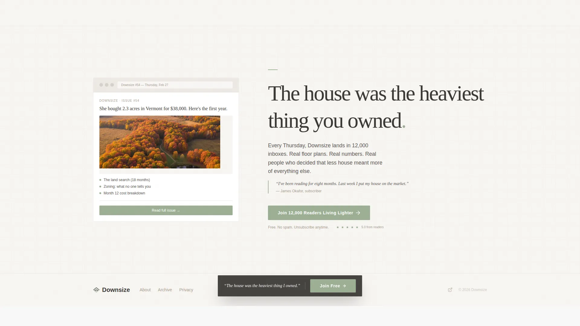
- A final call-to-action section anchored by a newsletter screenshot and the "Join 12,000 Readers Living Lighter" button, plus an extreme minimal footer
Feature list
This template ships with a set of purposeful, prompt-defined components that work together as a complete editorial landing page.
Asymmetric 60/40 Grid Layout
The page is structured on a deliberate 60/40 column split. Declarations and manifesto copy occupy the wider left column. Supporting visual artifacts occupy the narrower right column. The rhythm stays consistent across every declaration section, giving the page an editorial coherence that generic centered layouts cannot match.
Manifesto Declaration Sections
Each of the three middle sections is built around a single bold conviction statement. The statement dominates the 60-column, while the 40-column holds a concrete artifact, a photograph, a real expense breakdown, or a hand-annotated floor plan. This conviction-then-proof rhythm is hardwired into the section structure.
Single-Button Click-Through Flow
There are no form fields anywhere on this page. The primary call-to-action button appears three times: below the hero headline, floating after the third declaration, and anchored at the bottom beside the newsletter screenshot. Each placement is designed to catch the reader at the precise moment conviction peaks.
Scroll-Linked Animation System
The template includes scroll-triggered declaration reveals and staggered text animations. A cursor-responsive parallax effect is built into the hero section. Floating micro-interactions are layered across the page to reward attentive reading without distracting from the copy.
Soft Mist Branding System
The color system uses four values: morning fog white (#F7F5F2), weathered cedar (#A89B8C), charcoal linen (#3B3936), and muted sage (#9CAF94). Sage appears exclusively on buttons and pull-quotes. The palette is warm, grounded, and intentional, never cold or decorative for its own sake.
Faint Illustration Hero Element
A pencil-line cross-section illustration of a tiny house sits beneath the hero headline. It bleeds softly upward in a near-watermark opacity. It does not compete with the type. It rewards readers who pause.
Page sections overview
| Section | Purpose |
|---|---|
| Hero Manifesto Header | Anchors editorial voice with oversized type and primary call to action |
| Declaration One | Pairs "guest room" conviction with a compact kitchen photo artifact |
| Declaration Two | Pairs "mortgage" conviction with a real subscriber expense breakdown |
| Declaration Three | Pairs "400 sq ft" conviction with an annotated floor plan |
| Final Call to Action | Closes with newsletter screenshot and subscription button |
| Extreme Minimal Footer | Provides clean page close with no distraction |
Design & branding system
The visual identity follows a Luxe Minimal theme that feels editorial and grounded rather than decorative. Typography is set in Fraunces for serif headlines and Manrope for body copy and interface elements. The combination delivers warmth and clarity without visual noise.
- Color system: fog white (#F7F5F2) as the base, charcoal linen (#3B3936) for body text, weathered cedar (#A89B8C) for supporting elements, and muted sage (#9CAF94) reserved exclusively for buttons and pull-quotes
- Typography: Fraunces oversized serif for manifesto headlines creates immediate editorial authority; Manrope keeps supporting copy clean and readable at every size
- The faint pencil-line illustration in the hero section reinforces the handcrafted, intentional quality of the brand without adding visual clutter
Mobile & speed optimization
The page is built desktop-first around the 60/40 asymmetric grid, with a responsive stack that collapses gracefully for mobile viewports. The structure is static by design, using server components and minimal JavaScript to keep the experience fast and stable across devices.
- On mobile, the 60/40 columns stack vertically so declarations appear above their corresponding artifacts, preserving the conviction-then-proof reading order
- Scroll-linked animations and parallax effects are scoped to avoid layout shifts or performance issues on smaller screens
- The single-button conversion model removes all form-rendering overhead, keeping the page lightweight on every device
How this template helps you convert
The page is engineered around one goal: making the reader feel the philosophy before they are asked to act on it. Every layout decision, copy rhythm, and button placement serves that goal.
- The manifesto header creates an immediate emotional anchor. The reader understands the worldview within seconds of arriving, which lowers resistance before any subscription ask is made.
- The conviction-then-proof rhythm across three declaration sections builds a cumulative case. By the time the floating call-to-action button appears after the third declaration, the reader has already been walked through the argument in full.
- The final section pairs the newsletter screenshot with the primary button so the reader sees exactly what they are subscribing to at the exact moment they are most persuaded.
Other information about this template
This template is designed specifically for the tiny house living newsletter niche, where audience trust depends on editorial authenticity rather than promotional tactics. The page does not try to sell features. It sells a way of seeing.
- The creative direction is classified as Manifesto, meaning the scroll experience builds a belief system rather than revealing product features one by one
- The landing page is structured for click-through conversion to an external subscription platform, making it compatible with newsletter hosting services in this space
- Social proof is built into the page structure through the 12,000-subscriber count in the call-to-action copy, the real expense breakdown artifact in Declaration Two, and the newsletter screenshot in the final section
- The footer uses Pattern 4 (Superhuman Extreme Minimal), which strips the closing section to its bare essentials and keeps full attention on the subscription moment above it
- The template is suited to the Blog and Editorial category, with a specific focus on tiny house living content as the subcategory niche
Theme
Luxe Minimal
Creative direction
Manifesto
Color system
Soft Mist
Style
Asymmetric Grid (60/40)
Direction
Click-Through
Page Sections
Asymmetric 60/40 Editorial Grid
Manifesto Declaration Sections
Single-button Click-through Flow
Scroll-linked Animation System
Soft Mist Color System
Faint Pencil-line Hero Illustration
Related questions
Does this template include a sign-up form?
How many times does the call-to-action button appear on the page?
Can I replace the manifesto declarations with my own copy?
What fonts does this template use?
What type of newsletter is this landing page template designed for?



