Editorial Menswear Coming Soon Landing Page
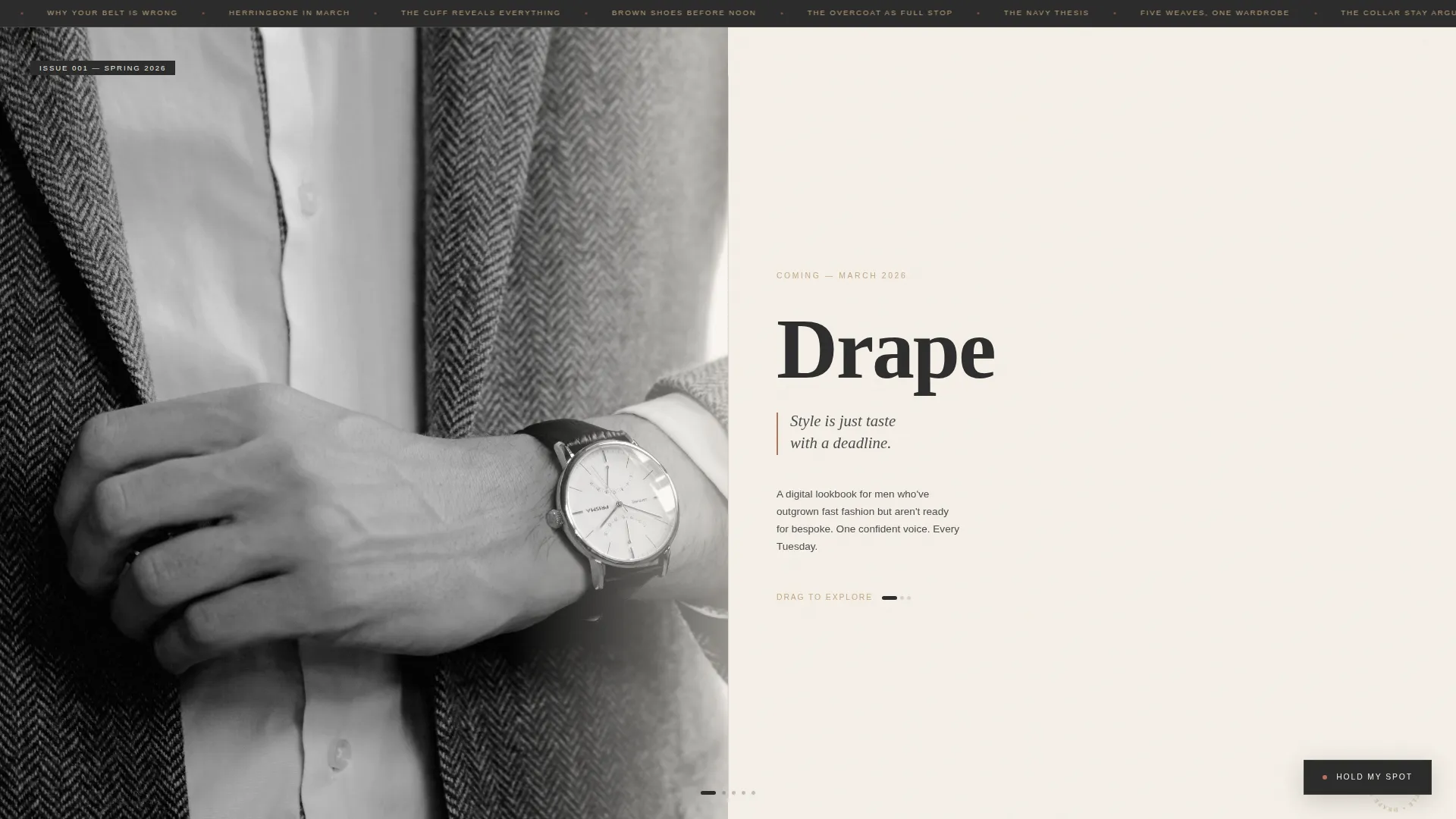
Drape is a horizontal scroll landing page built for a men's style editorial blog. It combines a half-page black-and-white hero photograph, a curated gallery walk through three editorial content rooms, and a fixed "Hold My Spot" waitlist form. The design feels like a heavyweight print magazine, unhurried, tactile, and confident in its voice.
by Rocket studio
Quick summary
Drape is a coming-soon landing page for a men's style editorial blog. It uses horizontal scroll to guide visitors through a gallery of curated content previews, flat-lay wardrobes, fabric swatches, and annotated street-style photography. A fixed waitlist form with a style-preference toggle captures founding reader signups before launch.
Who this template is for
This template is built for writers, editors, and creative professionals launching a men's style publication with a strong editorial point of view. It suits anyone who wants their blog's first impression to feel like a curated print spread rather than a standard coming-soon page.
- Men's style bloggers and content creators building a founding reader list before launch
- Editorial teams or solo writers positioning a fashion blog above the fast-fashion conversation
- Style-focused creatives who want a horizontal scroll landing page that leads with craft and restraint
What problem this template solves
Most coming-soon pages feel like placeholders. They use a countdown clock, a vague headline, and a generic email field that gives readers no reason to stay. That approach does not work for editorial brands, where voice and visual quality are the entire value proposition.
- A generic waitlist page cannot communicate editorial quality before launch
- Flat vertical layouts do not give content previews the deliberate pacing they deserve
- No style-preference capture means launch-day content cannot feel personally relevant to new readers
What you get with this template
You get a fully structured horizontal scroll landing page with five editorial rooms plus a minimal footer. Every section is built from the source brief and delivers a specific function in the reader's journey from arrival to signup.
- A half-page black-and-white hero with sharp serif editorial typography and a fixed "Hold My Spot" call to action
- Three gallery rooms covering a capsule wardrobe flat-lay, a fabric swatch comparison grid, and an annotated street-style triptych
- A dedicated waitlist room with an expandable email form, a style-preference toggle (minimal, classic, adventurous), and a scarcity line for founding readers
Feature list
This template delivers editorial design and interactive features that are grounded in the source brief. Each capability below is present in the described build.
Horizontal Scroll Gallery Walk
The page moves visitors through discrete editorial rooms using a horizontal scroll layout. Each room focuses on one content pillar. Generous negative-space gutters between rooms give the scroll a gallery-paced rhythm rather than a hurried feed.
Half-Page Hero Composition
The opening section splits into two equal halves. The left side holds a high-contrast black-and-white photograph focused on a man's hand adjusting a watch strap against a herringbone blazer. The right side carries the blog name in a sixty-point serif, an italic tagline, and a launch date in small caps.
Fixed Expandable Waitlist Form
A "Hold My Spot" button stays fixed in the bottom-right corner across all scroll positions. On click, it expands to reveal a single email input field and a style-preference toggle with three options: minimal, classic, and adventurous. This lets subscribers indicate their taste before the first issue drops.
Style-Preference Toggle
The toggle inside the waitlist form lets readers self-select a style personality at signup. This means launch-day content delivery can feel relevant from the first send, rather than generic.
Annotated Editorial Rooms
Each gallery room uses a distinct presentation format. Room one uses handwritten-style label annotations over a capsule wardrobe flat-lay. Room two displays a close-up fabric swatch grid comparing weaves. Room three presents a street-style triptych with art director markup drawn directly on the photographs.
Minimal Superhuman Footer
The footer follows a centered minimal pattern with social links and copyright. It keeps the close of the page as restrained as the rest of the design, without adding navigation or promotional clutter.
Page sections overview
| Section | Purpose |
|---|---|
| Hero: Photo + Text | Establish editorial identity with a half-page B&W photograph and sharp serif typography |
| Gallery Room One | Preview the capsule wardrobe content pillar with flat-lay and handwritten annotations |
| Gallery Room Two | Showcase fabric knowledge through a close-up weave swatch comparison grid |
| Gallery Room Three | Demonstrate editorial voice via an annotated street-style triptych |
| Waitlist Signup Room | Capture founding reader emails with style-preference toggle and scarcity copy |
| Minimal Footer | Close the page with centered social links and copyright in a restrained layout |
Design & branding system
The visual identity follows an Ink and Paper theme built around a Warm Stone color system. The palette references the feel of a linen-bound notebook left in afternoon sun, cream pages slightly yellowed, ink dried but still present, the spine cracked from use. Typography pairs Fraunces for editorial serif weight with DM Sans for interface and body copy.
- Colors: unbleached cotton (#F5F0E8) for backgrounds, charcoal editorial ink (#2C2C2C) for text, sandstone warmth (#C4A882) for accents, and muted terracotta (#B5705A) reserved for hover states and pull-quote details
- Typography: Fraunces handles display headings and pull-quotes at editorial scale; DM Sans handles labels, toggles, and body copy at readable weights
- Texture and restraint: terracotta appears sparingly, like a wax seal on an envelope, while backgrounds stay in the cotton-to-sandstone range throughout
Mobile & speed optimization
The template is built desktop-first to support the horizontal scroll gallery experience. A mobile fallback converts the horizontal room layout to a vertical scroll sequence so the content remains accessible on smaller screens.
- Horizontal scroll is the primary desktop experience; vertical fallback preserves all gallery rooms on mobile
- Animations use CSS smooth scroll, scroll-linked fade reveals, and a marquee element without relying on heavy external libraries
- The expandable waitlist form and style-preference toggle are interactive components built for both pointer and touch input
How this template helps you convert
The template earns reader trust before asking for anything. By the time a visitor reaches the waitlist form, three editorial rooms have already demonstrated the quality and tone of the publication. The fixed call to action stays present without being intrusive.
- The "Hold My Spot" button stays fixed in the bottom-right corner across all scroll positions, so the signup option is always one click away without interrupting the editorial experience.
- The style-preference toggle at signup makes the ask feel personal rather than transactional, and the "First 500 get the founding reader edit" scarcity line creates a clear, earned incentive to act now.
Other information about this template
This landing page is one of the more considered coming-soon templates available for editorial and fashion blog projects. A few practical details worth noting before you start customizing.
- The template is categorized under Blog and Editorial, with a Fashion and Beauty Blog subcategory, specifically built for a Men's Style Blog niche
- The Ink and Paper theme and Warm Stone color system are applied consistently across all six sections, so replacing placeholder photography maintains the palette automatically
- The intersection match score for this template's combination of creative direction, header concept, color system, and landing page direction is 13, indicating a tightly aligned build for this use case
- The footer pattern follows a Superhuman Minimal layout: centered social icons and copyright text only, with no navigation or secondary calls to action
Theme
Ink & Paper
Creative direction
Gallery Walk
Color system
Warm Stone
Style
Horizontal Scroll
Direction
Waitlist/Coming Soon
Page Sections
Horizontal Scroll Gallery Walk
Half-page Hero Composition
Fixed Expandable Waitlist Form
Style-preference Toggle at Signup
Annotated Editorial Gallery Rooms
Minimal Centered Footer
Related questions
Can I change the style-preference toggle options?
Does the horizontal scroll work on mobile phones?
Can I replace the placeholder photography in the gallery rooms?
Is this template only suitable for a coming-soon launch?
What fonts does this template use?



