Van Life Blog Masonry Landing Page Template
Drift is a masonry-style van life blog landing page built for storytellers on the road. It opens with a bold serif headline on a clean white field, then unfolds a progressive grid of journal cards that pull readers deeper into an origin story. Every card links to a full post, and a warm gold call-to-action invites visitors to start reading from the very first entry.
by Rocket studio
Quick summary
Drift is a single-page van life blog landing page with a masonry grid layout that fills like a life taking shape. It opens on a massive centered headline, drops readers into a scrolling origin story, and earns every click through atmosphere and momentum rather than hard selling.
Who this template is for
This template is built for writers and creators in the van life and slow-travel space who want their blog to feel as considered as the life they are documenting. It works equally well for someone just starting out and someone with dozens of posts already written.
- Nine-to-fivers and weekend planners who are building toward a van life transition and want a home for their early writing
- Couples or solo travelers who have already started the journey and need a landing page that captures the story so far
- Minimalism and slow-travel writers who want their content to feel editorial and personal rather than commercial
What problem this template solves
Most blog templates treat every post the same way: a list, a thumbnail, a date. That approach kills narrative momentum. Drift solves the specific problem of making a content archive feel like a story worth entering, not a database worth browsing.
- Readers arrive with no context and leave without clicking because nothing pulls them in with a sense of journey
- A flat grid treats a first-entry post the same as a recent one, losing the origin story that makes van life content compelling
- Generic layouts offer no emotional signal to tell a reader: this life is already in motion, and you need to catch up
What you get with this template
You get a fully structured, single-page blog landing page that leads with editorial presence and converts through story. Every section is intentional, and every design choice serves the reader's sense of being invited into something real.
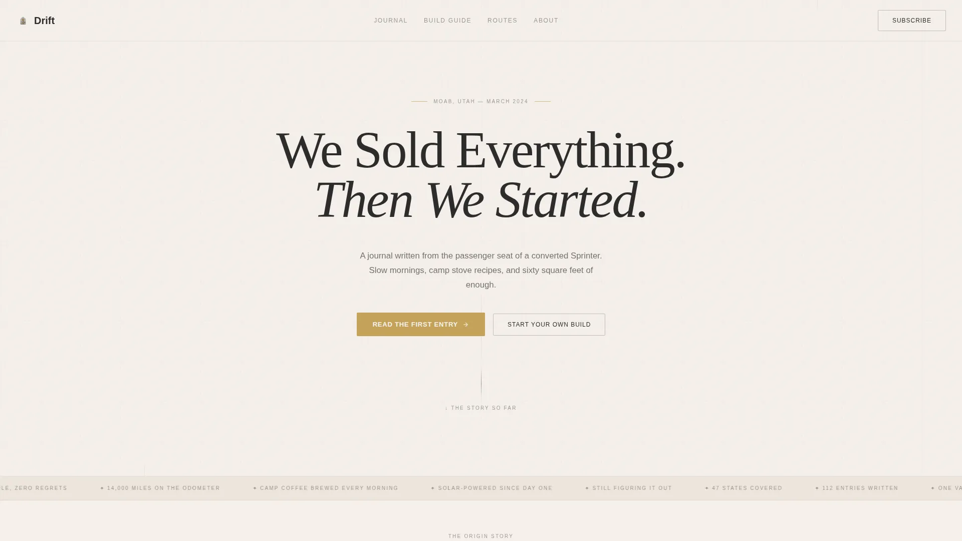
- A hero section with a large centered serif headline, a location dateline in small caps, and a tatami-gold call-to-action button pinned at the fold
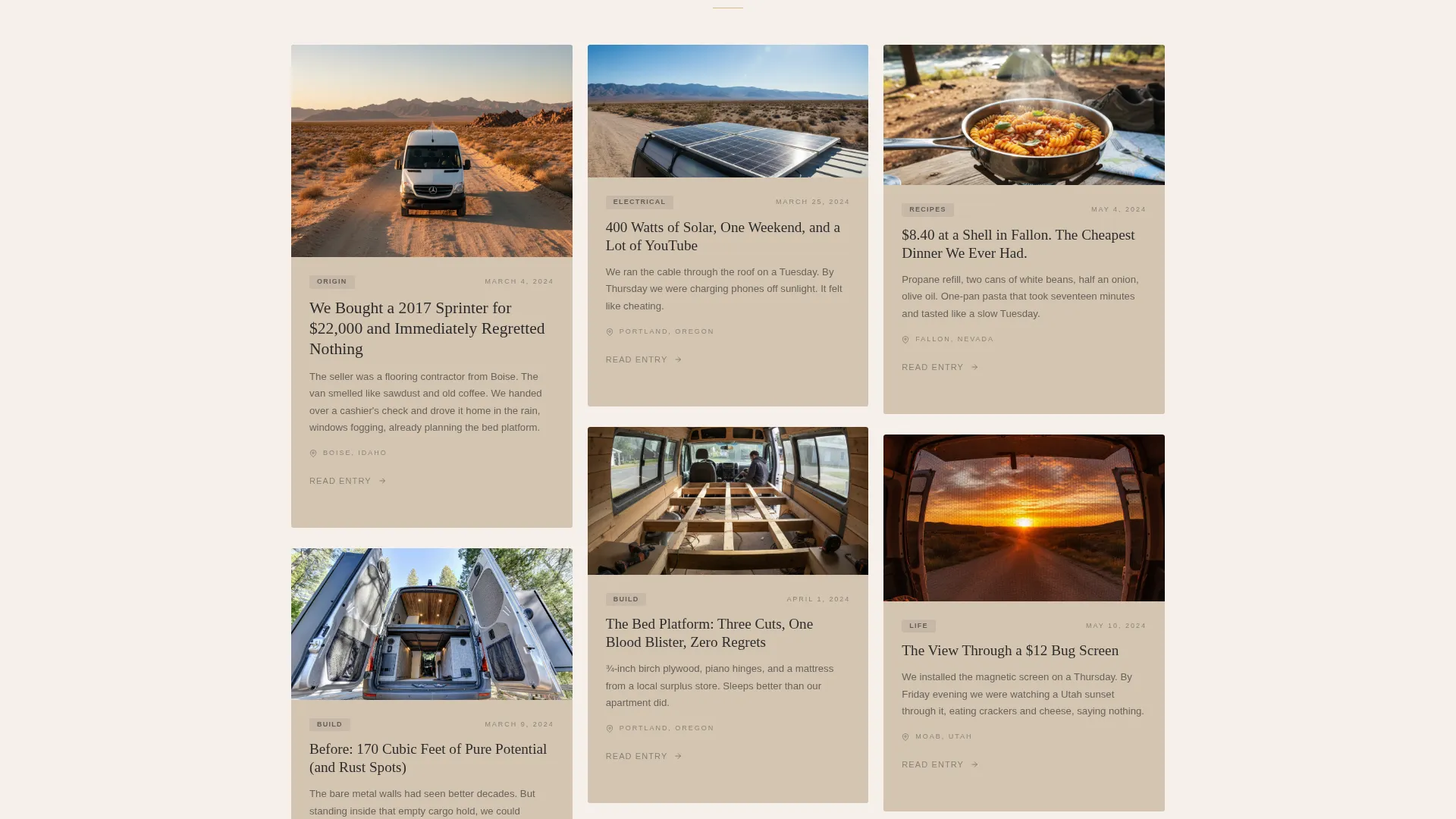
- A progressive masonry grid that builds from one card to two to three per row, mimicking a story unfolding in real time
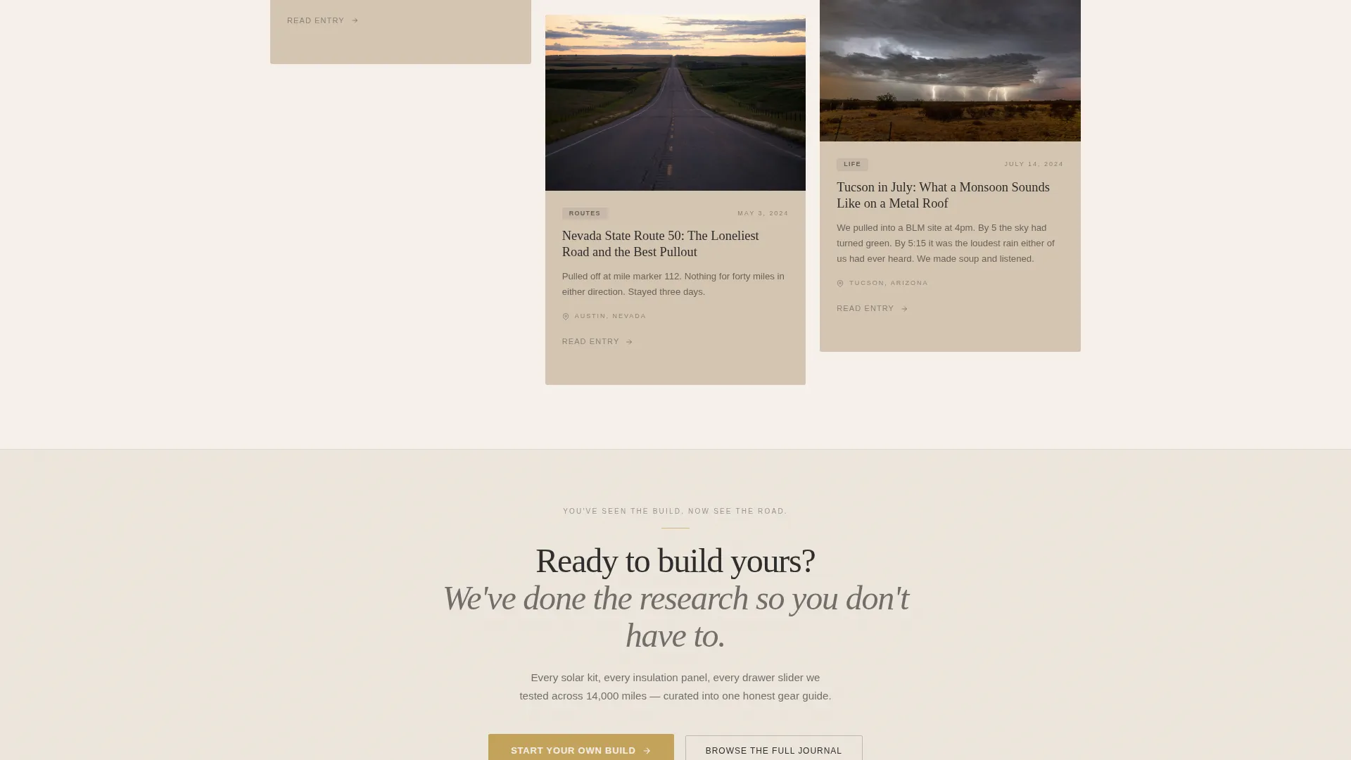
- A mid-grid secondary call-to-action break after the sixth row, plus a minimal footer in the linear Pattern 1 style
Feature list
This template is built around a core set of purposeful layout and interaction features drawn directly from the Drift brief.
Progressive Masonry Grid
The grid starts with a single card and expands row by row, one card then two then three across. This visual rhythm creates the feeling of a timeline filling in, pulling readers down the page with genuine narrative momentum.
Polaroid-Style Story Cards
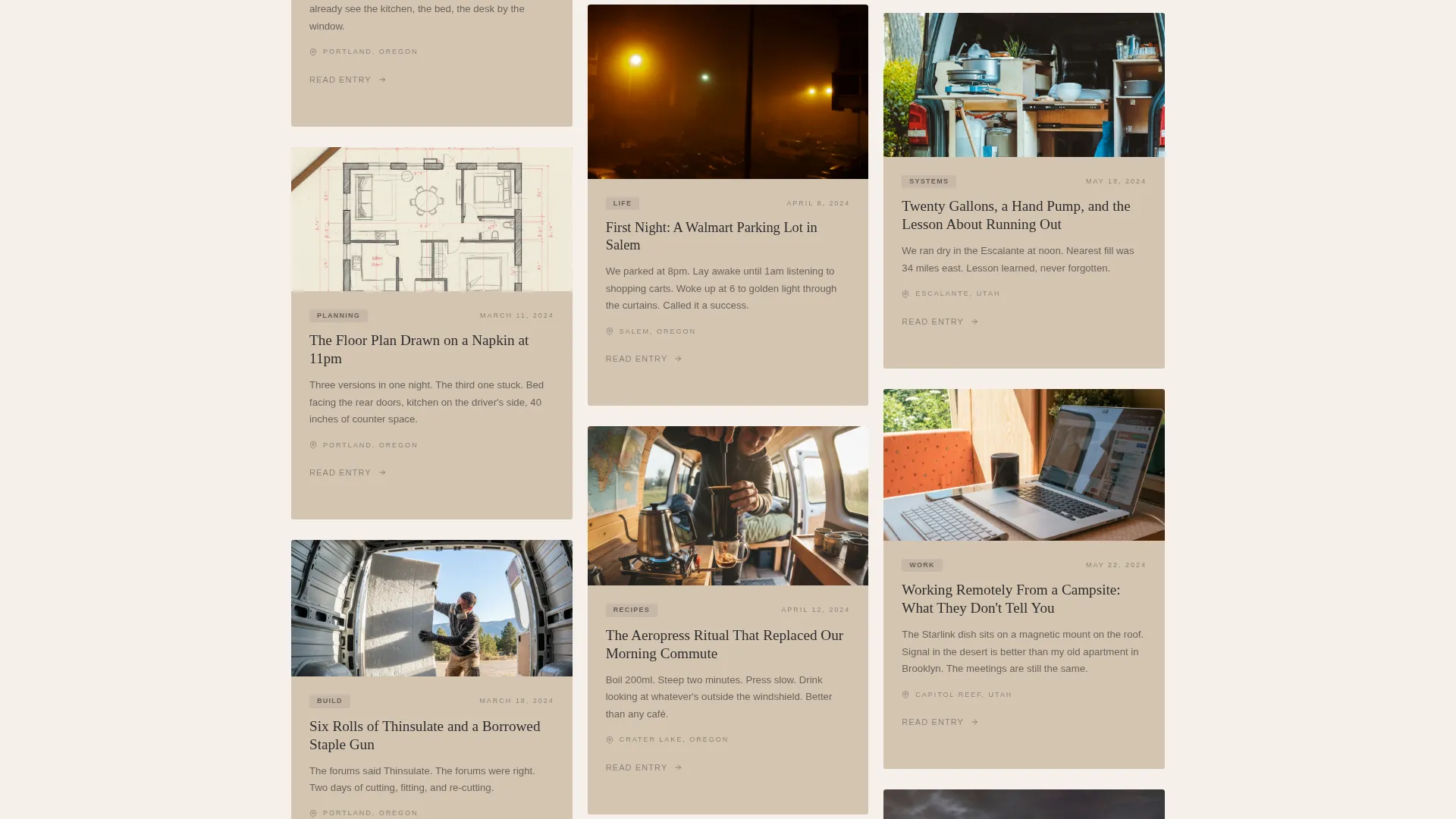
Each card is sized and styled like a snapshot moment: a hand-drawn floor plan, a desert sunrise, a propane receipt. Cards carry location datelines and link directly to full blog posts, making every tile a doorway rather than a preview.
Tatami-Gold Call-to-Action Button
The primary "Read the First Entry" button is set in tatami gold and pinned at the base of the hero fold. It is the first and clearest invitation to commit to the story. A secondary "Start Your Own Build" link appears mid-grid as a curated gear guide path.
Staggered Scroll Animations
Cards reveal themselves with a staggered animation as the reader scrolls, reinforcing the sense that the story is appearing in real time. The hover state adds a gold thread effect, making individual cards feel tactile and alive.
Spotlight Hover Interaction
Each masonry card responds to cursor hover with a spotlight effect, drawing focus to the card in view. This small interaction rewards exploration and keeps the reading experience feeling crafted rather than automated.
Sticky Header on Scroll
As readers move past the hero, the header pins to the top of the viewport. This keeps navigation accessible without distracting from the immersive grid below.
Page sections overview
| Section | Purpose |
|---|---|
| Hero Headline | Sets tone with a large serif headline, location dateline, and primary gold call-to-action |
| Origin Story Grid | Progressive masonry grid building from one to three cards per row |
| Mid-Grid Call-to-Action | Secondary path after row six linking to a curated gear guide |
| Continuing Masonry | Extended grid pulling readers deeper into the journal timeline |
| Linear Footer | Minimal ink-black-on-shoji-white footer in Pattern 1 style |
Design & branding system
The visual identity follows a Warm Artisan direction interpreted through a Japanese Zen color palette. The result feels like a handmade object: deliberate, imperfect, and warm. Typography pairs a warm serif for headlines with a clean sans-serif for body text, keeping the editorial tone grounded without feeling precious.
- Four-color palette: shoji white (#F5F0EB) as the page base, ceramic warm (#D4C5B2) filling card backgrounds, washed ink black (#2C2C2C) carrying all body text, and tatami gold (#C4A35A) reserved for hover states and linked phrases
- Fraunces is used for all headlines, bringing an organic warmth to large type; DM Sans handles body copy with quiet legibility
- Gold appears sparingly, only on hover and active link states, so every instance feels like a small reward rather than visual noise
Mobile & speed optimization
The template is built desktop-first for the masonry layout, with a fully responsive mobile stack that reflows cards into a single-column scroll. The reading experience holds across screen sizes without losing the editorial atmosphere.
- On mobile, the masonry grid collapses to a clean vertical stack, preserving card order and the narrative sequence
- CSS-only masonry and server components for the static grid keep the layout lean and avoid unnecessary JavaScript overhead
- Staggered animations are preserved on mobile at an appropriate scale, keeping the scroll feel intentional rather than flat
How this template helps you convert
Drift converts by making readers feel they have arrived late to a story worth catching up on. The design earns attention before it asks for a click.
- The hero's empty white space and single bold headline create immediate curiosity without clutter, priming the reader to scroll rather than bounce.
- The progressive grid rewards every scroll with a new card, building investment before the primary call-to-action appears, so the "Read the First Entry" click feels earned rather than asked for.
- The mid-grid secondary path to a gear guide captures a second reader segment, the builder audience, at exactly the moment their interest in the practical side of van life is highest.
Other information about this template
Drift sits in the Blog and Editorial category under the Travel Blog subcategory, with a specific niche fit for van life content creators. It is a click-through landing page designed to route readers to individual blog posts and a gear guide, not to collect leads directly.
- The template style is masonry or Pinterest-style, making it a strong fit for content-heavy journals with many individual posts to surface
- The creative direction is an Origin Story, meaning the layout is intentionally structured to reward reading from the top down rather than jumping in at any point
- The header concept is a giant headline centered on open white space, which works as a direct signal of editorial confidence and personal voice
- This template can support an informal American voice and works well for English-language content aimed at a United States audience
Theme
Warm Artisan
Creative direction
Origin Story
Color system
Japanese Zen
Style
Masonry/Pinterest
Direction
Click-Through
Page Sections
Progressive Masonry Grid Layout
Polaroid-style Journal Cards
Tatami-gold Call-to-action Design
Staggered Card Reveal Animations
Spotlight Hover on Cards
Sticky Header Behavior
Related questions
Can I customize the hero headline and dateline text?
Do the masonry cards link to external blog posts?
Is the masonry grid easy to update when I publish new posts?
Does the template include the gear guide page?
What fonts does this template use and are they free to use?



