Auto & Mobility Blog Reviews Website Template
Drive is a horizontal scroll editorial landing page built for car review and comparison blogs. It pairs a broadsheet newspaper masthead with cinematic photography, staff reviewer spotlights, and a sticky compare module. The layout earns every click through opinionated pull quotes and star ratings, giving readers just enough to make them need the full story.
by Rocket studio
Quick summary
Drive is a single-page, horizontally scrolling editorial landing page for automotive content publishers. It blends broadsheet newspaper aesthetics with a modern interactive layout. Reviewer personalities, cinematic photography, and contextual calls to action work together to pull readers from the landing page directly into full car review articles.
Who this template is for
Drive is built for automotive content creators who lead with voice and opinion, not specification lists. It suits editorial teams, solo reviewers, and small publication brands that want their landing page to feel like a curated magazine rather than a standard blog index.
- Car review bloggers and automotive journalists launching or refreshing a publication
- Enthusiast content teams publishing head-to-head vehicle comparisons
- Independent reviewers who want to spotlight multiple staff writers on a single page
What problem this template solves
Most blog landing pages force readers into a grid of thumbnails with no personality. They feel like archives, not publications. Drive fixes that by leading with editorial authority: a masthead, a cinematic hero, and reviewer spotlights that give each writer a distinct identity. Readers know immediately whose opinion they are reading and why it matters.
- Generic blog layouts bury reviewer voices behind category tags and post dates
- Visitors leave before clicking because nothing creates enough curiosity or urgency
- Comparison-minded readers have no quick way to pit two vehicles against each other
What you get with this template
The template delivers a complete, section-led landing page experience designed around horizontal scroll on desktop and a clean vertical fallback on mobile. Every component is built to move visitors from passive browsing to active clicking.
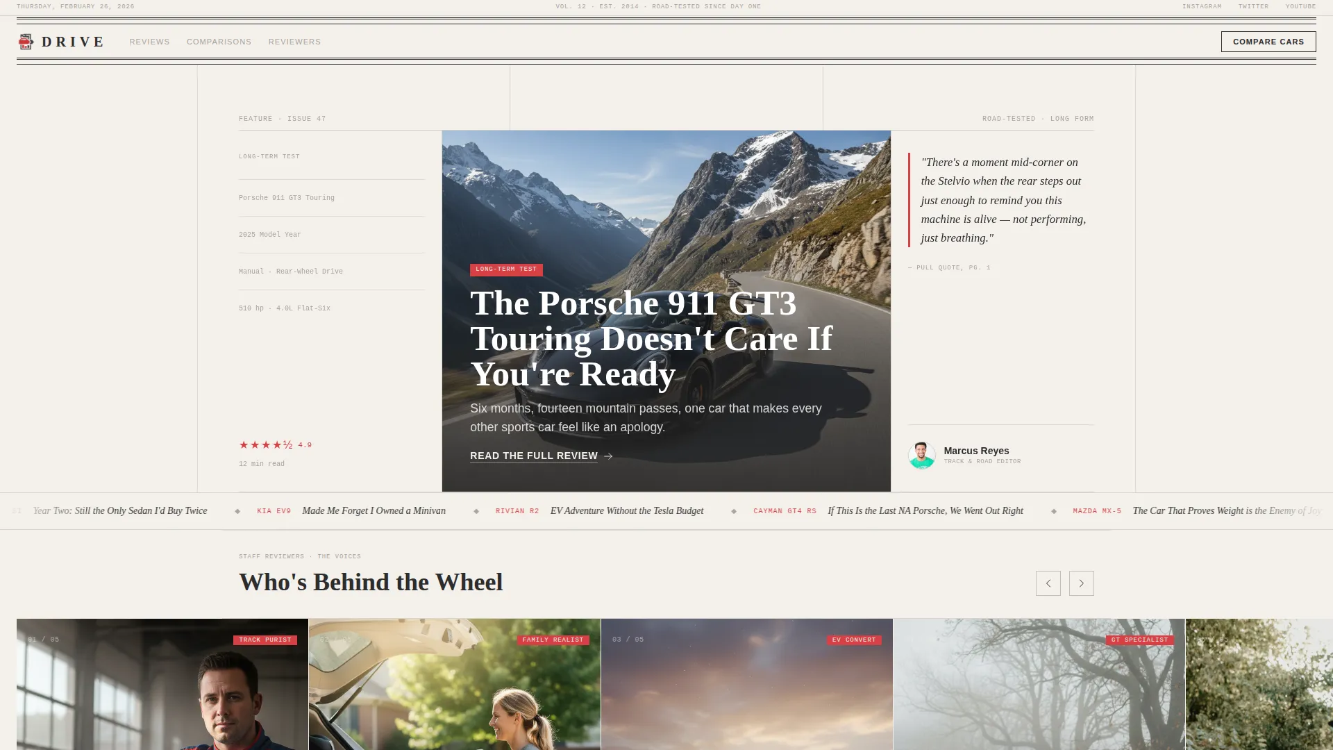
- A broadsheet-style hero with a cinematic car photograph, editorial headline stack, pull quote, and reviewer byline portrait
- Horizontal scroll reviewer panels, a featured reviews bento grid, a compare overlay module, a latest-headlines marquee ticker, and a minimal single-row footer
- A persistent bottom bar that updates contextually as the visitor scrolls, keeping the primary call to action always visible
Feature list
The Drive template includes a focused set of interactive and editorial components, each designed for a content-first automotive publication.
Newspaper Masthead Hero
The hero section opens with a broadsheet-style layout. A high-contrast serif wordmark sits across the top with a dateline underneath. Below that, a cinematic wide-angle car photograph fills the panel, cropped like a magazine cover. A three-deck editorial headline, column rules, a pull quote in signal red, and a small byline portrait give the section the authority of print.
Horizontal Scroll Reviewer Panels
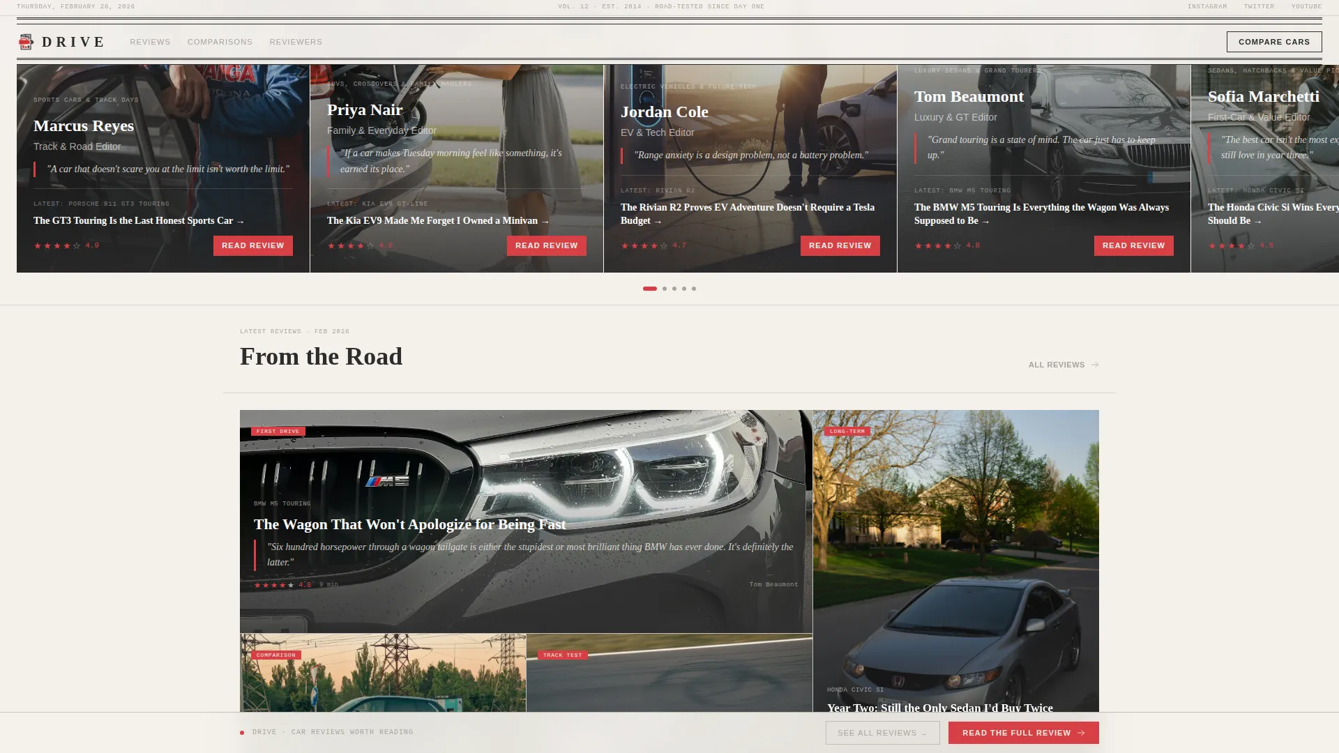
As the visitor scrolls sideways, each panel introduces a different staff reviewer through their signature beat. Reviewer cards carry a name, a one-line philosophy in italics, and their latest review headline as a clickable link. The horizontal motion mimics flipping through magazine pages, delivering a new voice with each swipe.
Featured Reviews Bento Grid
An asymmetric bento grid displays featured reviews with star ratings and a single provocative pull quote per review. The layout withholds the full justification, creating just enough opinion to push readers toward the complete article. Star ratings are typeset in a monospaced data font for precision and visual contrast.
Sticky Compare Module
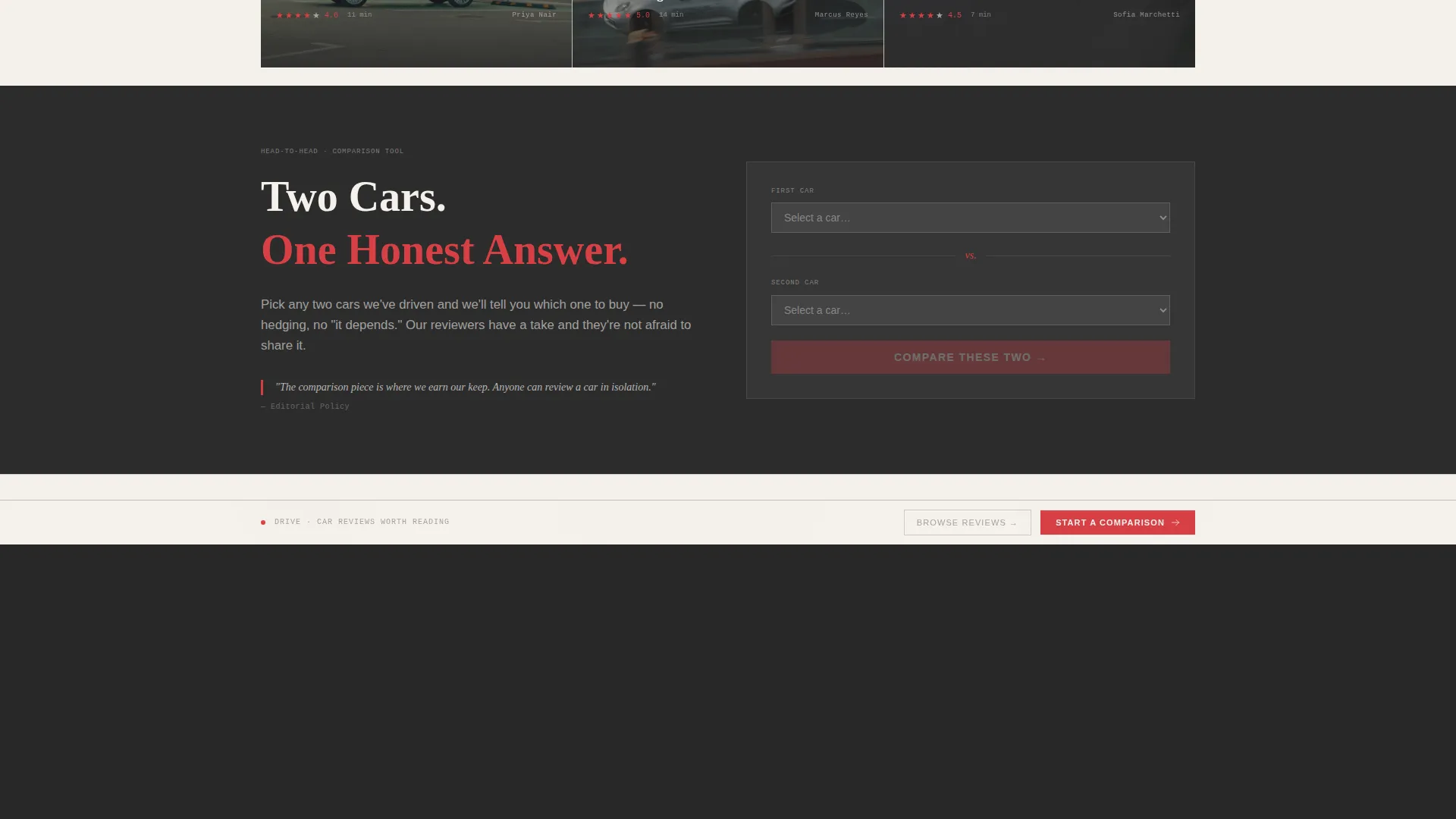
A sticky "Compare These Two" button remains accessible as the visitor scrolls. Clicking it opens a lightweight overlay where the visitor selects two vehicles and clicks through to the head-to-head comparison article. The module supports the secondary conversion path without interrupting the editorial flow of the page.
Contextual Persistent Bottom Bar
A persistent bottom bar anchors the primary call to action at the bottom of the viewport. The bar updates contextually as the visitor moves through reviewer panels, so the prompt always reflects the car or reviewer currently in view. This keeps click-through intent alive at every stage of the scroll.
Latest Headlines Marquee Ticker
A horizontal marquee ticker runs recent review titles continuously across the page. It reinforces publication frequency and gives passing readers a reason to explore beyond the featured content.
Page sections overview
| Section | Purpose |
|---|---|
| Masthead Hero Panel | Establish editorial authority with broadsheet layout, cinematic photo, and headline stack |
| Reviewer Spotlight Panels | Introduce staff writers through horizontal scroll cards with signature beats and latest review links |
| Featured Reviews Bento | Display star ratings and pull quotes in an asymmetric grid to spark click-through curiosity |
| Compare Overlay Module | Let visitors select two vehicles and navigate to a head-to-head article via a sticky trigger button |
| Headlines Marquee Ticker | Cycle recent review titles to signal active publishing and surface additional content |
| Minimal Single-Row Footer | Close the page cleanly with essential links using a developer-minimal single-row pattern |
Design & branding system
Drive uses an Editorial Magazine theme built on the Cloud Canvas color system. The palette is intentionally muted and tactile, letting photography carry the visual weight while typography stays composed and authoritative.
- Colors: soft newsprint white (#F4F1EC) as the base, asphalt charcoal (#2C2C2C) for text and structure, pencil-sketch gray (#A8A29E) for secondary elements, and signal red (#D64045) reserved for ratings, pull quotes, and hover states
- Typography: a tight high-contrast serif display face for headlines and the masthead wordmark, a clean sans-serif for body copy, and a monospaced font for data fields like ratings and model specifications
- Visual language: matte and ink-on-cotton in feel, with column rules, broadsheet spacing, and editorial cropping that references Sunday newspaper design
Mobile & speed optimization
Drive is desktop-first by design, with the horizontal scroll experience built for wide viewports. On smaller screens, the layout falls back gracefully to a standard vertical scroll so the content remains accessible without the cinematic horizontal motion.
- CSS scroll-snap powers the horizontal panel transitions without requiring heavy JavaScript libraries
- High-animation interactions including the sticky bottom bar, compare overlay, hover states, and marquee ticker are all handled through lightweight front-end techniques
- The mobile vertical fallback preserves reviewer cards, bento grid reviews, and the compare trigger in a readable stacked layout
How this template helps you convert
Drive is built around a Click-Through conversion model. The entire editorial experience is calibrated to create curiosity and then resolve it only inside the full article.
- Star ratings and single-sentence pull quotes appear without their justification, so readers must click "Read the Full Review" to find out whether the reviewer agrees with their gut feeling about a car.
- The contextual persistent bottom bar keeps the primary call to action updated and visible throughout the entire scroll, removing friction from the moment of click intent.
- The sticky "Compare These Two" module captures comparison-minded visitors who are cross-shopping vehicles, routing them to a dedicated head-to-head article rather than letting them leave the page undecided.
Other information about this template
Drive fits naturally within a broader editorial publishing ecosystem and can support a range of automotive content formats beyond standard reviews.
- The template style is Horizontal Scroll with a Creative Spotlight direction, making it well suited for multi-author publications that want each contributor to feel like a featured voice
- The header concept follows a Newspaper and Publication pattern, referencing classic broadsheet editorial design traditions
- The landing page direction is Click-Through, meaning the page is intentionally designed with no forms, no gates, and no friction before the first article visit
- The color system is Cloud Canvas, a palette that pairs well with high-contrast photography of US-market vehicles including sedans, SUVs, and electric vehicles
- The footer follows a minimal single-row pattern, keeping the close of the page clean and uncluttered for a publication-grade finish

Theme
Editorial Magazine
Creative direction
Creator Spotlight
Color system
Cloud Canvas
Style
Horizontal Scroll
Direction
Click-Through
Page Sections
Broadsheet Newspaper Masthead Hero
Horizontal Scroll Reviewer Panels
Asymmetric Featured Reviews Bento Grid
Sticky Compare Overlay Module
Contextual Persistent Bottom Bar
Latest Headlines Marquee Ticker
Related questions
Is this template suitable for a solo car reviewer or does it require a full editorial team?
Does the compare overlay require a backend or database connection?
Can the horizontal scroll be disabled for a purely vertical layout?
How many reviewer panels does the template include?
Is the bottom bar call to action text fixed or does it change per section?



