Artisan Tiny House Living Blog Landing Page Template
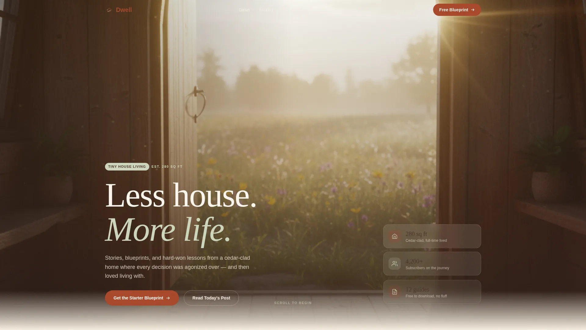
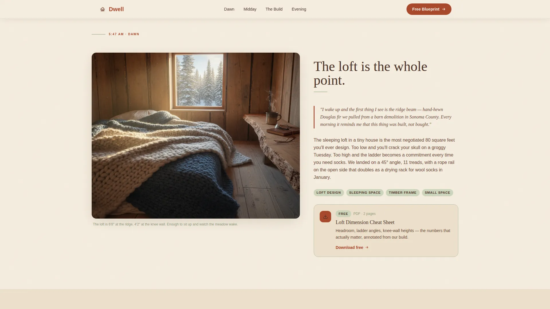
Dwell is a warm, journal-style tiny house living landing page built on an asymmetric 60/40 grid. It follows a day-in-the-life narrative from loft morning to string-light evening, pairing immersive photos with personal essay excerpts and contextual downloads. A primary email capture form and four section-level resource cards convert readers into subscribers naturally.
by Rocket studio
Quick summary
Dwell is a single-page tiny house living blog template built around honest storytelling and free downloadable resources. The asymmetric 60/40 grid alternates image and text columns across five distinct day-sections. Every section teaches something useful before offering a contextual download, so email capture feels like a natural next step rather than an interruption.
Who this template is for
This template is built for creators and writers who want to share the real experience of small-space living. It suits people who have something genuine to say and want readers to trust them before they ever fill in a form.
- Young couples in the dreaming or planning stage of their first tiny build
- Remote workers ready to leave traditional leases and document the transition
- Empty-nesters looking to downsize thoughtfully and share that story with others
What problem this template solves
Most blog templates treat editorial content and email capture as separate goals. The result is a page that either reads well or converts well, but rarely both. Dwell solves that tension by weaving resource downloads directly into the narrative scroll.
- Readers leave without subscribing because the call to action feels disconnected from the content
- Generic layouts make personal, tactile stories feel cold and clinical on screen
- Single-ask forms feel aggressive when the reader has not yet received any value
What you get with this template
You get a fully structured landing page with five content sections, a hero, and a footer. Every section is built around a specific moment in a day, with a clear visual role for the 60-column and the 40-column.
- A full-bleed hero with a hand-lettered headline and a primary email capture form including a journey-stage dropdown
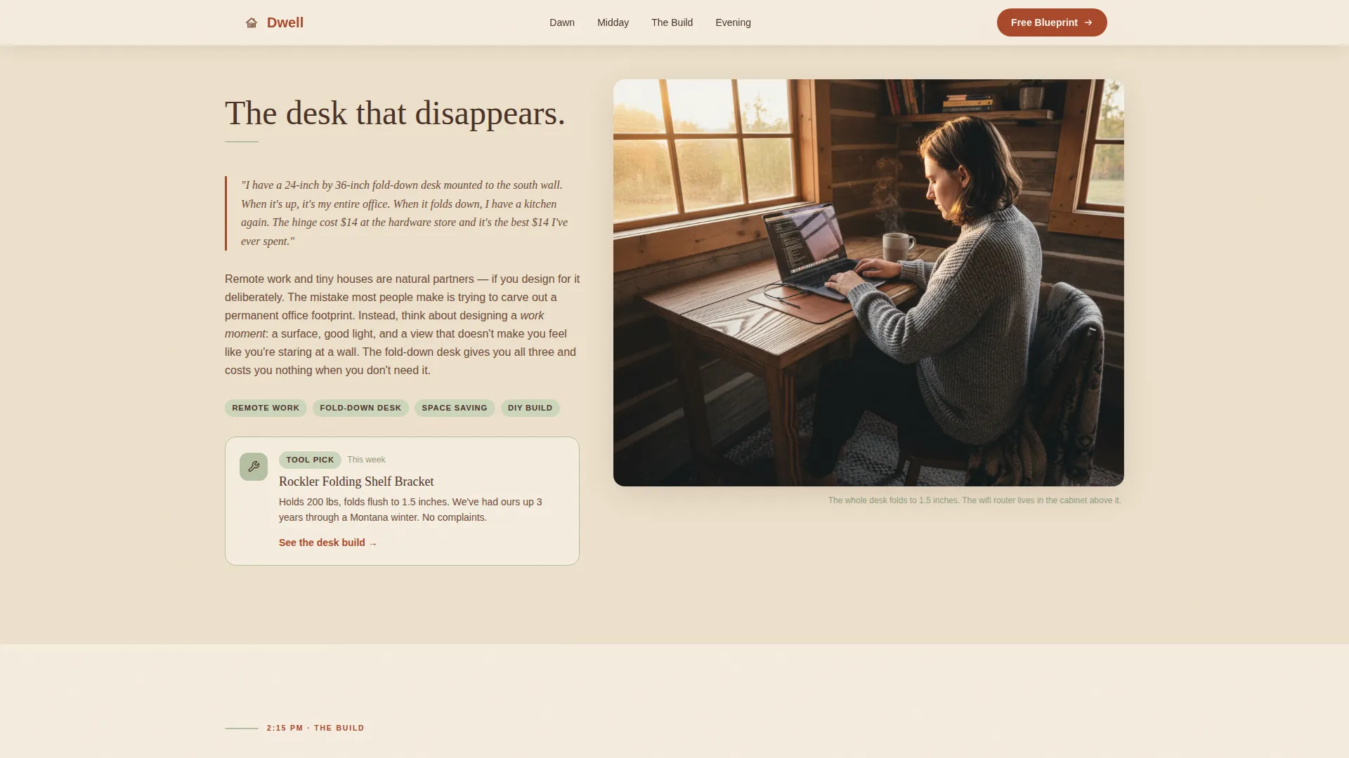
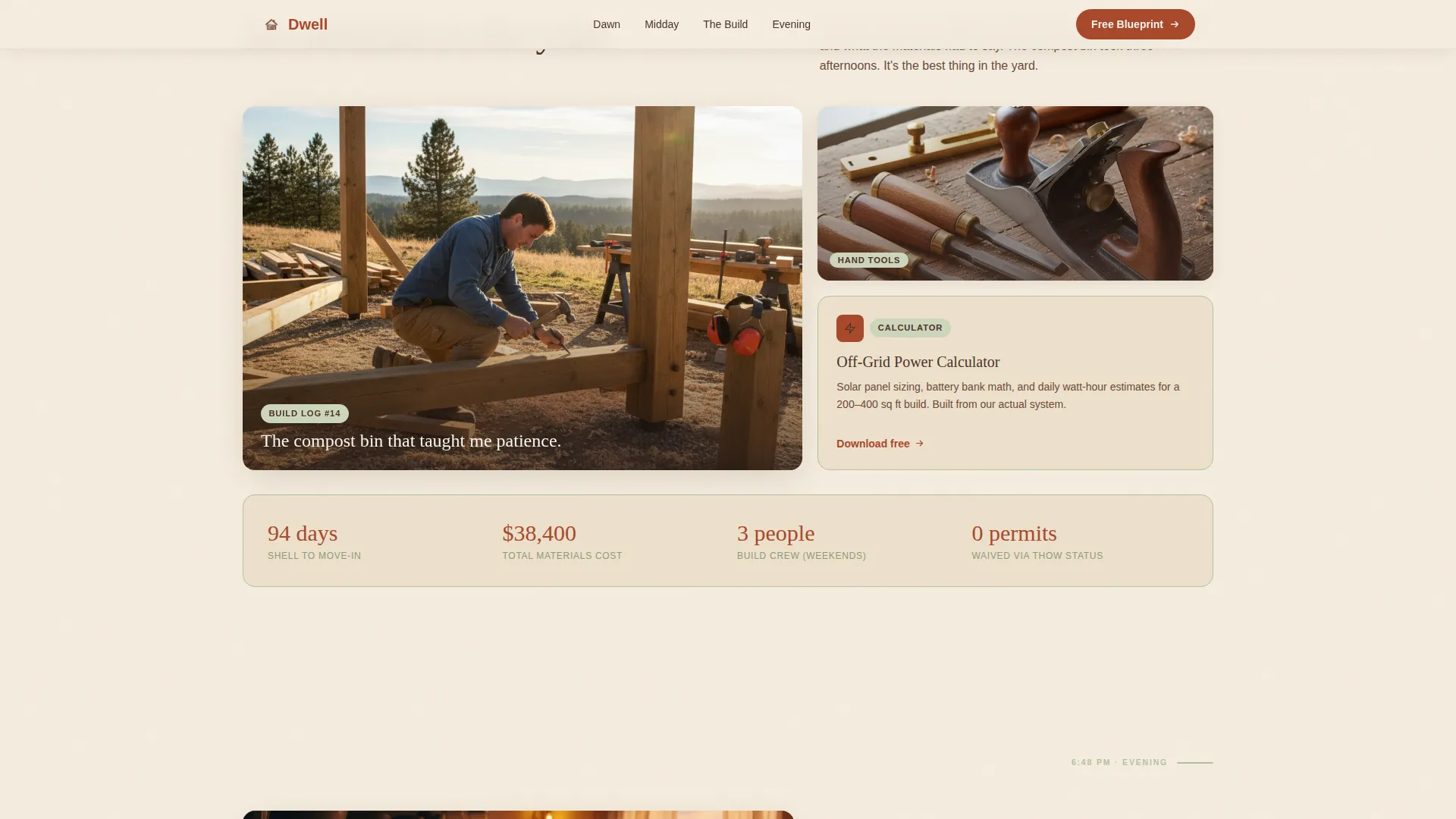
- Four day-section blocks pairing immersive imagery with essay copy and contextual download cards
- A footer built on the Arc Browser Split pattern with logo and tagline on the left and navigation links on the right
Feature list
This section outlines the core built-in capabilities that make Dwell functional as a content and subscriber-growth template.
Asymmetric 60/40 Grid Layout
The page uses a deliberate 60/40 column split throughout. The wider column carries the immersive photo or short looping video, while the narrower column holds the essay excerpt, tool card, or download resource. The sides alternate section by section, creating a page-turning rhythm.
Day-in-the-Life Section Flow
Five content sections follow a single day from dawn through evening. Each section is anchored to a real moment: loft coffee, remote work desk, yard build project, and string-light cooking. This narrative arc keeps readers scrolling with genuine curiosity.
Contextual Download Cards
Each day-section includes a downloadable resource card tied directly to the content of that moment. Cards are designed so a reader who has already entered their email can access subsequent downloads without re-entering their details.
Primary Email Capture with Journey Dropdown
The hero section includes an email field paired with a single dropdown. The dropdown asks readers where they are in their journey, with four options: Dreaming, Planning, Building, and Already Living. This single qualifying question adds context without friction.
Social Proof Stats Block
The template includes a built-in block for subscriber count, build statistics such as square footage and days to build, and reader journey tags. These figures give first-time visitors a quick signal that real people have trusted this resource.
Scroll Animation System
The template uses scroll-triggered fade-in-up animations, image hover zoom effects, parallax depth layers, and staggered reveal timing across sections. These motion effects are set to a medium intensity so they feel present without overwhelming the content.
Page sections overview
| Section | Purpose |
|---|---|
| Hero Full-Bleed | Introduce the blog and capture primary email with journey dropdown |
| Dawn Loft Section | Morning loft story paired with Loft Dimension Cheat Sheet download |
| Midday Work Section | Remote work narrative with tool recommendation card |
| Afternoon Build Section | Bento-grid build project with Off-Grid Power Calculator download |
| Evening Cook Section | String-light cooking story with Two-Burner Recipe Pack download |
| Footer Arc Split | Logo, tagline, and navigation links in a split layout |
Design & branding system
The visual identity uses a Warm Artisan theme built around a Parchment and Rust color system. Every color choice references something tactile and earned: a field journal left on a workbench, an oxidized hinge, a linen curtain sun-bleached over a season.
- Parchment (#F5EDDF) carries all backgrounds; Rust (#A8482B) drives headlines and hover states; Walnut (#4A3228) anchors body text
- Soft sage (#B5BFA1) appears in tags, dividers, and illustration accents such as dried herbs
- Typography pairs Fraunces display serif headlines with DM Sans body text for a contrast between warmth and clarity
Mobile & speed optimization
The template is built with a mobile-first priority because the target reader is often on a phone in a coffee shop, dreaming about a different kind of life. Layout, typography, and download cards are all designed to work cleanly on small screens first.
- Images are optimized for fast loading, and static sections use Server Components to keep JavaScript minimal
- Scroll animations are handled at a medium intensity level to avoid layout shifts on slower connections
- The 60/40 grid stacks cleanly into a single-column flow on narrow viewports without losing the alternating rhythm
How this template helps you convert
Dwell is designed around a value-first conversion model. Every section delivers something useful before making any ask. The result is a reader who reaches the download card already trusting the source.
- The hero captures the primary subscriber with an email field and a journey-stage dropdown, so the very first conversion happens at the top of the page with full context
- Each day-section then offers a contextual download tied to that section's specific content, so the email already captured unlocks the next resource without a repeated ask
Other information about this template
Dwell is a single landing page template, not a multi-page blog system. It is designed as a content and resource destination where the scroll experience itself is the product. A few additional details worth noting before you get started:
- The header concept is a full-bleed interior photo composed from inside the tiny house looking outward through an open door, with morning light flooding a plank floor
- The creative direction follows a Day-in-the-Life editorial arc, which is a well-established format in personal lifestyle blogging
- The footer follows the Arc Browser Split pattern: logo and tagline on the left, navigation links on the right
- The template is localized for English-language, United States-centric content including references to cedar, cast iron, and meadow landscapes
- The intersection of Blog and Editorial with the Tiny House Living Content subcategory makes this template a strong fit for niche lifestyle publishers who want to grow an email list without relying on sidebar widgets or pop-up overlays
Theme
Warm Artisan
Creative direction
Day-in-the-Life
Color system
Parchment & Rust
Style
Asymmetric Grid (60/40)
Direction
Content/Resource
Page Sections
Asymmetric 60/40 Grid Layout
Day-in-the-life Narrative Arc
Contextual Section Download Cards
Email Capture with Journey Dropdown
Social Proof Stats Block
Scroll Animation System
Related questions
Can I use this template without a tiny house of my own?
How does the email capture work across multiple sections?
Can I replace the included downloadable resources with my own?
Is this template suitable for a new blog with a small audience?
Does the 60/40 grid stack correctly on mobile screens?



