Cinematic Tiny House Living Channel Landing Page
Dwell is a single-column landing page template for a tiny house living YouTube channel. It uses a leather-bound journal aesthetic, cinematic dark colors, and scroll-driven chapter reveals to pull visitors into the story. The page captures email addresses through a parchment-styled bookmark form and delivers a free Field Guide PDF as its primary call to action.
by Rocket studio
Quick summary
Dwell is a Heritage and Story landing page template built for tiny house lifestyle content creators. It unfolds like a field journal, guiding visitors through four scroll chapters from a cinematic hero image to a community mosaic. The primary goal is converting curious visitors into email subscribers using a free downloadable Field Guide as the hook.
Who this template is for
This template is made for YouTube creators who document tiny house living, intentional downsizing, or small-space design. If your channel tells a story as much as it teaches a skill, the journal-paced layout fits naturally.
- Tiny house lifestyle creators building an email list alongside their YouTube audience
- Downsizing coaches or content producers who want a resource hub as their home base
- Retired or nomadic lifestyle channels that attract readers before they become viewers
What problem this template solves
Most YouTube channel landing pages feel like a generic link-in-bio page. They do not build trust, they do not tell a story, and they give a first-time visitor no reason to stay. Dwell solves that by treating the page itself as content.
- Visitors arrive with curiosity but no commitment; the journal pacing earns their attention before asking for an email address
- Channels with multiple content series struggle to present depth; the chapter structure organizes episodes, resources, and community into a readable arc
- Email capture on generic pages feels like an interruption; the parchment bookmark form feels like a natural part of the experience
What you get with this template
You get a fully structured single-column landing page with five distinct chapter sections, a working email capture form, and a cinematic visual system ready to receive your own episode photography and branding.
- A hero section styled as a leather-bound interior cover with a sepia-toned episode still and hand-stamped serif typography
- Four scroll chapters covering your build series, tools and materials resources, a viewer community mosaic, and a Field Guide call to action
- A parchment bookmark email capture card requesting only a first name and email, with the subline "We send one letter a month, never more"
Feature list
A paragraph introduces the feature set below. Each feature is grounded in what the template actually delivers based on the source brief.
Chapter-Based Scroll Architecture
The page is divided into four named chapters, each separated by a thin copper rule and a hand-lettered numeral. Scrolling through the page feels like turning pages in a printed journal, not clicking through a website menu.
Cinematic Hero with Sepia Still
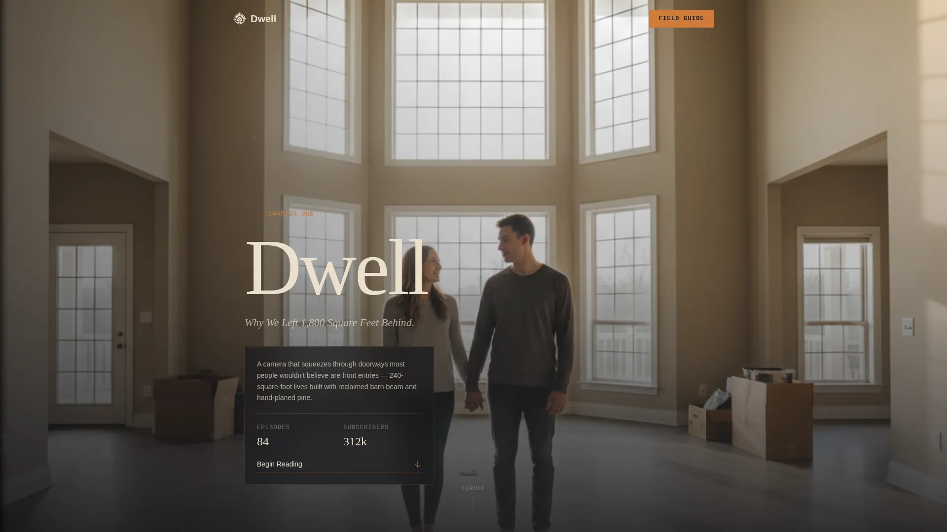
Chapter One opens as the interior cover of a leather-bound volume. A spine shadow runs down the left edge, and a sepia-toned episode still anchors the viewport before a soft scroll cue appears. The title is set in a hand-stamped serif to reinforce the documentary tone.
Episode Grid with Corkboard Framing
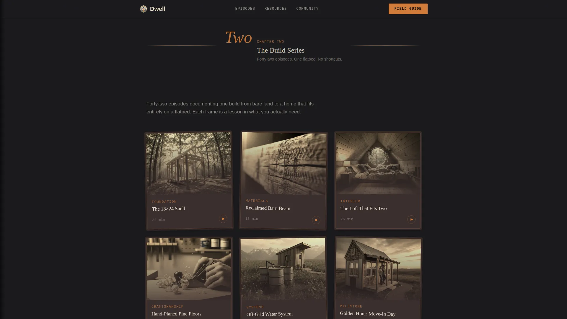
Chapter Two presents a curated grid of episode stills from the build series. Each thumbnail is framed to look like a photograph pinned to a corkboard, giving the gallery depth without feeling like a standard video grid.
In-Situ Resource Gallery
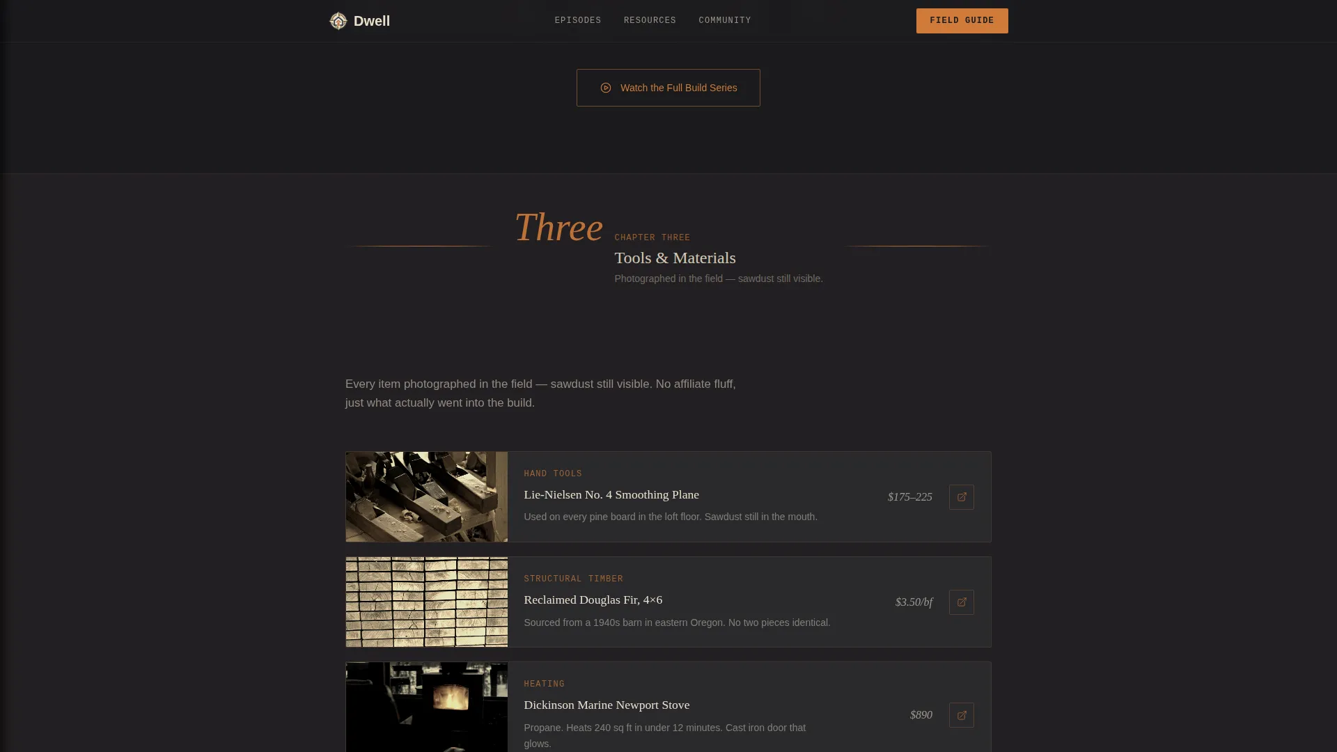
Chapter Three is a tools and materials section where every recommended item is photographed in context, with sawdust still visible and workshop textures intact. The gallery communicates authenticity rather than a polished product catalog.
Viewer Community Mosaic
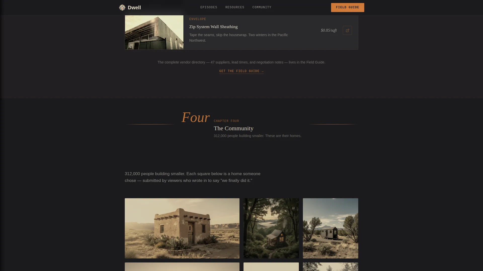
Chapter Four collects viewer-submitted tiny house tours in a growing mosaic layout. The composition grows denser as the visitor scrolls, making the community feel alive and expanding rather than static.
Parchment Bookmark Email Capture
The Field Guide call-to-action section uses a parchment-textured card styled like a bookmark. The form asks only for a first name and email. The primary button reads "Open the Field Guide" and leads to a free downloadable PDF containing a planning checklist, build-cost spreadsheet, and vendor directory.
Page sections overview
| Section | Purpose |
|---|---|
| Chapter One Hero | Opens the channel story with a cinematic sepia still and leather-bound cover styling |
| Build Series Grid | Displays episode stills in a corkboard-framed gallery for the build series |
| Tools and Materials | Presents in-situ resource photography for the channel's recommended items |
| Community Mosaic | Grows a viewer-submitted tiny house tour mosaic as the visitor scrolls |
| Field Guide call to action | Captures email with a parchment bookmark card and delivers a free PDF |
| Minimal Footer | Closes the page with a horizontal flow pattern |
Design & branding system
The visual identity follows a Heritage and Story theme built on a Cinematic Dark color palette. Every color choice references physical materials: charcoal from a cold hearth, brown from a weathered journal cover, cream from pressed parchment, and copper from hand-forged hardware.
- Color palette: deep hearth charcoal (#1A1A1D) for backgrounds, weathered journal brown (#3B2F2F) for section depth, parchment cream (#EAE0CC) for text and cards, and hand-forged copper (#CF7B3A) for links, timestamps, and hover states
- Typography: Fraunces serif for headlines to suggest hand-stamped printing, DM Sans for body text to keep reading comfortable, and JetBrains Mono for labels and timestamps to give data a workshop-log feel
- Texture and detail: spine shadows, copper rule chapter dividers, hand-lettered numerals, and a parchment card texture all reinforce the field journal metaphor throughout the page
Mobile & speed optimization
The template is designed desktop-first, with the wide viewport carrying the full documentary pacing. Chapter transitions and parallax effects are built to land well on larger screens first. Mobile layout adapts the single-column flow cleanly without losing the chapter structure.
- Scroll-linked chapter reveals use IntersectionObserver for efficient entrance animations that do not block content loading
- Static content sections use Server Components to keep the initial page load light
- Images are optimized to support the cinematic visual weight without slowing the scroll experience
How this template helps you convert
Conversion in this template is built into the experience itself. By the time a visitor reaches the email capture card, they have already moved through four chapters of content that make the channel feel substantial and trustworthy.
- The chapter arc builds emotional investment before the ask: visitors who scroll through the build series, resource gallery, and community mosaic arrive at the Field Guide form already engaged, not cold
- The bookmark-styled email form reduces friction by asking only for a name and email, and the "We send one letter a month" subline directly addresses the fear of inbox overload
- The secondary call to action, "Browse All Chapters," links to the full YouTube playlist and appears only after the community mosaic, giving visitors a natural next step once they have already felt the depth of the channel
Other information about this template
This template is part of a Blog and Editorial category built around the Tiny House Living Content subcategory. It sits at the intersection of documentary storytelling and content resource hubs, making it well suited for creators who want their landing page to double as a reading experience.
- The Gallery Walk creative direction means each scroll section functions as a self-contained visual chapter, not just a content block
- The Content and Resource landing page direction means the page leads with value first, offering a free downloadable guide before asking visitors to subscribe or browse
- The template uses the Single Column Flow layout, which keeps the pacing intentional and the narrative linear, matching the documentary rhythm of the channel itself
- The copper glow on call-to-action hover states and the staggered card reveal animations are part of the medium-weight animation system described in the design brief
Theme
Heritage & Story
Creative direction
Gallery Walk
Color system
Cinematic Dark
Style
Single Column Flow
Direction
Content/Resource
Page Sections
Chapter-based Scroll Architecture
Cinematic Hero with Sepia Episode Still
Corkboard Episode Grid
In-situ Resource Photography Gallery
Growing Community Mosaic
Parchment Bookmark Email Capture
Related questions
What is the primary call to action on this landing page?
Can I use this template without a completed build series?
How does the community mosaic section work?
What typography does this template use?
Is this template suited for channels outside the tiny house niche?



