Tiny House Living TikTok Channel Landing Page
Dwell is a warm, artisan-styled landing page template built for a tiny house living TikTok channel. It features a hand-drawn SVG cutaway illustration with parallax scrolling, an asymmetric 60/40 grid for community data storytelling, and an inline five-question style-matching quiz that delivers a personalized tiny house archetype to each visitor.
by Rocket studio
Quick summary
Dwell is a single-page landing page template designed for a tiny house living TikTok channel. It pairs original community survey data with a sketchbook-inspired visual identity and a frictionless inline quiz. Visitors scroll through illustrated data insights, discover what holds them back, and find their personal tiny living archetype, all without leaving the page.
Who this template is for
This template is built for content creators and media channels in the tiny house and alternative living space. It suits anyone who wants to convert curious visitors into engaged followers through storytelling and personalization.
- Tiny house TikTok creators who want a landing page that matches their craft-forward brand
- Off-grid lifestyle educators and DIY housing content producers looking to grow an audience
- Minimalism and alternative living channels that have community research to share
What problem this template solves
Most content landing pages are either too generic or too product-focused. Tiny house audiences are emotionally driven and skeptical of polished sales pitches. They need a page that feels honest, handmade, and genuinely useful before they commit to following or sharing their email.
- Generic templates lack the warm, raw-material aesthetic that tiny house audiences expect
- Visitors bounce before taking action because there is no clear, personalized next step
- Creators with original survey data have no ready structure to present it engagingly
What you get with this template
You get a complete, single-page layout with six named sections, a hand-crafted visual system, and a built-in interactive quiz flow. Every section is purposefully sequenced to move a visitor from curiosity to commitment.
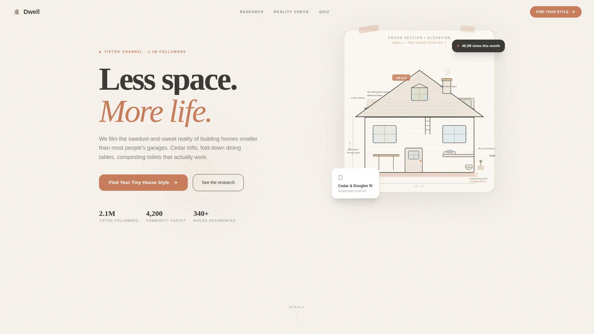
- A hand-drawn SVG hero illustration with parallax scroll behavior and a primary call to action
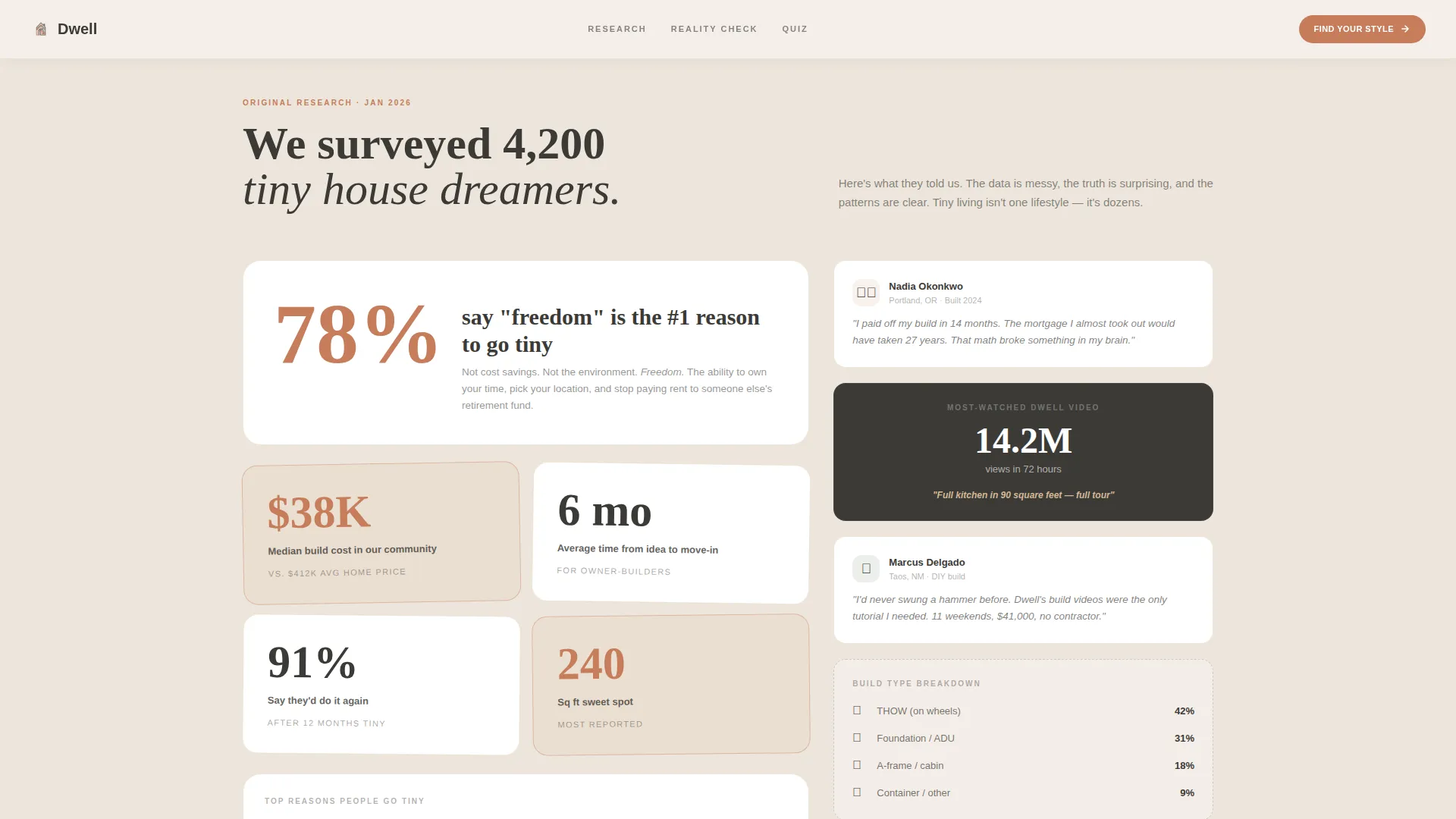
- A 60/40 asymmetric data grid that pairs community statistics with illustrated vignettes or embedded content
- An inline five-step quiz with archetype results and an optional email-gated lead magnet
Feature list
This template delivers a focused set of features drawn directly from its brief. Each one serves the channel's core goal: turning tiny-house-curious visitors into followers and quiz completers.
Hand-Drawn SVG Hero Illustration
The header uses a cross-section cutaway of a tiny house rendered in warm ink and soft watercolor. Each room is labeled like an architect's field notes, and the illustration responds to scroll with a subtle parallax effect that gently separates layers as the visitor moves down the page.
Asymmetric 60/40 Data Grid
The community data section uses a two-column asymmetric layout. The wider 60% column carries statistics and narrative findings from a 4,200-person survey. The narrower 40% column pairs each finding with an illustrated vignette or a TikTok embed, keeping the scroll visually varied and never text-heavy.
Inline Five-Step Style Quiz
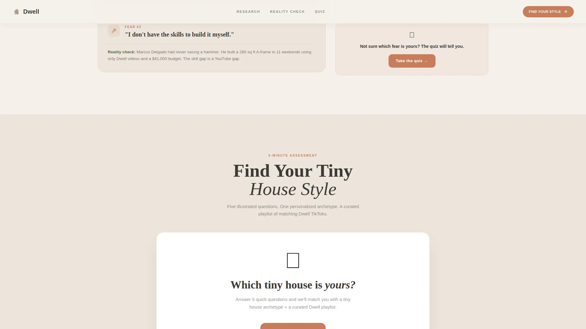
The primary call to action launches an inline quiz without redirecting the visitor. Five illustrated, tap-to-choose questions cover preferred climate, must-have feature, build-or-buy preference, solo-or-partner living, and budget comfort zone. Results reveal a named tiny house archetype with a curated content playlist and a follow prompt.
Archetype Result and Lead Magnet Gate
After the quiz, visitors receive a personalized tiny house archetype profile. A secondary path offers a downloadable "Tiny Living Readiness Scorecard" in exchange for an email address, creating a low-friction lead capture opportunity without blocking the core quiz experience.
GSAP Scroll Reveal Animations
Sections animate into view as the visitor scrolls using GSAP-powered reveal transitions. The quiz steps also use smooth transitions between questions, keeping the experience fluid on both desktop and mobile without jarring page jumps.
Fears and Friction Section
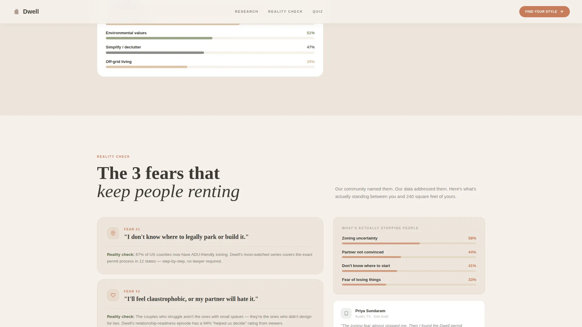
A dedicated section addresses the three most common fears that keep people renting. Each fear is presented with an illustrated vignette in the 40% column, giving the narrative emotional honesty before the quiz reframes the path forward.
Page sections overview
| Section | Purpose |
|---|---|
| Hero Illustration | Introduce the channel with a hand-drawn parallax cutaway and primary quiz call to action |
| Community Data Grid | Present survey findings from 4,200 respondents in an asymmetric 60/40 layout |
| Fears and Friction | Address the three fears keeping visitors from pursuing tiny living |
| Inline Style Quiz | Guide visitors through five illustrated questions to find their tiny house archetype |
| Quiz Results and Lead Magnet | Reveal the archetype profile and offer the email-gated Readiness Scorecard |
| Footer | Horizontal flow footer pattern with channel links and secondary navigation |
Design & branding system
The visual identity follows a Warm Artisan theme built around the Cloud Canvas color system. The overall feel is a dog-eared sketchbook left open on a workbench: cream pages, graphite smudges, and a single watercolor wash catching the afternoon light.
- Color palette: soft linen white (#F5F0EB), warm birch (#D4B896), pencil-sketch charcoal (#3B3A36), and hand-painted terracotta (#C67D5B) used on buttons and interactive accents
- Typography: Fraunces serif display for headings, DM Sans for body text, creating a contrast between editorial warmth and clean readability
- No stock photography anywhere; the hand-drawn illustration style signals craft authenticity from the first scroll
Mobile & speed optimization
The template is built mobile-first, reflecting the reality that most of its TikTok audience will arrive on a phone. The quiz interactions are designed as tap-to-choose rather than hover-based, making every step thumb-friendly.
- Static sections use server-side rendering for fast initial load, while the interactive quiz runs as a client component to keep interactivity smooth
- SVG parallax and GSAP animations are scoped to the illustration and scroll-reveal moments, avoiding unnecessary motion on lower-powered devices
- The 60/40 grid reflows cleanly on smaller screens, keeping data stories readable without horizontal scrolling
How this template helps you convert
The page is structured as a progressive narrative that earns trust before asking for anything. Every design and layout decision builds toward two conversion moments: a quiz completion and an optional email capture.
- The inline quiz acts as the primary frictionless conversion point. It requires no account and no email, lowering the barrier so even skeptical first-time visitors engage and receive a personalized result with matching content.
- The email gate appears only after the quiz delivers value. By the time visitors see the Readiness Scorecard offer, they have already received a personalized archetype, making the exchange feel fair and worth completing.
Other information about this template
This template is a strong fit for creators who already have community research to share. The 60/40 grid is particularly effective when the channel has real data points, viewer quotes, or view-count social proof to populate the wider column. Without authentic content, the data section will feel hollow, so creators should gather their own survey results or engagement statistics before launching.
- The footer uses a Vercel Horizontal Flow pattern, suitable for linking to a TikTok profile, a community newsletter, and supplementary resource pages
- The quiz archetype system is designed with five named results in mind ("The Mountain A-Frame," "The Rolling Studio," and similar profiles), giving creators a content roadmap for future TikTok series
- The template style is classified as an asymmetric grid landing page under the Blog and Editorial category, with a niche focus on tiny house living content
Theme
Warm Artisan
Creative direction
Industry Report
Color system
Cloud Canvas
Style
Asymmetric Grid (60/40)
Direction
Quiz/Assessment
Page Sections
Hand-drawn SVG Hero with Parallax
Asymmetric 60/40 Community Data Grid
Inline Five-step Style-matching Quiz
Archetype Reveal and Email-gated Scorecard
GSAP Scroll-reveal Animations
Fears and Friction Narrative Section
Related questions
Does the quiz work without redirecting visitors to another page?
Can I use this template without existing survey data?
Is the email capture required for every visitor?
What is the primary call to action on this landing page?
What type of creator is this landing page template designed for?



