Tiny House Course Landing Page Template
Dwelling is an editorial landing page template built for an 8-week tiny house living online course. Styled as a broadsheet architectural zine, it combines an asymmetric 60/40 grid with a cinematic dark palette and newspaper-style typesetting. It captures waitlist signups and Blueprint PDF leads through two distinct calls to action, front-loading real cost data and student outcomes before ever asking for an email.
by Rocket studio
Quick summary
Dwelling is a single-page waitlist template designed for an 8-week course on tiny house design, building, and legal parking. It presents course content through an editorial broadsheet layout, using real cost figures, student testimony, and a curriculum reveal to earn signups. Two capture paths handle different buyer readiness levels: a waitlist seat reservation and a free PDF floorplan download.
Who this template is for
This template is made for course creators who teach practical, alternative-living skills and need a landing page that builds credibility before it asks for anything. It suits an audience that is skeptical of hype and responds to evidence, specifics, and honest voice.
- Online educators launching a tiny house living course and collecting a pre-launch waitlist
- Course creators targeting burned-out renters, remote workers, and early retirees who want land ownership without a mortgage
- Educators who want dual lead capture: a committed waitlist and a lower-friction PDF download path
What problem this template solves
Most course landing pages lead with the pitch and lose the reader before trust is established. For a course about an unconventional life decision, that order of operations kills conversions. Dwelling flips the sequence: data and student outcomes come first, the ask comes later.
- Visitors who are curious but cautious get real cost numbers and peer stories before seeing any call to action
- Creators without a large audience can build a qualified waitlist by offering a free Blueprint PDF as a secondary entry point
- The editorial aesthetic signals depth and intention, filtering in serious students and filtering out casual browsers
What you get with this template
You get a complete, ready-to-customize landing page structured around a newspaper editorial concept. Every section is designed to move a skeptical reader from curiosity through evidence to commitment, using a layout that feels like a researched special-issue publication.
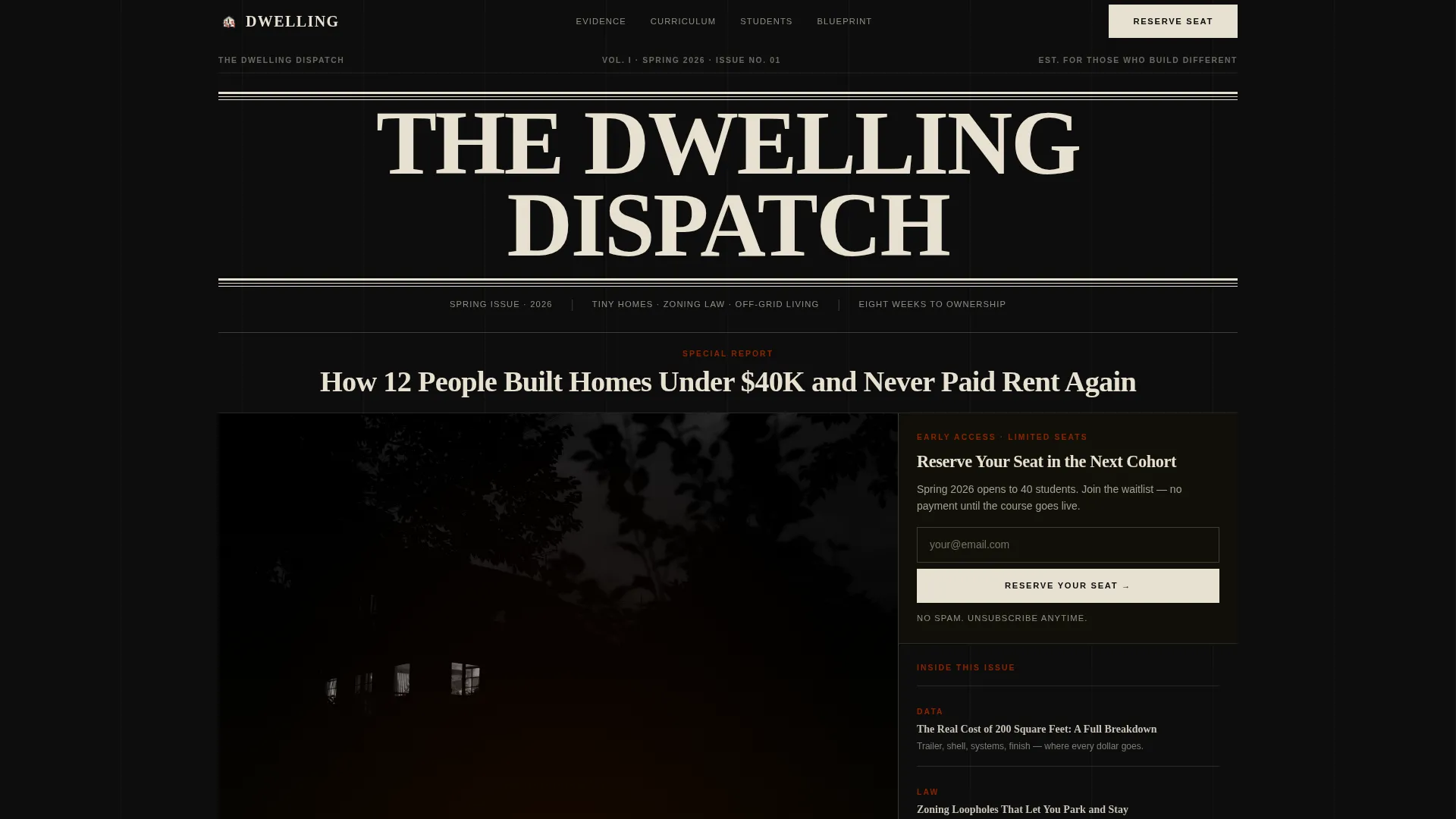
- A full-viewport newspaper masthead hero with a halftone-style photograph, a dateline, and a banner headline
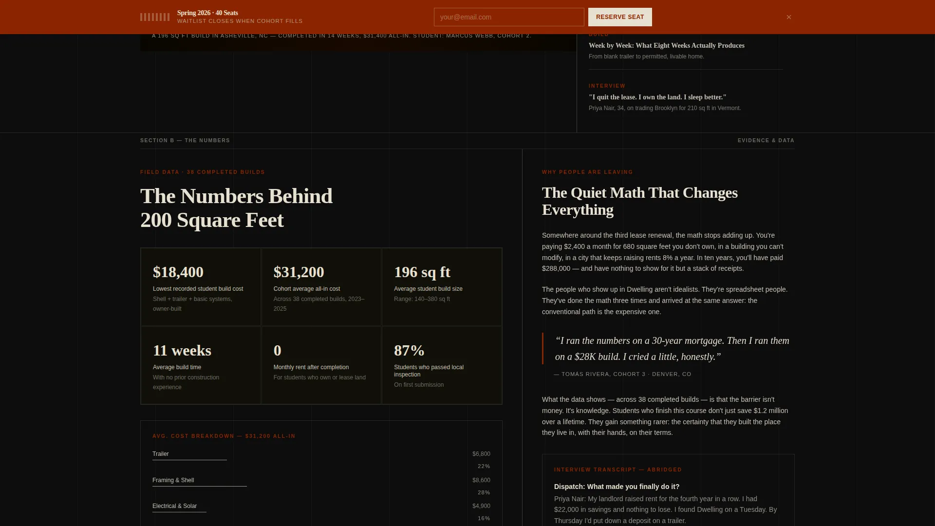
- An asymmetric 60/40 evidence grid featuring a cost data sidebar alongside editorial narrative
- An 8-week curriculum bento layout, broadsheet pull-quote testimonials, a Blueprint PDF capture form, and a sticky tear-strip waitlist bar
Feature list
A brief note on what is built into this template and how each piece supports the overall editorial experience.
Newspaper Masthead Hero Section
The header fills the full viewport as a publication front page. It includes a masthead reading "THE DWELLING DISPATCH" set in a heavy serif, a course launch dateline, and a banner headline anchored above a halftone-style hero photograph. A two-column broadsheet sidebar teases module topics as article headlines. The primary "Reserve Your Seat" call to action sits directly beneath the headline, styled as a newspaper subscription card.
Asymmetric 60/40 Evidence Grid
The evidence section divides the page into a wider editorial column and a narrower narrative column. The 60-side carries a cost data sidebar with real dollar figures, zoning references, and square-footage comparisons. The 40-side holds editorial narrative and student interview transcripts. This layout reinforces the course's credibility with specifics before any curriculum details appear.
8-Week Curriculum Bento Layout
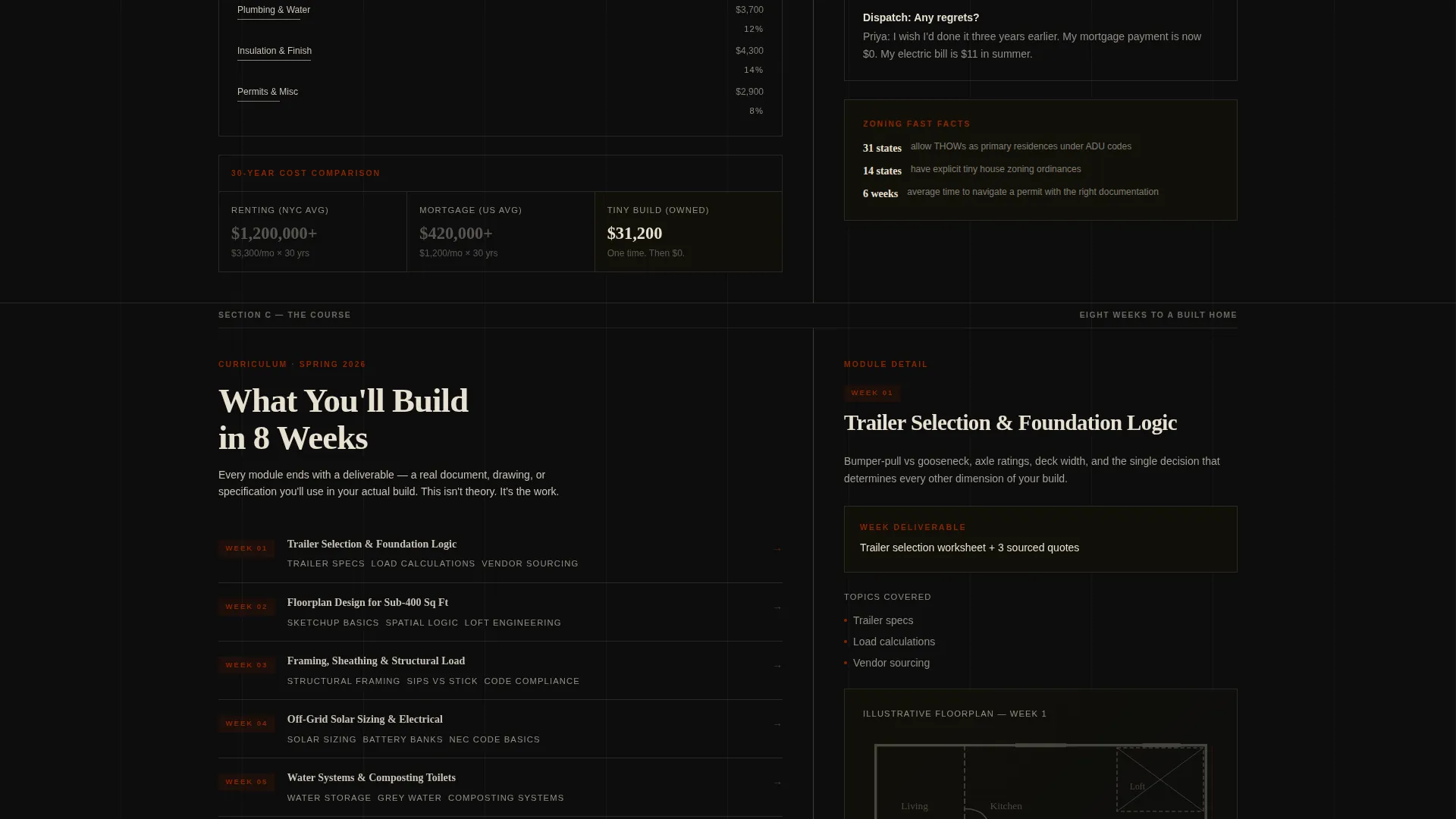
The curriculum section reveals the 8-week course structure as a bento-style grid of article headlines. A tab module switcher lets visitors browse week-by-week content without leaving the page. Each module is presented like a special-issue section header, keeping the editorial metaphor consistent from top to bottom.
Broadsheet Pull-Quote Testimonials
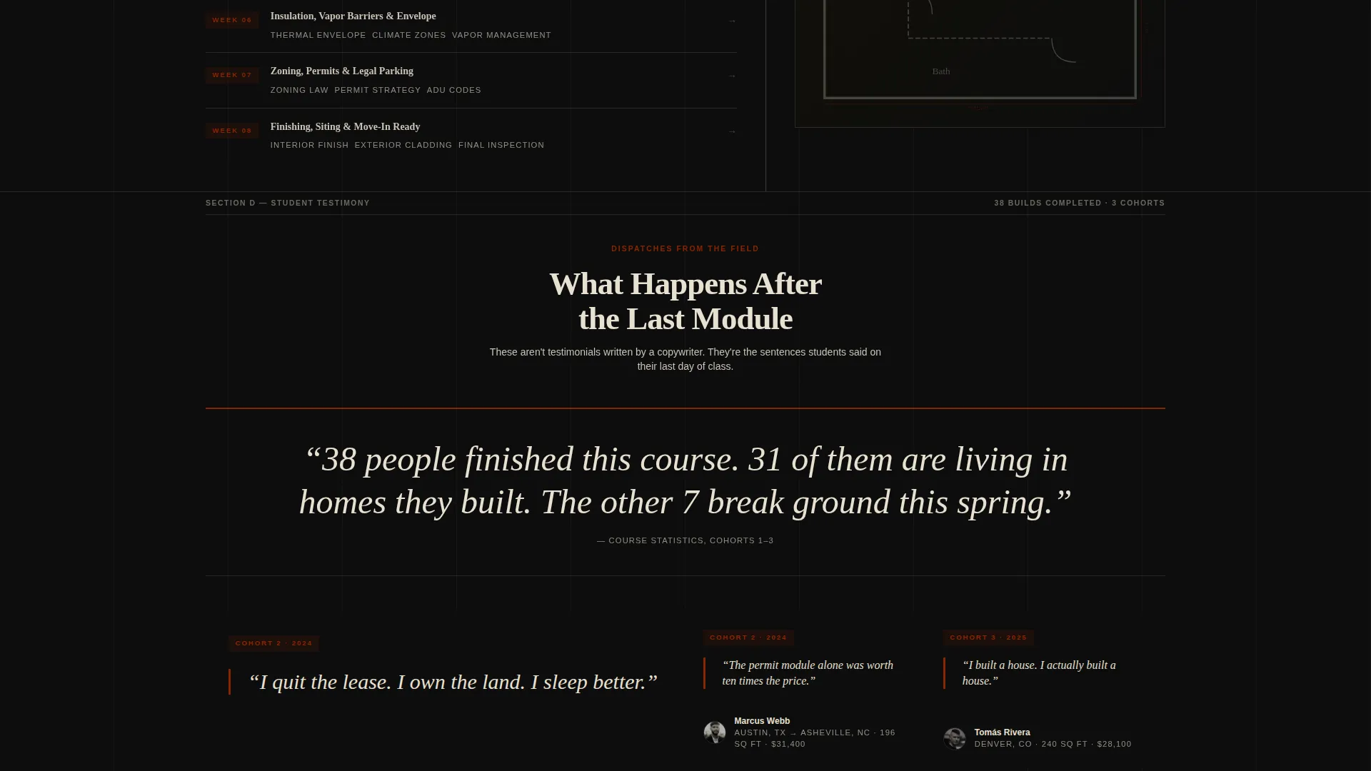
Student testimonials appear as large-format pull-quotes that interrupt the grid like broadsheet callouts. Each quote is a single sentence from a named graduate, formatted to read like a headline. An interview transcript style supports longer student stories alongside the pull-quotes for readers who want more detail.
Dual Lead Capture System
Two separate capture forms handle different levels of buyer readiness. The primary path uses a single email field to reserve a waitlist seat. The secondary path offers a free PDF floorplan starter kit in exchange for a name and email. A sticky tear-strip waitlist bar reappears after the third scroll section to keep the primary call to action visible without being intrusive.
FAQ Accordion and Interactive Elements
A collapsible FAQ accordion addresses common objections around zoning, cost, and course structure. The tab module switcher and accordion are built as interactive client-side components. Scroll-reveal animations and grayscale photo transitions add motion without distracting from the editorial tone.
Page sections overview
| Section | Purpose |
|---|---|
| Masthead Hero | Establishes editorial identity and captures first waitlist signups |
| Evidence Data Grid | Presents real cost breakdowns and zoning context to build trust |
| Curriculum Bento | Reveals the 8-week course structure as scannable article blocks |
| Testimonial Pull-Quotes | Delivers social proof through named student quotes and transcripts |
| Blueprint PDF Capture | Offers a free floorplan kit to convert lower-intent visitors |
| Sticky Tear-Strip Bar | Keeps the waitlist call to action visible across scroll depth |
| Minimal Footer | Closes the page with clean horizontal flow and essential links |
Design & branding system
The visual identity follows an Ink & Paper theme rendered in a cinematic dark color system. Typography pairs Fraunces, a heavy serif display face, with DM Sans for body copy and interface elements. Every color decision references the tactile quality of uncoated print stock.
- Color palette: deep editorial black (#0D0D0D) as the base, newsprint warm gray (#C8C2B4) for secondary text, aged parchment (#E8E0D0) for primary text, and red-oxide ink (#8B2500) reserved for pull-quotes, issue numbers, and hover states
- Typography roles: Fraunces carries all display and headline weight; DM Sans handles body paragraphs, captions, and form labels
- Texture and mood: halftone-style photography, slightly foxed edge treatments, and a limited-run architectural zine aesthetic throughout
Mobile & speed optimization
The template is built desktop-first to honor the broadsheet aesthetic, and it scales responsively to smaller viewports without losing the editorial hierarchy. Interactive components are separated into client-side elements to keep static sections light.
- Server Components handle static sections like the hero, evidence grid, and curriculum blocks to reduce render load
- Client-side components are scoped to interactive elements: the tab switcher, FAQ accordion, email capture forms, and sticky tear-strip bar
- Scroll-reveal animations and grayscale photo transitions are applied at medium intensity to support the editorial pacing without heavy overhead
How this template helps you convert
The page is structured to earn the signup rather than demand it. Real data and peer outcomes appear before any call to action, so by the time a visitor reaches the form, trust is already built.
- The masthead hero surfaces the "Reserve Your Seat" form immediately below the banner headline, catching high-intent visitors who decide fast
- The evidence grid and testimonial sections handle objections and build emotional resonance for visitors who need more proof before committing
- The sticky tear-strip bar and Blueprint PDF capture ensure that visitors who scroll past the first form still have two more opportunities to enter the funnel at the right level of commitment
Other information about this template
This template is part of a Blog & Editorial category build with a Tiny House Living Content subcategory focus. It is specifically matched to the Tiny House Living Online Course niche and carries an intersection match score of 13, indicating strong alignment between the editorial style and the course subject matter.
- The creative direction follows an Industry Report format, where scrolling the page feels like reading a deeply researched special issue rather than browsing a typical sales page
- The header concept is classified as Newspaper/Publication, and the landing-page direction is Waitlist/Coming Soon, meaning the entire structure is optimized for pre-launch audience building rather than direct checkout
- The footer uses a Vercel Horizontal Flow pattern (Pattern 3) for a clean, minimal close that does not distract from the conversion flow above it
Theme
Ink & Paper
Creative direction
Industry Report
Color system
Cinematic Dark
Style
Asymmetric Grid (60/40)
Direction
Waitlist/Coming Soon
Page Sections
Newspaper Masthead Hero
Asymmetric 60/40 Evidence Grid
Week Curriculum Bento Layout
Broadsheet Pull-quote Testimonials
Dual Lead Capture System
Interactive FAQ Accordion
Related questions
Can I use this template if my course is not yet fully built?
How does the dual lead capture work in practice?
Is the 60/40 grid layout fixed, or can I adjust the column proportions?
What fonts does this template use?
Does the sticky tear-strip bar appear on mobile screens?



