Tiny House Living Podcast Landing Page Template
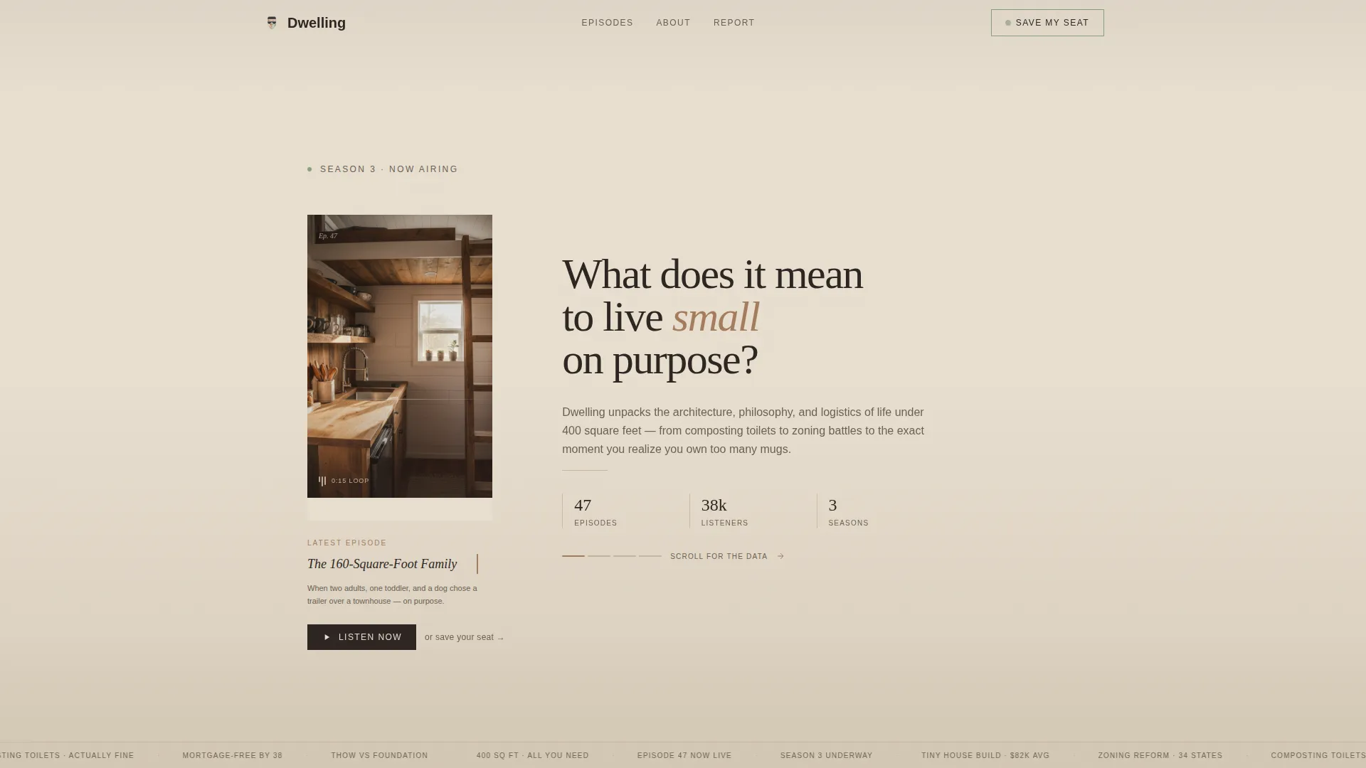
Dwelling is an editorial landing page for a weekly tiny house living podcast. It uses a horizontal scroll layout to guide visitors through magazine-style data panels, then invites them to join the waitlist for the live season. The warm, hand-built visual identity and intimate short-form reel header make the case before a single word is read.
by Rocket studio
Quick summary
Dwelling is a single-page horizontal scroll landing page built for a weekly podcast about tiny house living. It pairs a letterboxed vertical reel header with five editorial data panels, a mid-scroll waitlist form, and a report download at the end. The result is a page that earns the sign-up by proving depth first.
Who this template is for
This template suits podcast creators, independent media producers, and content-led brands who want their landing page to do more than announce a show. It is especially well suited for people working in the architecture, alternative housing, and intentional living space.
- First-time tiny house builders researching foundation costs and build logistics
- Remote workers and suburban homeowners considering a shift away from conventional housing
- Podcast hosts who want a waitlist page that reads like a magazine, not a newsletter opt-in
What problem this template solves
Most podcast landing pages feel like a placeholder. They list episode numbers, drop a subscribe button, and leave. Visitors arrive curious and leave underwhelmed because the page never proved the show was worth their attention.
- There is no editorial depth to hold a reader who arrived from a search or a share
- A standard hero plus form layout cannot communicate the intellectual weight of a topic like tiny house architecture and zoning law
- Without a staged reveal, curious visitors bounce before they ever reach the sign-up
What you get with this template
You get a fully structured, animation-rich landing page designed around a single editorial arc. Each section builds on the last, moving a visitor from curious observer to committed subscriber.
- A letterboxed vertical reel hero section with a typewriter episode title effect beneath it
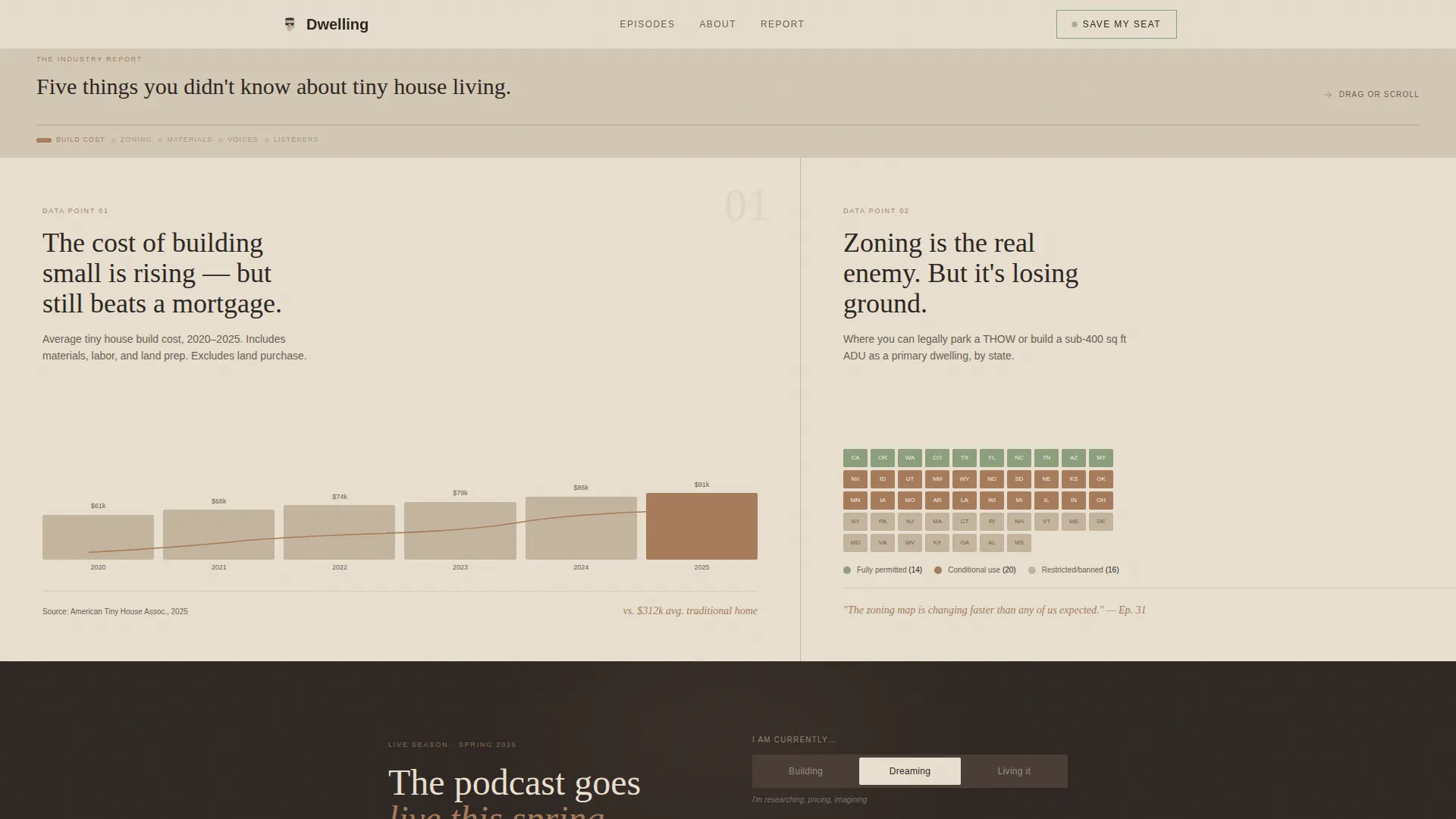
- Five horizontal scroll panels styled as magazine spreads, each presenting one data point or insight
- A mid-scroll waitlist form with a single email field and a three-option audience toggle, plus a secondary report-download conversion at the end
Feature list
A brief note on the features below: every item listed is directly drawn from the source brief for this template.
Horizontal Scroll with Snap Panels
The page drives a lateral scrolling experience where each panel locks into place on arrival. Five editorial panels cover build cost trends, a zoning legality map, a materials comparison, pull quotes from past guests, and listener statistics. Each panel is designed like a single magazine spread.
Short-Form Reel Hero
The header section plays a fifteen-second vertical-format video loop, letterboxed against the limestone background. The reel is shot handheld and shows the interior of a tiny house without a host face or logo. A serif episode title types itself in beneath the reel using a typewriter animation effect.
Mid-Scroll Waitlist Form
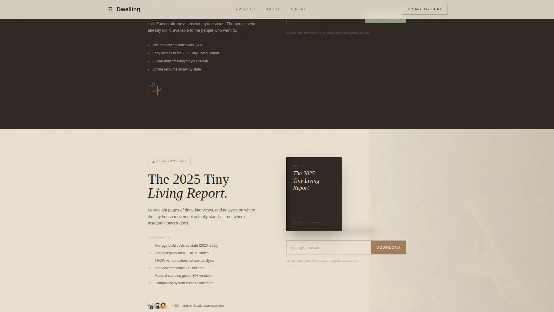
A "Save My Seat" email capture form appears after the third horizontal panel, timed to when visitor curiosity is highest. The form includes a single email field and a toggle asking visitors to identify as building, dreaming, or already living small. This segmentation detail is collected at the point of sign-up.
Secondary Report Download Conversion
At the end of the scroll, a second conversion offer invites visitors to download the 2025 Tiny Living Report. It uses the same email capture mechanic as the waitlist form, giving visitors who already signed up a shareable, tangible reason to stay engaged.
Editorial Data Panels
Each of the five horizontal panels presents one insight in a data-rich, art-directed format. Content includes a hand-drawn build cost trend line, a state-level zoning map, a side-by-side materials comparison, oversized pull quotes in serif type, and a listener count panel. The panels are designed to feel like pages from an annual report.
Warm Stone Visual System and Typography
The color palette uses sun-bleached limestone as the background wash, charred timber for body text and navigation, exposed cedar on hover states and progress indicators, and desert sage on active sections and call-to-action borders. Typography pairs Fraunces as the serif display face with DM Sans for body copy.
Page sections overview
| Section | Purpose |
|---|---|
| Reel Hero | Opens the page with a letterboxed vertical video loop and typewriter episode title |
| Horizontal Scroll Panels | Delivers five editorial magazine spreads with data, maps, quotes, and stats |
| Mid-Scroll Waitlist | Presents the "Save My Seat" email form and audience toggle after panel three |
| Report Download | Offers the 2025 Tiny Living Report as a secondary conversion at scroll end |
| Footer | Closes the page with a horizontal footer pattern |
Design & branding system
The design language is editorial magazine meets hand-built cabin. Every visual choice favors warmth, grain, and analog texture over clean digital minimalism. The palette and typography work together to feel like a physical object you would pick up and read slowly.
- Color system uses four values: limestone (#E8DFD0) for backgrounds, charred timber (#2C2420) for text, cedar beam (#A67B5B) for hover and progress states, and desert sage (#8B9E7C) for active elements and call-to-action borders
- Typography is set in Fraunces for all display and heading use, and DM Sans for body copy, captions, and form labels
- Animation stack includes a typewriter title effect, horizontal scroll snap, grain overlay, scan line texture, and staggered panel reveals
Mobile & speed optimization
The template is built desktop-first to support the horizontal scroll experience as its primary interaction. A mobile fallback converts the lateral panel flow into a vertical stack so all content remains accessible on smaller screens.
- Desktop layout uses native CSS scroll behavior and Intersection Observer for scroll-linked panel reveals and animations
- Mobile fallback preserves all five data panels and both conversion forms in a readable vertical sequence
- Animations use CSS-native techniques, keeping the interaction layer lightweight without relying on heavy script dependencies
How this template helps you convert
The page is structured as a staged argument. By the time a visitor reaches the first form, they have already encountered three data-rich panels that prove the show's depth. The sign-up feels earned rather than demanded.
- The reel hero and typewriter title establish intimacy and credibility immediately, giving a visitor a reason to keep scrolling rather than bouncing
- The mid-scroll waitlist form appears at the moment of peak curiosity, after three editorial panels have delivered genuine insight, making the "Save My Seat" ask feel like a natural next step
- The secondary report download at the end gives already-converted visitors a second reason to engage, extending reach through sharing without requiring a separate campaign
Other information about this template
This template is part of the Blog & Editorial category within the Tiny House Living Content subcategory. It is built for the Tiny House Living Podcast niche and carries a high intersection match score for its category alignment. A few additional details worth knowing before you use it:
- The page is localized for English-language audiences with United States-centric content context, including the state-level zoning map panel
- The episode title shown in the template is "Episode 47: The 160-Square-Foot Family," used as a realistic placeholder to illustrate the typewriter animation
- The audience toggle on the waitlist form uses three options: building, dreaming, and already living small, giving you immediate audience segmentation data from day one
- The footer uses a horizontal layout pattern consistent with the lateral scroll design language of the rest of the page
Theme
Editorial Magazine
Creative direction
Industry Report
Color system
Warm Stone
Style
Horizontal Scroll
Direction
Waitlist/Coming Soon
Page Sections
Horizontal Scroll with Snap Panels
Short-form Reel Hero
Mid-scroll Waitlist Form
Secondary Report Download
Editorial Data Panels
Warm Stone Visual System
Related questions
Can I replace the video reel with my own footage?
Is the horizontal scroll layout usable on mobile devices?
Do both conversion forms use the same email capture mechanic?
Can I update the data shown in the editorial panels?
What is the audience toggle on the waitlist form for?



