History & Culture Blog Pre-Launch Website Template
Edifice is a single-column landing page template built for an architecture history blog. It combines an animated SVG header illustration, three layered essay previews, and a focused waitlist conversion flow. The Luxe Minimal design draws from eighteenth-century engraving aesthetics, using cream, ink black, graphite, and oxblood red to create a monograph-quality reading experience.
by Rocket studio
Quick summary
Edifice is a landing page template for an architecture history blog. It presents three essay previews in an editorial cadence, builds intellectual curiosity with each scroll, and channels that curiosity into a waitlist signup. The design feels like a clothbound monograph opened in a quiet library, restrained and authoritative from the first line to the last.
Who this template is for
This template is built for writers, editors, and creators launching a design-literate editorial project. It suits anyone whose content demands a reading experience rather than a browsing one.
- Architecture students and practicing architects preparing to share thesis-level research or writing
- Design-literate content creators launching a history or culture blog with a niche, engaged audience
- Editorial founders building pre-launch anticipation through a waitlist before a public debut
What problem this template solves
Most blog landing pages look like generic content feeds. They fail the reader before a single paragraph is opened. Edifice solves the mismatch between serious intellectual content and shallow presentation.
- A standard newsletter or blog template cannot convey scholarly credibility at a glance
- Without a structured essay preview flow, visitors have no reason to commit their email address before launch
- Generic layouts undercut niche authority and lose the design-literate audience before the first scroll
What you get with this template
You get a complete single-column landing page built around editorial persuasion. Every section earns the next one, leading the visitor naturally toward the waitlist form.
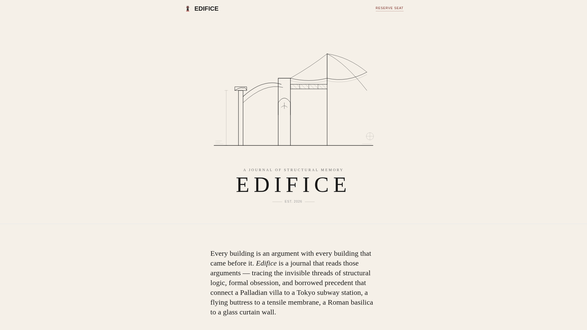
- An animated SVG hero illustration that draws itself on scroll, styled as an eighteenth-century architectural cross-section
- Three numbered essay preview sections with architectural thumbnail illustrations, pull quotes, and estimated read times
- Two waitlist call-to-action placements with a single email field, positioned at mid-page and at the page terminus
Feature list
This template packages several distinct components into one cohesive editorial landing page.
Scroll-Triggered SVG Animation
The hero illustration is an animated SVG architectural cross-section. Lines appear as if drawn by an unseen hand in real time as the visitor scrolls. The animation builds toward the blog masthead appearing in tracked-out capitals, functioning as a visual colophon.
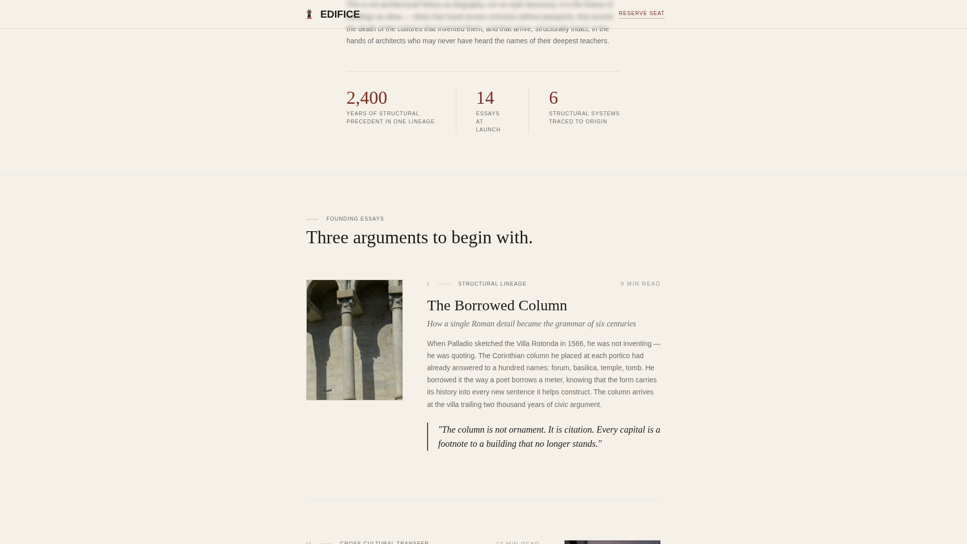
Three-Stage Essay Preview Flow
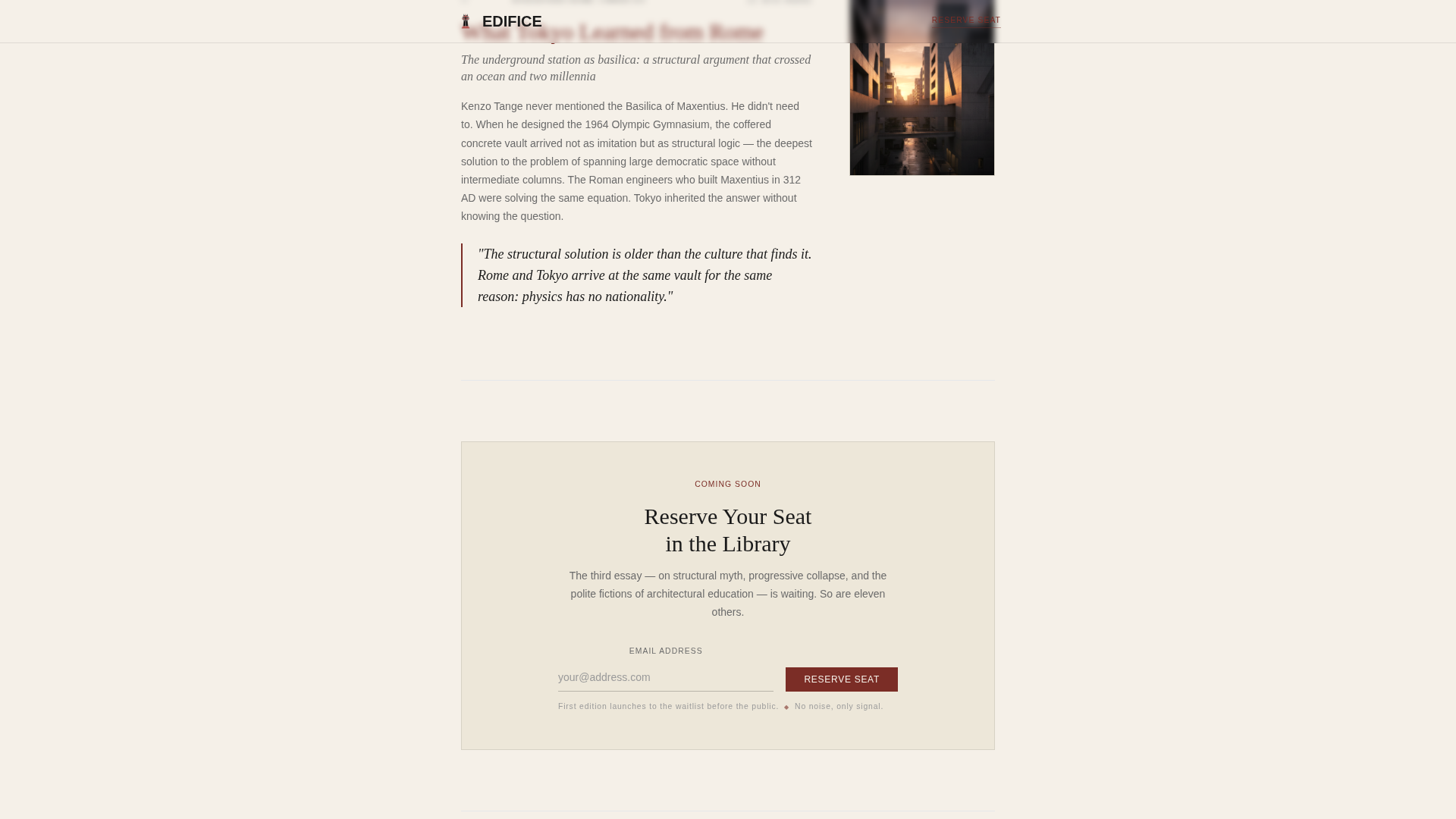
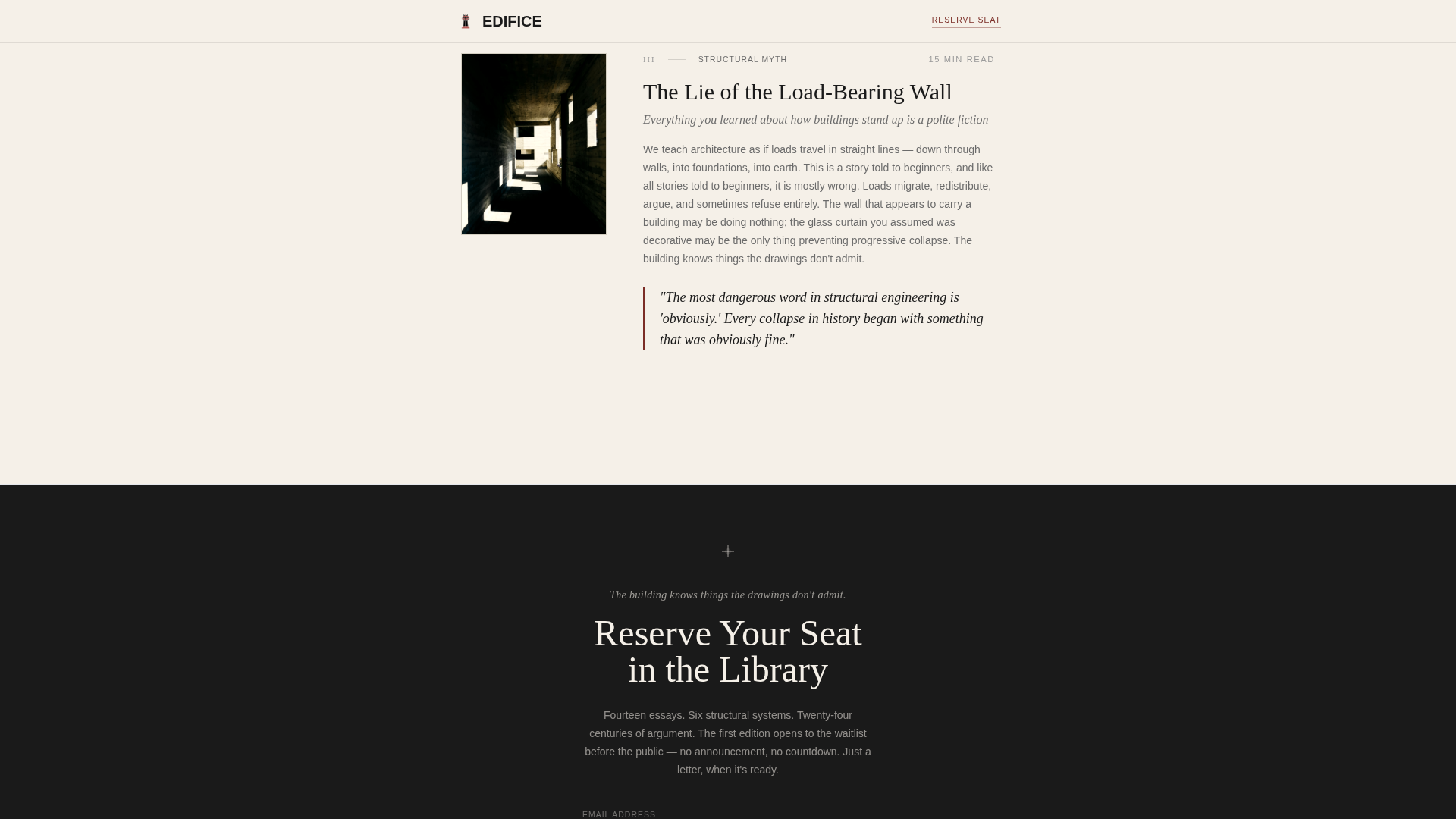
Three numbered essay entries are revealed in sequence below the editorial thesis. Each entry includes a thumbnail illustration, a pull quote, and an estimated read time. The progression moves from accessible to surprising to provocative, deepening the visitor's investment with every section.
Dual Waitlist Conversion Form
The email signup form appears twice: once after the second essay preview creates genuine curiosity, and again at the page's terminus after the third essay raises a question the visitor needs answered. Both placements use a single email field and a quiet, confident confirmation note.
Editorial Thesis with Data Callouts
Below the hero, a single authoritative paragraph states the blog's intellectual position. Sparse data callouts such as "2,400 years of structural precedent in one lineage" and "14 essays at launch" lend the weight of a research publication to the editorial introduction.
Staggered Text Reveals and Parallax
Text sections and section elements animate into view with staggered reveals as the visitor scrolls. Parallax motion adds depth to the reading experience without distracting from the content.
Page sections overview
| Section | Purpose |
|---|---|
| Animated SVG Hero | Draws the architectural cross-section on scroll and sets the masthead |
| Editorial Thesis Block | States the blog's intellectual position with sparse data callouts |
| Essay I Preview | Accessible entry point titled "The Borrowed Column" with pull quote |
| Essay II Preview | Surprising angle titled "What Tokyo Learned from Rome" with pull quote |
| Mid-Page Waitlist | First email signup placement after curiosity peaks at Essay II |
| Essay III Preview | Provocative hook titled "The Lie of the Load-Bearing Wall" |
| Terminal Waitlist | Final email signup placement after the third essay provocation |
| Minimal Footer | Extreme minimal footer with no social links or secondary navigation |
Design & branding system
The visual identity follows a Luxe Minimal theme built on an Ink and Paper color system. Every color decision references the material qualities of a first-edition treatise printed on cotton rag stock.
- Warm archival cream (#F5F0E8) dominates the background as breathing space; deep manuscript black (#1A1A1A) commands headlines in large serif type; faded graphite (#6B6B6B) carries body text
- Oxblood red (#7B2D26) appears exclusively on interactive elements and editorial highlights, never as decoration
- Typography pairs Fraunces as the display serif for headlines with DM Sans for body text, creating clear hierarchy between reading modes
Mobile & speed optimization
The template is designed desktop-first, replicating a monograph reading experience on large screens. It degrades gracefully to mobile without losing the editorial character of the layout.
- Staggered text reveals and scroll-linked SVG animation are handled via client-side components, keeping static content fast to render
- The single-column flow adapts cleanly to narrower viewports because the layout never relies on complex grid structures
How this template helps you convert
The entire layout is structured as a persuasion sequence. No alternative paths, no social links, and no distractions exist to pull the visitor away from the signup.
- The animated SVG hero establishes aesthetic authority immediately, signaling that this is not a generic blog before a single word is read
- The three-essay preview sequence escalates intellectual stakes deliberately, so the visitor reaches the waitlist form already convinced the content is worth reserving a spot for
Other information about this template
This template is part of the Blog and Editorial category, sitting within the History and Culture Blog subcategory. It is purpose-built for the architecture history blog niche, where design credibility and content authority must work together from the first impression.
- The layout uses a single-column flow with no sidebar, no navigation menu beyond the masthead, and no external links, keeping every element focused on one conversion goal
- The footer follows an extreme minimal pattern with no social profile links, reinforcing the journal-like seriousness of the publication
- The template is well suited for any forthcoming editorial project in design history, architectural theory, or cultural criticism that needs to build a pre-launch audience before going public
Theme
Luxe Minimal
Creative direction
Industry Report
Color system
Ink & Paper
Style
Single Column Flow
Direction
Waitlist/Coming Soon
Page Sections
Scroll-triggered SVG Hero Illustration
Three-stage Essay Preview Sequence
Dual Waitlist Conversion Placement
Editorial Thesis with Data Callouts
Staggered Reveals and Parallax Motion
Extreme Minimal Footer
Related questions
Can I replace the essay titles and preview content with my own writing?
Does the waitlist form connect to an email platform automatically?
Is this template only suited to architecture blogs?
How does the SVG hero animation behave on mobile devices?
Can the oxblood red accent color be changed to a different brand color?