Education Blog & Media Privacy Policy Website Template
Folio is an editorial masonry landing page built for education industry publishers and research blogs. It presents long-form reports on pedagogy, edtech funding, and policy in a curated, card-based grid. The design draws on warm parchment tones, refined serif typography, and scroll-triggered animations to give every report the authority it deserves and pull visitors deep into the content.
by Rocket studio
Quick summary
Folio is a single-page masonry landing page template designed for education industry report blogs. It combines broadsheet-level editorial presentation with a browsable card grid, giving district superintendents, edtech founders, and doctoral researchers a professional, visually considered entry point into long-form analysis on pedagogy, funding, and policy.
Who this template is for
This template is built for a focused, professional audience. It serves publishers and editors who produce serious education research and need a landing page that matches the quality of their work. It also suits any creative professional running an education-focused publication who wants the site to feel as considered as the content inside it.
- District superintendents, edtech founders, and doctoral researchers who consume weekly reports
- Education media teams and independent publishers producing policy and market analysis
- Research-led blogs needing a professional portfolio of long-form education content
What problem this template solves
Most blog templates treat every post the same. They force a linear list view that buries important work and gives no sense of editorial curation. For an education industry report blog, that generic presentation undermines the value of the content before anyone reads a word.
- Visitors cannot quickly scan, compare, or browse reports by theme or depth
- Generic layouts fail to signal the authority that busy professionals require before clicking
- No clear path exists to keep readers engaged or guide them toward the next relevant report
What you get with this template
You get a fully structured, single-page editorial landing page ready to customize in Figma. The template includes the full design system, all page components, and both a light and a focused dark theme option. Every element is designed to showcase the depth and craft of your education reporting.
- A hero section with giant centered serif headline and italic feature subline on parchment white
- A full masonry grid with three themed collections, staggered fade-up animations, and hover-state card interactions
- A sticky top bar email capture field for newsletter sign-ups and a clean single-row footer
Feature list
This template ships with a tightly considered set of features. Each one exists to serve the specific needs of an education research publication and the professional readers it attracts.
Editorial Masonry Grid Layout
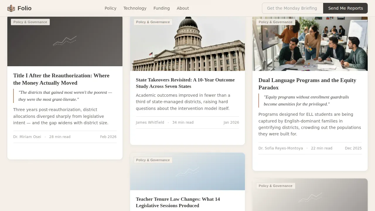
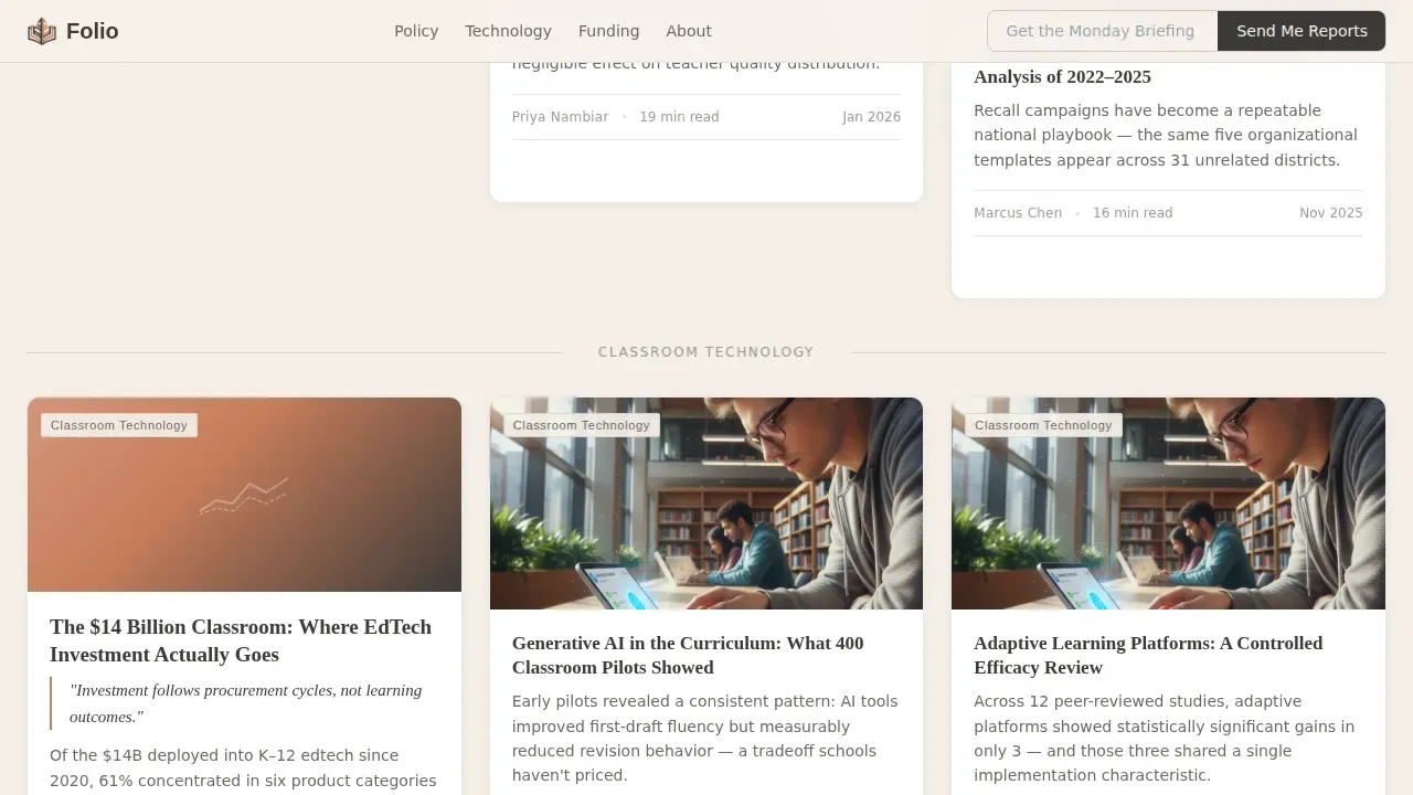
The masonry grid is the heart of this template. Report cards tile at variable heights depending on content depth, creating a wall of ideas that feels curated rather than chronological. Each card carries a muted cover illustration, a category tag, a graphite serif title, and a one-line thesis statement that opens a question only the full report can close. Scroll-triggered stagger animations bring tiles into view with a gentle fade-up as visitors move down the page.
Giant Centered Hero Headline
The hero section foregoes images entirely. An enormous Fraunces serif headline sits centered on a field of parchment white, tracked wide with nothing competing for attention. Below it, a single italicized subline names the current month's feature report. The presentation communicates authority through typography alone, the way a broadsheet masthead commands a newsstand. This approach keeps the landing page focused on a single value proposition from the first pixel.
Hover-State Card Interactions
Every masonry tile functions as its own clear call to action. On hover, the card lifts, the terracotta tag sharpens in color, and a "Read the Full Report" prompt appears. These interactive elements guide visitors toward specific actions without requiring a separate button section. The design keeps engagement high by rewarding curiosity at every tile rather than funneling visitors to one point on the page.
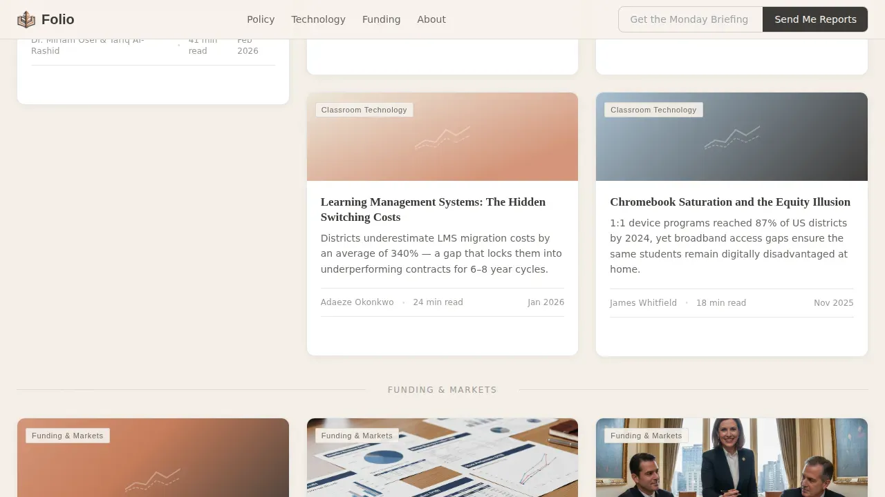
Thematic Collection Dividers
Reports are grouped into three loose collections: Policy and Governance, Classroom Technology, and Funding and Markets. Thin typographic dividers separate each group without breaking the visual flow of the wall. The layout allows visitors to orient themselves by interest area quickly. This approach supports progressive disclosure, showing high-level category context before visitors commit to reading a full report.
Sticky Email Capture Bar
A slim sticky bar sits at the top of the page throughout the scroll. It carries a brief prompt and a single form field for email capture, with a button labeled "Send Me Reports." The form fields are kept to an absolute minimum to reduce friction. This gives the landing page a secondary conversion path that does not interrupt the browsing experience of the masonry grid below.
Scroll-Triggered Animations
Tiles animate into view as visitors scroll, using a stagger fade-up pattern that makes the grid feel alive without being distracting. The animations are set to a medium intensity, keeping the presentation unhurried and considered. Each reveal reinforces the sense that something worth reading is waiting just below the current view, sustaining interest across the full length of the page.
Page sections overview
| Section | Purpose |
|---|---|
| Hero Headline Area | Sets editorial authority with oversized serif headline and italic feature subline |
| Masonry Report Grid | Showcases all reports in a browsable, variable-height card layout |
| Policy and Governance | Groups policy-focused reports under a thin typographic divider |
| Classroom Technology | Organizes edtech reports into a themed collection cluster |
| Funding and Markets | Presents market-sizing and investment reports as a distinct collection |
| Sticky Email Bar | Captures email leads with a slim top-bar field throughout scroll |
| Single-Row Footer | Closes the page with a clean, minimal linear footer |
Design & branding system
The visual identity follows an Atelier Studio editorial theme built on the Cloud Canvas color system. Every color choice was made to feel like a linen-covered desk under diffused northern light: studious without severity, warm without whimsy. The typography pairing of Fraunces for display and DM Sans for body text keeps reading comfortable across long pages while signaling design literacy to a professional audience.
- Warm parchment white (#F5F0E8) as the base field, soft graphite (#3D3A38) for all body and title text
- Muted sky wash (#C4D4E0) as a card background tone, with terracotta pencil (#C67D5B) reserved for hover states and category tags
- Fraunces refined serif for headlines and pull-quotes, DM Sans for body copy, tags, and the sticky bar
Mobile & speed optimization
The template layout is designed desktop-first to match how superintendents and researchers typically access long-form reports. The masonry structure and card hover states are built for larger screens where the full editorial wall can be appreciated. At the same time, the layout is structured to remain readable and navigable on mobile devices.
- Responsive layout adapts the masonry grid for tablet and mobile devices without losing the editorial feel
- Lazy-loaded images keep the page light; the static-first build approach means the site loads fast without heavy dependencies
- The sticky email bar remains accessible on smaller screens, preserving the secondary conversion path across all device sizes
How this template helps you convert
This landing page earns its clicks through craft rather than pressure. Every design decision points visitors toward one thing: reading the next report. Creating an effective education blog landing page means balancing credibility, clear value propositions, and user-centric presentation, and this template is built around exactly that principle.
- The masonry grid acts as its own social proof engine. The density and variety of reports signal an active, authoritative publication before a single word is read. Each card thesis creates an open question that pulls visitors deeper.
- The sticky email bar provides a low-friction secondary conversion path with minimal form fields, capturing newsletter leads without disrupting the browsing experience.
- Progressive disclosure through card-level thesis statements means visitors self-select into reports that match their interest, improving click quality and sustaining engagement across the full page.
Other information about this template
This template draws design inspiration from the tradition of small-press monograph publishing and broadsheet editorial design. It is well suited to any education media project where the goal is depth of click over volume of traffic. The template can support a range of education industry projects, from weekly policy briefings to quarterly market reports. It pairs naturally with portfolio websites that want to showcase editorial work samples alongside live report pages.
Understanding how real landing page examples work in the education sector can sharpen how you customize this template. Real landing pages that convert well in education combine social proof, a confident value proposition, and scannable layout. Folio covers all three through visual storytelling in the masonry grid, report card density as implicit social proof, and the clear editorial hierarchy of its typography system.
Folio the curated education industry report blog landing page template is built in Figma, making it straightforward to edit and customize without writing code. The template includes over 48 screens covering personal, blog, and portfolio websites with both a bright light theme and a sleek dark theme. Liam's Folio is a fully responsive Webflow template designed for easy customization, and the broader Folio family supports webflow sites as well as Figma-based design workflows. Landingi also offers portfolio sites and template starting points that share the same editorial sensibility for teams who want to start crafting a professional publication layout quickly.
- The template includes client logos placement areas and authority badge zones to showcase institutional social proof
- High quality images and data-driven chart visuals can be dropped into card illustration slots to act as visual teasers
- Videos, case studies, and field interview excerpts can be incorporated into individual report card details
- The design options within the template include both the warm light theme and a focused dark theme for different publication contexts
- Authority indicators such as author credentials on cards and pull-quote styling are built into the card components
- The template is a specialized web page purpose-built for education media, distinct from general-purpose portfolio websites

Theme
Atelier Studio
Creative direction
Curated Collection
Color system
Cloud Canvas
Style
Masonry/Pinterest
Direction
Click-Through
Page Sections
Editorial Masonry Card Grid
Giant Centered Hero Headline
Hover-state Report Card Ctas
Sticky Email Capture Bar
Thematic Collection Dividers
Scroll-triggered Stagger Animations
Related questions
Who is this landing page template designed for?
Can I customize the colors and typography?
Does the template include more than one theme or set of pages?
How does the template handle email capture?
Is this template suitable for mobile devices?



