Parenting & Family Blog Reviews Website Template
Advocate is an editorial-style special needs parenting landing page built on a masonry layout. It speaks directly to parents navigating Individualized Education Programs, therapy denials, and school meetings. A five-step quiz assessment guides visitors toward personalized support, while bold manifesto cards and pull-quote testimonials build trust before asking anything in return.
by Rocket studio
Quick summary
Advocate is a single-page special needs parenting resource built for the parent who is up at 1 a.m. searching for answers. The editorial magazine layout uses declaration-style masonry cards, black-and-white photography, and a five-step quiz assessment to meet families exactly where they are, overwhelmed, determined, and ready to act.
Who this template is for
This template was designed for creators, advocates, and organizations serving families of children with special needs. It speaks to the parent who already knows too much and still feels like they know nothing.
- Parents of school-age children working through Individualized Education Programs, therapy approvals, or school accommodation requests
- Bloggers, coaches, and advocacy platforms building trust-first funnels in the special needs parenting space
- Grandparents and extended family members searching for ways to help without overstepping
What problem this template solves
Most parenting resource pages feel clinical or generic. Families in the special needs space need a page that earns their trust before it asks for anything. This template solves the credibility gap between a parent's lived experience and the resources offered to them.
- Parents leave generic pages feeling unseen; this template opens with a manifesto voice that names the feeling first
- Quiz funnels often gate content too early; this template delays the email ask until the assessment results are ready, reducing friction
- Flat layouts fail to hold attention; the masonry grid creates a scrolling rhythm that mirrors flipping through a magazine you cannot put down
What you get with this template
You get a complete, single-page special needs parenting landing page with every section and interaction ready to customize. The layout is scroll-led, typographically bold, and built for the parent browsing on a phone late at night.
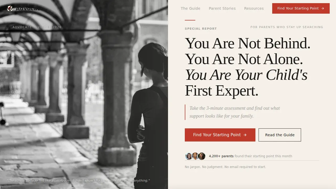
- An editorial split hero with a black-and-white photograph and a large serif manifesto headline
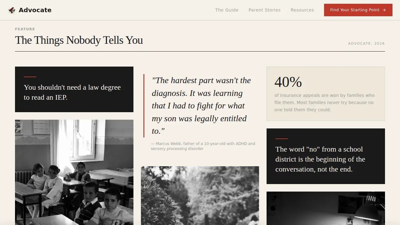
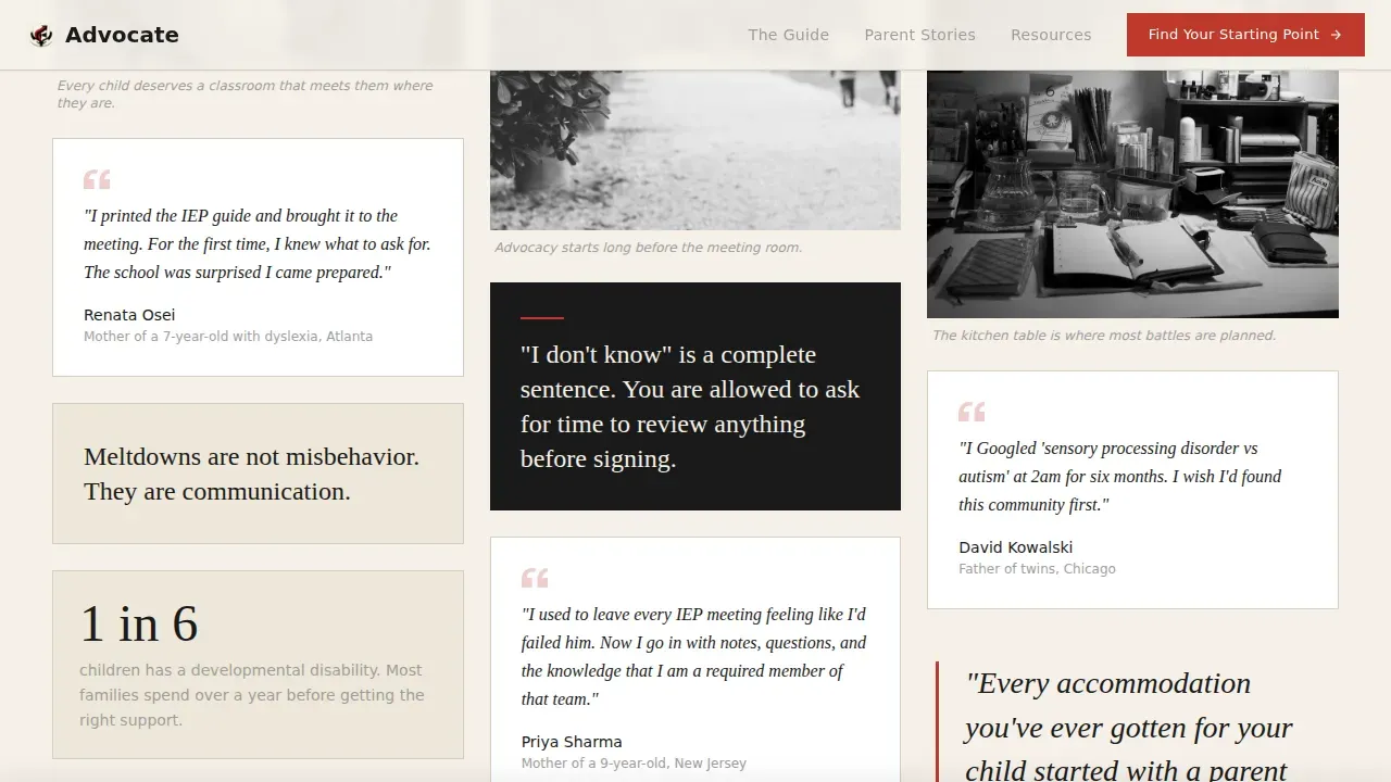
- A Pinterest-style masonry grid of declaration cards, staggered testimonials, and editorial photography
- A five-step quiz assessment modal with a progress bar, a fixed bottom call-to-action bar, and a late-stage email gate
Feature list
This template delivers a focused set of features built directly from the source brief. Each one serves the parent reader and the conversion goal together.
Editorial Split Hero Section
The hero divides the screen between a child's-eye-level black-and-white photograph on the left and a large Fraunces serif manifesto headline on the right. A single italic deck line sits beneath the headline and leads directly to the first call-to-action button.
Manifesto Masonry Grid
Declaration cards are laid out in a Pinterest-style masonry grid at staggered heights. Statements like "You shouldn't need a law degree to read an IEP" are interspersed with editorial photography and parent pull-quote testimonials, building emotional stakes as the reader scrolls.
Five-Step Quiz Assessment Modal
A low-friction five-question assessment opens from the primary call-to-action. It begins with "How old is your child?" and moves through diagnosis status, current school support, and biggest daily challenge. Each question appears on its own screen with a visible progress bar. The email gate appears only at the results stage.
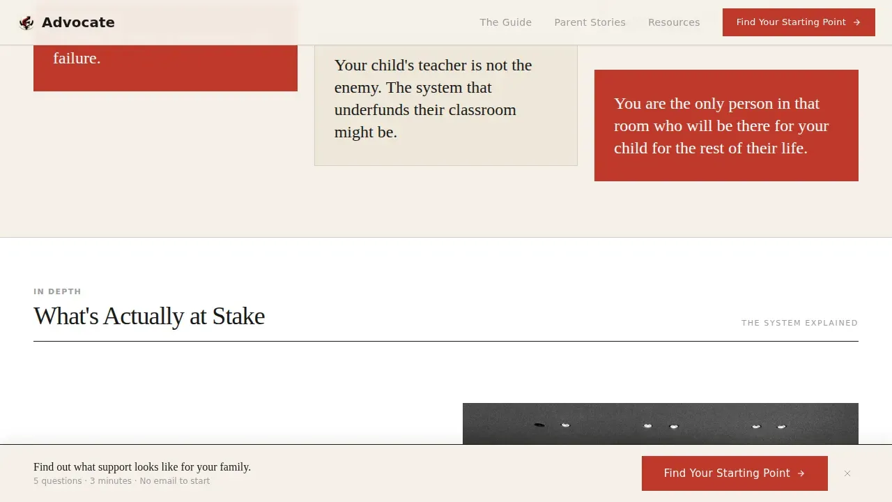
Fixed Bottom Call-to-Action Bar
After the third scroll depth, a persistent bottom bar activates with the "Find Your Starting Point" prompt. It stays visible as the reader continues scrolling, giving them a second entry point into the assessment without interrupting the reading experience.
Stakes and Testimonials Section
A dedicated editorial feature spread names what is actually at stake for families navigating special needs systems. Pull-quote style parent stories appear at staggered heights, grounding the emotional narrative in real voices before the final call-to-action.
Full-Width Assessment Call-to-Action
The page closes with a full-width editorial call-to-action block that mirrors the hero's urgency. It reinforces the assessment offer and provides a final conversion moment before the footer.
Page sections overview
| Section | Purpose |
|---|---|
| Editorial Split Hero | Introduce the manifesto voice and first call-to-action |
| Manifesto Masonry Grid | Build emotional stakes through declaration cards and staggered testimonials |
| Stakes Feature Spread | Name systemic and daily challenges facing special needs families |
| Pull-Quote Testimonials | Anchor trust with parent stories at staggered heights |
| Assessment Call-to-Action | Drive quiz completions with a full-width editorial prompt |
| Fixed Bottom Bar | Persistent secondary call-to-action after third scroll depth |
| Footer | Horizontal flow pattern closing the page |
Design & branding system
The visual identity follows an Ink and Paper editorial system. Every color choice is deliberate, and every typographic decision reinforces the broadsheet authority of the page.
- Color palette: warm newsprint cream (#F5F0E8) dominates all backgrounds; deep editorial black (#1A1A1A) carries all body text; margin-note gray (#9E9E9E) handles supporting labels; underline red (#C0392B) is reserved sparingly for links, pull quotes, and call-to-action elements
- Typography: Fraunces serif is used for all editorial headlines and declaration cards; DM Sans handles body copy and supporting text, maintaining a clear reading hierarchy
- Visual style: black-and-white photography shot at child's-eye height, staggered masonry card heights, and generous serif columns create the feel of a freshly printed broadsheet under a reading lamp
Mobile & speed optimization
The template is designed mobile-first, reflecting the real behavior of its audience. Parents searching for special needs parenting resources are most often on their phones, often late at night.
- The masonry grid reflows cleanly for mobile screens, preserving the staggered editorial rhythm without horizontal scrolling
- The five-step assessment modal is built for one-thumb navigation, with one question per screen and a visible progress bar at all times
- Images are described as optimized in the brief, and the assessment modal is lazy-loaded to keep the initial page experience fast
How this template helps you convert
Every design decision in this template serves one goal: getting the right parent to complete the assessment. The page earns the click before it asks for anything.
- The hero manifesto headline speaks to the parent's exact emotional state before any offer is made, reducing the distance between arrival and trust
- The masonry grid builds layered stakes across scroll depth, moving from daily frustrations to systemic gaps to empowerment, so the parent feels understood enough to act by the time they reach the call-to-action
- The five-step quiz uses the lowest-friction question first and delays the email gate until results are ready, so completion rates stay high and drop-off stays low
Other information about this template
This template sits at the intersection of editorial content design and advocacy-focused conversion strategy. It was built specifically for the special needs parenting niche within a broader blog and editorial category.
- The creative direction follows a Manifesto style, meaning the page leads with declarations rather than product claims, which suits an audience that is skeptical of one-size-fits-all parenting advice
- The masonry layout style draws from Pinterest-style visual grammar, making it familiar to the audience already consuming parenting content on visual platforms
- The template is categorized under Blog and Editorial, Parenting and Family Blog, and is well suited for advocacy platforms, resource hubs, and community-led parenting brands
- Scroll-reveal animations and stagger effects are set at a medium intensity, keeping motion purposeful rather than distracting
- The footer uses a horizontal flow pattern consistent with modern editorial publishing layouts
Theme
Editorial Magazine
Creative direction
Manifesto
Color system
Ink & Paper
Style
Masonry/Pinterest
Direction
Quiz/Assessment
Page Sections
Editorial Split Hero with Manifesto Headline
Manifesto Masonry Grid Layout
Five-step Quiz Assessment Modal
Fixed Bottom Call-to-action Bar
Stakes and Pull-quote Testimonials
Related questions
Does the quiz assessment require an email address to start?
Can I customize the manifesto declaration cards in the masonry grid?
What makes this different from a standard parenting blog template?
Is this template suited for mobile users?
Can an advocacy organization use this template, or is it only for individual bloggers?



