LegalTech Startup Comparison Website Template
Endpoint is a comparison landing page template built for developer-first legal API products. It follows a Problem-to-Solution scroll arc, opening with a chaotic multi-vendor pain table and resolving it with clean green-check comparison rows, a live sandbox query, and a floating call to action. The terminal-dark Acid Digital design speaks directly to backend engineers evaluating their next data layer.
by Rocket studio
Quick summary
Endpoint is a single-page comparison landing page template designed for legaltech API products targeting backend engineers and technical decision-makers. It uses a void-black terminal aesthetic, syntax-highlighted JSON cards in the hero, and a Problem-to-Solution scroll arc that walks visitors from fragmented data chaos to unified REST endpoint clarity. The primary call to action is "Explore the Docs," supported by an inline sandbox.
Who this template is for
This template is built for teams that need to convince potential customers through code, not marketing copy. If your product replaces messy legal data pipelines with clean, versioned REST endpoints, this page speaks that language instantly.
- Backend engineers at legal SaaS companies who need to evaluate integration options fast
- Solo developers building compliance checkers who want to run a test query before committing
- CTOs at mid-size firms running a build-versus-buy analysis on their data layer
What problem this template solves
Legal API teams face a real positioning challenge. Potential buyers are technical, skeptical, and already burned by vendors with inconsistent schemas and surprise rate limits. Standard marketing landing pages lose these visitors in the above the fold area before a single line of code appears.
- Fragmented vendor sprawl makes it hard to show a clear competitive advantage in one view
- Generic SaaS landing pages fail to address developer pain points with enough technical depth
- Comparison landing page designs built for non-technical audiences do not convert engineers
What you get with this template
This template delivers a full comparison landing page built around the Problem-to-Solution Arc creative direction. Every section is designed to move a skeptical technical visitor from recognition of their current pain to confident action.
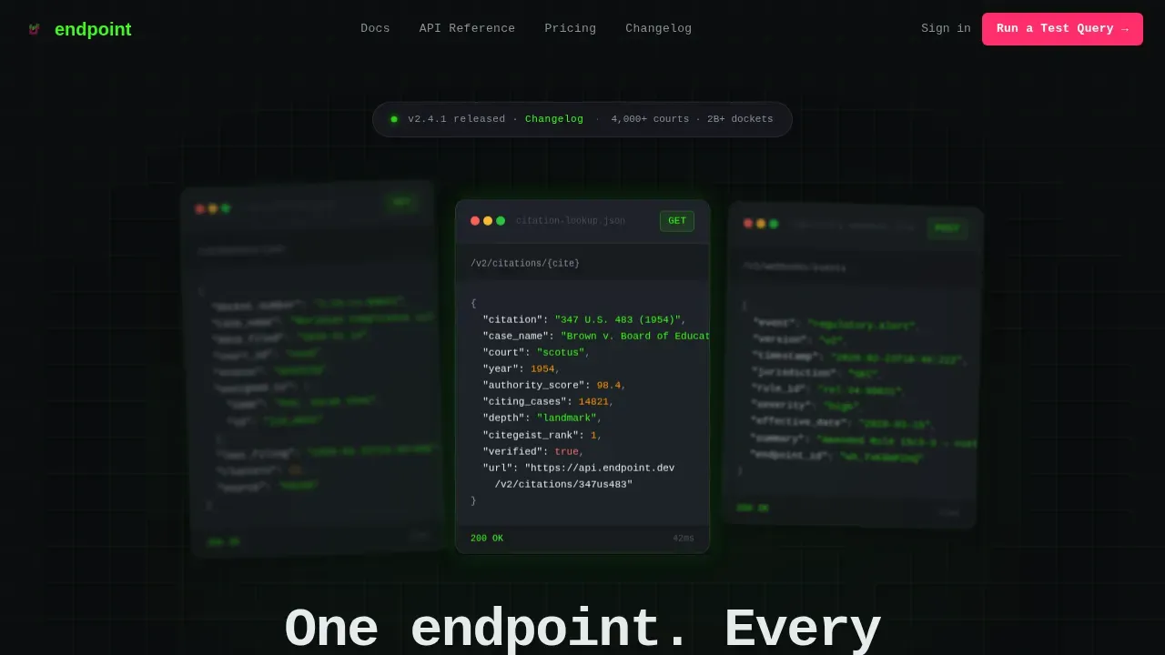
- A hero section with three floating dark-glass JSON cards showing real API response objects
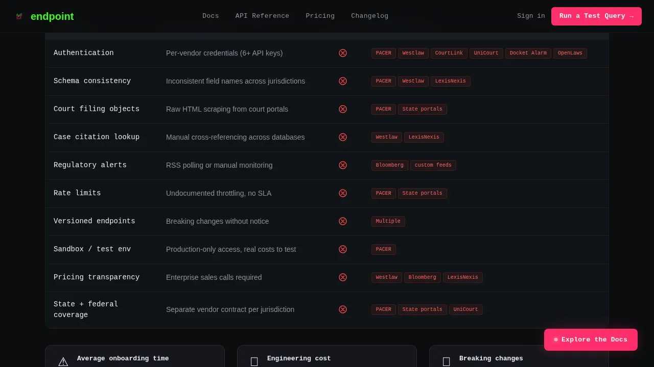
- A before-and-after comparison table structure: chaotic red-X pain view collapsing into clean green-check resolution
- An inline sandbox section where visitors paste a case number and see a live simulated response
- A floating "Explore the Docs" call to action that pins to the viewport once the visitor scrolls past the pain section
- A footer styled after the GitHub Developer Minimal pattern (Pattern 8)
Feature list
This template is packed with purpose-built components. Each one supports a specific moment in the developer decision making process.
Hero with Syntax-Highlighted JSON Cards
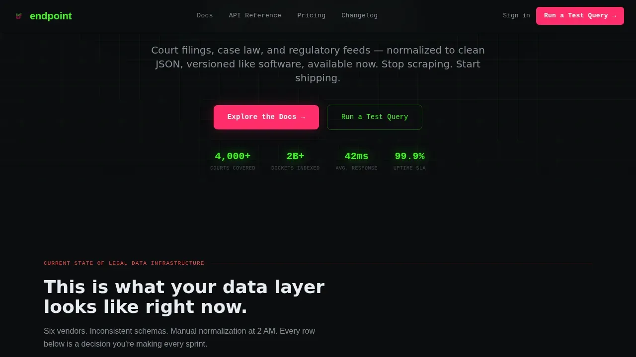
Three frosted dark-glass panel cards float against a void-black background. Each card renders a real API response object: a court filing, a case citation lookup, and a regulatory alert webhook payload. The JSON is syntax-highlighted in phosphor green and white. A typewriter headline animates beneath the cards. This is the compelling headline moment, and it earns attention at first glance without a single stock image.
Pain-State Comparison Table
The scroll opens with a chaotic comparison table showing what aggregating legal data looks like without the API: multiple vendors, inconsistent schemas, manual normalization, and throttled rate limits. Each row is a mess of red Xs and asterisks. This feature comparison chart is deliberately uncomfortable. It reflects the visitor's own current situation back at them. The table row stagger reveal animation makes the suffering feel visible and real.
Visual Break and Curl Command Block
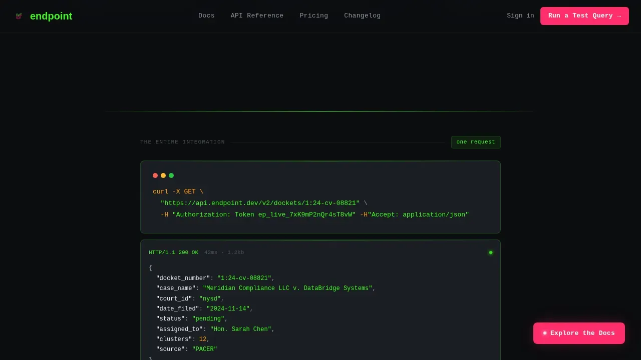
A hard visual break separates pain from solution. A single curl request appears centered on screen, rendered in monospaced type against the dark terminal gray background. This is the page's secret weapon: one line of code that reframes everything before and after it. It gives potential buyers a concrete moment of clarity before the solution table loads.
Solution Comparison Table with Floating Call to Action
The same comparison table rebuilds below the visual break. Every row now shows clean green checks, unified response formats, and a single authentication header. A "Explore the Docs" call to action button sits at the top of the resolved table. Once the visitor scrolls past the pain section, this button pins as a floating element in the viewport. Helping prospects act at the exact moment of conviction is what makes this layout a high converting landing page structure.
Inline Sandbox Query Environment
The sandbox section lets visitors paste a real case number and see a simulated live response. No email gate. No friction. This interactive demo is the closer. It gives engineers the hands-on signal they need to trust the integration. An interactive demo of this type is particularly effective in developer-focused comparison landing pages because it removes the final objection before signup.
Terminal-Dark Acid Digital Design System
The full page uses a void-black primary background, phosphor green accents on code and data elements, deep terminal gray for panel surfaces, and hot signal magenta reserved exclusively for the primary call to action buttons and deprecation warnings. Typography alternates between JetBrains Mono for code blocks and DM Sans for prose. This visual identity is not decorative. It is a trust signal for the exact audience this page is built to convert.
Page sections overview
| Section | Purpose |
|---|---|
| Hero JSON Cards | Open with real API response objects in floating dark-glass panels |
| Typewriter Headline | Deliver the core value proposition with animated text entry |
| Pain Comparison Table | Show the fragmented multi-vendor suffering with red X rows |
| Visual Break Curl | Hard reset with a single curl command as the pivot moment |
| Solution Comparison Table | Rebuild the same rows with green checks and unified format |
| Docs Call to Action | Float the primary action button once visitor passes the pain view |
| Inline Sandbox | Let visitors run a simulated test query with a case number input |
| Developer Footer | GitHub Developer Minimal footer with navigation and quick links |
Design & branding system
The design is built on the Acid Digital color system. It feels like a code editor at full brightness on a dark monitor. Every color decision reinforces credibility with a technical audience.
- Void black (#0B0D0F) as the primary background, deep terminal gray (#1A1D23) for card and panel surfaces, and phosphor green (#39FF14) for all code, data, and accent elements
- Hot signal magenta (#FF2D6B) used exclusively for primary call to action buttons and deprecation warning indicators, so the eye always knows where to act
- JetBrains Mono for all code blocks and JSON renders; DM Sans for all prose, headlines, and navigation copy
Mobile & speed optimization
The template is desktop-first by design, built for backend engineers working on large monitors. The layout adapts cleanly for smaller screens without losing its core visual logic.
- The mobile layout collapses the three hero JSON cards into a vertically stacked single-card view, preserving the terminal aesthetic on mobile devices
- Mobile optimization of the comparison table converts horizontal rows into scannable vertical card blocks, keeping the side by side comparison readable at any screen width
- Server Components handle all static content rendering; Client Components manage animations, the floating call to action pin, and the sandbox interaction layer
How this template helps you convert
This template is engineered to guide visitors through the decision making process step by step. The scroll itself is the conversion funnel.
- The pain table earns trust by showing visitors their current reality: fragmented legal data sources, broken schemas, and spiraling vendor costs. Visitors recognize their own pain points immediately, which primes them to receive the solution with credibility rather than skepticism.
- The visual break and curl command create a hard cognitive reset. One line of code collapses weeks of integration research into a single moment of clarity. This is where the comparison landing page moves from informational to convincing.
- The inline sandbox interactive demo closes the gap between belief and action. Visitors who run a test query are potential buyers who have already experienced the product working. Social proof elements and the floating call to action button then give them a frictionless path to the docs.
Other information about this template
This template is a strong fit for legaltech API products competing in a market where potential customers are actively comparing software options side by side. The legal API market in 2026 is dominated by specialized data providers focusing on litigation analytics, court records, and AI-driven document intelligence. Key players in this space include LexisNexis, Thomson Reuters, UniCourt, Courtroom Insight, and Synthesis Datafy.
Competitor comparison landing pages are designed to directly compare your product or service against those of your competitors. They are particularly effective for young SaaS companies with limited brand recognition and minimal search traffic, because they help establish credibility by answering the exact question a visitor already has. Creating competitor comparison pages is a smart way to guide visitors toward choosing your product by answering: "How does this compare to the others?"
The best competitor comparison pages are clear, honest, and backed by useful information. It is important to avoid bashing competitors on comparison pages, as this can damage your brand's credibility. Instead, these pages should provide objective information that helps users make informed decisions. Highlighting unique selling points is essential for differentiating your product in a crowded market.
Well-known page examples from other SaaS categories illustrate what works. Groove's competitor comparison landing page against Zendesk emphasizes ease of use and includes customer testimonials to highlight user satisfaction. Float's comparison landing page against Expensify effectively highlights cost savings and desired features that competitors lack. Duda's side by side comparison chart against Squarespace builds authenticity and trust. ActiveCampaign's competitor comparison against Mailchimp is a great example of listing features at a lower price while using client testimonials to support claims. The comparison page for Shopify versus WooCommerce is an excellent example of a well structured layout that highlights customer testimonials for social proof. BambooHR's competitor comparison against Namely uses text blocks to map customer pain points directly to solutions, rather than a standard comparison table.
These page examples share a common pattern: they are visually appealing, well structured, and use social proof to convince potential buyers. They also show that a single well-executed comparison landing page can drive more targeted traffic and improve conversion rate for a specific audience.
This Endpoint template supports creating competitor comparison pages for multiple competitor matchups. Each comparison landing can target a specific audience segment and relevant keywords, which helps drive targeted traffic from visitors already deep in the decision making process. A structured subfolder approach for all your comparison pages also supports broader discoverability.
An effective API comparison landing page must bridge the gap between business value for decision-makers and technical ease for developers. Key criteria for evaluating legal endpoint APIs include strict regulatory compliance, robust security, data accuracy, API performance, and ease of integration. Regulatory-grade compliance and independent certifications are critical for legal API security, and potential buyers will look for these signals on the page.
The "Developer First" block in the sandbox section includes a live code snippet showing a basic GET request, consistent with best practices for developer-facing landing pages. UniCourt specializes in real-time access to federal and state court records, dockets, and analytics, representing the kind of real-time legal access that the API-first approach in this template is positioned to replace or complement. Thomson Reuters Dockets and SEC APIs provide structured court data for litigation analytics and corporate intelligence. Synthesis Datafy focuses on clause extractor and content classifier APIs, enabling developers to build and structure contract data. LexisNexis Protégé is a developer-focused AI API that embeds conversational search and legal intelligence directly into workflows. Courtroom Insight APIs allow integration of structured data on expert witnesses, arbitrators, and judges into internal CRMs.
This template can also support third party ratings badges and user stories in the social proof zone, depending on the team's available assets. Adding customer testimonials and client testimonials above the fold or near the call to action helps convince potential customers who are close to deciding. Regularly updating comparison pages ensures the information stays current and relevant to potential customers. This is especially important for SaaS comparison pages in rapidly evolving markets like legaltech.
- Designed specifically for developer-first API products in the legaltech niche
- Supports multiple competitor comparison pages from a single base template structure
- The saas comparison table structure adapts to any two tools or two platforms being compared
- The interactive demo sandbox can surface valuable insights from live query results
- Small businesses and solo developers can use the sandbox section to self-qualify before contacting sales
- This endpoint legal api comparison landing page template is purpose-built for the Comparison/Versus landing page direction within the Directory and Discovery theme
- Suits teams that need to optimize landing pages for search intent without sacrificing developer credibility
- The above the fold area leads with real code, not abstract promises, which directly addresses user search intent for technical comparison queries
- Using relevant keywords in your comparison landing page copy helps attract more targeted traffic from visitors already comparing alternatives
- The landing page copy and landing page design work together to communicate the product's advantages at every scroll depth
- Competitive comparison pages built on this template can include a feature comparison chart, detailed breakdown sections, and an alternative solution framing block
- The page design supports high converting landing pages by combining compelling headline animation, detailed information in the comparison table, and a no-friction interactive demo as the closer
- Adding third party ratings to the social proof zone further strengthens trust signals for potential buyers still in the evaluation stage
- The page design also enables brand recognition growth for early-stage API products competing against established alternatives
Theme
Directory & Discovery
Creative direction
Problem→Solution Arc
Color system
Acid Digital
Direction
Comparison/Versus
Page Sections
Floating Dark-glass JSON Hero Cards
Problem-to-solution Comparison Table Arc
Floating Pinned Call to Action Button
Inline Sandbox Query Environment
Terminal-dark Acid Digital Visual System
Github Developer Minimal Footer Pattern
Related questions
Can I use this template for multiple competitor comparison pages?
Does the sandbox section require a live API connection to function?
Can the comparison table rows be customized for different evaluation criteria?
What makes this template different from other comparison landing pages for API products?
How do I update the template when my comparison information changes?



