Edtech Waitlist Landing Page Template
Enroll is a split-screen edtech waitlist landing page template built for education platforms ready to launch. It pairs a live-animated dashboard preview with a spec-sheet scroll flow, guiding teachers, coordinators, and tutors from first impression to waitlist signup. The design runs on a focused Midnight Blue palette with electric cyan accents that make every interaction feel intentional.
by Rocket studio
Quick summary
Enroll is a single-page edtech waitlist landing page template designed for education platforms building toward launch. It uses a 50/50 split-screen layout, a Dynamic Motion theme, and a Midnight Blue color system to communicate product value fast. Visitors see the app working before they are ever asked to sign up.
Who this template is for
This template is built for education technology teams that need to capture early interest before their product goes live. It speaks directly to the people who will use the tool every day, and it reflects their real working conditions.
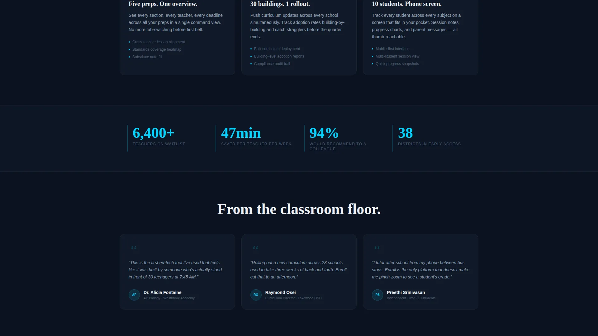
- High school department heads managing multiple course preparations at once
- District coordinators rolling out new curricula across many school buildings
- After-school tutors tracking several students across multiple subjects, often on a phone screen
What problem this template solves
Classroom workflow tools often struggle to communicate their value to busy educators in a short window of attention. A generic landing page cannot show motion, rhythm, or the relief of seeing everything in one place. This template solves that gap.
- Educators have no patience for abstract promises; they need to see the product working
- Waitlist pages without a clear conversion path lose sign-ups to friction
- Mobile users, including tutors and coordinators in the field, need a layout that works on a small screen
What you get with this template
You get a fully structured, single-page waitlist landing page with animated sections, a dual-path conversion bar, and a visual identity built for a focused, technical audience. Every layout decision is made to move a visitor from curiosity to commitment.
- A split-screen header with a live-animated dashboard mockup on the right and a headline on the left
- A spec-sheet scroll flow that isolates each feature with animated detail panels and data callouts
- A fixed bottom conversion bar with an email field, a platform toggle for iOS and Android, and a secondary demo video path
Feature list
The template delivers a complete set of visual and structural components designed specifically for an edtech waitlist launch. Each feature serves a specific moment in the visitor's journey.
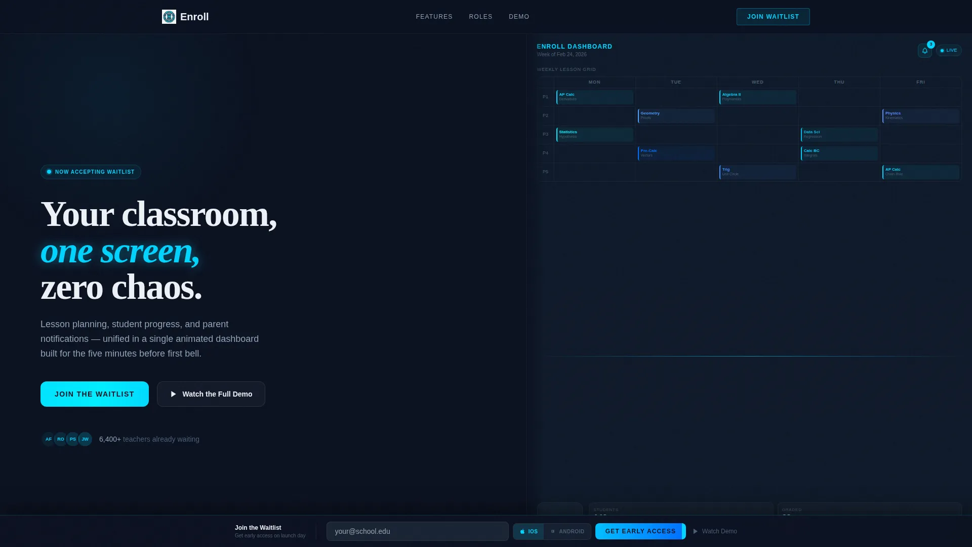
Split-Screen Dashboard Header
The header divides the viewport equally. The right half shows a live-animated mockup: a weekly lesson grid auto-populating, a student engagement ring chart filling to 87 percent, and a notification badge incrementing from 3 to 4. The left half holds a single white headline on deep navy. Nothing is static.
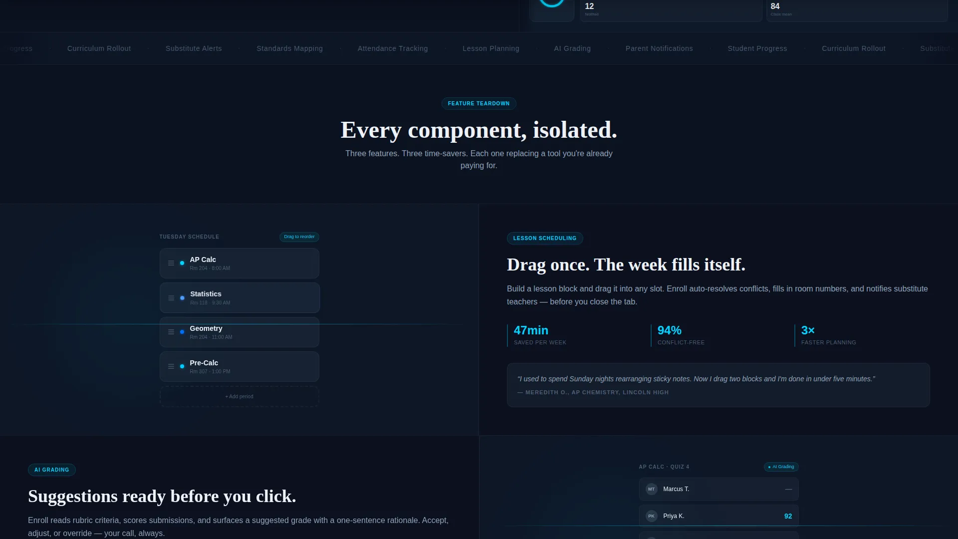
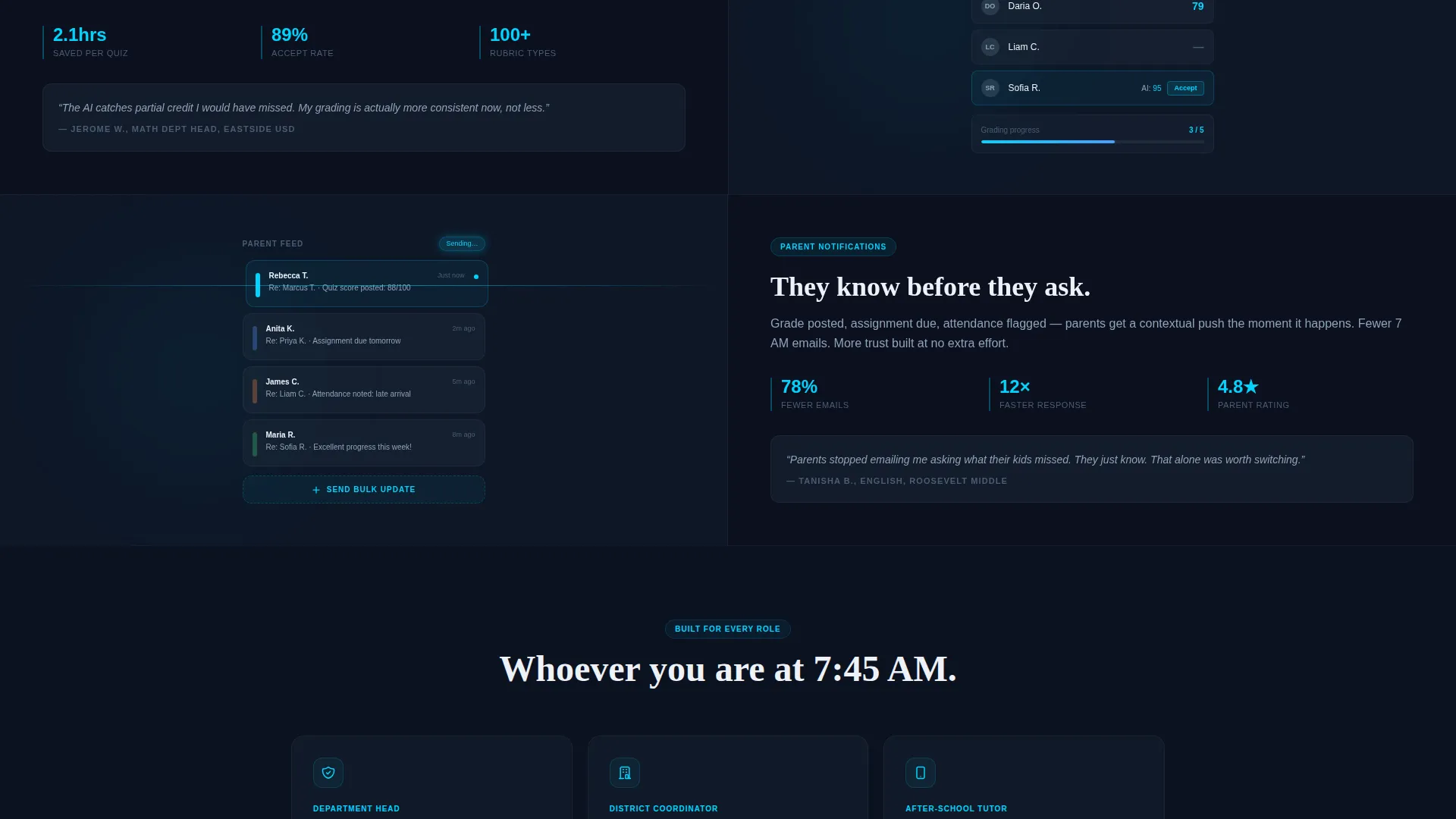
Spec-Sheet Scroll Sections
Scrolling past the header, each section isolates one product feature. The left panel shows a tight animated detail of that feature in action, such as drag-and-drop scheduling or an AI grading suggestion panel. The right panel presents three data points: time saved, an adoption statistic, and a one-line teacher quote in italics.
Fixed Dual-Path Conversion Bar
After the visitor passes the second section, a slim bottom bar slides up. It holds a single email input field and a phone-type toggle so visitors can choose iOS or Android. On launch day, the download link is sent directly to them. A secondary "Watch the Full Demo" link opens an inline video ending on the same waitlist form.
Looping Micro-Animations
Every section uses seamlessly looping micro-animations: cards shuffle, grades resolve, and a progress bar climbs. These animations are not decorative. They show the product running and remove the need for the visitor to imagine what the tool does.
Electric Cyan Interaction States
Every hover, toggle, and progress bar in the template uses electric cyan (#00D4FF) as its active state color. This creates a consistent visual language that signals interactivity and reinforces the cockpit-at-altitude aesthetic of the overall design.
Page sections overview
| Section | Purpose |
|---|---|
| Split-Screen Header | Establish product feel and show the dashboard mockup immediately |
| Spec Sheet: Scheduling | Show drag-and-drop lesson planning with time-saved data |
| Spec Sheet: AI Grading | Highlight grading suggestion feature with adoption stat |
| Spec Sheet: Notifications | Demonstrate parent notification feed with teacher quote |
| Fixed Waitlist Bar | Capture email and platform preference for launch-day delivery |
| Inline Demo Video | Provide a deeper product walkthrough ending on waitlist capture |
Design & branding system
The visual identity follows a Dynamic Motion theme anchored in a Midnight Blue color system. The palette is built for focus and precision, evoking a command center or cockpit at cruising altitude.
- Core colors: deep navy (#0B1120) for backgrounds, muted slate (#1B2838) for secondary surfaces, crisp interface white (#EDF1F7) for text, and electric cyan (#00D4FF) for all active and interactive states
- Typography and layout lean technical and clean, designed to feel like a professional instrument panel rather than a consumer app store page
- Motion is the primary design language; every component implies the product is already running
Mobile & speed optimization
The template is built with mobile users in mind from the start. Tutors and field coordinators are a defined part of the target audience, and the layout accounts for smaller screens without losing the core visual impact.
- The split-screen layout adapts for phone screens so the dashboard mockup and headline remain readable on a single viewport
- The fixed conversion bar is designed for thumb-friendly interaction, with a clear email input and a simple platform toggle
How this template helps you convert
This template earns the sign-up before asking for it. By the time the conversion bar appears, the visitor has already watched five product features in motion. The structure of the page is a deliberate sequence.
- The animated header shows the product in action immediately, creating trust and curiosity before any feature copy appears.
- The spec-sheet scroll flow builds conviction section by section, pairing visual proof with real data points and educator voices.
- The fixed dual-path bar removes friction at the moment of decision by offering both a waitlist email path and a demo video path in one persistent element.
Other information about this template
This template sits in the Startup and Launch category, specifically within the EdTech Startup subcategory and the EdTech Waitlist Landing Page niche. It carries an Intersection Match Score of 13, indicating a strong alignment between the template's visual and structural choices and the expectations of this specific niche.
- The template is part of a curated collection of edtech landing page templates designed for pre-launch and waitlist campaigns
- It is suitable for teams building education software, classroom management tools, or tutoring platforms who need a polished launch presence quickly
- The Dynamic Motion theme and Spec Sheet creative direction can be adapted for related education technology products beyond classroom scheduling
Theme
Dynamic Motion
Creative direction
Spec Sheet
Color system
Midnight Blue
Style
Split Screen (50/50)
Direction
App Download
Page Sections
Split-screen Dashboard Header
Spec-sheet Scroll Flow
Fixed Dual-path Conversion Bar
Looping Micro-animations
Electric Cyan Interaction States
Related questions
Who is this landing page template designed for?
Can I edit the animated sections to match my product?
What does the dual-path conversion bar include?
Is this template suitable for mobile users?
Do I need a development team to use this template?


