Editorial Manufacturing Insights Landing Page Template
Chronicle is an industrial broadsheet landing page template built for manufacturing thought leadership publishers. It pairs a heritage newspaper masthead with a Japanese Zen color system to create an editorial landing page that earns reader trust before asking for anything. Designed for operations directors, plant managers, and process engineers, it turns long-form manufacturing journalism into measurable lead generation.
by Rocket studio
Quick summary
Chronicle is a single-page editorial landing page template designed for manufacturing thought leadership publications. It draws on the visual grammar of heritage broadsheet newspaper design to create a reading experience that feels earned, not marketed. The template is built for business publishers who need their industrial landing page to demonstrate writing quality upfront, then convert readers into subscribers through minimal-friction forms.
Who this template is for
Chronicle is built for a specific kind of publisher: one whose readers distrust fluff and reward depth. If your audience spends forty minutes with a well-argued industry piece, this template speaks their language.
- Operations directors, VP Manufacturing leaders, and plant managers who read long-form industry journalism and expect technical authority from every page they visit
- Process engineers and supply chain architects who want a digital resource that treats their work with the same seriousness they bring to it
- Editorial teams, independent publishers, and company content studios launching or relaunching a manufacturing media presence online
What problem this template solves
Most landing page templates are built for speed and volume. They optimize for clicks before earning trust. For a niche industrial blog serving skeptical, senior readers, that approach fails. The main goal of Chronicle is different: prove value first, then ask.
- Manufacturing publishers struggle to create an online home that signals editorial credibility without looking like a generic corporate website
- Standard landing page designs underserve readers who expect the density and intelligence of a trade journal, not a marketing brochure
- Collecting qualified leads from a technically sophisticated audience requires a page that earns the click, not one that demands it before delivering anything
What you get with this template
Chronicle delivers a complete, customized editorial landing page layout. Every section is pre-structured so your team can focus on filling in your writing and images rather than debating layout decisions. The template is ready to deploy and simple to tailor to your publication's specific branding.
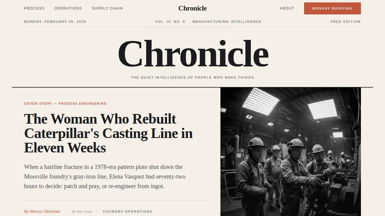
- A full-width newspaper masthead homepage section with a serif nameplate, dateline, lead headline, and a three-column ruled story grid showing category tags, author bylines, and estimated read times
- Three generous long-form excerpt blocks separated by full-bleed photographic interludes that demonstrate writing depth before any conversion ask appears
- Two lead generation touchpoints: an inline email prompt after the second excerpt and a persistent bottom bar that appears after sixty percent scroll depth, plus a secondary gated PDF download form for the quarterly manufacturing intelligence report
Feature list
Chronicle's design and structure are built around a single conviction: that a landing page for serious industrial readers must earn every pixel of attention it asks for. The features below reflect the specific capabilities built into this template.
Newspaper Broadsheet Masthead
The homepage opens with a full-width typographic masthead modeled on heritage broadsheet newspaper design. It includes a serif nameplate set in Fraunces display type, a dateline, and a lead headline in large editorial type. A black-and-white photojournalistic portrait crops tight at the shoulders below the headline. This section establishes publication authority immediately and provides the trust signals that senior industry readers expect before reading further.
Three-Column Ruled Story Grid
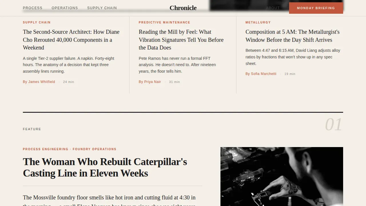
Below the masthead fold sits a three-column story grid with visible ruled lines between columns. Each story card displays a category tag, article headline, author name, and estimated read time. This layout mirrors the visual logic of a print newspaper, giving readers an immediate sense of editorial scope and helping them navigate to the content most relevant to their role. Grid-based design of this kind remains one of the strongest modern design trends for organizing editorial content on landing pages.
Long-Form Excerpt and Photo Interlude Rhythm
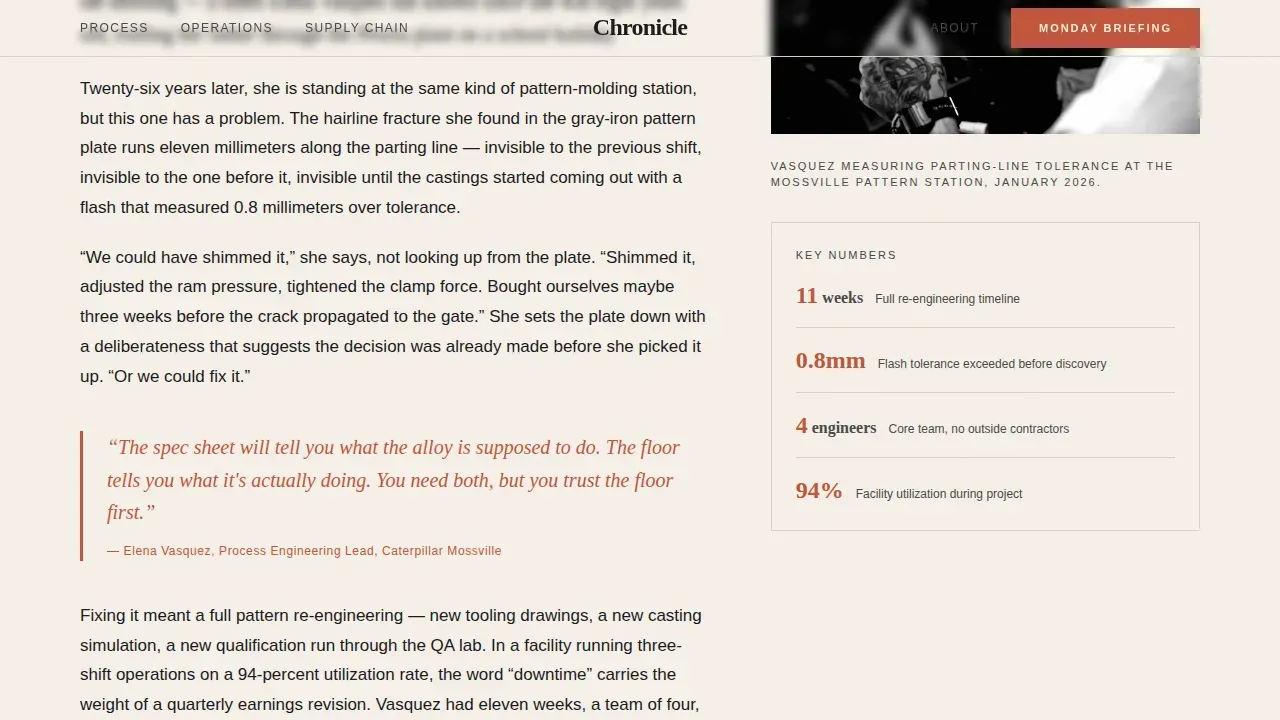
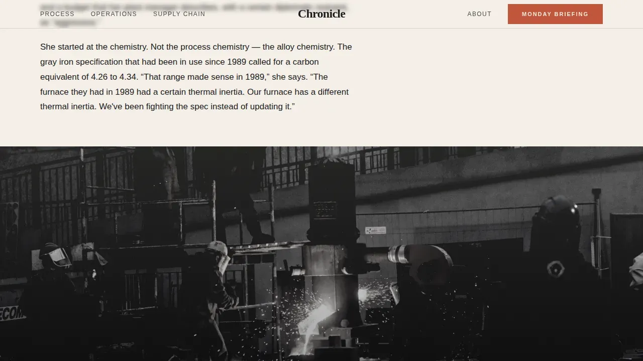
The scroll experience alternates between long-form excerpt blocks and full-bleed photographic interludes. The first section opens on a factory floor at dawn through a narrative lede. Subsequent sections move from industry-wide trends down to a single person's decision at a single machine on a single shift. Full-width images with documentary framing draw attention to the writing and reinforce the publication's credibility. This rhythm is deliberate: read, breathe, see, read again.
Inline and Persistent Lead Capture Forms
The template includes two lead generation touchpoints. The first is a subtle inline email prompt that appears after the second article excerpt. It asks for a work email only, one field, no friction. The second is a persistent bottom bar that activates after the visitor scrolls past sixty percent of the page. Both contact forms are pre-built into the layout, so publishers can begin capturing leads immediately without additional development work.
Gated PDF Report Download
A secondary conversion path offers a downloadable quarterly manufacturing intelligence report. This gated download form collects email address plus job title, providing richer lead qualification data. The section is pre-designed with a clear, action-oriented call to action and a simplified two-field form. Content highlights like this downloadable report give readers a tangible resource and help publishers segment their audience by seniority and role.
Japanese Zen Color and Typography System
The visual identity uses a four-color palette drawn from Japanese Zen design: washi cream dominates the reading surface, sumi ink black anchors headlines and body text, stone garden gray structures dividers and secondary navigation, and kiln-fired persimmon appears sparingly on pull quotes, bylines, and hover states. Fraunces handles all display and headline type. DM Sans handles body copy and interface elements. This branding system gives the page a contemplative, authoritative quality that matches the tone of serious industrial journalism.
Page sections overview
| Section | Purpose |
|---|---|
| Masthead and nameplate | Establishes publication identity with broadsheet newspaper header, dateline, and editorial lead headline |
| Three-column story grid | Displays article cards with category tags, author bylines, and read times below the fold |
| Feature excerpt one | Opens the scroll with a factory floor dawn narrative lede and documentary image interlude |
| Rolling mill interlude | Full-bleed photographic break separating the first and second excerpt blocks |
| Feature excerpt two | Second long-form article sample with inline email lead capture prompt embedded after the closing paragraph |
| Kaizen photo interlude | Full-bleed Kaizen whiteboard image interlude providing a visual breath before the third excerpt |
| Feature excerpt three | Deepest narrative excerpt focusing on a single decision at a single machine on a single shift |
| PDF report section | Gated download section for the quarterly manufacturing intelligence report with a two-field form |
| Footer | Minimal horizontal footer in Pattern 3 layout |
Design & branding system
Chronicle's visual identity is rooted in the Heritage and Story theme. The design draws from both the tactile history of print newspaper production and the contemplative restraint of Japanese Zen aesthetics. Every color decision and typographic choice is intentional, aimed at readers who can tell the difference between professional design and a template that just looks busy.
- Color palette: washi cream (#F5F0E8) as the dominant reading surface, sumi ink black (#1A1A1D) for all headlines and body text, stone garden gray (#4A4A48) for dividers and secondary navigation structure, and kiln-fired persimmon (#C2553A) used sparingly for pull quotes, bylines, and hover states so that every instance signals importance
- Typography: Fraunces serif for all display headlines and the masthead nameplate, DM Sans for body copy, category tags, form labels, and interface elements, creating a clear hierarchy between editorial voice and functional text
- Imagery style: documentary black-and-white portraiture for the masthead, full-bleed grayscale and warm-toned photographs for interludes, zero stock photography, every image reads as field-reportage
Mobile & speed optimization
Chronicle is built desktop-first, reflecting the reality that its target readers typically engage during extended desk-based reading sessions. That said, the layout adapts for tablet viewing so that the publication remains accessible across the devices most common in modern industrial business environments. The template uses server components for static content and keeps JavaScript minimal, which supports fast initial load times.
- Desktop-first layout with responsive adaptation for tablet screens, ensuring the three-column grid and full-bleed interludes render correctly on larger display surfaces
- Low-to-medium animation profile using staggered fade-in-up scroll triggers with no physics excess, keeping the page feeling editorial rather than promotional
- Minimal navigation structure implemented deliberately to keep reader focus on the content and the conversion forms, reducing distractions from the primary lead capture goal
How this template helps you convert
A landing page for a niche industrial publication cannot convert through pressure alone. Chronicle's conversion strategy is built on editorial proof. The page earns the subscription before it asks for it. This approach works specifically because the audience consists of senior professionals who are actively concerned about the quality of the information they consume.
- Three long-form excerpt blocks appear before any hard conversion ask, demonstrating the depth and specificity of the writing so that subscribing feels like securing access to something genuinely valuable rather than surrendering data to a marketing funnel
- The inline email form after excerpt two captures readers at peak engagement using a single work email field, no additional friction, making it easy to act on the impulse without breaking the reading flow
- The persistent bottom bar activates only after sixty percent scroll depth, targeting readers who have already invested time in the page and are therefore the most qualified prospects for the Monday Briefing subscription or the gated PDF report download
Other information about this template
Chronicle sits within a broader landscape of industrial landing page and editorial website templates that serve publishers, media companies, educational institutions, and business content teams. Understanding how it fits into that context helps teams make the right choice for their project.
- Industrial website templates available across the web span formats including HTML templates, CSS templates, bootstrap templates, and options suitable for different publishing platforms. Chronicle is delivered as an HTML template with clean, modern design conventions, making it straightforward to deploy or adapt.
- Publishers who want to explore comparable editorial landing page layouts can find inspiration from resources like Unbounce, which provides landing page examples across many industries, and platforms like Nicepage, where over 200 industrial templates are available for specialized layouts.
- WordPress users will find that the visual structure of this template can inform a custom WordPress theme build, as the section architecture and branding system translate naturally into WordPress page builder environments. Many publishers use HTML templates as a visual blueprint before migrating to a WordPress site for ongoing editorial management.
- The template's structure supports the addition of features common to industrial media platforms: newsletter signup forms, contact forms for reader inquiries, link sharing to social media, and a resource section that can be expanded over time as the publication's archive grows.
- From a branding perspective, the template is customized to a manufacturing thought leadership context but can be adapted for adjacent industry verticals. Publishers in heavy industry, supply chain logistics, materials science, or process engineering will find the editorial tone and visual system transferable with minimal adjustment to colors and copy.
- The history of broadsheet newspaper design stretches back through European history, and Chronicle deliberately references that print tradition. The heritage aesthetic is not decorative: it signals to readers that this publication takes journalism seriously. That signal matters to an audience of senior industry professionals who have spent careers reading technical trade media.
- Teams concerned about the time investment required to build an editorial landing page from scratch will save significant development hours using this template. Using pre-built templates create a professional result faster than custom builds, and Chronicle's pre-structured different sections mean your editorial team can go from project brief to live page without lengthy back-and-forth on layout.
- The template's resource section is designed to be updated regularly, linking out to reports, deep-dive articles, and downloadable guides that reinforce the publication's authority. An active, updated resource section helps the site build topical depth over time and gives readers a reason to return.
- For publishers considering how to grow their online presence across media platforms, Chronicle's email-first conversion strategy integrates cleanly with any email marketing service. The one-field inline form and two-field gated download form are designed to feed directly into whatever email list management tools your team already uses.
- Note that the template is provided for editorial and business use. Personal use adaptations are possible, though the design is optimized for professional publishing contexts. Teams should also note that the template's visual weight and typographic density are calibrated for desktop reading sessions; tablet rendering is supported, but the experience is designed around a larger screen.
Theme
Heritage & Story
Creative direction
Day-in-the-Life
Color system
Japanese Zen
Style
Editorial/Magazine
Direction
Lead Generation
Page Sections
Broadsheet Newspaper Masthead Header
Three-column Ruled Editorial Grid
Long-form Excerpt and Photo Interlude Scroll
Dual Lead Generation Touchpoints
Gated PDF Report Download Section
Japanese Zen Color and Type Hierarchy
Related questions
What types of publishers will get the most value from this template?
Can I customize the color palette and typography for my own publication's branding?
Does the template include lead capture forms already built in?
Is this template compatible with a WordPress site build?
Does the template support video content in the interlude sections?



