Internet Service Provider Professional Website Template
Fibermetrics is a single-page fiber optic ISP landing page built around a live stats dashboard header, a glassmorphic comparison table, and an app download call to action. It targets remote workers, streaming households, and small businesses ready to leave legacy copper behind. The design feels like a network operations center, dark, precise, and data-driven.
by Rocket studio
Quick summary
Fibermetrics is a high-performance fiber optic ISP landing page template built on a Dashboard Pro theme. Animated speed counters open the page, a structured comparison table builds the case, and every scroll reveals evidence rather than promises. The primary call to action drives visitors toward downloading the fiber management app.
Who this template is for
This template is designed for fiber optic internet service providers who want to win over technically aware prospects. If your audience evaluates plans by numbers rather than taglines, this layout speaks their language.
- Remote engineers and IT professionals who run persistent connections and care about latency and upload parity
- Streaming households and multi-device families who hit congestion every evening and need symmetrical speeds
- Small business owners who rely on overnight backups and cannot afford asymmetrical or unreliable upload bandwidth
What problem this template solves
Legacy ISP pages lead with promises. They bury real performance data and use vague phrases like "up to" to avoid accountability. Prospects who have been burned by cable or DSL plans arrive skeptical. This template solves the credibility gap by leading with verifiable, animated metrics and a structured side-by-side comparison.
- Skeptical visitors leave before converting because the page never shows proof of speed
- Comparison shopping is difficult when ISPs present data in incompatible or cherry-picked formats
- The app download step feels disconnected when the page has not already demonstrated what the app monitors
What you get with this template
You get a complete single-page layout organized as an industry report. Every section is designed to transfer credibility, not just awareness. The page moves visitors from "I'm curious" to "I want this" by showing data at every step.
- A viewport-filling animated stats header with real-time counters for download speed, upload speed, and ping
- A glassmorphic comparison table benchmarking fiber plans against anonymized cable and DSL alternatives
- A network topology diagram, coverage map section, testimonial carousel, and a pre-call to action app preview
Feature list
This section covers the core built-in components that define how the template functions and persuades.
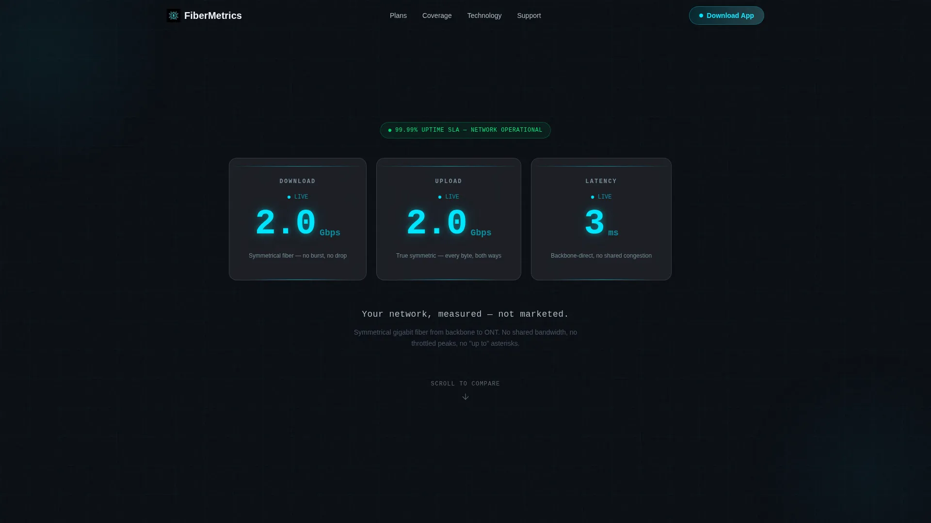
Animated Live Stats Header
Three frosted-glass cards fill the opening viewport. Each card displays an animated counter: download speed climbing to 2 Gbps, upload mirroring it symmetrically, and ping settling at 3 milliseconds. Numbers tick upward with easing curves, and cyan digits pulse faintly. The single tagline beneath reads "Your network, measured, not marketed."
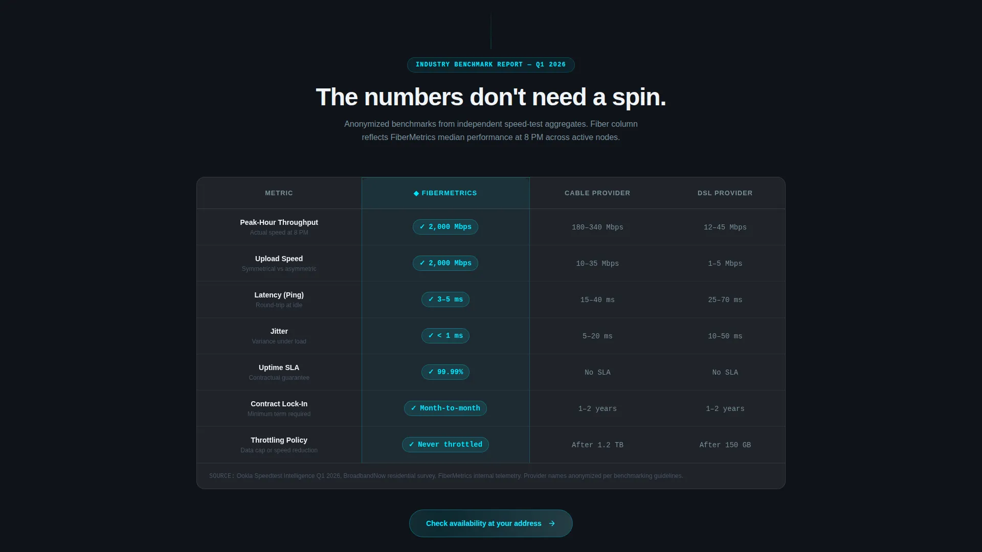
Glassmorphic Comparison Table
The comparison table sits at the heart of the page. Fiber plans are placed alongside anonymized cable and digital subscriber line benchmarks across peak-hour throughput, jitter, uptime service-level agreement, and contract lock-in. Frosted glassmorphic cells with cyan highlights on the fiber column make the winner visible without a single superlative in the copy.
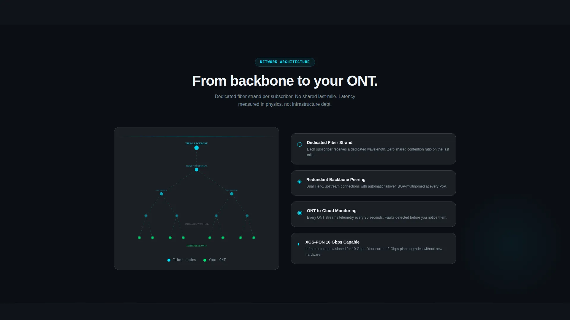
Network Topology Diagram
A dedicated section illustrates the fiber path from backbone infrastructure to the optical network terminal (ONT) at the premises. This diagram gives technically minded visitors a clear picture of how the network is built and why it performs differently from coaxial or copper alternatives.
Real-Time Coverage Map
A coverage section includes an address lookup interface so visitors can confirm service availability before committing. This removes a common friction point and keeps high-intent prospects moving toward the app download.
Testimonial Carousel with Speed Screenshots
Pull-quote testimonials are formatted as an industry-report-style carousel. Each testimonial is paired with a verifiable speed-test screenshot reference, grounding social proof in measurable evidence rather than unattributed praise.
App Download Call to Action
The primary call to action reads "Download the My Fiber App" with platform-detected badges for iOS and Android rendering dynamically. A secondary path offers a QR code on desktop for instant mobile handoff. A brief app preview before the button shows the dashboard where users monitor real-time speed, manage connected devices, and pause Wi-Fi by room.
Page sections overview
| Section | Purpose |
|---|---|
| Animated Stats Header | Opens with live speed and ping counters to anchor credibility instantly |
| Comparison Table | Benchmarks fiber against cable and DSL across key performance metrics |
| Network Topology Diagram | Visualizes the fiber path from backbone to premises |
| Coverage Map Lookup | Lets visitors check address-level service availability |
| Testimonial Carousel | Pairs pull-quote social proof with speed-test screenshot references |
| App Preview Block | Demonstrates app dashboard features before the download prompt |
| App Download call to action | Drives conversions with dynamic platform badges and desktop QR code |
Design & branding system
The visual identity follows a Dashboard Pro theme using a glassmorphic color system. The palette was designed to feel like a network operations center running at 2 AM: ambient darkness with information glowing through frosted surfaces. Every color has a functional role.
- Deep void black (#0B0E14) as the base canvas, translucent panel white at 12% opacity (#FFFFFF1F) for frosted glass cards, and electric cyan (#00E5FF) for live data accents and highlights
- Soft lavender-gray (#B0BEC5) handles secondary text and supporting labels, keeping hierarchy clear without adding visual noise
- Typography is minimal and metric-forward, with the animated counter numbers acting as the primary visual element on entry
Mobile & speed optimization
The template is built with a mobile-first scroll experience in mind. The comparison table reflows cleanly on smaller viewports, and the app download section is designed to feel natural on a phone screen where the action will actually occur.
- The platform-detected app badges and QR code handoff adapt to screen size so the download path stays friction-free on every device
- Animated counters and frosted glass card layouts are structured to render clearly on high-density mobile displays without overwhelming the viewport
How this template helps you convert
The layout follows an evidence-first persuasion arc. Trust is built before the call to action ever appears, which means visitors arrive at the download button already convinced.
- The animated stats header opens with hard numbers, replacing vague marketing copy with metrics that technically literate visitors immediately recognize as meaningful
- The comparison table and topology diagram give cautious buyers the structured proof they need to justify switching providers, removing the need for external research
- The app preview section closes the loop by showing exactly what the visitor gains after downloading, making the final click feel like a natural continuation rather than a leap of faith
Other information about this template
This template sits within the Telecom and Connectivity category, specifically scoped to the fiber optic internet service provider niche. It is a strong fit for regional fiber providers, municipal broadband operators, and competitive overbuilders targeting markets still served by aging infrastructure.
- The creative direction follows an industry report cadence, meaning the scroll experience feels authoritative and data-dense rather than promotional
- The template style is a comparison table landing page, making it especially effective when the competitive landscape includes visible weaknesses in cable or DSL offerings
- The header concept is a stats and metrics dashboard, which signals technical credibility from the first frame and sets the tone for every section that follows

Theme
Dashboard Pro
Creative direction
Industry Report
Color system
Glassmorphic
Style
Comparison Table
Direction
App Download
Page Sections
Animated Live Stats Dashboard Header
Glassmorphic Comparison Table
Network Topology Diagram
Coverage Map with Address Lookup
Testimonial Carousel with Speed-test References
App Download Call to Action with QR Code Handoff
Related questions
What type of business is this template designed for?
Can I customize the speed numbers and comparison table data?
Does the template support both iOS and Android app download links?
What makes the comparison table effective for skeptical visitors?
Is the testimonial section suitable for real customer evidence?


