Authoritative Culinary Industry Report Landing Page Template
Digest is a hub-and-spoke editorial landing page template built for food and beverage industry briefings. It renders a full weekly edition on a single page using a typographic Chapter/Book spread, four anchor-linked chapters, and a sticky subscribe bar. The Ink and Paper design system uses unbleached cream, editorial charcoal, and red pencil accents to create the authority of a printed trade journal.
by Rocket studio
Quick summary
Digest is a precision-crafted editorial landing page template for food and beverage industry report publishers. It delivers a complete weekly briefing on one long-form page, structured as four anchor-linked chapters under a hardcover-style title spread. The design borrows its authority from printed trade journals, cream stock, charcoal ink, red pencil markup, and earns subscriptions by giving away the full edition before asking for an email.
Who this template is for
This template is built for publishers, analysts, and editorial teams who serve professionals making real market decisions in the food and beverage space. The target audience has no patience for generic content libraries or surface-level recaps. They want the argument, the data, and the implication, all before their second coffee.
- CPG brand managers tracking shelf velocity, ingredient trend curves, and evolving consumer preferences across categories
- Beverage startup founders and beverage manufacturers who need to read supply chains and consumer demands a quarter ahead of the competition
- Foodservice distributors and food companies publishing weekly intelligence briefings for their professional readership
What problem this template solves
Most editorial landing pages in the food industry treat the page like a storefront: headline, teaser, call to action, done. That approach fails the professional reader. A CPG strategist, a foodservice buyer, or an analyst watching the beverage industry doesn't respond to a teaser. They respond to depth they can evaluate on the spot. The problem is that most templates are built for conversion before trust, and the reader sees through it immediately.
Digest solves this by inverting the order. The full current edition lives on the page. The reader can assess the quality of the analysis, the sharpness of the data callouts, and the precision of the argument before a subscription is ever mentioned. The result is a landing page that earns the inbox slot rather than begging for it.
- Generic editorial templates fail to communicate analytical rigor, leaving the reader with no reason to subscribe
- Teasers and gated previews frustrate professional readers who need to verify quality before committing their attention
- Most page structures lack a clear reading arc, so the reader exits instead of scrolling toward the call to action
What you get with this template
You get a fully structured, single-page editorial experience designed to publish and monetize a weekly food and beverage industry briefing. Every section is purpose-built. Every design decision reinforces the credibility of the editorial brand. Nothing is decorative for its own sake.
- A Chapter/Book title spread hero acting as the edition's interior title page, complete with volume number, thesis headline, and anchor-linked table of contents
- Four fully composed chapter sections covering market overview, supply chain analysis, consumer behavior, and a forward-looking industry prediction, each with margin-style data callouts and pull quotes
- A sticky subscription bar that appears after the reader scrolls past Chapter I, containing a single email input and a secondary PDF download link
Feature list
This landing page template ships with a focused set of components, each one derived from the editorial brief and designed to serve the professional reader.
Chapter/Book Title Spread Hero
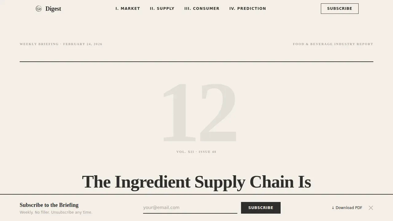
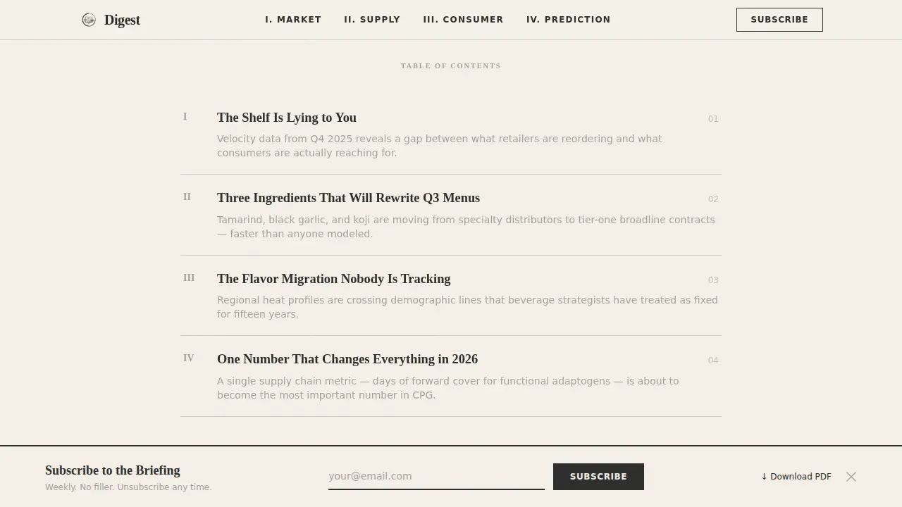
The page opens as the interior title page of a hardcover annual report. A large serif numeral marks the current volume edition. A one-line thesis headline sits centered in oversized Fraunces serif type. Below it, five anchor-linked chapter abstracts form the table of contents. The background is unbleached cream with a faint paper grain texture. There is no photography, no illustration, and no hero image in the photographic sense, only typographic confidence that holds a reader's attention the way a dust jacket from a university press commands a shelf.
Anchor-Linked Chapter Navigation
The navigation bar at the top of the page links directly to each of the four content chapters. Readers can jump to any section without losing their place. Each anchor corresponds to a chapter with a bold declarative thesis statement, giving the page the structure of a long-form argument rather than a browsable content feed. The navigation bar keeps the reading experience linear and purposeful even when a reader re-enters from a specific section link.
Manifesto-Style Scroll Architecture
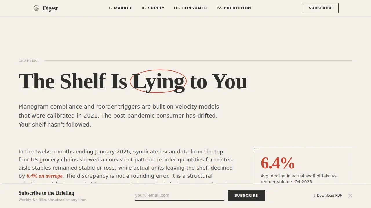
Each chapter opens with an oversized serif thesis statement that makes a bold claim. The data then arrives to support it. Charts are rendered in charcoal and red pencil strokes. Data callouts appear in the margins like handwritten annotations. The scroll escalates in tension: from market overview to supply chain disruption to consumer behavior shift to a final industry prediction. The page reads like a closing argument, not a content archive. This structure is the core value proposition of the Digest format.
Margin Annotation Data System
Every chapter carries margin-style data callouts positioned like an editor's handwritten notes beside the main copy. These annotations surface key statistics, growth signals, and pointed observations about food safety, food waste, nutritional profiles, and plant based category shifts without interrupting the reading flow. The margin system gives the page its editorial character and makes data feel like evidence inside an argument rather than decoration beside a blog post.
Sticky Subscribe Bar with PDF Link
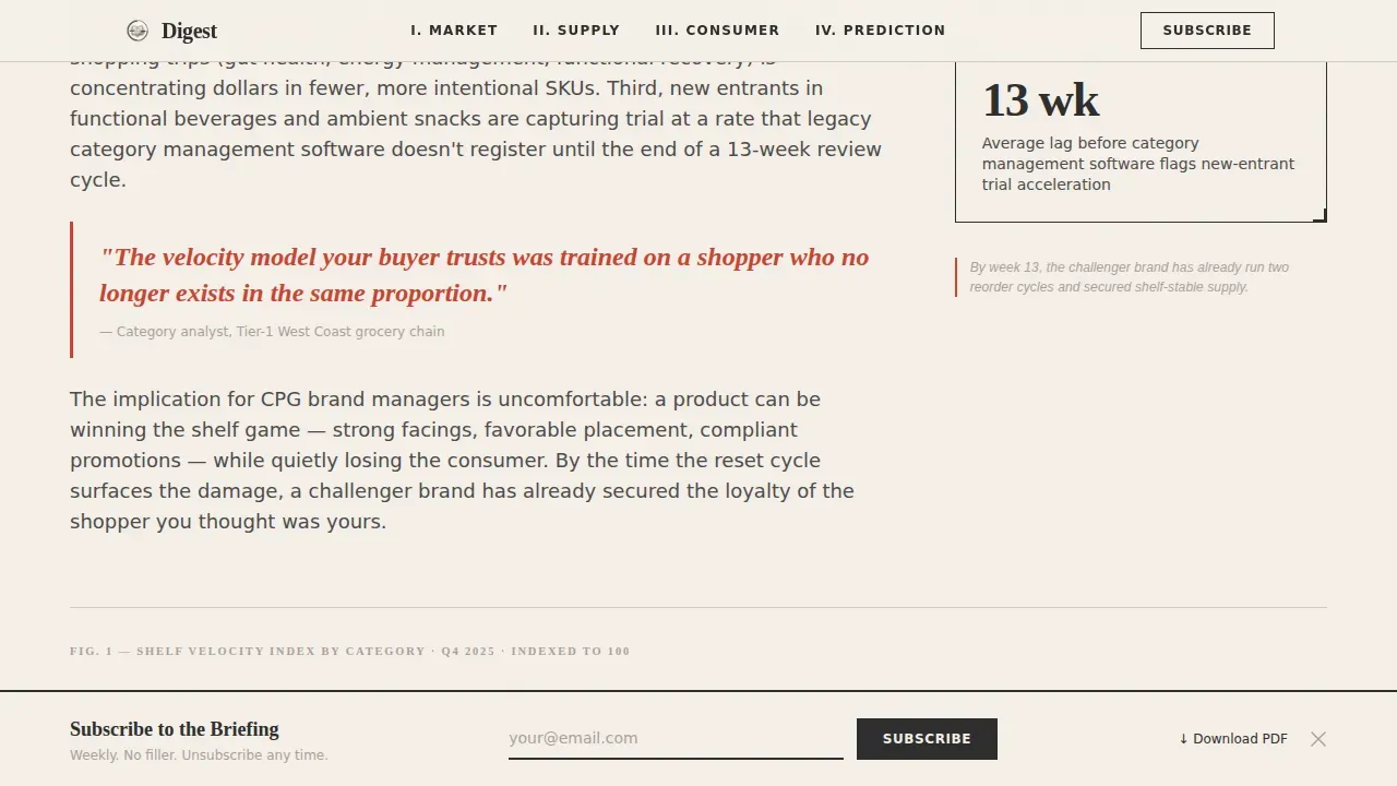
After the reader scrolls past the first chapter, a sticky bar appears anchored to the bottom of the viewport. It contains a single email input field and a primary call to action inviting the reader to subscribe to the briefing. A secondary link reads "Download This Edition as PDF," giving the reader a frictionless alternative conversion path. The bar persists as the reader moves through the remaining chapters, maintaining the call to action in view without interrupting the reading experience.
Editorial Pull Quote System
Throughout the page, pull quotes from industry insiders appear in Fraunces serif at an elevated type scale with red pencil accent styling. These quotes serve as social proof anchors at key moments in the reading arc. They reinforce the credibility of the analysis and build trust with readers who are evaluating whether the briefing is worth their recurring attention. Customer testimonials and insider perspectives appear at natural pauses in the argument, not forced into a sidebar or a separate section.
Page sections overview
| Section | Purpose |
|---|---|
| Title Spread Hero | Edition title page with volume number, thesis headline, and anchor-linked table of contents |
| Chapter I: Market Overview | "The Shelf Is Lying to You", market data with charcoal charts and margin annotations |
| Chapter II: Supply Chain | "Three Ingredients That Will Rewrite Q3 Menus", supply chain disruption analysis |
| Chapter III: Consumer Behavior | "The Flavor Migration Nobody Is Tracking", consumer behavior shift with data callouts |
| Chapter IV: The Prediction | "One Number That Changes Everything in 2026", forward-looking industry forecast |
| Sticky Subscribe Bar | Persistent bottom-bar call to action with email input and PDF download secondary link |
| Footer | Horizontal pattern footer with contact details and brand navigation |
Design & branding system
The visual identity of this landing page follows an Ink and Paper theme built on the Cloud Canvas color system. Every design decision reinforces the feeling of cracking open a freshly printed trade journal: the warmth of uncoated paper, the authority of black ink, the urgency of an editor's red markup circling the line that matters most. Visual appeal here comes entirely from typographic confidence and editorial precision, not from photography or illustration.
- Color palette: unbleached stock cream (#F5F0E8) for the page background, editorial charcoal (#2C2C2C) for body type and charts, margin-note gray (#A8A09B) for supporting annotations, and red pencil (#C94432) for anchor links, pull quotes, and hover states
- Typography: Fraunces serif for all display headings, thesis statements, pull quotes, and volume numerals; DM Sans for body copy, data labels, and user interface elements including the navigation bar and subscribe bar
- Texture and atmosphere: a faint paper grain texture applied to the cream background gives the page physical presence; white space is used structurally to separate chapters and let the argument breathe between sections
Mobile & speed optimization
The template is built desktop-first to serve its primary audience of trade journal readers at a desk. The reading experience is optimized for a wide viewport where the chapter layout, margin annotations, and pull quote positioning can be fully expressed. Mobile adaptation is included so that the landing page displays correctly when readers access the briefing on a phone or tablet.
- Desktop-first layout with column-based margin annotation system that reflows gracefully to a single-column stack on smaller screens
- Scroll-reveal animations and parallax effects are implemented at medium intensity, keeping the page visually active without creating distraction
- Server components handle static content sections to keep the page lightweight; JavaScript is minimized to what is needed for the sticky bar and scroll-triggered elements
How this template helps you convert
This landing page is designed around a single conversion insight: readers who experience real depth before a call to action are far more likely to act on it. The subscription model here earns trust first. Conversion rates improve when the reader has already spent fifteen to twenty minutes with the content and concluded, on their own terms, that the next edition is worth an inbox slot. A polished, professional landing page reinforces that judgment at every scroll point.
- The full current edition is published on-page, so the reader evaluates quality directly before the subscription bar appears, this is the primary mechanism for improving conversion rates and building long-term subscriber trust
- The sticky subscribe bar activates only after Chapter I, ensuring the call to action arrives when the reader is already engaged and has passed the point of idle browsing, minimizing distractions and keeping visitor's attention focused on the conversion path
Other information about this template
This template is relevant to a wide range of food and beverage topics that define the current market. Understanding what the briefing covers helps publishers position their content and helps readers recognize why the format resonates. The template supports editorial coverage across the full spectrum of modern industry analysis.
- The food and beverage industry is expected to grow significantly by 2029, driven by evolving consumer preferences and a focus on sustainability, this template gives publishers a professional platform to cover that growth
- Key trends the template's chapter structure is designed to hold include plant based foods, cellular agriculture, digestive health ingredients, added vitamins in functional beverages, and nutritional profiles of reformulated food products
- Food safety and food waste have become central concerns for food companies and manufacturers; the margin annotation system can surface data on both without interrupting the editorial narrative
- Supply chains for beverage manufacturers and food production operators are under increasing scrutiny as consumers demand transparency about where specific foods come from and how they are processed
- Consumer demands around plant based alternatives, improved taste in low-sugar options, and cleaner ingredient lists are reshaping how food companies develop and market food products
- The HFSS (High in Fat, Sugar and Salt) regulations in the UK restrict the advertising of unhealthy food products and encourage brands to reformulate; publishers covering these regulatory shifts will find the chapter format ideal for walking through implications step by step
- Brands that adapt to HFSS legislation gain a competitive edge by aligning with evolving consumer preferences for healthier options, this is the kind of argument this template is built to host
- AI technologies are helping reduce food waste and accelerating trend response for food and beverage companies; the briefing format supported by this template is well-positioned to translate that complexity into actionable intelligence
- Meal planning services and food delivery platforms, including meal kit operators, are reshaping grocery shopping habits and creating new market signals worth tracking; the template's chapter structure can hold that analysis at the depth it deserves
- Pre portioned ingredients, direct-to-consumer food delivery models, and e-commerce channel shifts are among the specific structural changes that food and beverage industry analysts are watching closely
- Social media plays a huge part in how food brands reach consumers today; publishers covering social media strategy alongside market data will find the manifesto scroll format hits harder than a standard blog layout
- Plant based category growth, cellular agriculture funding rounds, and the demand for improved taste in plant based products without compromising nutritional profiles are among the most-read topics in any serious beverage industry briefing
- Digestive health ingredients, added vitamins, and health claims around functional food products require careful, data-backed editorial treatment, the margin annotation system in this template supports exactly that
- The page is built as a professional landing page for a specific publishing use case; it is not a general-purpose website or a multi-page content hub, and it is distinct from other pages in a broader editorial site ecosystem
- Blue Apron pioneered the model of delivering pre portioned ingredients with meal planning guidance; the template can support editorial analysis of how such services have reshaped consumer expectations around food delivery and grocery shopping
- QR codes can be embedded in the PDF download version of the edition, linking print-format readers back to the digital landing page, this is an optional enhancement consistent with the template's dual-format design intent
- Contact details for the editorial team can be placed in the footer alongside the horizontal navigation pattern, giving the page a complete professional identity without adding clutter to the reading experience
- The template is an essential tool for any food and beverage editorial operation that wants to convert casual readers into loyal subscribers by demonstrating depth before asking for commitment
Theme
Ink & Paper
Creative direction
Manifesto
Color system
Cloud Canvas
Style
Hub & Spoke (Anchor Nav)
Direction
Content/Resource
Page Sections
Chapter/book Title Spread Hero Section
Manifesto Scroll with Thesis-led Chapters
Margin Annotation Data Callout System
Sticky Subscribe Bar with PDF Download
Editorial Pull Quote and Social Proof System
Anchor Navigation Bar and Hub-and-spoke Structure
Related questions
Who is this landing page template designed for?
Does the page give away the full edition before asking for a subscription?
What sections does this landing page template include?
Can this template be adapted for topics beyond food and beverage?
What typography and color system does this template use?



