Dental Blog & Media Booking Website Template
Floss is an editorial dental landing page template built as a horizontal scroll experience. It guides anxious adult readers through illustrated how-to panels covering brushing, flossing, sensitivity, and whitening. The warm, magazine-style design builds trust before asking for anything, then closes with a simple weekly digest signup that feels like bookmarking a favorite resource.
by Rocket studio
Quick summary
Floss is a horizontal scroll landing page template for a dental how-to blog. It moves readers laterally through curated editorial panels, each teaching one dental topic through illustrated diagrams and short-form copy. The Soft Mist color palette and serif typography create a calm, magazine-like feel that reassures nervous readers and earns trust before the lead-generation ask.
Who this template is for
This template is built for creators and publishers who want to educate, not alarm. It suits anyone launching a dental content brand with a strong editorial voice and a real audience to serve.
- Dental bloggers and health content creators launching a digest or newsletter
- Practitioners or educators building a patient-friendly content resource
- Designers and agencies producing an editorial health landing page for a client
What problem this template solves
Most dental content online feels either clinical and cold or rushed and ad-heavy. Readers who are already anxious about their teeth do not stay on pages that make them feel judged or overwhelmed. This template solves the tone and trust problem first, then handles the conversion.
- Anxious readers bounce from sterile or preachy health content before they reach any call to action
- Generic blog layouts bury useful information inside walls of text instead of teaching one clear idea at a time
- Lead-capture forms that appear too early feel intrusive and reduce signups from readers who have not yet seen any value
What you get with this template
You get a fully structured horizontal scroll landing page built around an editorial magazine framework. Every panel is ready to receive your illustrated content and how-to copy without requiring a redesign from scratch.
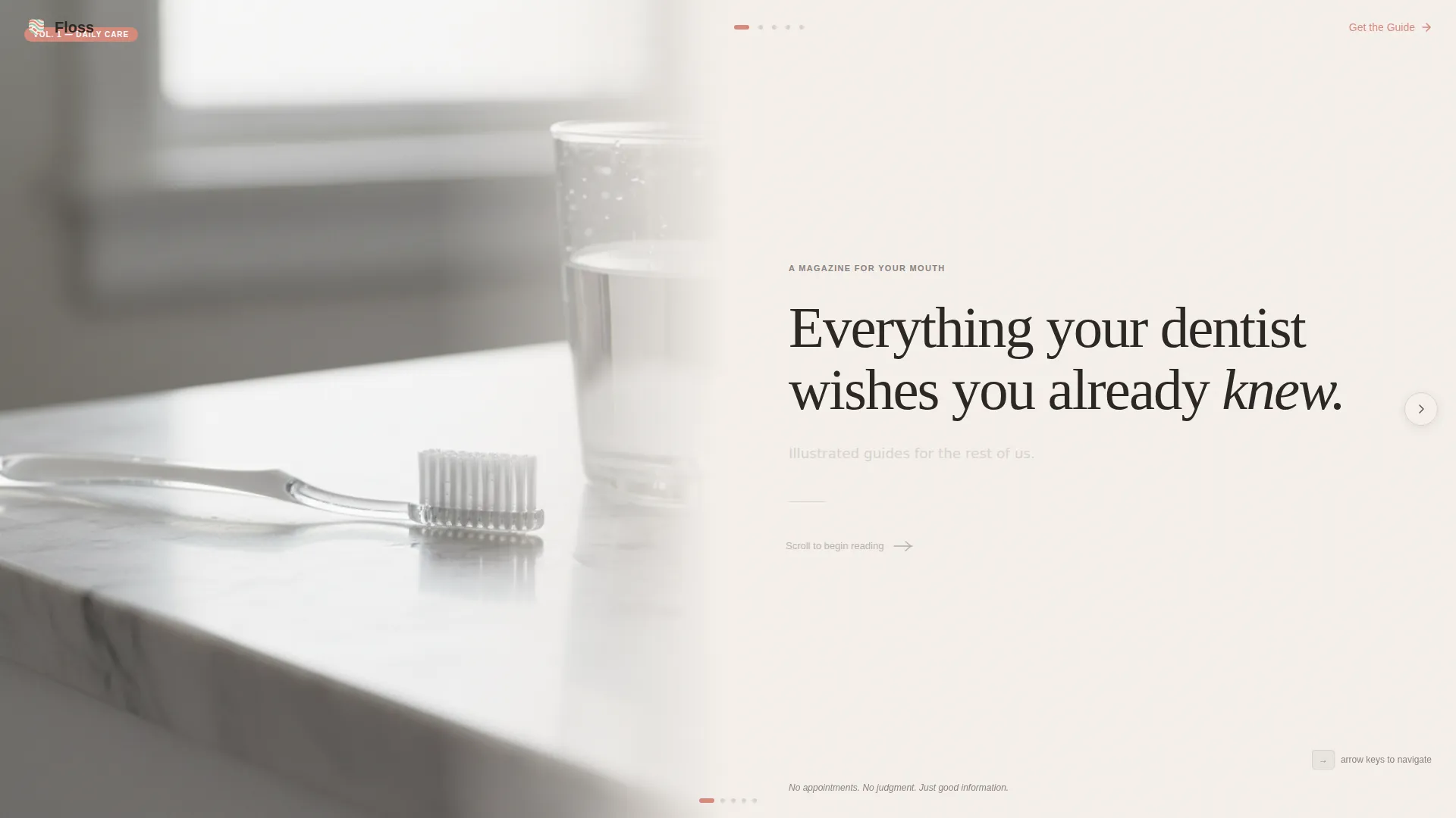
- A half-page editorial hero section with a serif headline and a split photo-and-text composition
- Five horizontal gallery panels covering brushing, flossing, sensitivity, whitening, and orthodontic aftercare, each with space for illustrated diagrams and a highlighted key takeaway
- A full-width lead-generation spread and a floating coral pill call-to-action button that appears after the third panel
Feature list
This template delivers a focused set of components that work together to teach, engage, and convert readers at a natural pace.
Horizontal Gallery Walk Layout
Each panel is a standalone editorial spread presenting one how-to topic at a time. Panels progress from daily basics to more advanced topics like implant maintenance, rewarding readers who keep scrolling with increasingly specific knowledge.
Half-Page Hero Composition
The header splits the screen between an editorially lit photograph on the left and a large serif headline on the right. The layout references the calm visual grammar of a premium health magazine, with generous whitespace and a single-line subhead in whisper gray.
Floating Lead-Capture Call to Action
A coral pill button labeled "Send Me the Guide" appears as a floating element after the third content panel. It reappears as a full-width signup spread at the scroll's end, keeping the ask visible without interrupting the reading flow.
Two-Field Signup Form with Preference Toggle
The lead form asks only for a first name and an email address. A toggle lets readers identify as either "New to dental care" or "Catching up after a long break," making the signup feel relevant and personal rather than generic.
Editorial Pull-Quote Highlights
Each gallery panel features a single key takeaway displayed in muted coral. These pull-quote moments break up the reading rhythm, draw attention to the most important idea in each panel, and reinforce the editorial magazine aesthetic.
Soft Mist Color System
The palette uses warm linen, whisper gray, clinical mint, and muted coral in clearly defined roles. The color system is consistent across all panels and components, so the page feels cohesive as readers scroll through the full horizontal experience.
Page sections overview
| Section | Purpose |
|---|---|
| Editorial Hero Header | Introduces the brand with a split photo and serif headline |
| Brushing Technique Panel | Teaches correct brushing method with illustrated diagrams |
| Flossing and Sensitivity Panel | Covers flossing mechanics and sensitivity causes side by side |
| Whitening and Aftercare Panel | Addresses whitening truths and orthodontic aftercare guidance |
| Advanced Care Panel | Delivers deeper topics like implant maintenance for engaged readers |
| Floating call to action Pill | Prompts signup after the third panel without interrupting scroll |
| Full-Width Signup Spread | Closes the page with the lead-generation form and preference toggle |
| Footer | Provides horizontal flow navigation and supporting page links |
Design & branding system
The visual identity follows an Editorial Magazine theme inspired by the calm, unhurried quality of premium printed health publications. Every design decision reinforces trust and readability rather than urgency.
- Typography pairs Fraunces, a variable serif display face, for headlines with DM Sans for body copy, creating a warm but legible editorial rhythm
- The Soft Mist palette assigns warm linen (#F5F0EB) as the background, whisper gray (#D6D2CD) for secondary text, clinical mint (#B8D8D0) for supporting panels, and muted coral (#D4897C) strictly for pull-quotes and interactive elements
- Whitespace is used deliberately throughout every panel to keep the layout breathing and prevent the page from ever feeling crowded or clinical
Mobile & speed optimization
The template is designed desktop-first, built around a smooth horizontal scroll experience with CSS scroll-snap for precise panel-to-panel navigation. A vertical fallback layout is included for smaller screens.
- CSS scroll-snap keeps panel transitions crisp and intentional on desktop, so the gallery walk feel is preserved as readers move through the content
- The mobile fallback converts the horizontal panel sequence into a vertical stacked layout, maintaining full content access on phones and tablets
- Medium-intensity animations including panel reveals and the floating call-to-action pill are applied to support the editorial pacing without overwhelming the reading experience
How this template helps you convert
This template earns trust through content before it ever makes an ask. The conversion strategy is sequenced deliberately to match how a cautious reader actually moves through a page.
- Three full illustrated panels deliver genuinely useful dental guidance before any lead-generation element appears, so readers arrive at the signup already trusting the source.
- The floating coral pill button surfaces naturally after the third panel, offering the guide as a continuation of the experience rather than an interruption.
- The two-field form with a preference toggle reduces friction at the moment of signup, making the exchange feel like a personalized recommendation rather than a data capture.
Other information about this template
This template is part of a broader editorial landing page family suited to health and wellness content brands that prioritize voice and visual quality alongside conversion.
- The template style is classified as Horizontal Scroll with a Gallery Walk creative direction, making it distinct from standard vertical blog or content landing page layouts
- The lead-generation direction is embedded in the page architecture from the start, not added as an afterthought
- The Fraunces and DM Sans typeface pairing is specified in the design system and contributes to the warm clinical tone the brief calls for
- The footer follows a horizontal flow pattern consistent with the overall scroll direction of the page



Theme
Editorial Magazine
Creative direction
Gallery Walk
Color system
Soft Mist
Style
Horizontal Scroll
Direction
Lead Generation
Page Sections
Horizontal Gallery Walk Layout
Half-page Editorial Hero
Floating Lead-capture Call to Action
Two-field Form with Preference Toggle
Editorial Pull-quote System
Soft Mist Design System
Related questions
Who is the ideal reader this template is designed for?
Can I customize the illustrated diagrams inside each panel?
How does the horizontal scroll work on mobile devices?
How many panels does the template include?
Is the lead form connected to any email platform out of the box?



