Hobby & Passion Content Premium Blog Website Template
Flourish is an elegant calligraphy and lettering landing page template built for creative community blogs. It uses an asymmetric 60/40 grid, a rich Parchment and Rust color palette, and a publication-style masthead to draw visitors into a founder's origin story. Two conversion paths, a community sign-up form and a free practice sheet download, turn curious readers into engaged members.
by Rocket studio
Quick summary
Flourish is a single-page calligraphy community template that blends editorial design with lead generation. The 60/40 asymmetric grid alternates story text and process photography to carry visitors through a founder's journey. Two conversion paths capture members at different stages of readiness, from committed practitioners to the casually curious.
Who this template is for
This template is built for calligraphy creators and lettering educators who want a page that feels as intentional as the craft itself. It speaks directly to people building an audience around beautiful writing.
- Wedding calligraphers ready to launch a community or blog around their practice
- Hobbyist letterers moving from brush pens to pointed nibs who want to grow an audience
- Graphic designers or educators who teach historical scripts and want to attract students
What problem this template solves
Most blog templates feel generic. They cannot communicate the warmth, texture, or tradition that calligraphy communities depend on to earn trust. A template that looks like every other content site will not move a visitor to share their email with a stranger on the internet.
- Visitors leave without converting because the page lacks emotional depth and a clear narrative arc
- Creators waste time trying to adapt cold, corporate templates to warm, craft-focused content
- Lead generation forms feel transactional rather than inviting, losing people who are almost ready to commit
What you get with this template
You get a fully structured, single-page layout that guides visitors from curiosity to commitment through storytelling. Every section earns its place in the scroll.
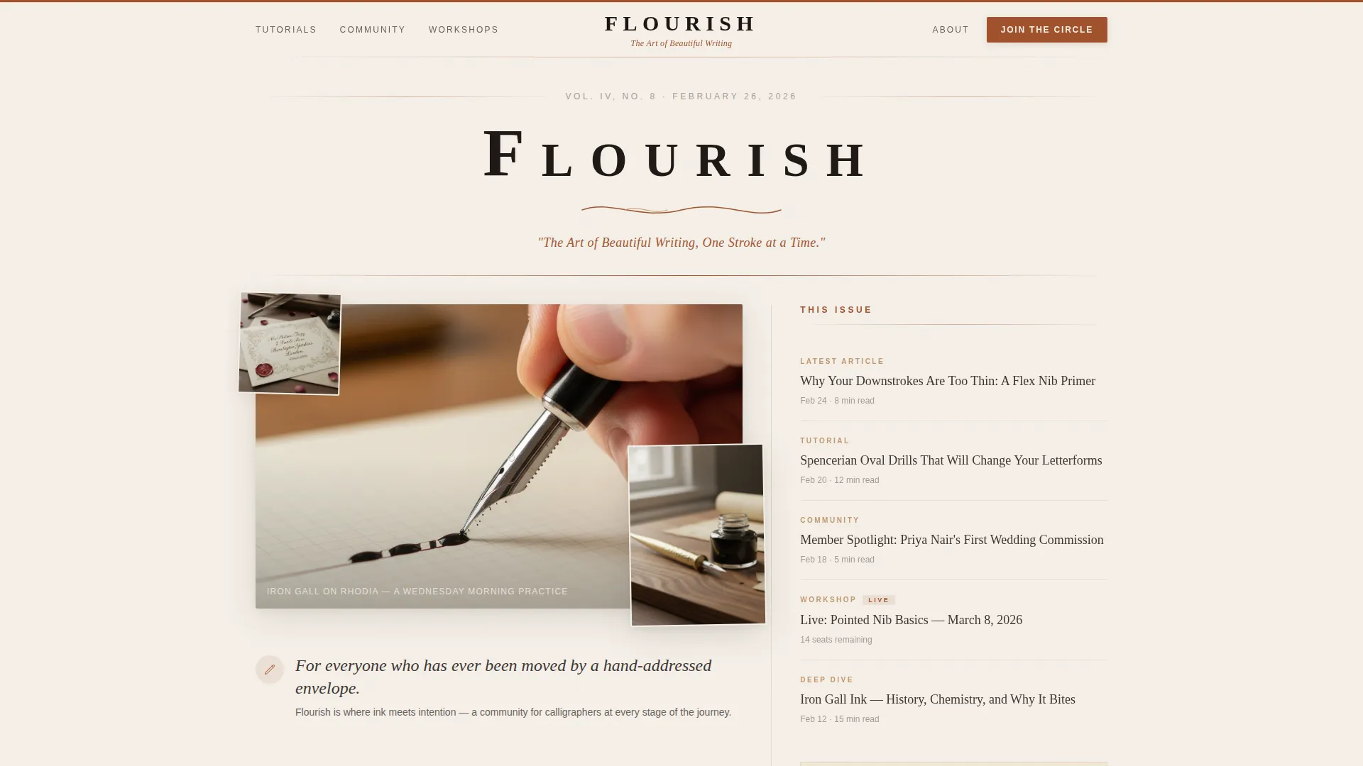
- A publication masthead hero with a 60/40 editorial grid, an editorial photograph slot, and a broadsheet-style table-of-contents sidebar
- A full-width lead generation form at the narrative's emotional peak, plus a secondary gated download for visitors who are not yet ready to join
- Scroll-reveal animations, an ink-stroke SVG draw animation, a sticky ribbon call to action, and a radio-button journey selector built into the sign-up form
Feature list
A brief introduction: each feature below is grounded in the template's built-in layout and interaction design, as described in the source brief.
Asymmetric 60/40 Editorial Grid
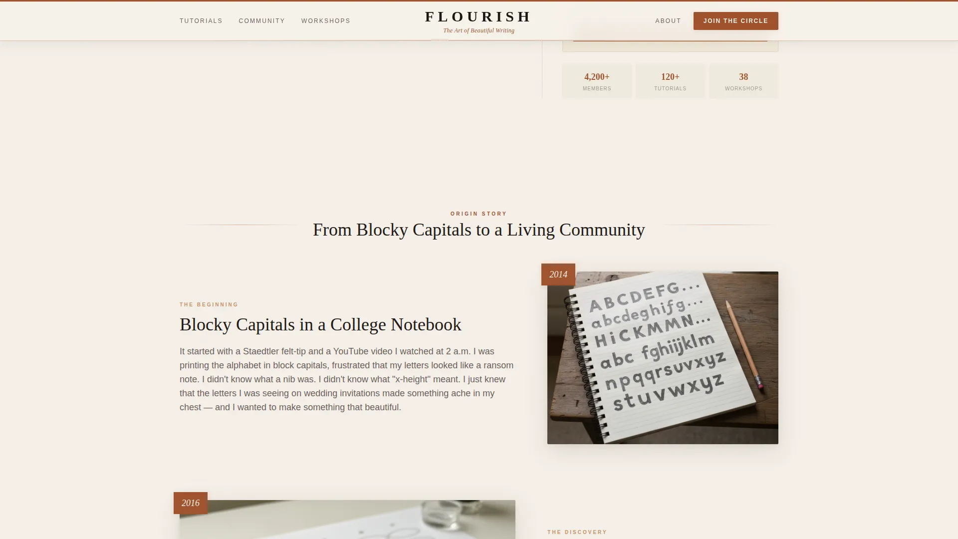
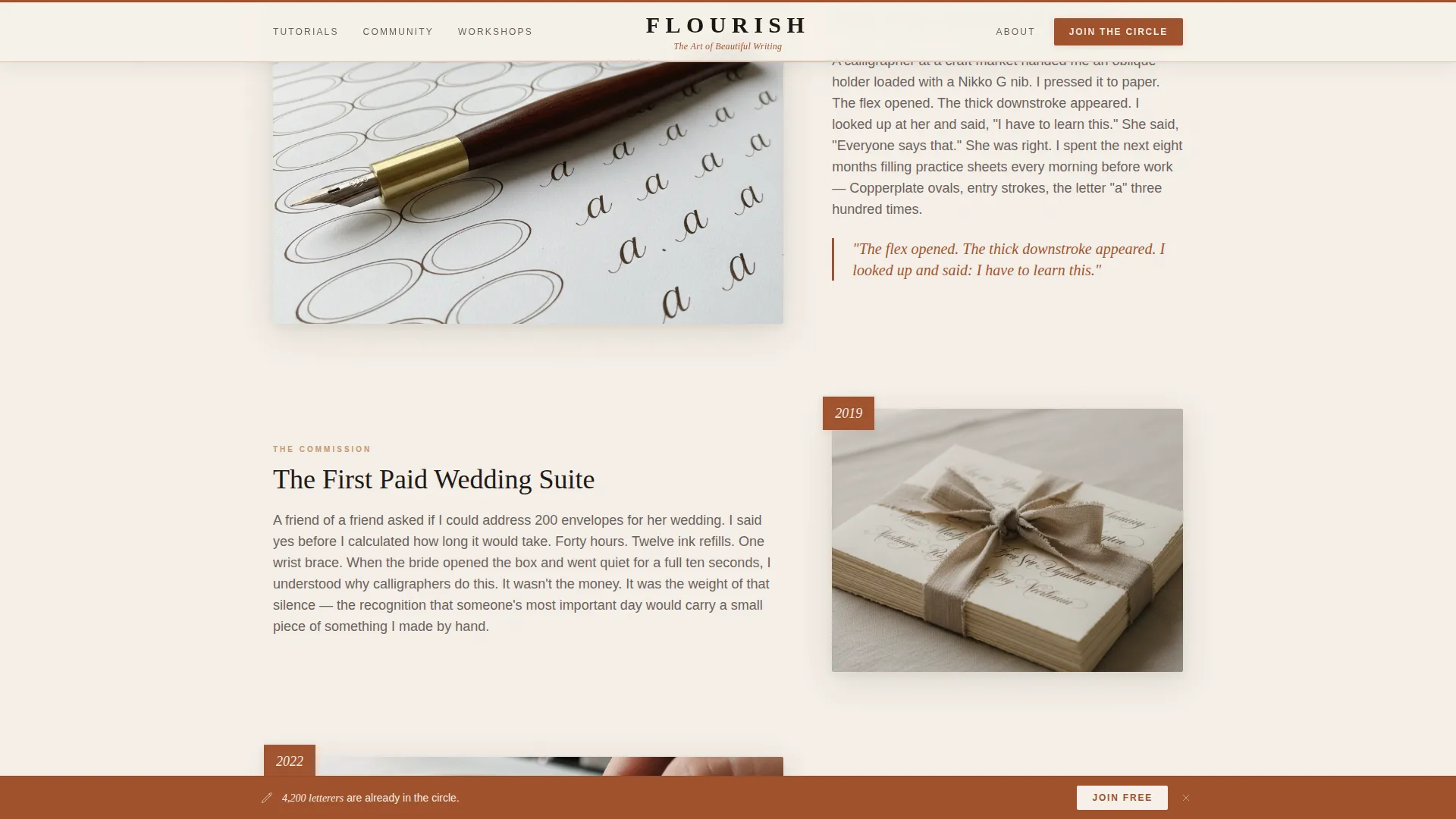
The page uses a 60/40 column split that alternates dominance across sections. Story text fills the wide column while the narrow column holds process photography, then the layout flips so a full specimen image anchors the wide side and a pull quote sits alongside. This rhythm keeps the scroll visually dynamic and editorially credible.
Publication Masthead Header
The header is styled as a Victorian type-specimen masthead. "FLOURISH" runs across the top in a tracked-out serif, with a hand-lettered script subhead beneath. The design immediately signals craft and editorial authority without a word of body copy.
Dual Conversion Paths
The primary call to action, "Join the Letter Circle," appears as a sticky ribbon after the second scroll section and again as a full-width form at the narrative peak. A secondary path offers a free downloadable Foundational Strokes Guide gated behind email only, capturing visitors who want value before commitment.
Journey-Selector Radio Form
The lead generation form includes a first name field, an email field, and a single radio question asking where the visitor is in their lettering journey. Three options, Just Curious, Practicing Weekly, and Working Professionally, let visitors self-identify and feel seen rather than sorted.
Scroll Reveals and Ink-Stroke Animation
Sections enter the viewport with scroll-reveal transitions. An ink-stroke SVG draw animation adds a tactile moment that mirrors the act of writing itself. Hover states shift to rose-gold, rewarding the visitor's curiosity with a visual response.
Origin Story Narrative Arc
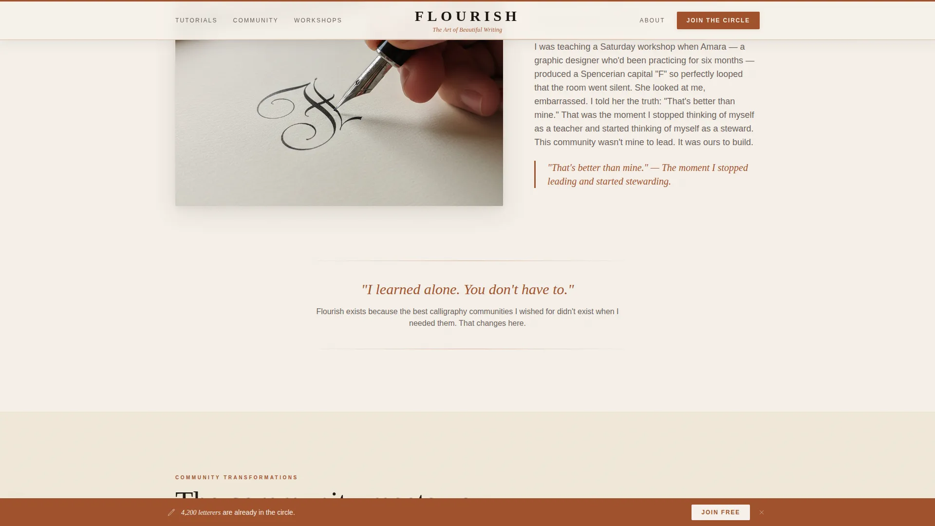
The page is structured as a personal founder timeline. Each section deepens the story from early practice to professional work to communal purpose. The emotional climax, "I learned alone; you don't have to," arrives just before the primary sign-up form, making the conversion feel earned.
Page sections overview
| Section | Purpose |
|---|---|
| Hero Masthead | Introduce the publication identity and provide an editorial TOC sidebar |
| Origin Story | Narrate the founder's journey using alternating 60/40 grid panels |
| Community Transformation | Display student specimen gallery and pull quotes in a bento-style layout |
| Join the Letter Circle | Host the full-width lead generation form at the emotional peak |
| Free Download | Gate the Foundational Strokes Guide behind an email capture call to action |
| Footer | Close the page with a horizontal flow pattern layout |
Design & branding system
The visual identity is Luxe Minimal editorial. It takes cues from Victorian type specimens and translates them into a modern, restrained layout. Every color decision traces back to the image of a calligrapher's desk at golden hour.
- Aged vellum (#F5F0E8) backgrounds, warm graphite (#3B3332) body text, and oxidized rust (#A0522D) headlines and dividers form the core palette
- Muted rose-gold (#C4956A) appears only on hover states and pull quotes, rewarding interaction without cluttering the baseline design
- Fraunces serif handles headlines for editorial weight; DM Sans handles body copy for clean legibility at smaller sizes
Mobile & speed optimization
The template is designed desktop-first to match how calligraphers typically work, at a desk, with room for a wide editorial layout. Full mobile support is included so the page remains usable and readable on any screen size.
- The asymmetric 60/40 grid reflows gracefully for smaller viewports, keeping the story arc intact
- Static sections use server components for efficient rendering; interactive elements like animations and hover transitions use client components
How this template helps you convert
The page is built around a single conversion objective: turning a curious visitor into a Letter Circle member. Every design and layout decision serves that goal.
- The sticky ribbon call to action appears after the second scroll section, catching visitors at the moment they are already engaged but before they have decided to leave
- The origin story narrative builds emotional investment across multiple sections, so the sign-up form arrives as a natural next step rather than an interruption
- The secondary free download path ensures visitors who are not ready to join still leave something behind, giving the creator a warm lead to nurture over time
Other information about this template
This template is a strong starting point for anyone building a calligraphy and lettering blog or creative community platform. It is localized for English-language audiences with United States formatting conventions, including USD pricing references and MM/DD/YYYY date formats.
- The footer uses a horizontal flow layout pattern suited to editorial and community pages
- The template is categorized under Blog and Editorial, with a Hobby and Passion Content subcategory, making it a focused fit for niche creative communities
- Social proof elements, including student transformation specimens, community member counts, and pull quotes, are built into the Community Transformation section
Theme
Luxe Minimal
Creative direction
Origin Story
Color system
Parchment & Rust
Style
Asymmetric Grid (60/40)
Direction
Lead Generation
Page Sections
Asymmetric 60/40 Editorial Grid
Publication Masthead Header
Dual Conversion Paths
Journey-selector Sign-up Form
Scroll Reveals and Ink-stroke Animation
Origin Story Narrative Arc
Related questions
Who is this template designed for?
What are the two conversion paths included?
Can I use this template if I am just starting my blog?
What makes the layout different from a standard blog template?
What interactive elements are included?



