Productivity & Time Management Content Reviews Website Template
Flow is an asymmetric 60/40 landing page template built for productivity and time management online communities. It pairs a Type Over Image hero with an Origin Story narrative structure, two visible framework diagrams, a Weekly Review Template download form, and a member social proof section. The Luxe Minimal design uses an Ink and Paper color system to create a restrained, editorial feel that earns trust before asking for anything.
by Rocket studio
Quick summary
Flow is a single-page landing page template designed for productivity communities and content-resource destinations. It uses an asymmetric 60/40 grid, an Origin Story creative direction, and an Ink and Paper color system to create a quiet, editorial atmosphere. The page gives two full framework diagrams to the reader before presenting any form, building trust through generosity rather than pressure.
Who this template is for
This template is built for founders and community builders who want to attract serious, systems-minded members. It suits anyone running a productivity or time management community who needs a page that feels credible and considered, not loud or salesy.
- Productivity community founders launching a content-resource destination
- Independent coaches or consultants who teach structured time management methods
- Knowledge workers building a paid or free membership around focus and deep work practices
What problem this template solves
Most community landing pages lead with features or pricing. They ask for commitment before earning it. Flow inverts that logic by surfacing real frameworks and a founder story first, so visitors feel understood before they see a form.
- Visitors leave when a page gives nothing before asking for an email
- Generic grid layouts fail to create the reading rhythm that turns browsers into members
- A plain symmetrical layout cannot carry the narrative weight of an Origin Story structure
What you get with this template
You get a fully structured, single-page layout built around five distinct content sections and a linear footer. The design system is ready to apply; the section architecture is already sequenced to move a visitor from discovery to download without a hard sell.
- A Type Over Image hero with a 60/40 asymmetric grid and workspace photography slot
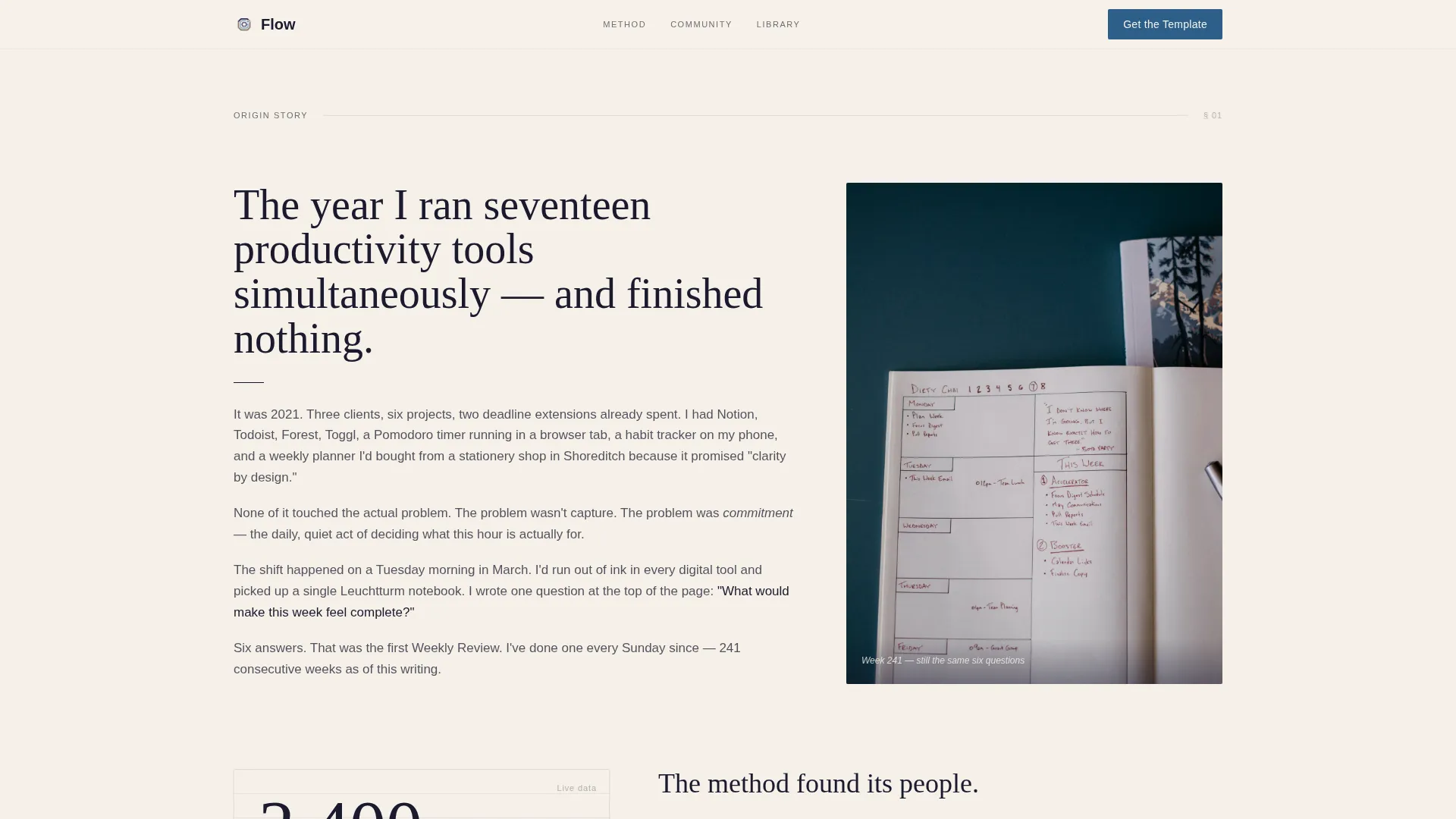
- An alternating narrative section that pairs long-form founder copy with handwritten schedule photography
- A two-part framework diagram section, a download call to action with a minimal two-field form, and a member social proof section with stats and testimonial cards
Feature list
Asymmetric 60/40 Grid Layout
The page uses a persistent 60/40 column split that alternates emphasis across sections. One section places the narrative passage in the wide column; the next flips it, letting a data point dominate while a testimonial sits quietly in the narrow column. This creates a reading rhythm that feels like turning pages rather than scrolling a feed.
Type Over Image Hero
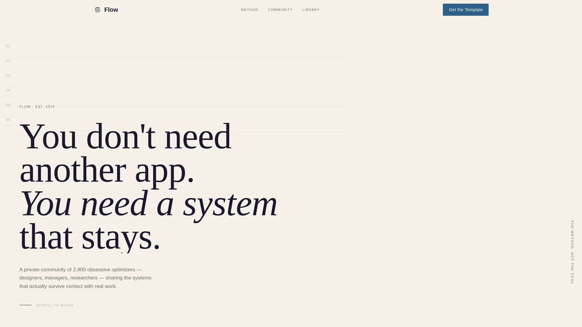
The hero places a bold Fraunces display serif headline directly over a muted, desaturated workspace photograph. The headline sits in the 60-column while the image bleeds into the 40. No call to action appears here; the section is designed to slow the reader down with the weight of a single sentence.
Origin Story Narrative Structure
The page scrolls from a founder confession through a personal crisis, a private method, a shared framework, and finally a thriving community. Each section peels back one layer. This structure makes the community feel earned and real, not manufactured.
Pre-Form Framework Diagrams
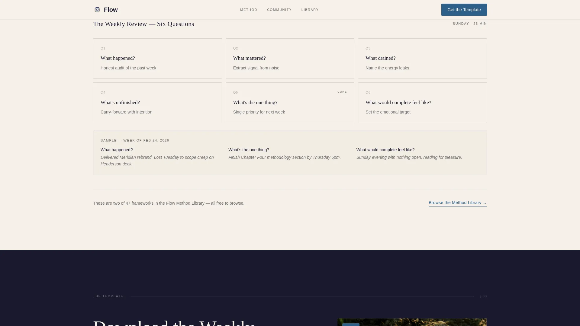
Two complete framework diagrams and a sample weekly review are visible on the page before any form appears. This give-first approach lets the visitor assess the quality of the method before committing to anything.
Weekly Review Template Download Form
The primary call to action is a two-field form asking only for a first name and email. Placeholder text reads like a nudge rather than a label, keeping the tone consistent with the editorial voice of the rest of the page.
Member Social Proof Section
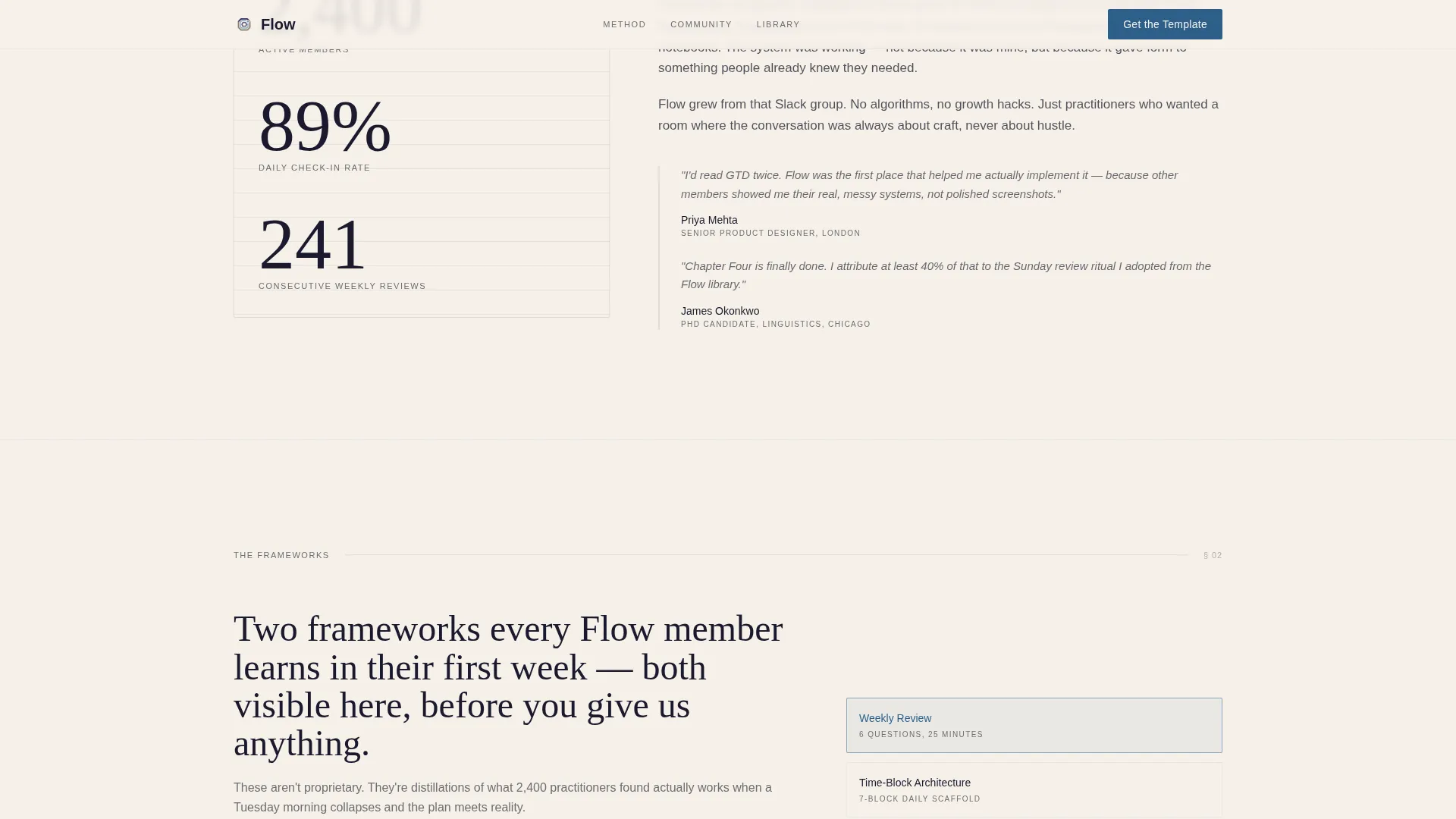
A dedicated section surfaces the community's member count, a daily check-in rate statistic, and a rotated testimonial scroll rail with member photos. These elements give the visitor third-party confirmation that the method works for real people.
Page sections overview
| Section | Purpose |
|---|---|
| Hero: Type Over Image | Opens with a bold serif headline over a workspace photograph to set tone and slow the reader |
| Origin Story Narrative | Alternates 60/40 emphasis across founder confession, method reveal, and community arc |
| Framework Diagrams | Displays two full productivity frameworks on-page before any form appears |
| Download Call to Action | Presents the Weekly Review Template form with a two-field, low-friction entry point |
| Member Social Proof | Shows member count stats, daily check-in rate, and rotated testimonial cards |
| Footer: Linear Single-Row | Closes the page with a clean, minimal single-row footer pattern |
Design & branding system
The visual identity follows a Luxe Minimal theme built on an Ink and Paper color system. Cream dominates the canvas. Deep manuscript black commands all primary typography. Pencil-graphite gray handles secondary text and dividers. A single fountain-pen blue accent is reserved exclusively for links, calls to action, and active states. Typography pairs Fraunces as the display serif with DM Sans as the body typeface.
- Color palette: cream (#F5F0E8) canvas, black (#1A1A2E) type, graphite (#6E6E73) secondary, blue (#2D5F8A) accent only
- Typography: Fraunces for display headings, DM Sans for body copy and form labels
- Animation: clip-in reveals, fade-up stagger on scroll, and spotlight hover behavior on testimonial cards
Mobile & speed optimization
The template is built desktop-first around the 60/40 asymmetric grid, with a defined mobile stack fallback so the column structure collapses cleanly on smaller screens. Scroll behavior and reveal animations use native browser capabilities to keep the experience smooth without heavy dependencies.
- Desktop-first layout with a mobile stack fallback for the asymmetric grid
- Native CSS smooth scroll and Intersection Observer used for section reveal animations
- Rotated testimonial scroll rail adapts to a touch-friendly horizontal scroll on mobile
How this template helps you convert
The page is structured as a Content/Resource destination, meaning conversion happens through demonstrated value rather than promotional pressure. The sequence is deliberate: give first, ask second.
- Two full framework diagrams and a sample weekly review appear on the page before the download form, so the visitor has already received value before they see a field to fill in.
- The primary call to action asks only for a first name and email, reducing the friction of the download step to its absolute minimum.
- A secondary browse path linking to a free method library gives hesitant visitors a no-commitment entry point lower on the page, keeping them engaged without forcing a decision.
Other information about this template
Flow is built for the productivity and time management niche, where trust is earned through demonstrated expertise rather than bold claims. The template's Origin Story creative direction is particularly well-suited to communities built around a founder's personal method. The give-first content architecture reflects the expectations of an audience that has already read widely and is skeptical of surface-level advice.
- The footer uses a Pattern 1 Linear Single-Row layout for a clean, uncluttered close
- Form placeholder text is written in the editorial voice of the page: "What your calendar calls you" and "Where we send the PDF"
- The template is localized for English language, United States date format, and USD currency context
- A secondary conversion path, "Browse the Method Library," links to free articles for visitors who are not yet ready to download
Theme
Luxe Minimal
Creative direction
Origin Story
Color system
Ink & Paper
Style
Asymmetric Grid (60/40)
Direction
Content/Resource
Page Sections
Asymmetric 60/40 Grid Layout
Type Over Image Hero Section
Origin Story Narrative Flow
Pre-form Framework Diagrams
Minimal Two-field Download Form
Member Social Proof with Scroll Rail
Related questions
What type of community is this template designed for?
Do I need a founder story to use this template?
What does the download form collect from visitors?
How does the page handle visitors who are not ready to sign up?
Can I replace the social proof statistics with my own numbers?



