Hobby & Passion Content Blog & Content Website Template
Fold is a masonry-style origami blog and community landing page built around a warm Atelier Studio aesthetic. It guides visitors from their first crease to advanced models through a progressive content layout. Free diagrams appear before any signup ask, and two clear calls to action, a beginner tutorial path and an email community invite, turn curious readers into active folders.
by Rocket studio
Quick summary
Fold is a single-page origami blog and community hub with a Pinterest-style masonry grid layout. The page follows an Origin Story flow, moving visitors from a cinematic hero opening through beginner tutorials, intermediate and advanced models, and a community section. Three free diagrams are visible before any signup prompt, earning trust through generosity first.
Who this template is for
This template is built for creators who want to share origami knowledge with a wide but passionate audience. It works especially well if your content spans multiple skill levels and you want to grow a loyal readership over time.
- Hobbyist bloggers sharing folding tutorials with beginners and midnight folders
- Teachers who need a clean resource hub for printable origami diagrams
- Advanced and competition folders building a community around complex models
What problem this template solves
Most blog templates treat all content equally, placing every post in a flat chronological list. That format fails an origami audience, where a beginner needs guided sequencing and an advanced folder wants density and visual richness at a glance.
- A flat grid buries beginner-friendly content under intimidating advanced models
- Generic blog layouts give no sense of progression or folding journey
- Standard email signups ask for commitment before earning trust
What you get with this template
You get a fully designed, section-led origami landing page that mirrors the natural arc of a folder's learning journey. Every visual and structural decision comes from the source brief, so nothing feels generic or placeholder-like.
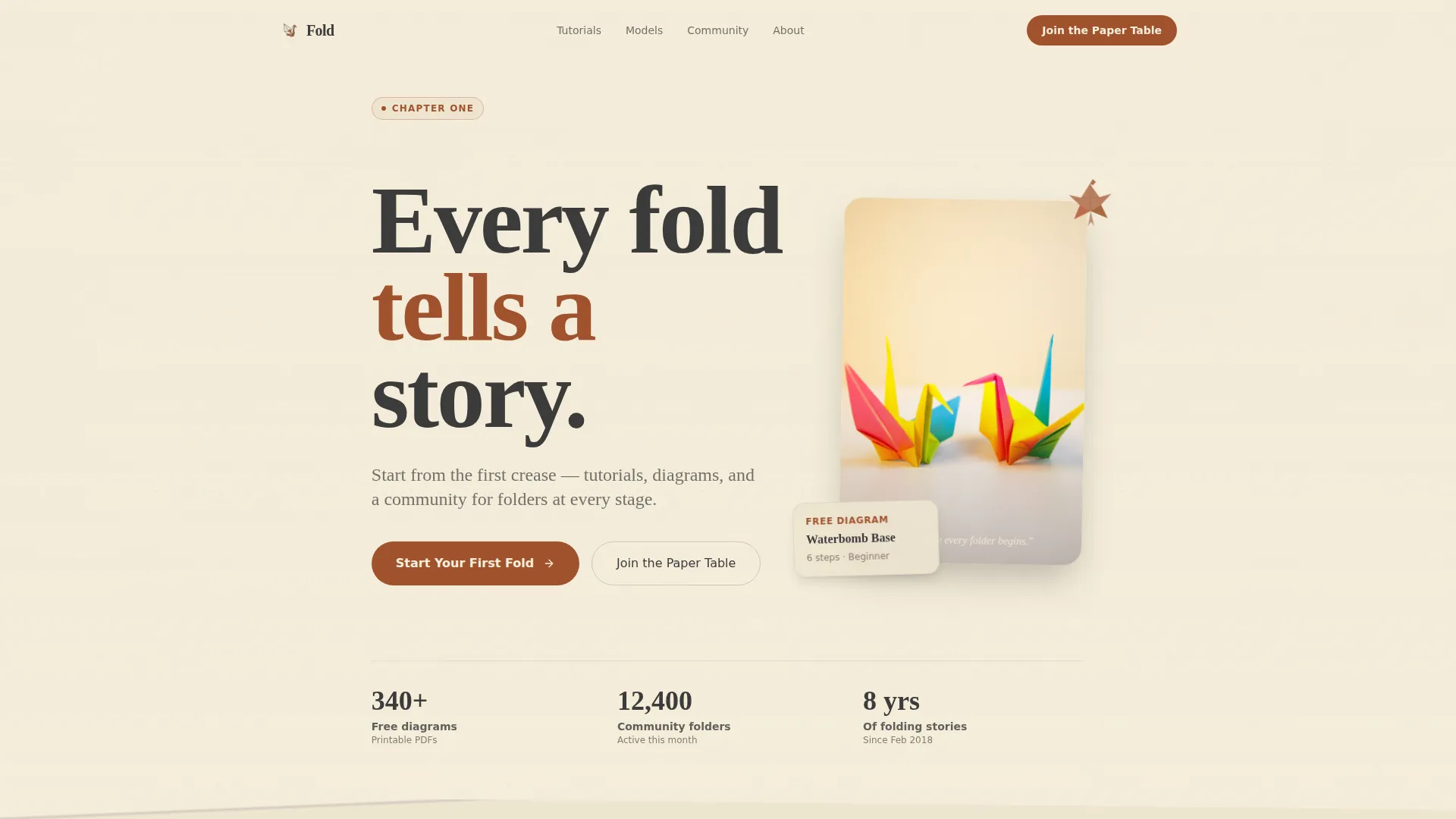
- A cinematic hero section with paper texture, oversized serif type, and a crane ornament
- A progressive masonry content grid split across beginner and advanced difficulty levels
- Two conversion paths: a primary tutorial call to action and a community email signup with a notification toggle
Feature list
A brief introduction to the feature set: each component below is drawn directly from the template brief and serves a specific purpose within the origami blog layout.
Cinematic Chapter Hero
The hero section opens like a book page. Massive serif type sits on a slightly off-white textured background, accompanied by an illustrated crane in the margin. A page-curl visual at the bottom edge encourages the scroll as if turning to the next chapter.
Progressive Masonry Grid
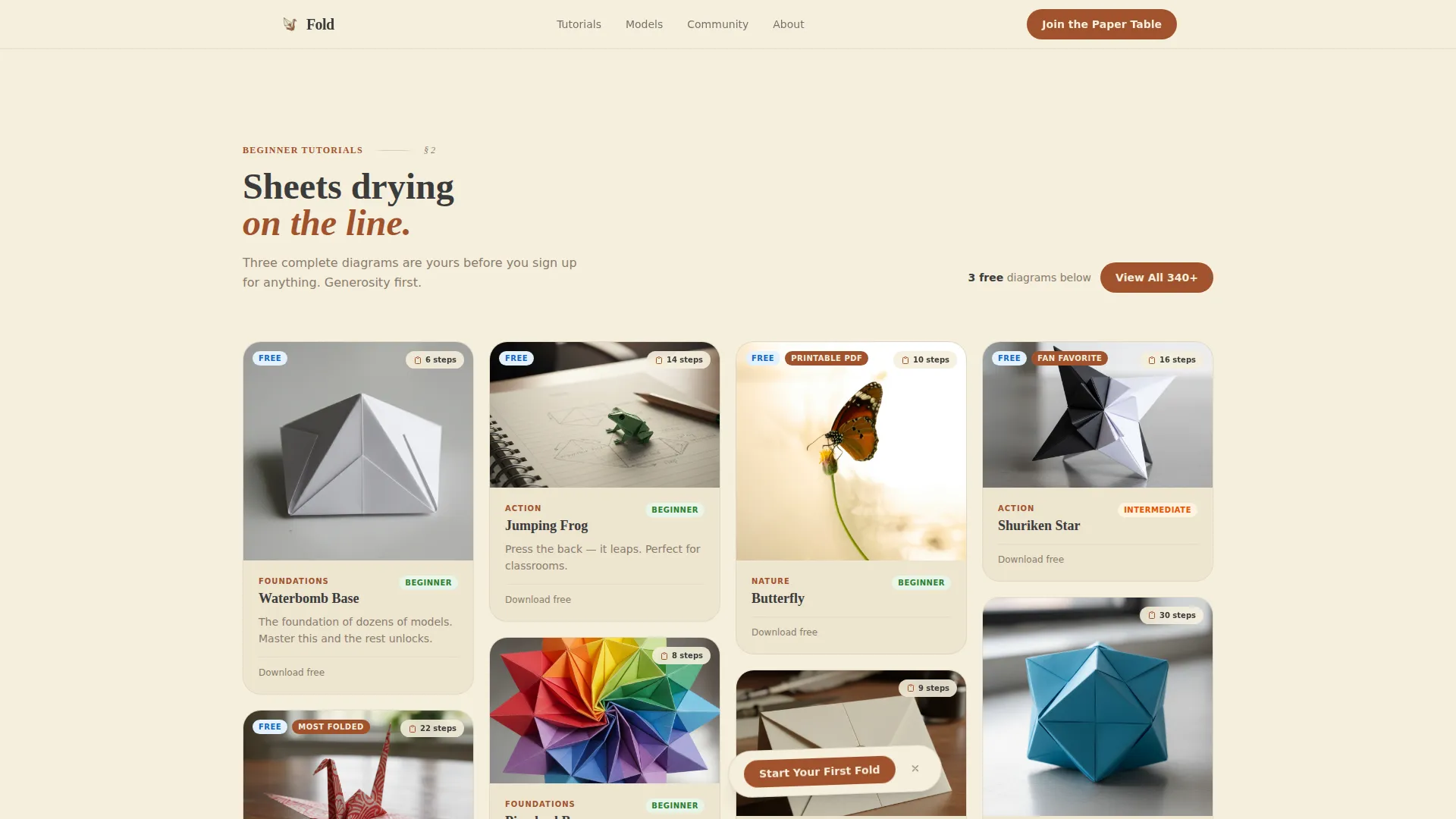
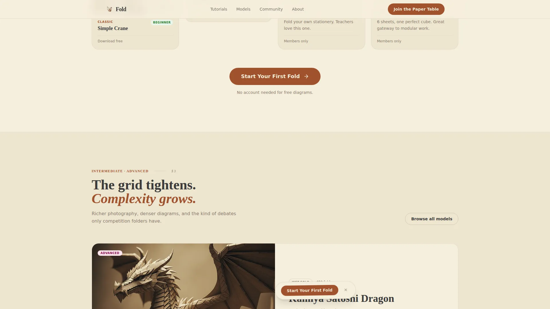
The template uses a Pinterest-style masonry layout split into two distinct grid zones. The beginner zone uses a looser card arrangement with difficulty tags and free diagram previews. The advanced zone tightens visually, with richer photography and denser diagram detail as complexity grows.
Origin Story Section
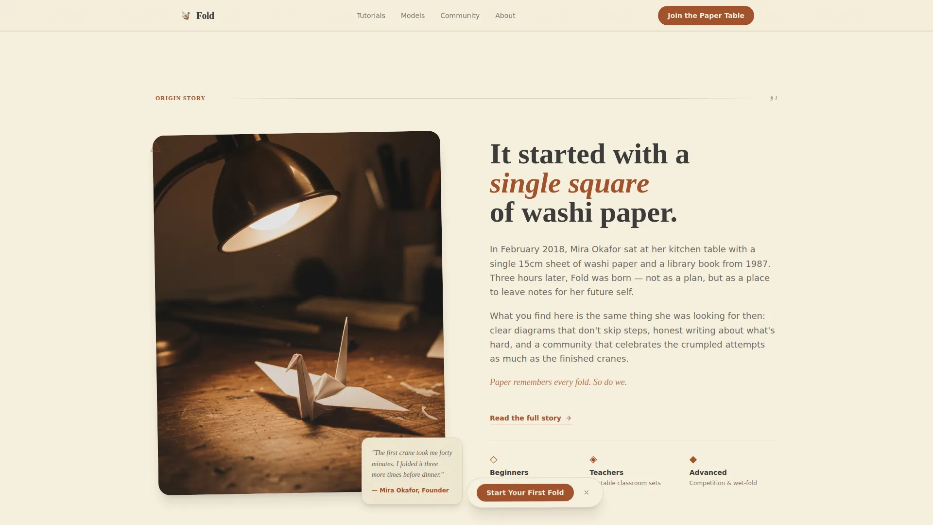
A dedicated section introduces the blog's founding moment with a short paragraph and a photo of the first model folded. This anchors the page emotionally and gives the community a sense of authentic origin.
Dual Conversion Paths
The primary call to action, "Start Your First Fold," links to a curated beginner tutorial path and appears both beneath the hero and as a floating prompt at the bottom of the viewport. A secondary path, "Join the Paper Table," is an email signup with a single field and a toggle between weekly digest and challenge-only notifications.
Community and Challenges Section
The final content section surfaces reader-submitted gallery photos, folding challenge participation counts, and a community member count. This section provides social proof and makes the page feel like a living, active space rather than a static blog.
Hover and Animation States
Masonry cards have hover states. The page includes a paper texture parallax effect, a masonry stagger reveal on scroll, a page-curl CSS animation, and a marquee element. Animations are set to a medium intensity level to keep the experience engaging without being distracting.
Page sections overview
| Section | Purpose |
|---|---|
| Hero / Chapter Opening | Establishes mood, blog title, subtitle, and primary call to action |
| Origin Story | Shares founding moment with a photo of the first folded model |
| Beginner Masonry Grid | Displays free beginner tutorials with difficulty tags in a loose card layout |
| Intermediate / Advanced Grid | Shows richer photography and diagram previews in a tighter masonry layout |
| Community and Challenges | Features reader galleries, challenge counts, and member social proof |
| Footer | Presents logo and tagline on the left with navigation links on the right |
Design & branding system
The visual identity follows a wabi-sabi Atelier Studio aesthetic. The palette feels like a wooden workbench stained with tea, warm and tactile, with deliberate imperfection built in.
- Four-color Parchment and Rust system: washi cream (#F5EEDC) for backgrounds, iron-oxide rust (#A0522D) for headings and active states, charcoal (#3B3B3B) for body text and diagram lines, and soft shadow gray (#D5CBBF) for card separation
- Typography pairing: Fraunces serif for headings to give a hand-pressed editorial feel, and DM Sans for body text to keep reading comfortable
- Paper texture is applied to the hero background, and the page-curl CSS effect at the hero base reinforces the chapter-opening concept throughout
Mobile & speed optimization
The template is designed desktop-first, which suits origami photography well since larger screens show diagram detail more clearly. The responsive layout adapts the masonry grid for smaller screens without losing the progression structure.
- Masonry columns collapse responsively as viewport width decreases
- Server Components handle static masonry rendering to keep JavaScript minimal
- The floating call to action remains accessible at all viewport sizes
How this template helps you convert
The page is structured so that value arrives before any ask. Visitors receive complete, browsable content before they encounter a signup prompt.
- Three complete diagrams are visible in the masonry grid before the email signup appears, so trust is earned through generosity rather than demanded upfront.
- The primary "Start Your First Fold" call to action appears twice, once below the hero and once as a floating prompt, keeping the beginner tutorial path visible throughout the scroll without being aggressive.
- The "Join the Paper Table" toggle lets visitors self-select between a weekly digest and challenge-only notifications, reducing signup friction by letting readers choose exactly what they want.
Other information about this template
This section covers additional practical details about the template that may help you decide if it is the right fit for your project.
- The template style is Masonry and Pinterest-style, making it well suited to visual content-heavy blogs where image variety and card size diversity improve browsing engagement
- The creative direction follows an Origin Story arc, which means the scroll experience is intentionally sequential, curiosity leads to first attempt, which leads to growing skill, and finally to community belonging
- The footer follows a split layout with the logo and tagline on the left and navigation links on the right, keeping the brand present without competing with the content above
- Date formatting uses MM/DD/YYYY and all content is written in English, making this template ready for an English-language origami community out of the box
Theme
Atelier Studio
Creative direction
Origin Story
Color system
Parchment & Rust
Style
Masonry/Pinterest
Direction
Content/Resource
Page Sections
Cinematic Chapter Hero Section
Progressive Masonry Grid Layout
Origin Story Founding Section
Dual Conversion Path Design
Community Gallery and Challenges
Scroll Animations and Hover States
Related questions
Can I use this template without a large existing content library?
Is the email signup connected to a specific platform?
Can I change the color palette to match a different brand?
Does the template work for a teacher who needs a resource page without a community section?
How does the floating call to action behave on smaller screens?



