News & Magazine Blog Website Template
Folio is an editorial arts magazine landing page template built for culture publications covering painters, poets, playwrights, and printmakers. It follows a day-in-the-life scroll structure that unfolds like an actual magazine issue. The Parchment and Rust color system and display serif typography give every section the weight and warmth of real print.
by Rocket studio
Quick summary
Folio is a single-page editorial template designed for arts and culture magazines. It scrolls like a feature story, moving from a dawn studio visit through an evening gallery opening. The Ink and Paper visual theme, display serif headlines, and rust accent details make the page feel like a printed issue, not a website.
Who this template is for
This template is built for editors, publishers, and creatives who want their online presence to feel as considered as their print work. It suits anyone launching or promoting a culture and arts magazine.
- MFA students and working artists who want a publication that reflects serious creative practice
- Gallery owners and curators looking for a magazine platform with real editorial credibility
- Literary readers, retired teachers, and essay lovers who value long-form culture coverage
What problem this template solves
Most magazine landing pages look like news aggregators. They list articles, show thumbnail grids, and ask for an email before the visitor has read a single sentence. Folio solves that by making the landing page itself an editorial experience.
- Visitors consume real editorial craft before they ever see a call to action
- The scroll structure earns trust gradually, so the subscribe prompt feels natural rather than transactional
- The print-first visual system communicates quality without a single word of self-promotion
What you get with this template
You get a fully structured editorial landing page that doubles as a sample issue. Every section is a chapter, and every design choice reinforces the magazine's identity.
- A half-page editorial header with a black-and-white artist portrait and oversized serif headline
- Five narrative chapters moving from morning studio through evening gallery, each with its own visual treatment
- A click-through call-to-action pattern with a rust text link early and a full-width button at the close
Feature list
This template is built from specific editorial and visual decisions described in the source brief. Each feature below reflects a real part of the template.
Half-Page Editorial Header
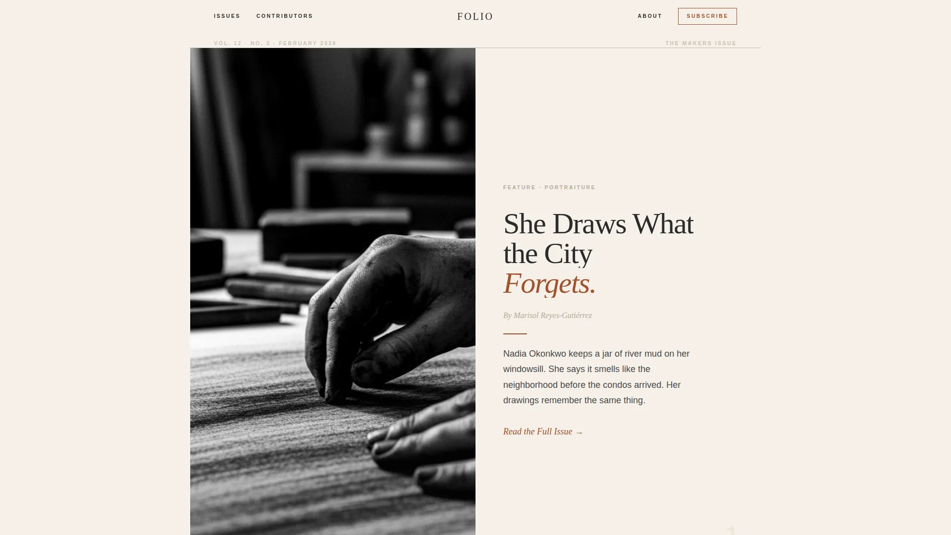
The header splits the screen in two. The left half holds a black-and-white portrait of an artist mid-process, shot tight with shallow depth of field. The right half is pure parchment with a display serif headline, an italic byline, and a thin rust rule above a two-sentence lede. It reads like an opening spread, not a hero banner.
Day-in-the-Life Scroll Structure
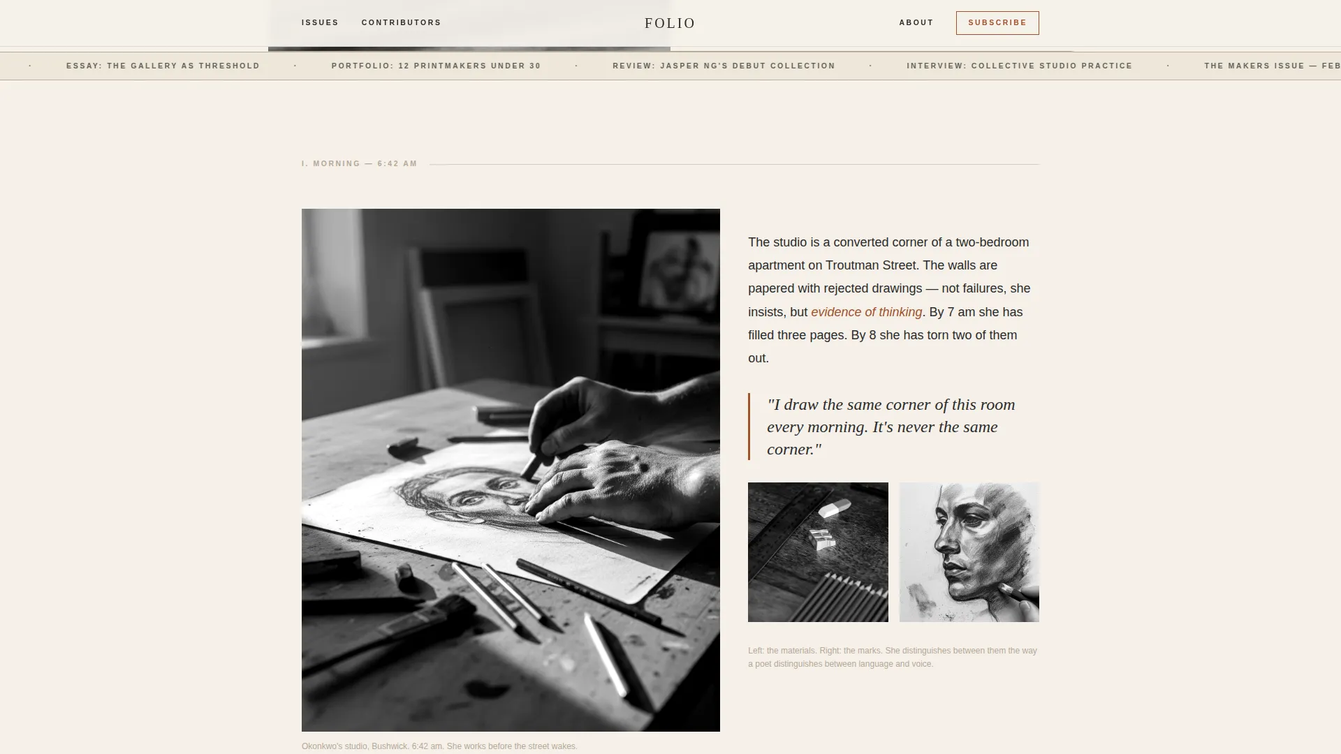
The page is divided into five narrative chapters: morning process shots, a midday interview pull-quote, an afternoon community portrait grid, and an evening gallery section. Scrolling through the page is the same as reading through an issue. By the time a visitor reaches the final call to action, they have already consumed a full editorial arc.
Pull-Quote and Full-Bleed Image Pairing
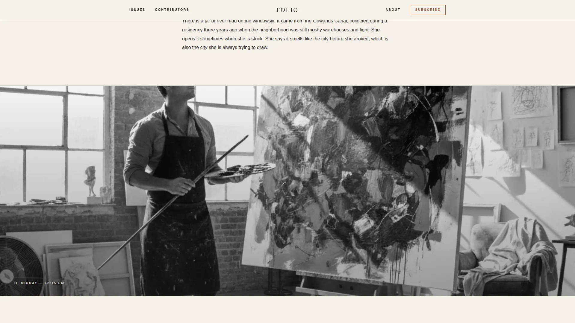
Interview excerpts appear as large rust-accented pull-quotes set between full-bleed images. This mirrors how print magazines use white space and typography to slow the reader down at a key moment. The combination of scale and contrast makes these sections the emotional center of the page.
Community Portrait Grid
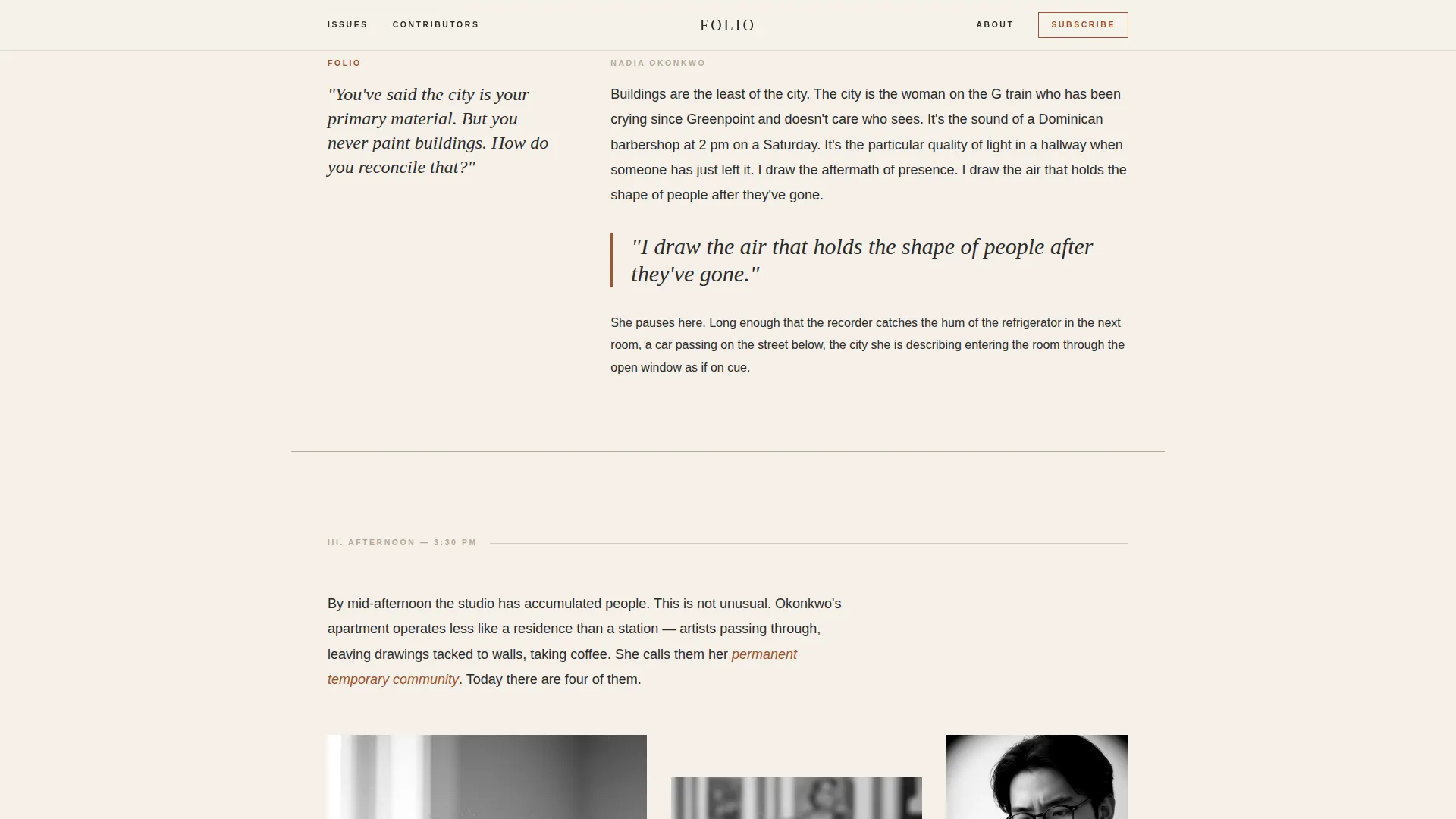
The afternoon chapter introduces collaborators, mentors, and peers through a thumbnail portrait grid with short editorial captions. This section builds social proof through editorial voice rather than star ratings or testimonials, which matches how arts audiences recognize credibility.
Click-Through Call-to-Action Pattern
There is no form and no input field. The call to action appears twice: first as a rust-colored text link after the header lede, then as a full-width button after the gallery section. The two-step placement mirrors how print magazines build desire before offering a subscription card.
Parallax Scroll and Text Reveal Animations
The template includes parallax image movement, text reveal masks, and grayscale-to-color hover transitions. A marquee ticker adds a secondary layer of editorial motion. These interactions are handled through IntersectionObserver and static server components for scroll and parallax client components.
Page sections overview
| Section | Purpose |
|---|---|
| Editorial Header | Opens the page as a feature spread with portrait and headline |
| Morning Chapter | Sets quiet studio atmosphere with process close-ups and a pull-quote |
| Midday Chapter | Delivers an interview excerpt between full-bleed images |
| Afternoon Chapter | Introduces community through a portrait grid with captions |
| Evening Chapter | Presents finished work on a gallery wall with the primary call to action |
| Minimal Footer | Closes the page with an ultra-minimal horizontal layout |
Design & branding system
The visual identity is built on an Ink and Paper theme using the Parchment and Rust color system. Every color choice has a specific editorial role, borrowed from the logic of letterpress printing and layout dummies.
- Unbleached cream (#F5F0E8) dominates the background like actual paper stock; dried-ink charcoal (#2B2B2B) carries all body text; oxidized rust (#A0522D) marks pull-quotes, bylines, and hover states; margin-note pencil gray (#B5A898) draws section rules and dividers
- Typography pairs Fraunces as the display serif for headlines with DM Sans for body text and interface elements
- The overall aesthetic is a letterpress broadsheet left on a wooden desk in afternoon light, warm, textured, and deliberately imperfect
Mobile & speed optimization
The template is built desktop-first to honor the print magazine aesthetic, with graceful degradation on smaller screens. The editorial hierarchy and typographic scale remain readable at every breakpoint.
- Server components are used for all static sections; client components handle scroll, parallax, and IntersectionObserver interactions
- Parallax and animation layers are scoped to the client so static content loads without waiting for interactive scripts
- The layout adapts from a split-column desktop header to a stacked single-column view on mobile without losing editorial tone
How this template helps you convert
Folio earns the subscription click by making the landing page itself worth reading. The trust-building happens through editorial experience, not persuasion copy.
- The rust text link after the header lede gives early readers an immediate path to the full issue before any commitment is asked
- By the time the full-width button appears after the gallery section, the visitor has followed one artist through an entire day and already feels invested in the magazine
Other information about this template
This template is well suited for culture and arts publications that want to launch a compelling digital presence without sacrificing the editorial weight of their print identity.
- The template is categorized under Blog and Editorial, with a News and Magazine subcategory, making it a strong fit for arts-focused editorial projects
- The footer follows an ultra-minimal horizontal pattern, keeping the close of the page as clean and uncluttered as the colophon of a printed issue
- Social proof in this template takes the form of editorial bylines, contributor names, issue numbers, and portrait captions rather than star ratings or subscriber counts
- The English (USA) editorial voice and no-currency design make it easy to localize for any arts publication audience
- The intersection of the Day-in-the-Life creative direction and the Click-Through call-to-action pattern is deliberate: the scroll narrative does the persuasion work so the button only needs to feel like turning a page
Theme
Ink & Paper
Creative direction
Day-in-the-Life
Color system
Parchment & Rust
Style
Editorial/Magazine
Direction
Click-Through
Page Sections
Half-page Editorial Header
Day-in-the-life Scroll Structure
Pull-quote and Full-bleed Image Pairing
Community Portrait Grid
Click-through Call-to-action Pattern
Parallax Scroll and Text Reveal Animations
Related questions
Does this template include a subscription form or email capture?
Can I adapt the day-in-the-life structure for a different artist or issue each month?
What typefaces does this template use?
Is this template suitable for a digital-only arts magazine?
How does the two-step call-to-action pattern work?



