Book Reviews & Literary Criticism Content Booking Website Template
Folio is a hub and spoke landing page template built for literary criticism and book review communities. It opens like a printed book, guides visitors through four chapter-styled sections, and earns trust through visible criticism before asking anyone to join. The template is desktop-first, typographically driven, and built around an anchor navigation system pinned to the left margin.
by Rocket studio
Quick summary
Folio is a single-page, anchor-navigated landing page template designed for a literary criticism and book review online community. It presents itself as an open book in the browser, uses chapter-structured sections to walk serious readers through the community's values, and converts visitors through an evidence-first content strategy rather than marketing claims.
Who this template is for
This template is built for people who take literary criticism seriously and want a community space that reflects that rigor. It suits founders and organizers launching or growing a writing-focused reading community online.
- MFA students and serious literary readers who write criticism
- Retired English teachers and long-form book reviewers
- Book club organizers who want curated discussion over algorithmic recommendations
What problem this template solves
Most community landing pages lead with features and ask for trust before proving they deserve it. Literary audiences are skeptical of that approach. They read closely, they notice hollow copy, and they leave fast if the tone is wrong.
- Generic community templates lack the typographic weight that serious readers expect
- Algorithm-driven platforms offer no space for long-form criticism or annotation culture
- Standard landing pages ask for a sign-up before giving the visitor a reason to care
What you get with this template
You get a fully structured, single-page landing page that unfolds like a printed book. Every section has a defined role in earning the reader's trust before the call to action appears.
- A chapter-styled hero with a rotating pull-quote and massive serif display typography
- Four anchor-navigated spoke sections covering the canon, the conversation, the craft, and the community
- Two placed calls to action and a secondary "Browse the Stacks" path for uncommitted visitors
Feature list
This template's features follow directly from its brief and are grounded in the actual page structure and design system described.
Chapter-Styled Hero Spread
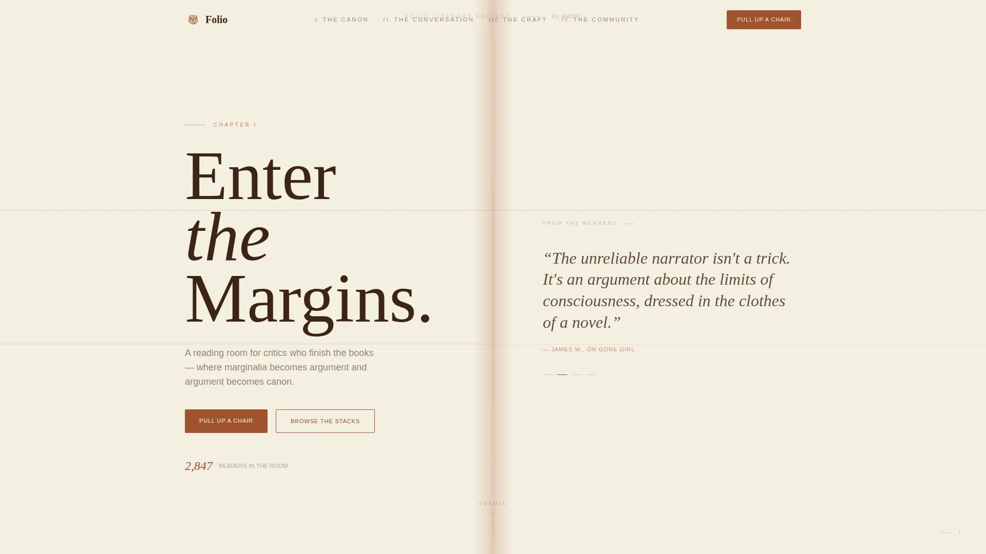
The header presents as an open book spread across the full viewport. The left page carries the community name set in a serifed display face with a chapter label. The right page rotates a member pull-quote typeset in a hot-metal style. A ruled line connects both pages.
Pinned Anchor Navigation
A left-margin navigation bar lists the four spoke sections as roman-numeral chapters. It stays pinned as the visitor scrolls, letting them move between sections without losing their place. Active states highlight in rust to mark where they are on the page.
Marginalia Scroll Reveals
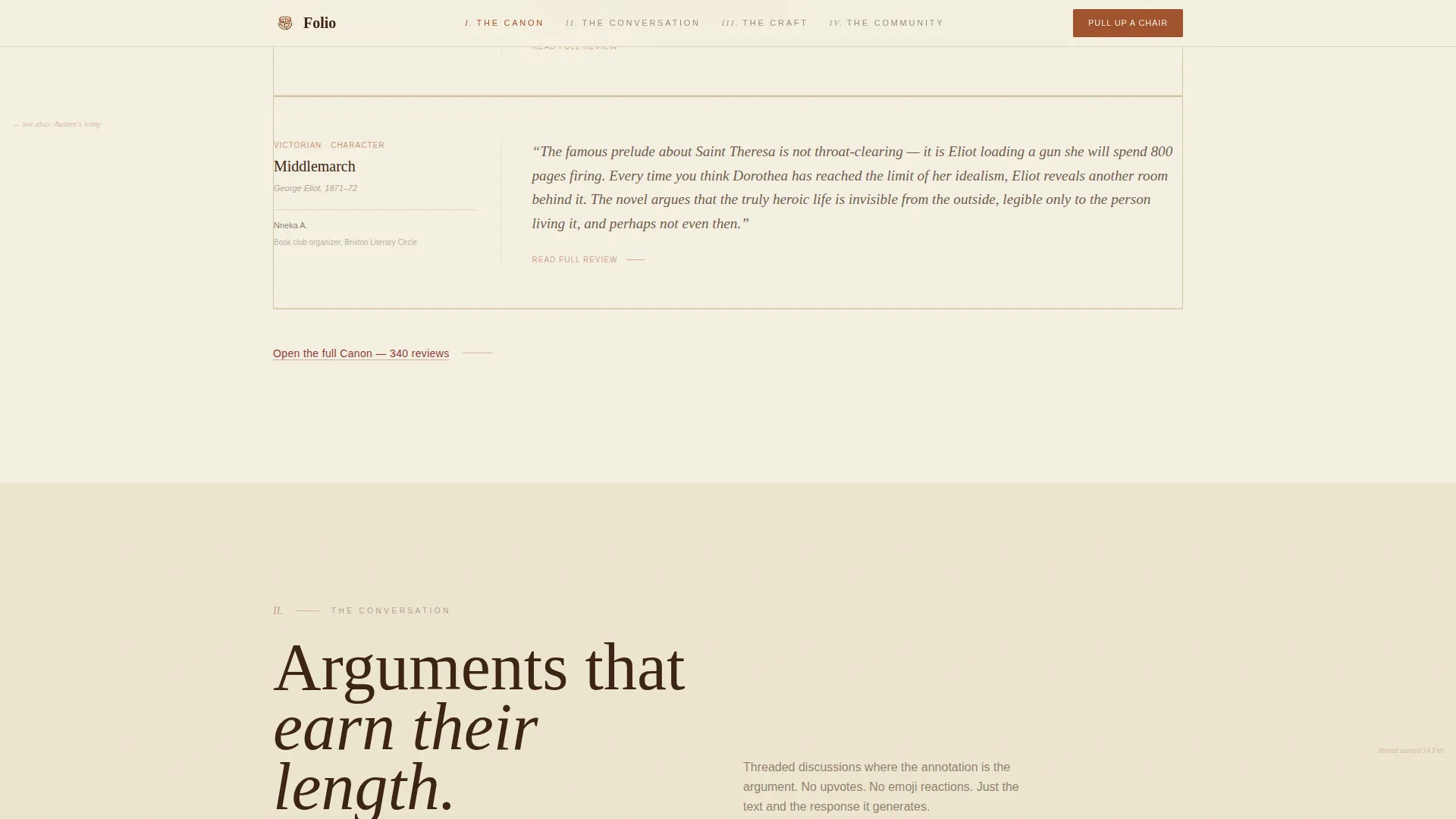
As the visitor scrolls through each section, annotation-style notes appear in the margins. These mimic a previous reader's pencil notes and act as social proof, showing member voices without interrupting the main argument of each section.
Evidence-First Content Blocks
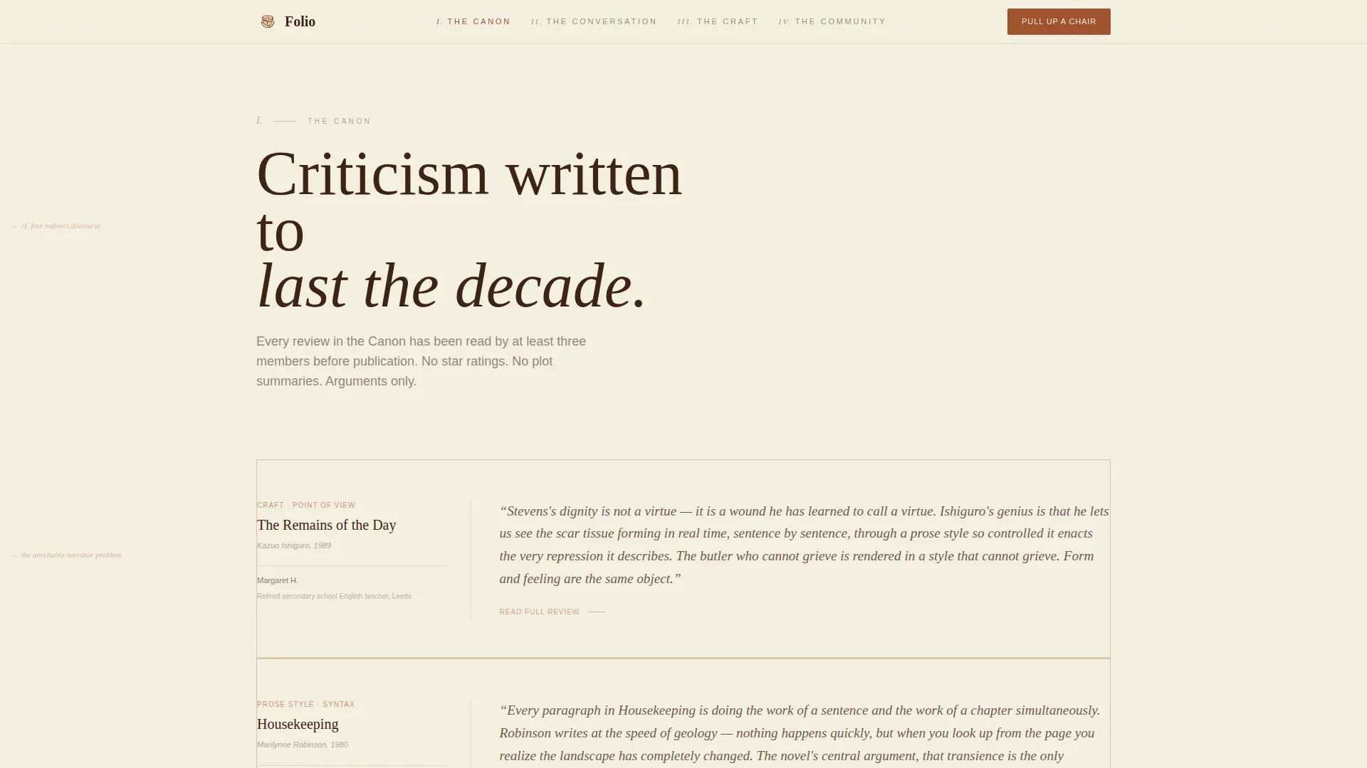
Each spoke section opens with a one-sentence thesis in oversized italic, then expands into full paragraphs of real criticism and craft discussion. Visitors read actual content before they see a sign-up prompt, which builds trust before the ask.
Dual Conversion Paths
The primary call to action, "Pull Up a Chair," links to a free membership form that asks only for a display name, a favorite book, and an email. A secondary path, "Browse the Stacks," opens three unlocked review collections and a sample craft essay for visitors who are not ready to commit.
Minimal Footer with Horizontal Flow
The footer follows a clean horizontal flow pattern. It stays typographically consistent with the rest of the page and avoids visual clutter so the page ends with the same editorial restraint it starts with.
Page sections overview
| Section | Purpose |
|---|---|
| Hero Chapter Spread | Opens the page as a book, sets tone and rotating pull-quote |
| I. The Canon | Displays curated review excerpts to prove writing rigor |
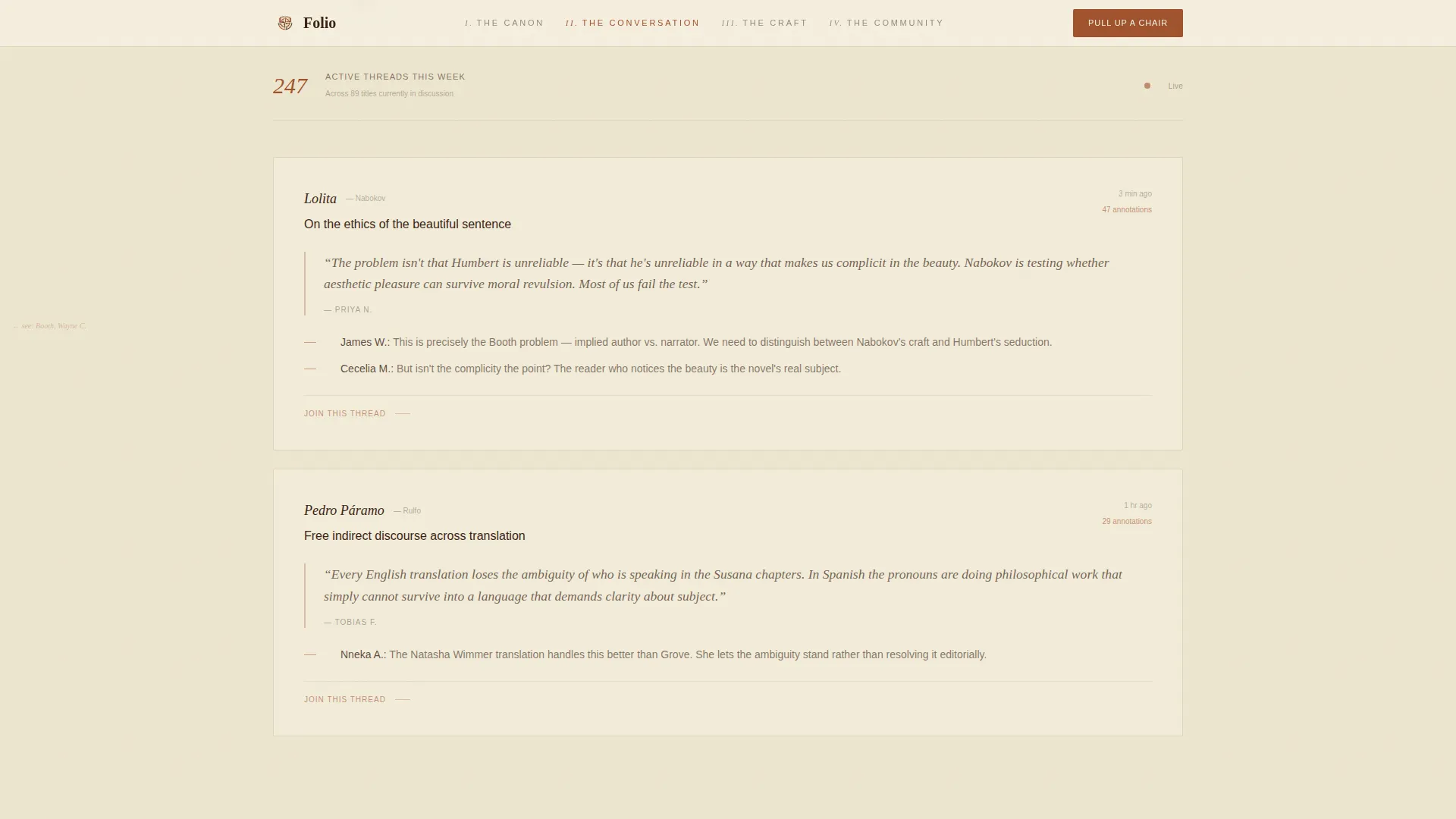
| II. The Conversation | Shows annotation threads and marginalia-style scroll reveals |
| First Call to Action | Places "Pull Up a Chair" prompt after the second spoke |
| III. The Craft | Previews craft essays on point of view and narrative tense |
| IV. The Community | Features member shelves, named voices, and reading lists |
| Page Footer | Closes with minimal horizontal flow pattern |
Design & branding system
The visual identity follows an Atelier Studio approach. Every color and type choice references the physical world of manuscript conservation and letterpress printing, creating a reading environment that feels earned rather than designed.
- Color palette: aged vellum (#F5F0E1), foxed-page tan (#D4C5A9), oxidized iron rust (#A0522D), deep library walnut (#3B2314) for body text, and faded red ink (#8B3A3A) for accent links and hover states
- Typography: Fraunces as the serifed display face for headings and pull-quotes, DM Sans as the body typeface for readable long-form paragraphs
- Section dividers use rust marks, backgrounds stay in the vellum-to-tan range, and walnut carries all readable type with the visual weight of letterpress impression
Mobile & speed optimization
The template is built desktop-first, reflecting its primary audience of MFA students working late at desks and retired teachers reading carefully at home. A mobile fallback is included so the page remains functional on smaller screens.
- Desktop layout is the priority, with the pinned left-margin navigation and full open-book spread designed for wide viewports
- Server Components handle static content sections to keep the page lightweight where interactivity is not needed
- Client Components are used sparingly, limited to animated elements such as the rotating pull-quote, marginalia reveals, and chapter transitions
How this template helps you convert
Folio earns the click by giving real content before asking for anything. The conversion strategy is built into the page structure itself, not added as an afterthought.
- Visitors read full paragraphs of actual criticism in sections I and II before they ever see a sign-up prompt, so the community proves its standard before making an ask.
- The "Pull Up a Chair" call to action appears after the second spoke, when the visitor has already read enough to feel the community's voice. A second placement at the bottom of the page catches those who kept scrolling.
- The "Browse the Stacks" secondary path removes commitment pressure entirely, letting cautious visitors explore three unlocked review collections and a sample craft essay on their own terms.
Other information about this template
This template sits within the Blog and Editorial category, specifically built for the Book Reviews and Literary Criticism Content subcategory. A few additional details are worth noting for anyone evaluating it for their project.
- The template uses GSAP ScrollTrigger for all scroll-based animations, including the staggered marginalia reveals and chapter transition effects
- The anchor navigation rhythm alternates between dense text blocks and generous white space, teaching the visitor how the community thinks before asking them to join
- The free membership form is intentionally minimal: display name, one favorite book, and an email address only
- No photography or illustration is used anywhere in the template; pure typography and whitespace carry the entire visual argument
- The template style is Hub and Spoke with Anchor Navigation, a format well suited to content-rich communities that want to present multiple themes within a single scrollable page
Theme
Atelier Studio
Creative direction
Vision & Mission
Color system
Parchment & Rust
Style
Hub & Spoke (Anchor Nav)
Direction
Content/Resource
Page Sections
Chapter-styled Hero Book Spread
Pinned Left-margin Anchor Navigation
Marginalia Scroll Reveal Animations
Evidence-first Spoke Sections
Dual Conversion Path Design
Typographic-only Visual Identity
Related questions
Who is this landing page template built for?
Can I customize the chapter sections and color palette?
What does the Browse the Stacks path do?
Does the template include scroll animations?
What does the membership form ask for?



