Knife Making Newsletter Landing Page Template
Forge is a masonry-style landing page template built for a knife making newsletter. It combines a dramatic full-bleed hero image, a scrollable content archive grid, a social proof strip, and a personalized five-question quiz. The design uses a letterpress-inspired Ink & Paper palette to feel like a broadsheet, not a signup form.
by Rocket studio
Quick summary
Forge is a single-page newsletter landing page template for the knife making community. It blends editorial masonry layout with a personalized quiz flow to turn curious visitors into committed subscribers. The design feels like a worn workshop notebook, and the content strategy makes visitors feel they are already reading the newsletter before they ever subscribe.
Who this template is for
This template is built for newsletter creators who serve a specific, knowledgeable audience. It suits anyone publishing long-form maker content where depth and credibility matter more than generic hype.
- Hobbyist bladesmiths publishing a weekly knife making newsletter
- Custom makers and knife collectors who want a content-first subscription page
- Editorial newsletter operators looking for a quiz-driven, community-feel landing page
What problem this template solves
Most newsletter landing pages look like every other signup form on the internet. They ask for an email address before giving a single reason to trust the sender. For a niche audience like bladesmiths and knife collectors, that approach fails immediately.
- Visitors see no proof of content quality before being asked to subscribe
- Generic layouts feel disconnected from the craft and culture of the audience
- There is no way to personalize the subscription experience or show readers why this newsletter is relevant to them specifically
What you get with this template
You get a fully structured single-page layout that leads visitors through a content experience before asking for anything in return. Every section is designed to build trust incrementally.
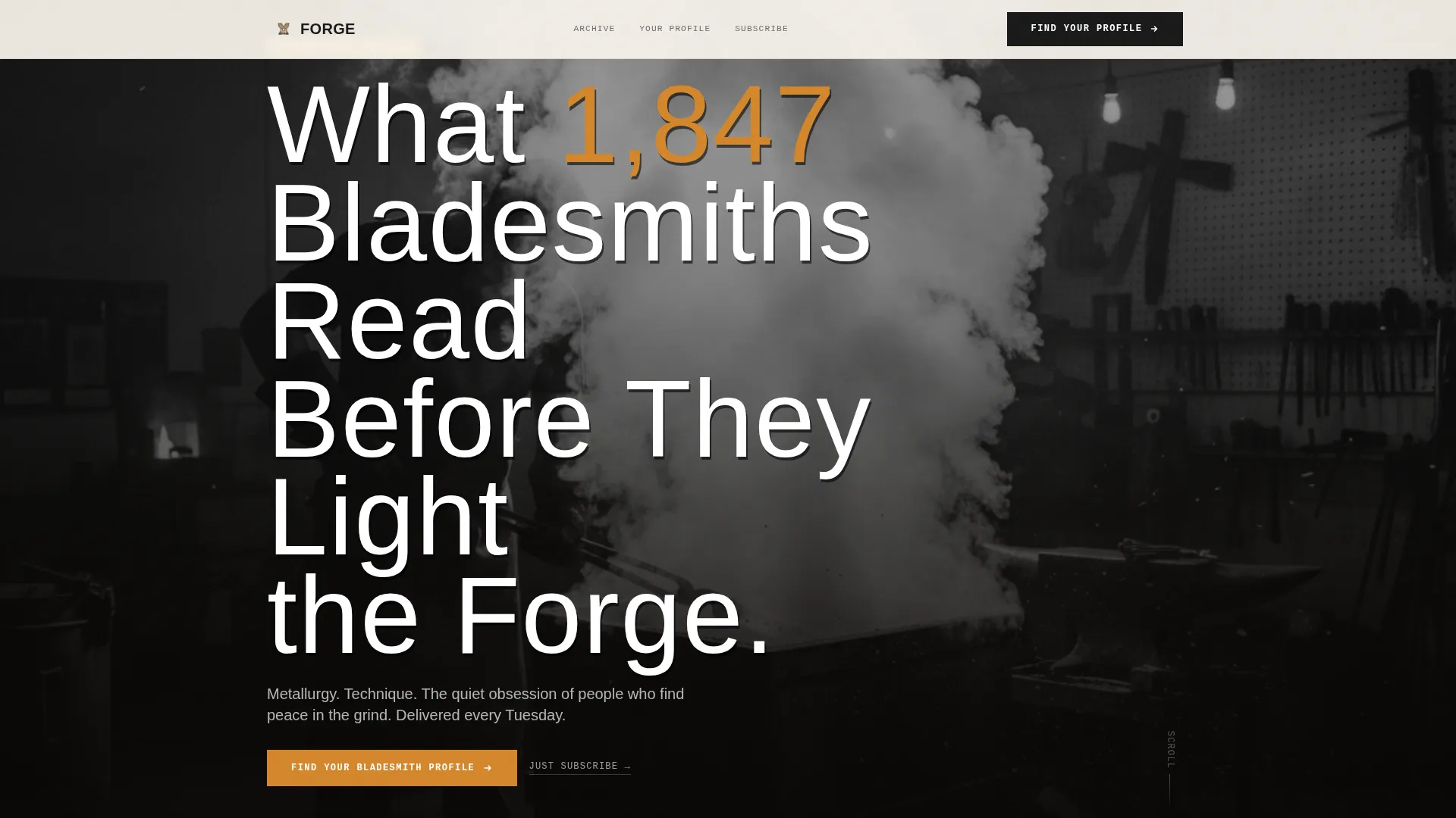
- A full-bleed hero section with oversized condensed type placed directly over a black-and-white quench photograph
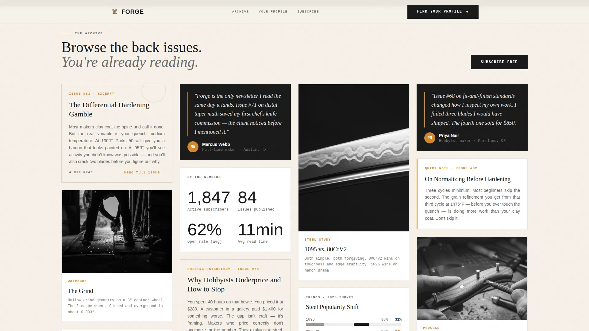
- A masonry archive grid displaying content artifacts including excerpts, reader polls, charts, testimonials, and micro-essays
- A five-question interactive quiz that delivers named maker archetypes and a personalized issue recommendation with automatic newsletter enrollment
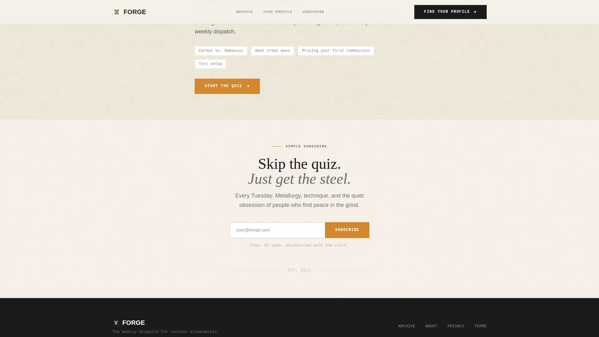
- A secondary simple subscribe path for visitors who prefer to skip the quiz
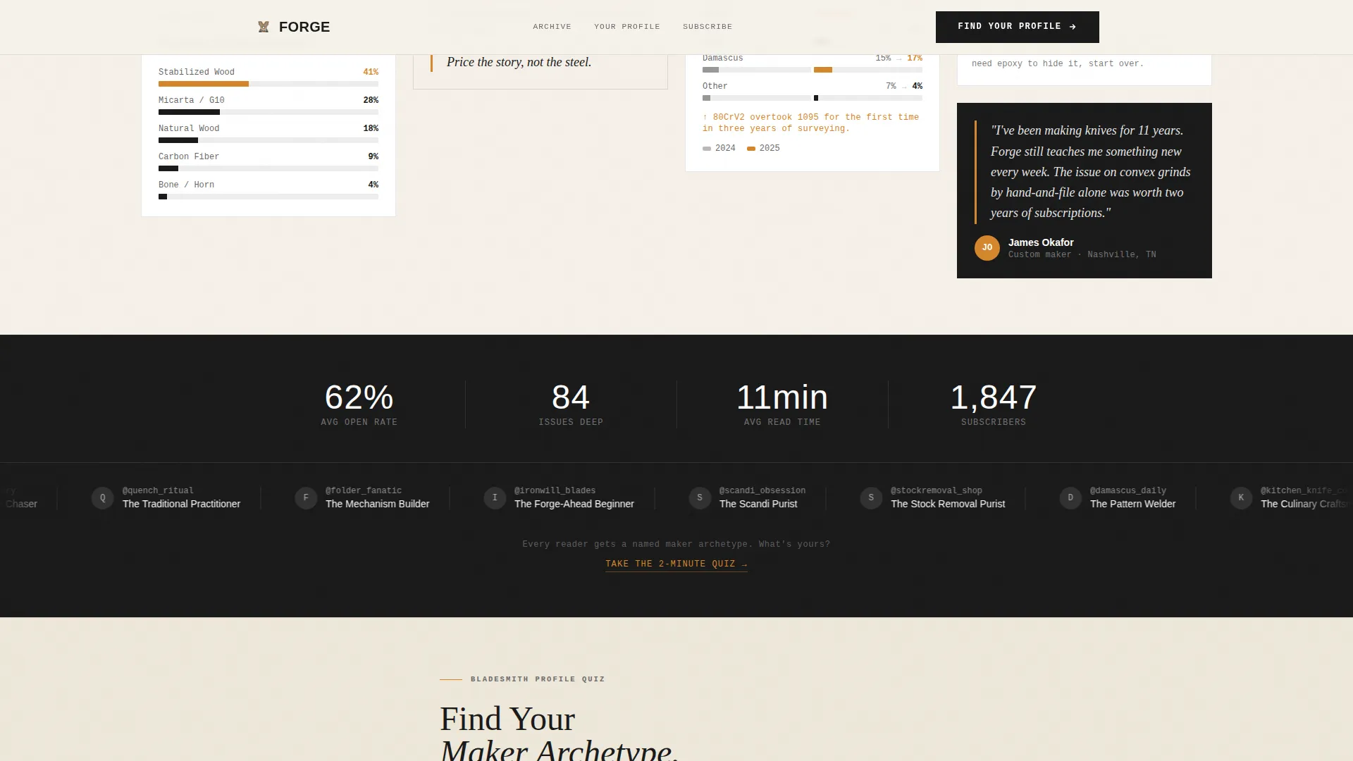
- A social proof marquee strip with reader handles, maker archetypes, and subscriber stat callouts
Feature list
This section covers the core built-in capabilities that make Forge work as a knife making newsletter landing page.
Full-Bleed Hero with Type Over Image
The hero is a full-width black-and-white photograph of a blade mid-quench, with the headline stamped directly over the image in oversized condensed serif type. A subscriber count badge sits within the frame. There is no gradient box or overlay panel, just strong typographic contrast against the photograph.
Masonry Archive Grid
The page unfolds as a Pinterest-style masonry grid of content cards. Cards vary in height and density, mixing image-heavy layouts with pure text blocks. Content types include issue excerpts, reader poll results, steel trend charts, maker testimonials, and short micro-essays, creating the rhythm of a printed journal rather than a marketing scroll.
Five-Step Personalized Quiz
The primary call to action leads visitors through a five-question quiz covering preferred steel type, primary build style, experience level, biggest frustration, and tool setup. Results deliver a named maker archetype such as "The Stockremoval Purist" or "The Forge-Ahead Beginner," paired with a personalized issue recommendation and seamless newsletter enrollment.
Social Proof Marquee Strip
A horizontally scrolling strip showcases reader handles, community archetypes, and key subscriber statistics. This section builds credibility through peer recognition rather than generic star ratings, which fits the culture of a craft-focused audience.
Secondary Simple Subscribe Path
Below the quiz section, a clean email capture field offers a direct subscription option. Visitors who prefer not to complete the quiz can subscribe in one step without friction or extra clicks.
Ink & Paper Design System
Typography, color, and spacing work together to evoke a letterpress broadsheet. Dense justified body text on parchment, heavy serif headlines, and amber used sparingly for links, buttons, and pull-quote borders give every element the weight of something printed rather than displayed on a screen.
Page sections overview
| Section | Purpose |
|---|---|
| Hero Image Header | Anchor attention with bold typographic contrast over a dramatic quench photograph |
| Subscriber Count Badge | Establish immediate social proof within the hero frame |
| Masonry Archive Grid | Simulate a content browsing experience with varied editorial card types |
| Social Proof Strip | Scroll reader handles, archetypes, and stat callouts in a marquee format |
| Quiz Call to Action | Guide visitors through a five-question bladesmith profile assessment |
| Archetype Result State | Deliver a named maker profile and personalized issue recommendation |
| Simple Subscribe Field | Capture emails from visitors who skip the quiz |
| Footer Split Layout | Display logo and tagline on the left with navigation links on the right |
Design & branding system
The visual identity follows an Ink & Paper theme that references the tactile quality of letterpress printing on cotton stock. Every design decision prioritizes weight, texture, and restraint over brightness or decoration.
- Color palette: unbleached parchment (#F5F0E8) as the base, carbon black ink (#1A1A1A) for body text and headlines, workshop graphite (#6B6B6B) for supporting metadata, and forge-ember amber (#D4872C) reserved exclusively for links, buttons, and pull-quote borders
- Typography: Bebas Neue for condensed display headings, DM Serif Display for editorial headlines, and IBM Plex Mono for labels and metadata callouts
- Visual texture: body text sits dense and justified on parchment, headlines render in heavy serif faces that feel carved rather than typed, and amber appears sparingly like a glowing hot spot in a dim workshop
Mobile & speed optimization
The template is built desktop-first to match the browsing behavior of collectors and serious makers, but it adapts responsively for mobile visitors. Performance choices favor a static-first approach that keeps load times reasonable without sacrificing the editorial visual weight.
- Masonry card entrances use staggered IntersectionObserver reveals so the grid feels alive without blocking the initial render
- Images across the masonry grid are lazy-loaded to avoid unnecessary upfront payload
- The five-step quiz runs as a client component, keeping the rest of the page static and fast
How this template helps you convert
The conversion strategy is built around trust before ask. Visitors are immersed in the content experience before they encounter any signup prompt, which lowers resistance significantly for a skeptical craft audience.
- The masonry archive shows real content artifacts early in the scroll, so visitors self-qualify by engaging with material that already feels like the newsletter itself
- The personalized quiz turns a generic signup into a meaningful interaction, delivering a named archetype result that makes enrollment feel like a tailored recommendation rather than a mass-market email grab
- The secondary simple subscribe field catches visitors who are convinced but impatient, ensuring no motivated subscriber leaves without a clear, low-friction path to join
Other information about this template
This template is categorized under Blog & Editorial with a Knife Making Content subcategory, making it well suited for niche newsletter operators in the maker and craft space. A few additional details worth knowing before you choose it.
- The footer follows a split layout pattern with logo and tagline on the left and navigation links on the right
- Animation intensity is set to medium, using marquee scroll for the social proof strip and staggered card entrances for the masonry grid
- The quiz interactivity is high by design, with a five-step state flow and a distinct archetype result display state
- The template is scoped to a single landing page and does not include multi-page navigation or blog archive routing
- Content placeholders across the masonry grid are designed to be replaced with real issue excerpts, poll data, and reader quotes from your own newsletter archive
Theme
Ink & Paper
Creative direction
Industry Report
Color system
Ink & Paper
Style
Masonry/Pinterest
Direction
Quiz/Assessment
Page Sections
Full-bleed Hero with Bold Typography
Masonry Archive Content Grid
Five-step Personalized Quiz Flow
Social Proof Marquee Strip
Secondary Direct Subscribe Field
Ink & Paper Visual Identity
Related questions
Can I use this template without running the quiz?
How many questions are in the bladesmith profile quiz?
What types of content cards does the masonry grid support?
Is this template suitable for a newsletter outside the knife making niche?
What typography does this template use?



