Pharmaceutical Newsletter Landing Page Template
Formulary is a pharmaceutical newsletter landing page built for lead generation. It uses a masonry grid layout, a cinematic half-page header, and an editorial broadsheet aesthetic to convert medical professionals into subscribers. The page shows real pipeline intelligence previews, a founder origin story, and social proof before presenting the subscription call to action.
by Rocket studio
Quick summary
Formulary is a single-page newsletter landing page designed for pharmaceutical intelligence audiences. It combines a masonry card grid, a scroll-driven origin story, and a multi-placement subscription form to move skeptical, expert readers from curiosity to commitment. The design feels like a letterpress broadsheet: dense, deliberate, and built to earn trust before asking for an email address.
Who this template is for
This template is built for newsletter publishers operating in regulated, high-stakes industries where readers distrust vague content. It suits founders, editors, and content strategists launching a pharmaceutical or life sciences newsletter.
- Medical affairs directors, biotech founders, and hospital pharmacists who need intelligence before the news cycle catches up
- Newsletter publishers who need a lead generation page that demonstrates content quality before asking for a subscription
- Pharma competitive intelligence teams and committee members who evaluate sources critically before committing
What problem this template solves
Most newsletter landing pages ask for trust before earning it. For expert readers in pharmaceutical and biotech fields, a generic signup page is a dealbreaker. These audiences need evidence of depth, not just a headline and a form.
- Readers leave without subscribing when the page shows no proof of content quality or analytical rigor
- A standard landing page cannot convey pipeline intelligence density or editorial credibility through a single hero block
- Without layered social proof and real content previews, high-value professional subscribers do not convert
What you get with this template
You get a fully structured, single-page layout designed to convert professional pharmaceutical audiences into newsletter subscribers. Every section is built to show, not just tell, what the newsletter delivers.
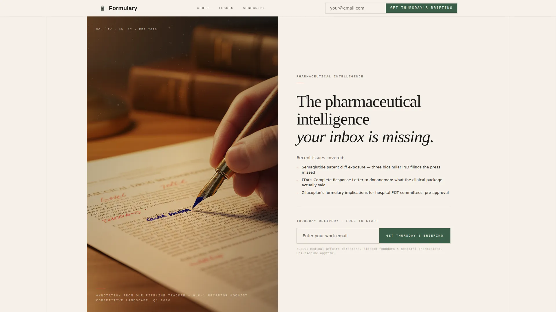
- A cinematic half-page header with a serif headline, a proof sentence naming real editorial content, and an inline email capture form
- A scroll-driven origin story section followed by a masonry grid of varied cards including pipeline previews, analyst notes, prediction scorecards, testimonials, and issue covers
- A blurred current-issue teaser, a sticky subscribe bar that activates at 40 percent scroll depth, and a closing expanded subscription form with role and therapeutic area fields
Feature list
This template includes a focused set of layout and interaction features drawn directly from its editorial lead generation brief.
Half-Page Cinematic Header
The header splits into two halves. The left side holds a moody, shallow-depth-of-field photograph of a hand annotating a drug monograph under amber desk light. The right side carries a large serif headline and a proof sentence referencing recent issue topics, with an inline email field and submit button placed directly below.
Masonry Card Grid
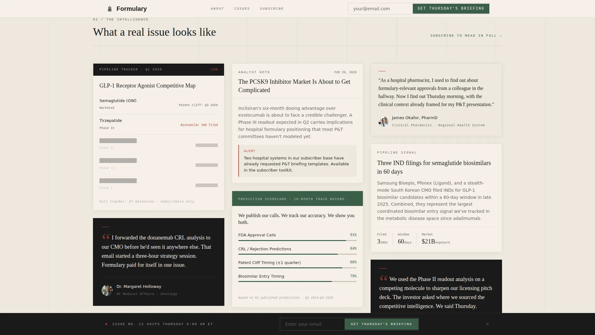
The masonry grid displays cards in varied sizes, each showing a different facet of the newsletter. Cards include pipeline tracker previews, short-form analyst notes, prediction accuracy scorecards, subscriber testimonials with named roles, and sample issue covers. The layout feels curated rather than chaotic, like research clippings pinned to a studio wall.
Scroll-Driven Origin Story
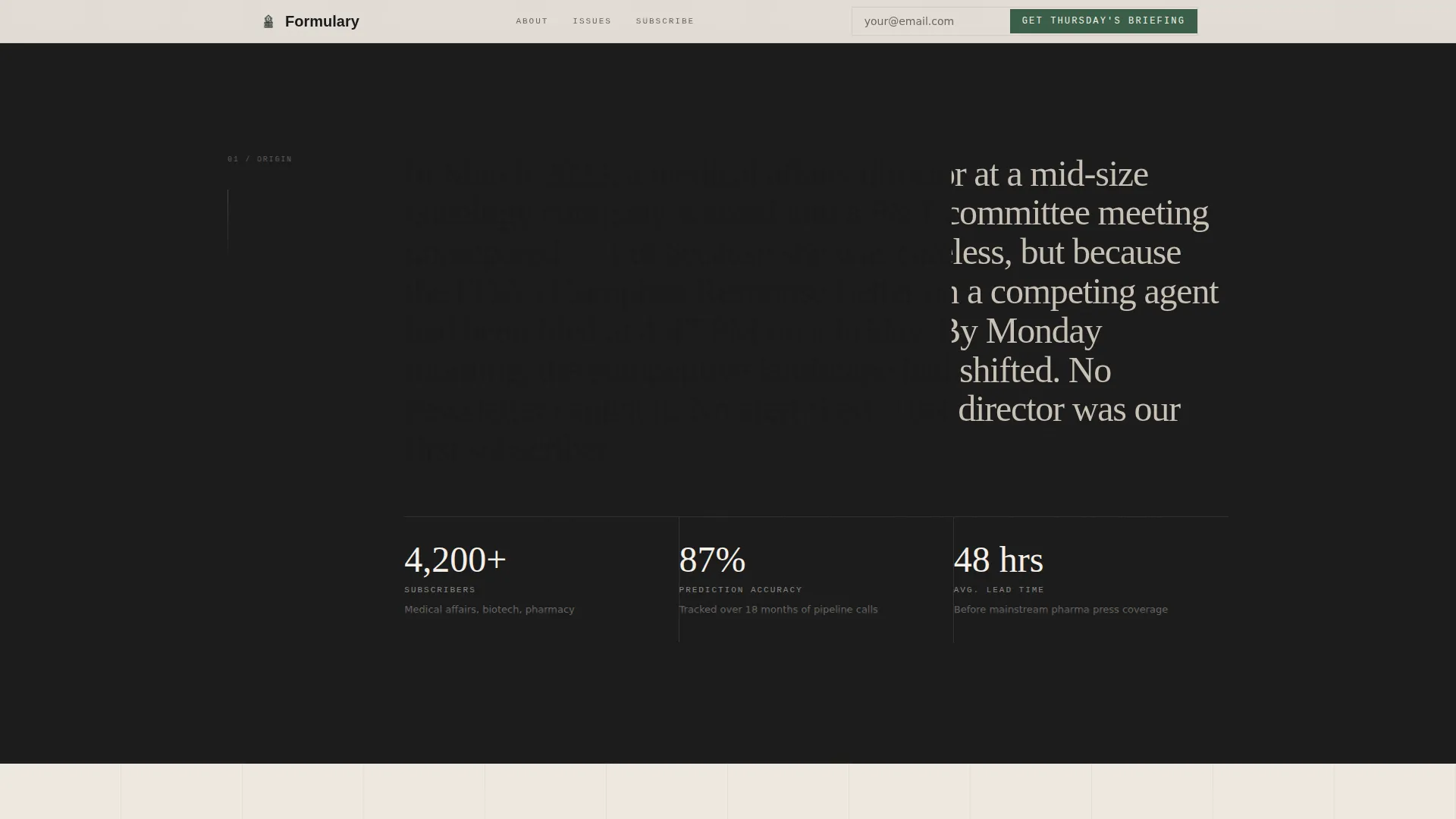
Below the header, a scroll-scrub narrative section tells the founder's moment of frustration and the specific regulatory gap the newsletter was built to close. Intersection observer reveals and scroll-triggered animations guide the reader through the story progressively, building credibility before introducing the subscription ask.
Blurred Issue Teaser Card
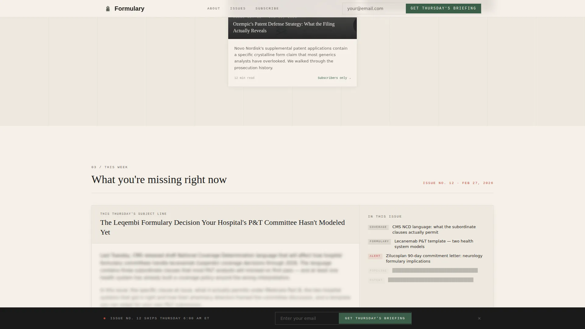
A full-width card near the bottom of the page shows the current issue subject line, blurred just enough to create informational tension. This card transitions the reader from content proof to the final call to action by making the cost of not subscribing feel immediate and concrete.
Multi-Placement Subscription Form
The subscription call to action appears in three locations: inside the header, as a sticky bottom bar after 40 percent scroll depth, and in the closing anchor section. The closing form expands to collect role title and therapeutic area of interest alongside the email address, allowing the publisher to segment subscribers from day one.
Editorial Spotlight Cards
Masonry cards support a spotlight hover effect, where moving the cursor over a card draws the eye with a subtle highlight interaction. This keeps the grid engaging on desktop without relying on heavy animation or JavaScript-driven transitions.
Page sections overview
| Section | Purpose |
|---|---|
| Cinematic hero header | Establishes editorial authority and captures email immediately |
| Inline call to action form | First subscription ask placed inside the hero block |
| Origin story narrative | Founder credibility story that explains why the newsletter exists |
| Masonry card grid | Demonstrates content depth through varied preview cards |
| Pipeline tracker preview | Shows redacted intelligence data to prove analytical rigor |
| Analyst note card | Displays short-form editorial voice and information density |
| Prediction scorecard card | Proves past accuracy to build forward-looking trust |
| Testimonial cards | Named role and company-type social proof within the grid |
| Blurred issue teaser | Creates informational tension before the final subscribe ask |
| Expanded subscribe form | Collects email, role, and therapeutic area to close the page |
| Linear single-row footer | Closes the page with minimal distraction |
Design & branding system
The visual identity follows an Atelier Studio editorial aesthetic, referencing the look and texture of a letterpress proof pulled from a vintage pharmaceutical journal. Typographic weight carries the primary visual load. Color appears only where attention must be directed.
- Color palette: editorial black (#1A1A1A), warm rag paper (#F5F0E8), apothecary green (#3B5F4A) for primary actions, thin rule red (#C2463B) for links and hover states, and soft alabaster (#EDE8DF) for alternating section backgrounds
- Typography uses Fraunces for serif display headlines, DM Sans for body copy, and IBM Plex Mono for data labels and pipeline identifiers
- Black is reserved for pull quotes and section anchors; backgrounds alternate between rag paper and alabaster to create rhythm without color noise
Mobile & speed optimization
The template is built desktop-first to match the reading habits of its primary audience, who scan intelligence briefings on a laptop at breakfast. Full mobile responsiveness is included so the page remains functional and readable on smaller screens.
- Masonry grid reflows cleanly for mobile viewports, preserving the card hierarchy without losing the editorial structure
- CSS-first animations and intersection observer reveals keep the scroll-driven interactions lightweight, relying on minimal JavaScript for interactive behaviors like the sticky subscribe bar
How this template helps you convert
The page is structured so that every scroll depth earns the next subscription ask. Readers are shown evidence of value before they are ever asked for an email address.
- The hero section pairs a compelling headline with a proof sentence naming real editorial content, so the visitor understands the newsletter's depth within the first five seconds of landing on the page
- The masonry grid and origin story work together to layer social proof, content previews, and founder credibility across multiple card types before the blurred issue teaser creates final urgency
- Three subscription form placements, including the sticky bar and the expanded closing form, ensure the call to action is always reachable without interrupting the content-first narrative
Other information about this template
This template is a strong fit for pharmaceutical newsletter publishers who want a professionally crafted lead generation page without building from scratch. Several practical details are worth noting before you start customizing.
- The footer follows a linear single-row pattern, keeping the page close without adding navigation complexity or distraction
- Date formatting in the template follows the MM/DD/YYYY convention suited for a United States audience, with English-language copy throughout
- The template is localized for English (United States) readers and includes no currency fields or pricing components
- Social proof elements, including testimonial cards and a prediction accuracy scorecard, are placeholders ready for real subscriber quotes and editorial win data
Theme
Atelier Studio
Creative direction
Origin Story
Color system
Ink & Paper
Style
Masonry/Pinterest
Direction
Lead Generation
Page Sections
Half-page Cinematic Header
Masonry Card Grid Layout
Scroll-driven Origin Story
Blurred Issue Teaser Card
Multi-placement Subscription Forms
Related questions
Who is this landing page template designed for?
What sections are included in the template?
Can I customize the card content in the masonry grid?
Does the subscription form collect more than just an email address?
What makes this template different from a standard newsletter signup page?



