Pharmaceutical Blog & Media Pre-Launch Website Template
Formulary is a coming-soon landing page template built for pharmaceutical review blogs. It pairs a cinematic video hero, a staggered masonry review grid, and a waitlist form into one warm, apothecary-inspired layout. Designed for health writers, independent pharmacists, and patient advocates, it turns pre-launch anticipation into a growing list of engaged early readers.
by Rocket studio
Quick summary
Formulary is a single-page waitlist template for a pharmaceutical review blog. It opens with a looping video reel, flows into a Pinterest-style locked review grid, and closes with a waitlist form that doubles as an editorial research tool. The warm parchment-and-rust visual identity gives the page the feel of a trusted, handcrafted reference rather than a clinical website.
Who this template is for
This template is built for health communicators who want to launch a pharmaceutical review blog with credibility and intention. It suits independent voices who need a polished pre-launch presence before the first review goes live.
- Pharmacists and clinical writers building an honest drug and supplement review platform
- Patient advocates and chronic illness communities preparing reader-first health media
- Independent health journalists or researchers collecting an audience before launch
What problem this template solves
Most health content online feels either too clinical or too promotional. There is rarely a trusted middle ground that reads like a real second opinion. This template solves the pre-launch credibility gap for review blogs that need to earn reader trust before a single article is published.
- Readers have no place to wait for honest, plain-language pharmaceutical reviews
- Founders lack a launch page that communicates editorial seriousness without a full site
- Waitlist forms rarely collect useful data; this one asks readers what they want reviewed first
What you get with this template
You get a complete, single-page pre-launch layout that works from hero to footer without extra setup. Every section serves a clear purpose, and the visual design does the trust-building before a word is read.
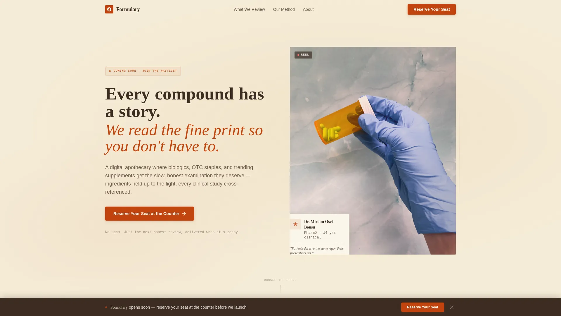
- A cinematic video hero section with a hand-lettered headline overlay and primary call-to-action button
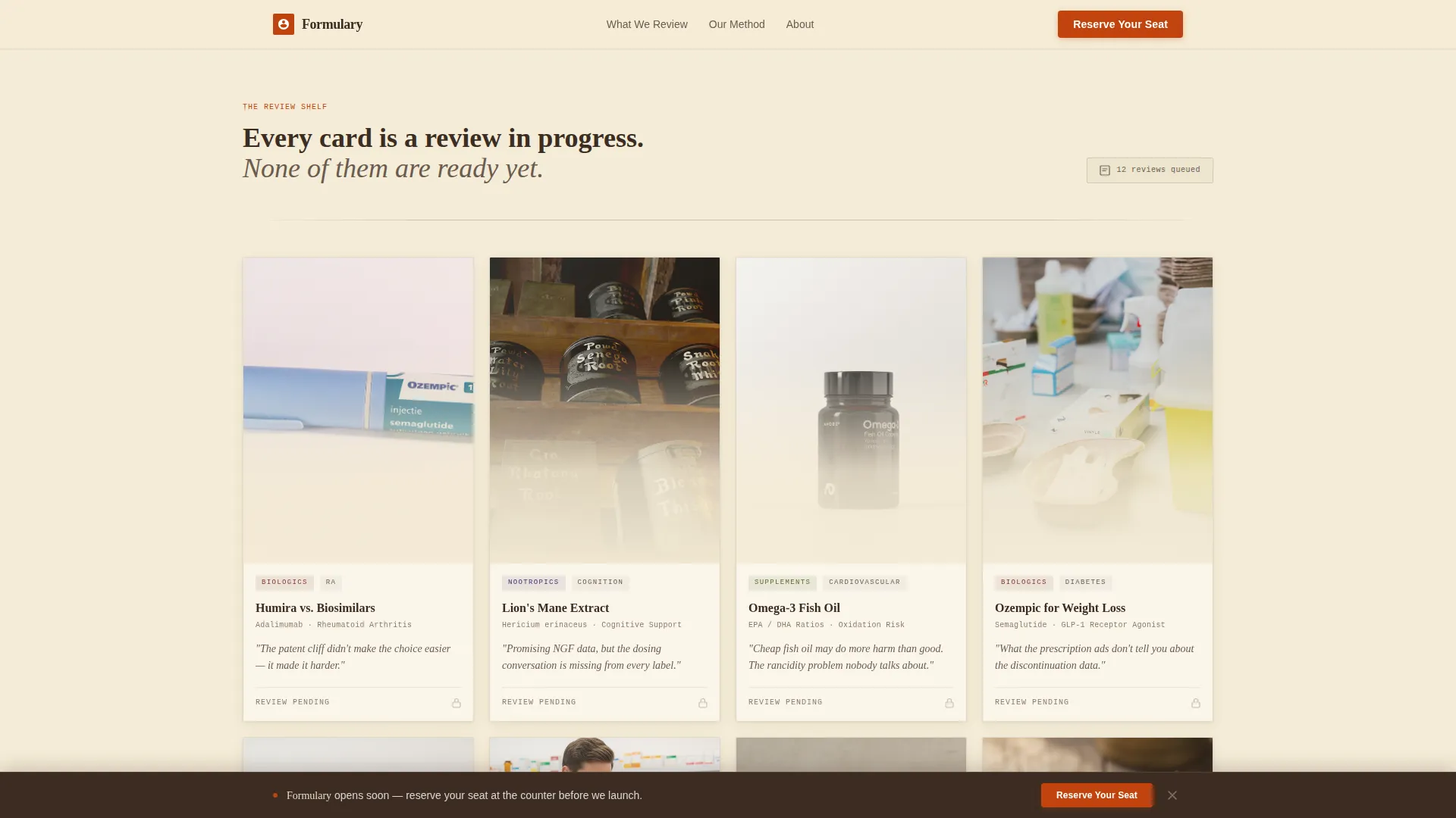
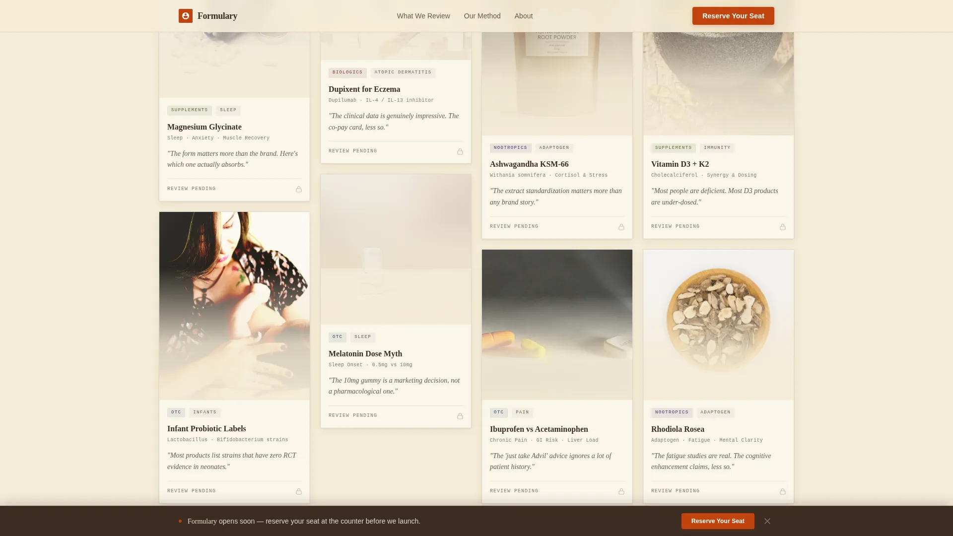
- A masonry review card grid with paper-drop stagger animation and locked "Coming Soon" ribbon styling
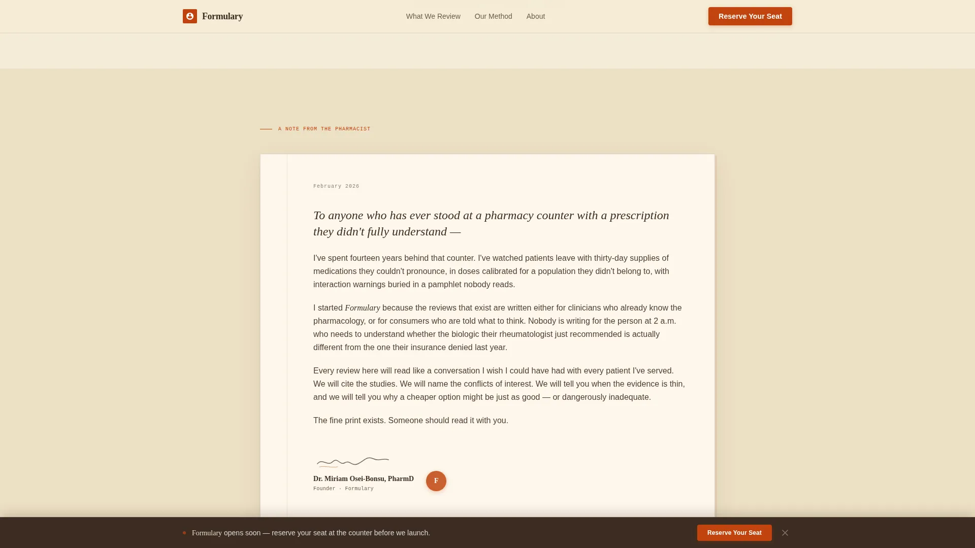
- A founding-note editorial break, a two-field waitlist form, and a sticky bottom call-to-action bar
Feature list
This template ships with six purposeful components, each designed to move a cautious health reader from curiosity to commitment.
Cinematic Video Hero Reel
The header opens with a looping, warmly graded video of hands turning amber pill bottles, grinding tablets, and underlining clinical study printouts. A hand-lettered headline fades in over the final frame, setting the editorial tone immediately.
Staggered Masonry Review Grid
Review cards of varying sizes fill the grid like pinned index cards on a corkboard. Each card shows a tinted product photograph, a hand-drawn category tag, a one-sentence verdict in italic serif, and a "Coming Soon" ribbon. Cards animate in with a gentle paper-drop stagger as the visitor scrolls.
Founding Pharmacist Note
A full-width editorial card breaks the masonry grid midway through the page. It presents a handwritten-style letter from the founding pharmacist explaining the blog's purpose, adding a personal credential signal without a formal biography section.
Editorial Waitlist Form
The waitlist form collects an email address first, then asks one optional question: what medication or supplement do you wish someone would finally review honestly? This turns every signup into a piece of editorial research and gives subscribers a direct stake in the launch.
Sticky Bottom Call-to-Action Bar
A persistent call-to-action bar fades in after three scroll depths and stays visible as the reader continues down the page. It reinforces the "Reserve Your Seat at the Counter" prompt without interrupting the reading flow.
Category Breadth Signal
Review cards span four editorial categories: Biologics, Over-the-Counter medications, Nootropics, and Supplements. The visible range signals editorial depth and gives readers a reason to believe the blog will cover their specific health questions.
Page sections overview
| Section | Purpose |
|---|---|
| Video Hero Reel | Opens the page with cinematic context and the primary waitlist call to action |
| Masonry Review Grid | Displays locked review cards to signal editorial depth and build anticipation |
| Founding Note Card | Delivers a personal pharmacist statement as a full-width editorial trust moment |
| Waitlist Signup Form | Collects email and optional review request to grow and inform the launch list |
| Sticky Bottom Bar | Keeps the call to action visible after three scroll depths without disrupting flow |
| Horizontal Footer | Closes the page with dot-separated links in a clean, minimal footer pattern |
Design & branding system
The visual identity follows a Warm Artisan theme using a parchment and rust color system. Every design decision leans toward the tactile, the deliberate, and the trustworthy rather than the sterile or the clinical.
- Color palette: aged vellum parchment (#F5ECD7) for backgrounds, apothecary amber rust (#C1440E) for accents and hover states, mortar-and-pestle stone (#6B5B4F) for subheadings, and deep tincture brown (#3B2C22) for long-form body text
- Typography: Fraunces serif for display headlines, DM Sans for body copy, and IBM Plex Mono for category labels and tags
- Creative direction follows a Curated Collection layout, where varied card sizes mimic a corkboard of pinned reference cards rather than a uniform grid
Mobile & speed optimization
The template is built mobile-first, reflecting the reality that much pharmaceutical research happens on a phone late at night. Scroll-triggered animations and a persistent call-to-action bar are both tuned for smaller screens.
- Intersection Observer powers the paper-drop stagger on masonry cards, keeping animation smooth without blocking the main thread
- The hero video uses lazy loading so the page begins rendering quickly before the reel plays
- CSS scroll-behavior and scroll-triggered reveals keep the experience fluid across both mobile and desktop viewports
How this template helps you convert
Every section is arranged to move a skeptical health reader toward one action: joining the waitlist. The page earns trust first, then asks for the email.
- The cinematic reel and hand-lettered headline establish editorial credibility within the first few seconds of landing on the page, reducing the reader's instinct to leave immediately.
- The locked masonry grid creates genuine anticipation, showing readers the breadth of what is coming rather than delivering a generic "we're launching soon" message.
- The optional review request field in the waitlist form gives subscribers a sense of ownership over the editorial calendar, making the signup feel like participation rather than a transaction.
Other information about this template
This template is part of the Blog & Editorial category under the Pharmaceutical Blog & Media subcategory. It is built specifically for the pharmaceutical review blog niche and is well suited to anyone launching direct-to-consumer health media with a pre-launch waitlist goal.
- The footer follows a horizontal, dot-separated link pattern inspired by minimal editorial footer layouts
- The "Coming Soon" ribbon and locked card state can be updated to live review links once the blog launches, giving the template a clear second life beyond the pre-launch phase
- The optional waitlist question field is designed to seed the editorial calendar with real reader demand data from day one
- The page tone is deliberately unhurried and warm, making it appropriate for audiences who are fatigued by fast, disposable health content
Theme
Warm Artisan
Creative direction
Curated Collection
Color system
Parchment & Rust
Style
Masonry/Pinterest
Direction
Waitlist/Coming Soon
Page Sections
Cinematic Video Hero with Headline Overlay
Staggered Masonry Review Card Grid
Founding Pharmacist Editorial Note
Editorial Waitlist Form with Optional Field
Scroll-triggered Sticky Call-to-action Bar
Category Breadth Signal Across Card Grid
Related questions
Can I use this template before my first review is published?
What does the optional field in the waitlist form do?
Is the hero video footage included with the template?
Can the masonry grid support more than four review categories?
Who is the sticky bottom bar designed for?



