Construction Blog & Media Specialist Blog Website Template
Framework is a hub-and-spoke landing page template built for construction how-to blogs. It organizes carpentry, framing, concrete, and finish-work articles into trade-discipline grids with difficulty badges and read-time labels. A cinematic dark visual identity and a sticky amber anchor nav make it easy for apprentices, homeowners, and general contractors to find exactly the depth they need.
by Rocket studio
Quick summary
Framework is a single-page content hub template designed for construction and carpentry how-to blogs. It groups articles by trade discipline, signals skill level with difficulty badges, and drives email sign-ups through a downloadable Field Guide offer. The Atelier Studio aesthetic gives every section the feel of a master carpenter's workshop after hours.
Who this template is for
This template is built for publishers and creators running construction education blogs. It works equally well for solo trade writers and small editorial teams.
- First-year apprentices and DIY homeowners who need basic carpentry and framing guidance organized by topic
- Seasoned general contractors who want quick access to code-compliant reference articles and detail drawings
- Trade bloggers and content creators who need a professional, browsable hub to showcase a large article library
What problem this template solves
Most construction blogs are a flat, reverse-chronological feed. Readers have no fast way to find articles matched to their skill level or trade. Framework solves that by organizing everything into named discipline spokes with visible difficulty tiers.
- Apprentices and homeowners waste time hunting for entry-level guides buried among advanced content
- General contractors need reference-grade material fast, not a scroll through unrelated beginner posts
- Blog owners lose potential subscribers because there is no clear conversion moment tied to the content depth
What you get with this template
You get a fully structured, single-page content hub with a cinematic dark design system and six named content spokes. Every major section is designed and ready to populate with your article library.
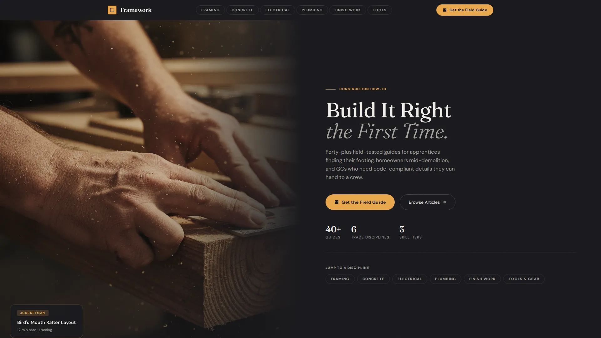
- A Half-Page Photo and Text hero split with a sticky amber anchor nav ribbon linking to each trade spoke
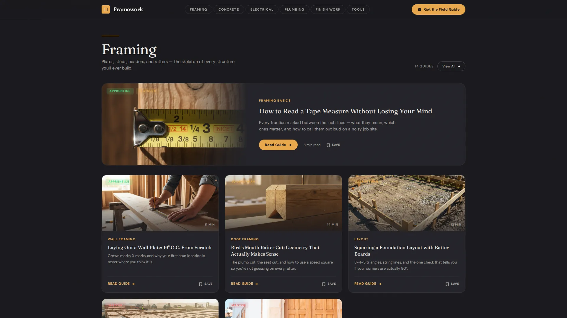
- Six article card grids (Framing, Concrete, Electrical, Plumbing, Finish Work, Tools and Gear) with difficulty badges and read-time labels
- A Field Guide call-to-action section with a two-field email capture form and a free PDF checklist bundle offer
Feature list
This template includes the following built-in design and layout features based on the source brief.
Sticky Anchor Navigation Ribbon
An amber-colored anchor nav sits pinned inside the hero section and stays accessible as visitors scroll. It lists all six content spokes and ends with the primary "Get the Field Guide" call-to-action button, keeping conversion always one click away.
Trade Discipline Article Card Grids
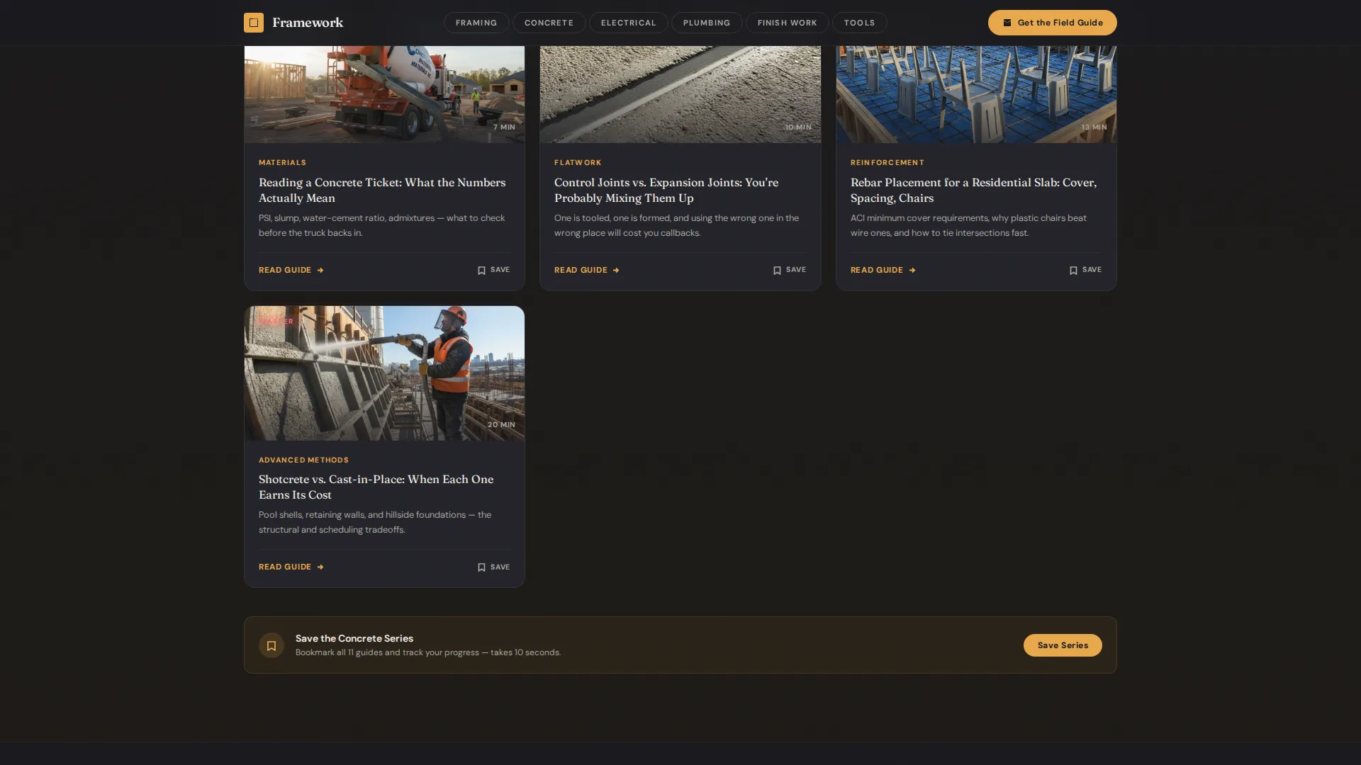
Each spoke section renders article cards in a structured grid. Every card displays a thumbnail image, a difficulty badge (Apprentice, Journeyman, or Master), and an estimated read time, giving visitors the context to self-select before they click.
Scroll-Linked Section Transitions
As visitors scroll from one trade spoke to the next, a thin amber rule expands and the background warms half a shade. These subtle visual cues signal a new chapter without breaking reading flow.
Save This Series Bookmark Button
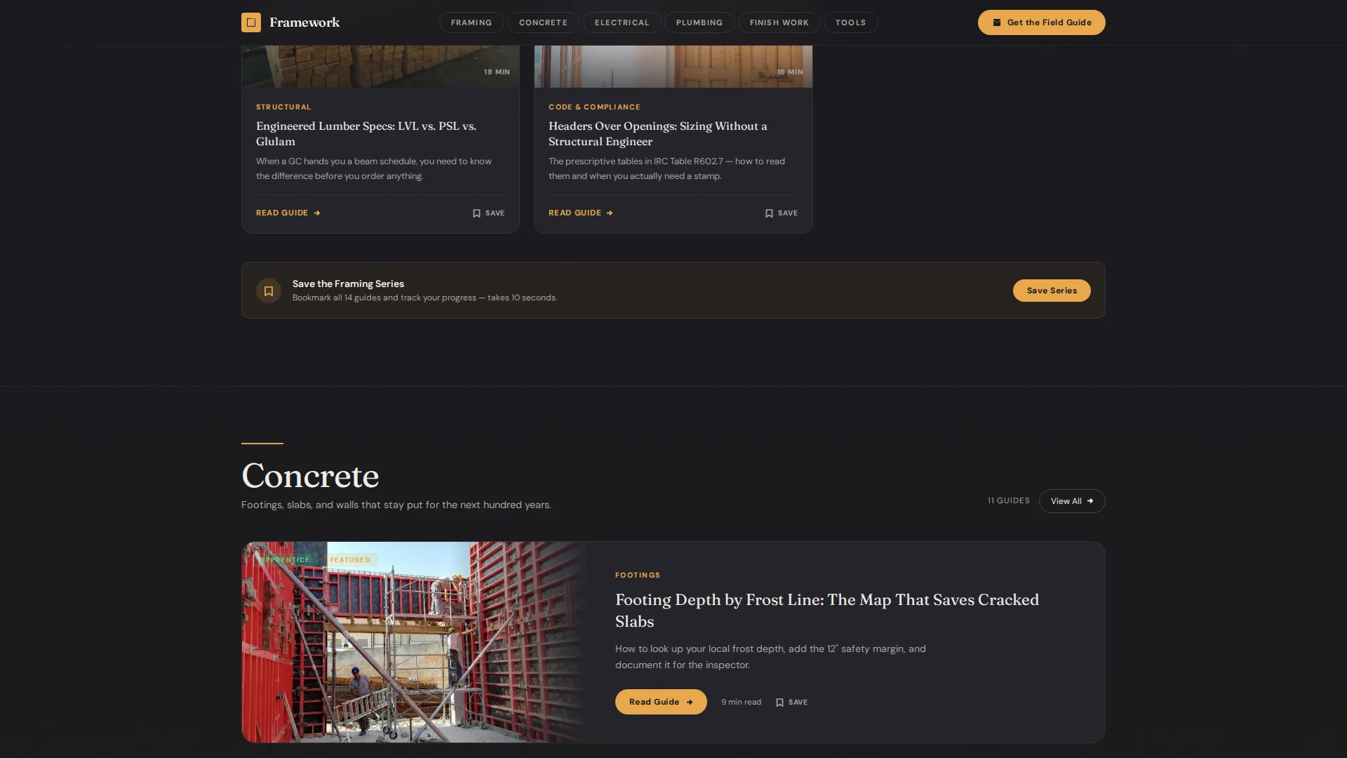
Each article card includes a "Save This Series" bookmark button. When a visitor clicks it, a lightweight account-creation prompt appears, creating a secondary conversion path inside every spoke.
Field Guide Email Capture Section
A dedicated call-to-action section offers a free downloadable PDF checklist bundle covering Rough Framing, Concrete Pour Day, and Final Inspection Prep. The form collects only a first name and email, with a pre-checked newsletter opt-in for weekly build tips.
Bento-Style Varied Card Grid
The Finish Work and Tools and Gear spokes use a bento-style varied card layout for visual rhythm. Larger feature cards sit alongside smaller detail cards, rewarding deeper browsing without feeling cluttered.
Page sections overview
| Section | Purpose |
|---|---|
| Hero photo split | Introduces the blog with a cinematic half-page photo and oversized chalk-white headline |
| Anchor nav ribbon | Provides sticky jump links to all six content spokes and the Field Guide call to action |
| Framing spoke grid | Displays framing articles with difficulty badges and read-time labels |
| Concrete spoke grid | Groups concrete and footing articles with alternating amber section dividers |
| Electrical spoke grid | Organizes electrical how-to articles by skill tier |
| Plumbing spoke grid | Surfaces plumbing guides with consistent card formatting |
| Finish Work grid | Uses bento-style layout for finish carpentry and trim articles |
| Tools and Gear grid | Showcases tool and gear guides in a varied bento card layout |
| Field Guide call to action | Email capture form tied to a free PDF checklist bundle download offer |
| Footer | Horizontal flow footer pattern with site navigation and newsletter confirmation |
Design & branding system
The visual identity follows an Atelier Studio theme with a Cinematic Dark color system. Every design decision evokes a workshop after hours: a single work light over a mahogany bench, everything outside its cone fading to black.
- Color palette: deep workshop charcoal (#1A1A1E) dominates backgrounds, worn tool-steel gray (#3B3B42) separates content cards, warm Edison-bulb amber (#E8A84C) marks all clickable elements and category tags, and chalk-line white (#F0EDE8) keeps long-form text readable
- Typography: Fraunces serif handles all display headlines for a craft-era weight, while DM Sans handles body copy and user interface elements for clarity at small sizes
- Staggered card reveals and scroll-linked amber rule expansion add motion without overwhelming the browse-first reading rhythm
Mobile & speed optimization
The template is built desktop-first to serve general contractors reviewing content on laptops. Mobile layout support is included so apprentices and homeowners can access articles from a job site on their phone.
- Lazy image loading is applied to article card thumbnails to keep the page responsive as content volume grows
- Static content is prioritized throughout so the page loads cleanly before any interactive states are triggered
- Card grids reflow for smaller screens, maintaining readable thumbnail sizes and badge legibility on mobile
How this template helps you convert
The page earns the click by proving depth first. Visitors browse forty-plus organized articles before they are ever asked for an email address. Two conversion paths work in parallel.
- The primary call to action, "Get the Field Guide," is pinned to the anchor nav and leads to a dedicated email capture section offering a free PDF checklist bundle, requiring only a first name and email to claim.
- The secondary path lives inside each spoke: the "Save This Series" bookmark button on every article card triggers a lightweight account creation prompt, converting engaged browsers without interrupting their reading flow.
Other information about this template
This template is part of the Framework template line, which focuses on organized, browse-first content hubs for trade and craft publishers.
- The Hub and Spoke layout style is well suited to blogs with large article libraries that need disciplined organization by topic or skill level
- The Curated Collection creative direction means this page is built to organize, not to teach, depth is implied through article count and badge variety, not inline instruction
- The footer uses a Vercel Horizontal Flow pattern, giving the page a clean, professional close with navigation links and newsletter confirmation
- Article count labels per category can be used as social proof signals alongside read-time badges and the three-tier difficulty system
- The template is designed for an English-language audience referencing United States construction codes and practices
Theme
Atelier Studio
Creative direction
Curated Collection
Color system
Cinematic Dark
Style
Hub & Spoke (Anchor Nav)
Direction
Content/Resource
Page Sections
Sticky Amber Anchor Navigation
Trade Discipline Article Card Grids
Three-tier Difficulty Badge System
Field Guide Email Capture Section
Save This Series Bookmark Button
Scroll-linked Section Transitions
Related questions
What content spokes are included in this template?
What does the Field Guide call-to-action section include?
Can this template support a large article library?
What difficulty levels do the article cards display?
Who is this template best suited for?



