Supply Chain & Logistics Newsletter Blog Website Template
Freight is a single-column editorial landing page template built for supply chain and logistics data newsletters. It opens with a muted short-form reel, moves through a creator spotlight and curated edition gallery, and closes with a direct subscribe call to action. The design follows a Japanese Zen editorial system, pairing serif headlines with generous white space for an authoritative, broadsheet reading experience.
by Rocket studio
Quick summary
Freight is a single-column landing page template designed to convert supply chain professionals into newsletter subscribers. It leads with a short-form video reel, introduces the editor through a creator spotlight, and builds trust through a gallery of past editions. Every layout decision reinforces editorial authority and makes the subscribe action feel earned, not pressured.
Who this template is for
This template is built for newsletter creators and media operators working in data-heavy professional niches. It suits anyone who needs to demonstrate analytical credibility before asking for an email address.
- Procurement directors and third-party logistics founders launching or promoting a weekly intelligence newsletter
- Supply chain analysts and logistics consultants who produce briefings for executive audiences
- B2B content marketers who need a content and resource hub that earns the subscription through visible editorial depth
What problem this template solves
Most newsletter landing pages ask for trust before offering any evidence. They list benefits without showing the actual work. For a data-driven supply chain audience, that approach fails immediately.
- Readers in this niche are skeptical professionals who evaluate sources before subscribing, so the template leads with real edition previews and visible data callouts
- The sticky subscribe bar and archive access section remove friction by letting visitors read before committing
- The creator spotlight addresses the trust gap by humanizing the editor and grounding the newsletter in a specific, credible point of view
What you get with this template
You get a complete single-column landing page layout structured around five purpose-built sections. Each section is designed to deepen credibility as the visitor scrolls.
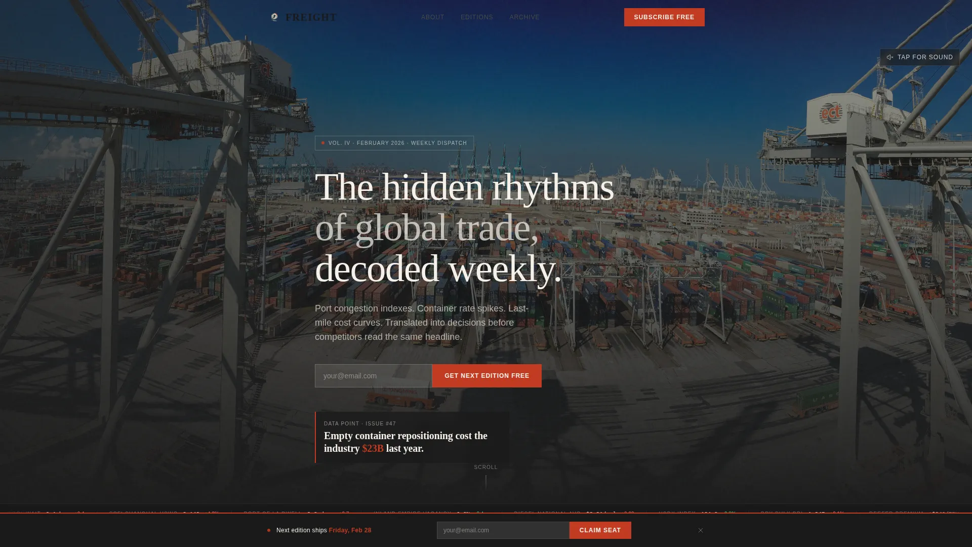
- A hero reel section with muted autoplay video, a lower-third data stat overlay, captions, and a subscribe call to action placed directly beneath
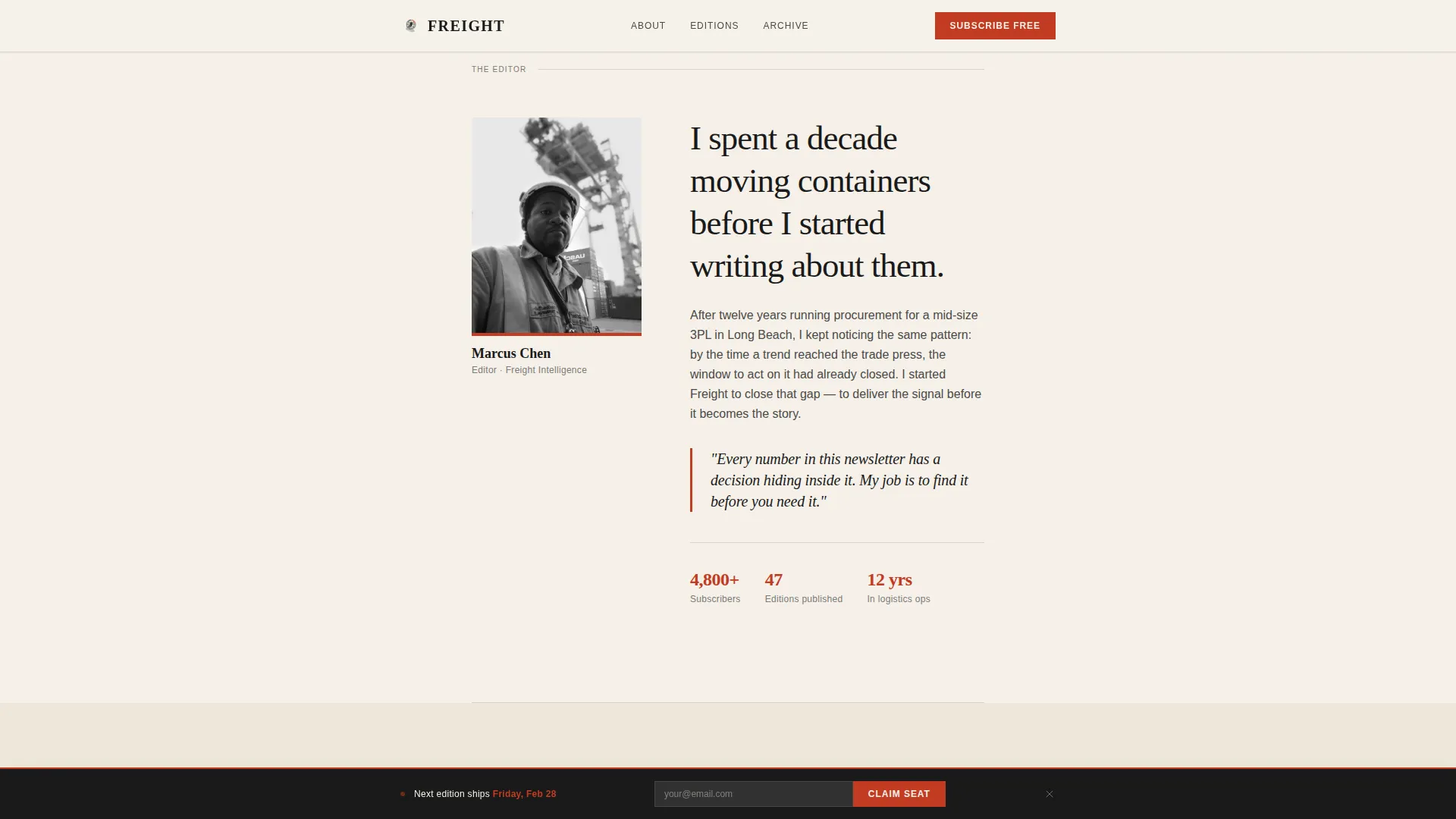
- A creator spotlight block with portrait placement, a two-sentence origin story, and space for credibility anchors
- An edition gallery with magazine-spread cards, a sticky subscribe bar that resurfaces after the third card, an archive access block with three unlocked past editions, and a linear single-row footer
Feature list
This section describes the core built-in capabilities of the Freight template as delivered.
Short-Form Reel Hero Section
The page opens with a vertical-format, fifteen-second video loop designed for muted autoplay. A lower-third overlay displays a single data stat in clean typography. Captions run automatically, and a tap-for-sound prompt invites engagement without forcing it.
Creator Spotlight Block
After the reel, the layout introduces the newsletter editor with a portrait and a two-sentence origin story. This section provides space for credibility anchors so visitors understand who is behind the analysis before reading a single edition card.
Magazine-Spread Edition Gallery
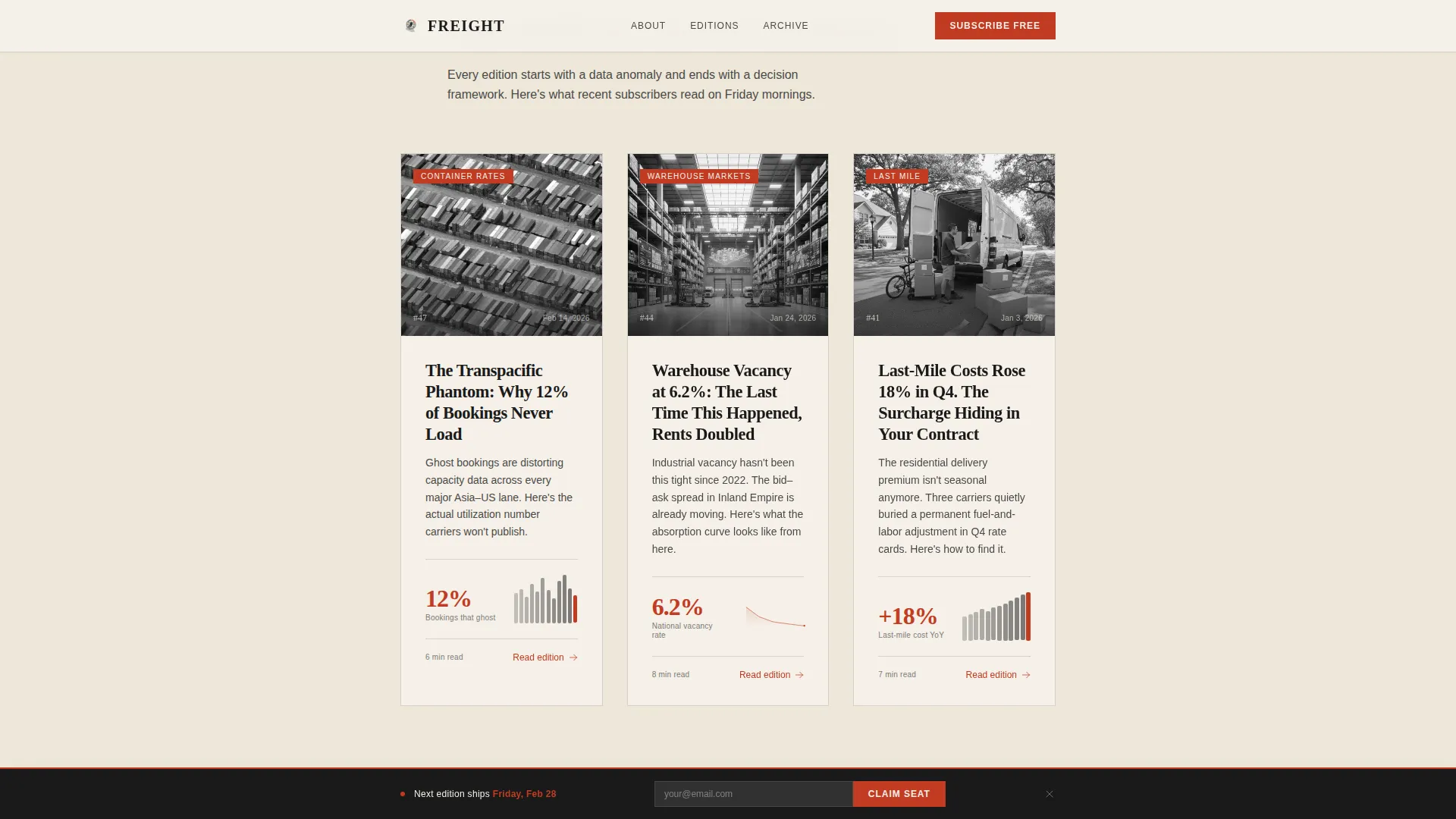
Past editions are presented as individual cards, each showing a bold headline, a single chart or data visualization placeholder, and a two-line summary written in editorial voice. The staggered card layout creates a rhythm that mirrors turning pages rather than scrolling a feed.
Sticky Subscribe Bar
A minimal subscribe bar is built into the scroll behavior. It resurfaces after the visitor passes the third edition card, keeping the subscribe call to action visible without interrupting the reading experience earlier in the flow.
Archive Access with Unlocked Editions
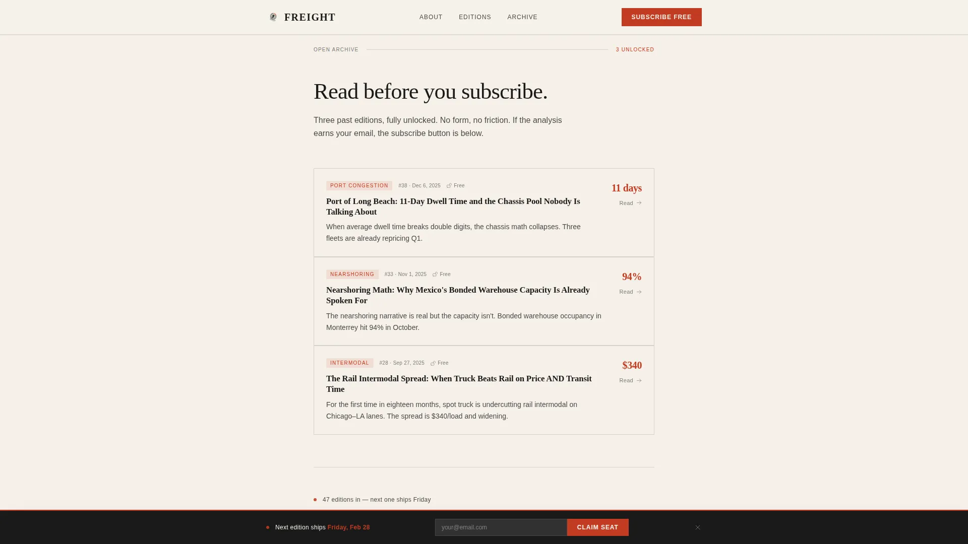
Three fully unlocked past editions are accessible directly from the page. This section gives hesitant visitors a low-commitment path to evaluate the newsletter before submitting their email address.
Torii Vermillion Accent System
A single accent color, torii vermillion (#C23B22), is applied exclusively to data callouts, subscribe buttons, and pull quotes. Every instance of the accent carries visual weight because it appears sparingly, functioning like a red approval stamp on a formal document.
Page sections overview
| Section | Purpose |
|---|---|
| Hero Reel | Opens with muted autoplay video and a lower-third data stat, with a subscribe call to action directly below |
| Creator Spotlight | Introduces the editor with a portrait, two-sentence origin story, and credibility anchors |
| Edition Gallery | Displays past editions as magazine-spread cards with headlines, chart placeholders, and editorial summaries |
| Sticky Subscribe Bar | Resurfaces a minimal subscribe prompt after the visitor passes the third edition card |
| Archive Access | Presents three unlocked past editions and a final subscribe call to action |
| Footer | Delivers a linear single-row footer layout |
Design & branding system
The visual identity draws from an Editorial Magazine theme filtered through a Japanese Zen color philosophy. The result is a restrained, deliberate layout where every color and type choice carries intentional weight.
- The four-color palette uses washi paper cream (#F5F0E8) as the dominant reading surface, sumi ink black (#1A1A1A) for headlines, stone garden gray (#4A4A48) for body text and secondary navigation, and torii vermillion (#C23B22) as the sole accent
- Typography pairs Fraunces serif for headlines with DM Sans for body text and interface elements, creating a broadsheet reading hierarchy
- Wide white margins and generous spacing give the layout a hand-bound journal quality, making the scroll feel deliberate rather than rushed
Mobile & speed optimization
The template is built desktop-first but designed to perform equally well on mobile. Supply chain professionals check data at all hours, including on phones late at night.
- Scroll-linked reveal animations use native CSS scroll behavior and IntersectionObserver, keeping motion smooth without heavy dependencies
- The short-form reel is vertical-format by design, fitting naturally in a mobile viewport without cropping or reformatting
- Staggered edition card animations and parallax on the reel section run at medium intensity, balancing visual richness with a clean reading experience on smaller screens
How this template helps you convert
The layout is structured as a progressive trust sequence. Each scroll step earns the next, so by the time a visitor reaches the subscribe field, they have already read real analysis and seen real data.
- The hero reel opens with a concrete, surprising data point, establishing the newsletter's analytical voice in the first fifteen seconds and placing the subscribe call to action immediately after
- The edition gallery and archive access section let visitors read actual content before committing, so entering an email feels like claiming a seat rather than surrendering information
- The sticky subscribe bar keeps the action visible throughout the scroll without interrupting reading, catching visitors at the moment they decide they want more
Other information about this template
This template is categorized under Blog and Editorial, with a specific focus on the supply chain and logistics data and trends newsletter niche. It is built for the intersection of B2B content marketing and supply chain intelligence publishing.
- The template uses a Content and Resource landing page direction, meaning the page earns the subscription by openly showing editorial value rather than hiding it behind a gate
- Localization is set for English (US) with date formatting in MM/DD/YYYY and pricing references in USD
- Animation intensity is set to medium, covering scroll-linked reveals, parallax on the reel, and staggered edition cards, all implemented without third-party animation libraries
- The footer follows Pattern 1, a linear single-row layout suited to minimal editorial footers
Theme
Editorial Magazine
Creative direction
Creator Spotlight
Color system
Japanese Zen
Style
Single Column Flow
Direction
Content/Resource
Page Sections
Short-form Reel Hero with Data Overlay
Creator Spotlight with Origin Story
Magazine-spread Edition Gallery
Sticky Minimal Subscribe Bar
Open Archive Access Section
Japanese Zen Editorial Color System
Related questions
Can I replace the video reel with a static image if I do not have video content?
How many past edition cards does the gallery section include by default?
Is the archive access section gated or open to visitors by default?
Can I update the torii vermillion accent color to match a different brand palette?
Is this template suitable for a newsletter in a niche other than supply chain and logistics?



