Supply Chain & Logistics Newsletter Pre-Launch Website Template
Freight is a hub-and-spoke landing page template built for a monthly supply chain intelligence publication. It combines a cinematic stacked headline, anchor-nav chapter flow, and a restrained Luxe Minimal aesthetic to turn qualified professionals into waitlist signups. The design earns trust through editorial confidence, scarcity framing, and a founder-letter scroll experience that deepens conviction section by section.
by Rocket studio
Quick summary
Freight is a single-page waitlist landing page template for a monthly supply chain deep-dive newsletter. It uses a hub-and-spoke anchor navigation structure to guide readers through an origin story, an editorial philosophy, an issue preview, and a reader-audience section. Every design decision reinforces the quiet authority of a publication built by someone who has walked the container yards.
Who this template is for
This template is built for founders and editors launching a high-conviction supply chain or logistics publication. It suits anyone who needs to convert informed professionals into early waitlist signups before a first issue goes live.
- Procurement directors and operations leaders who want a credible industry read
- Logistics professionals and supply chain analysts evaluating a new intelligence source
- Direct-to-consumer brand founders and curious outsiders who want to understand how goods actually move
What problem this template solves
Most newsletter landing pages feel generic. They promise value, show a mock-up, and ask for an email. That approach does not work when the reader is a procurement director who has seen hundreds of vendor pitches or an operations leader who reads fine print for sport.
- Generic templates cannot project the editorial authority a serious publication demands
- Standard waitlist pages offer no narrative arc, so skeptical readers leave before they trust the offer
- Without clear role-based targeting, high-value subscribers feel unseen and move on
What you get with this template
You get a complete, ready-to-customize waitlist landing page structured around five clearly defined spoke sections and an anchor navigation bar. The layout is designed for desktop-first reading with a strong mobile experience, following the Luxe Minimal visual identity described in the brief.
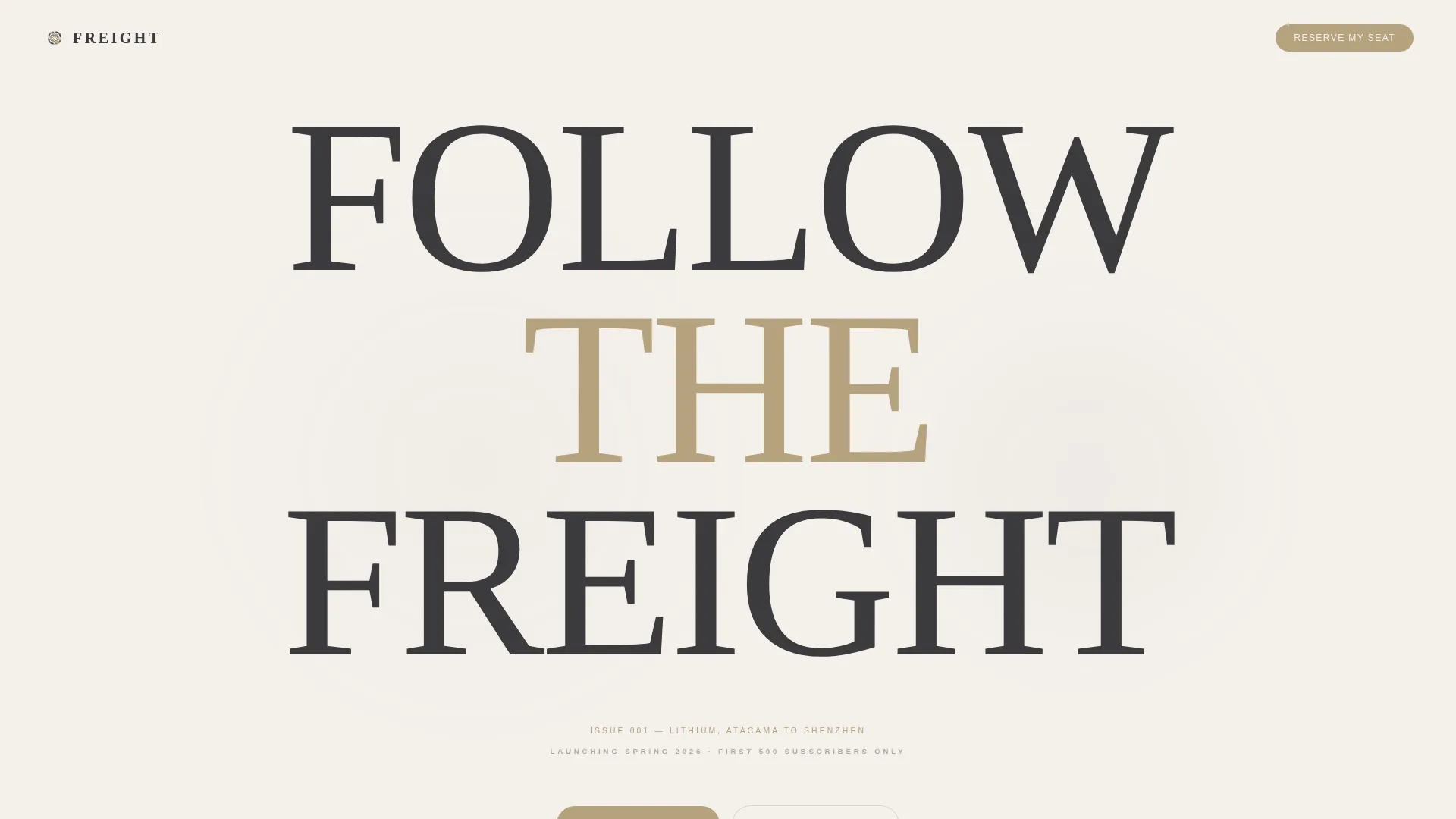
- A stacked giant headline hero with a single-issue subtitle line and a primary "Reserve My Seat" call to action
- Five anchor-navigated content spokes covering origin story, editorial philosophy, issue preview, and reader archetypes
- A waitlist form with a work-email field and an optional role dropdown, plus a "Read the Manifesto" secondary scroll path
Feature list
A single paragraph introduces the feature set before each item is broken out below.
This template delivers a tightly scoped set of features drawn from the source brief. Each one serves the waitlist conversion goal or the editorial trust-building experience.
Giant Stacked Headline Hero
Three words, "FOLLOW / THE / FREIGHT," are set in an ultra-light serif at roughly 15vw and stacked vertically at center. Each word fades in one beat apart. Below the headline, a small-caps line carries the issue date and subject, such as "ISSUE 001, LITHIUM, ATACAMA TO SHENZHEN." The hero uses only language and negative space with no images or illustrations.
Hub-and-Spoke Anchor Navigation
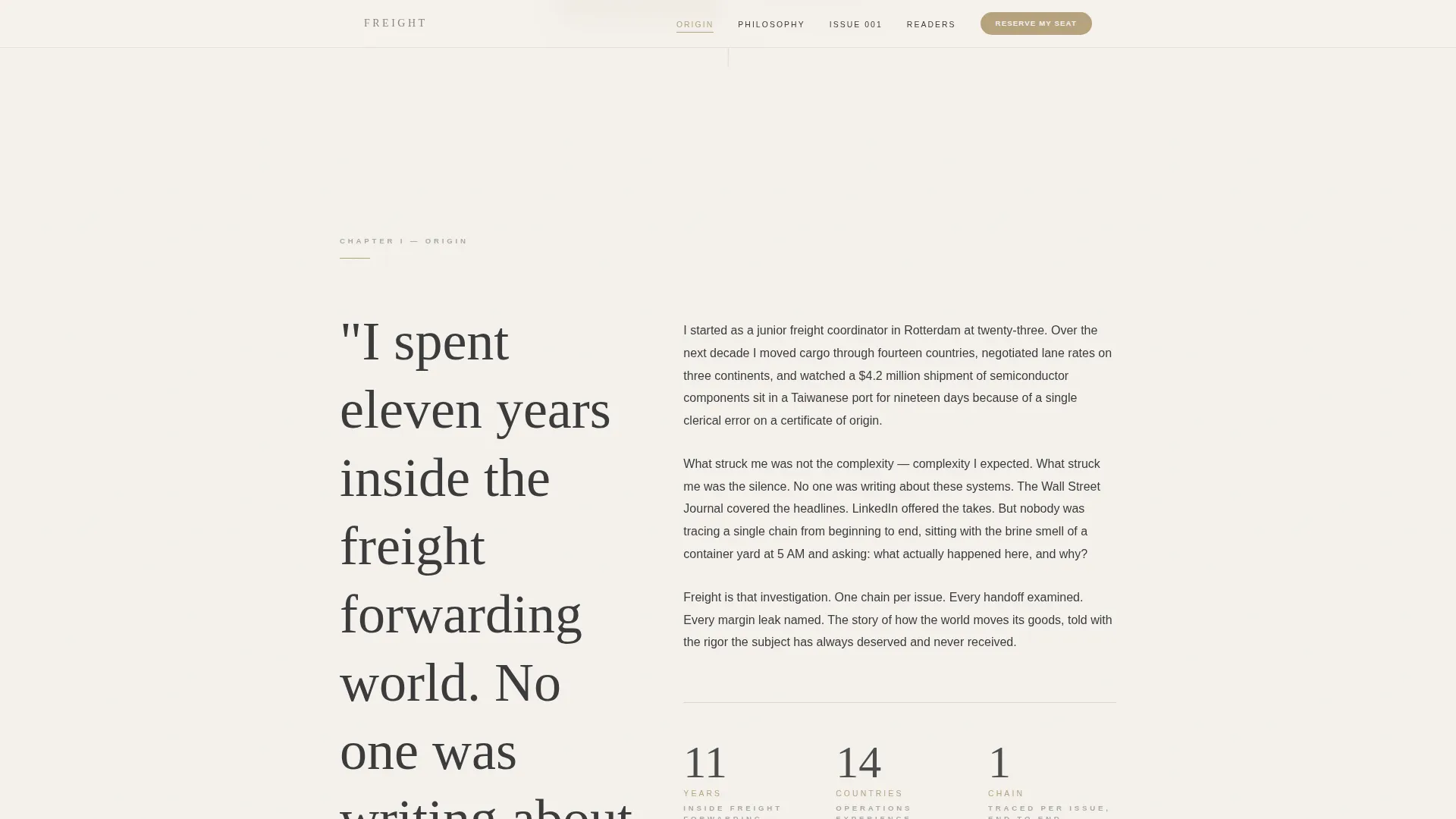
A persistent anchor navigation bar links to each chapter spoke on the page. The active spoke is highlighted in muted brass. This structure lets readers jump to the section most relevant to them without losing their place in the broader narrative.
Waitlist Signup Form
The form collects a work email address as the required field. An optional role dropdown offers six choices: procurement, operations, logistics, founder, analyst, and curious outsider. The primary call-to-action button reads "Reserve My Seat" and is styled in muted brass.
Origin Story Chapter Flow
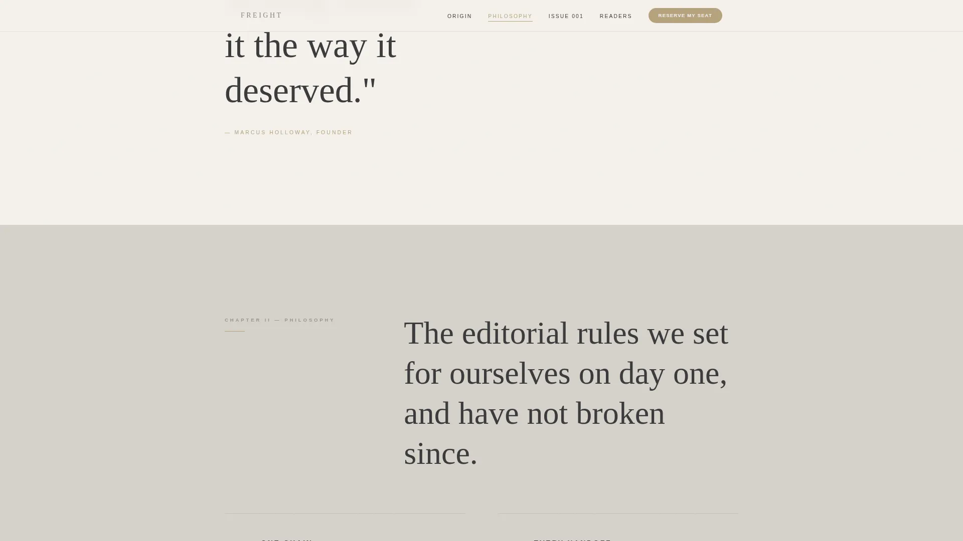
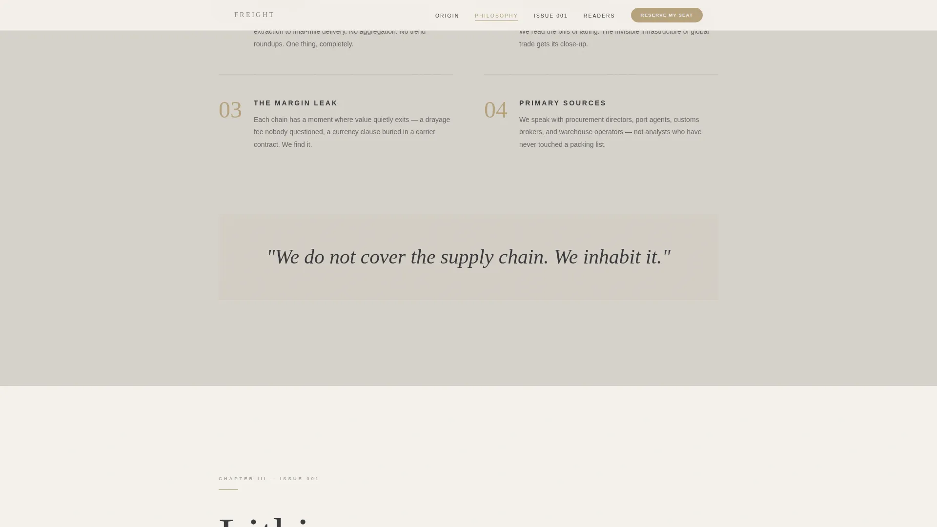
Scrolling through the page unfolds the founder's background in freight forwarding, the editorial philosophy of tracing one supply chain per issue end to end, and a preview of the Issue 001 narrative arc. Each spoke deepens reader conviction through a founder-letter tone.
Scarcity Signal
A fixed subscriber cap is mentioned once on the page. It is stated plainly, without countdown timers or urgency theatrics, so the scarcity feels genuine rather than manufactured.
Soft Mist Color System with Brass Accent
Backgrounds alternate between fog white and pale smoke to separate spokes without borders or dividers. Muted brass appears only on anchor navigation highlights, hover states, and the waitlist button, keeping the accent meaningful and restrained.
Page sections overview
| Section | Purpose |
|---|---|
| Hero Headline | Introduce the publication with stacked typography and issue subtitle |
| Anchor Navigation | Give readers instant access to any chapter spoke |
| Origin Story | Establish founder credibility and the reason this publication exists |
| Editorial Philosophy | Explain the one-chain-per-issue approach end to end |
| Issue 001 Preview | Show the narrative arc of the debut issue: Lithium, Atacama to Shenzhen |
| Reader Archetypes | Define who this publication is for and signal belonging |
| Waitlist Form | Capture work email and optional role for the subscriber list |
| Footer | Display social icons and centered copyright in a minimal pattern |
Design & branding system
The visual identity is Luxe Minimal, drawing on the restrained aesthetic of a Kinfolk editorial spread applied to the subject of Japanese warehousing. Enormous whitespace, typographic discipline, and a four-color palette do all the work that most templates assign to imagery.
- Fog white (#F4F1EC) and pale smoke (#D6D2CB) alternate as section backgrounds, creating separation without borders
- Brushed graphite (#3B3B3D) carries all body text with generous leading so each sentence feels deliberate
- Muted brass (#B5A27E) is reserved exclusively for anchor nav highlights, hover states, and the waitlist button; Fraunces ultra-light serif anchors the hero while DM Sans handles all body copy
Mobile & speed optimization
The template is designed desktop-first, reflecting the reality that its core readers are likely at a desk when they encounter the page. Mobile rendering is treated as a strong secondary priority, not an afterthought.
- Staggered word reveals and scroll-linked opacity animations use minimal client-side JavaScript to keep the experience light
- Server components handle all static sections, reducing the amount of JavaScript the browser needs to execute on load
- The anchor navigation and waitlist form adapt cleanly to smaller screens so mobile visitors can still complete a signup without friction
How this template helps you convert
The page is engineered to earn trust before it asks for anything. Every spoke deepens the reader's conviction that the publication is worth their work email and the implicit signal of belonging that comes with it.
- The "Read the Manifesto" secondary path scrolls skeptical readers through the full origin story before surfacing the signup form again, meeting readers who need more context before committing
- The plain-stated subscriber cap creates genuine scarcity without gimmicks, giving early adopters a reason to act before capacity closes
- The role dropdown on the signup form makes each subscriber feel seen and categorized, reinforcing that this publication was built for professionals like them
Other information about this template
This template is part of a broader Blog and Editorial category and sits within the Supply Chain and Logistics Newsletter subcategory. It is suited to the Supply Chain and Logistics Monthly Deep Dive niche, where audience expectations around editorial quality and professional credibility are unusually high.
- The hub-and-spoke layout style makes this template reusable for future issue launch pages or seasonal editorial campaigns with minimal structural changes
- The template uses the Waitlist and Coming Soon landing-page direction, meaning it is optimized for pre-launch momentum rather than direct subscription or e-commerce conversion
- The Hub and Spoke anchor navigation pattern is a deliberate structural choice: it mirrors how a well-edited long-form article unfolds, which matches the reading habits of the target professional audience
- Animation intensity is set to medium, with staggered word reveals, scroll-linked opacity transitions, and cursor parallax elements that add depth without distracting from the editorial content
Theme
Luxe Minimal
Creative direction
Origin Story
Color system
Soft Mist
Style
Hub & Spoke (Anchor Nav)
Direction
Waitlist/Coming Soon
Page Sections
Giant Stacked Hero Headline
Hub-and-spoke Anchor Navigation
Role-based Waitlist Form
Origin Story Chapter Flow
Soft Mist Branding System
Genuine Scarcity Signal
Related questions
Can I change the issue subtitle line in the hero section?
Is the waitlist form connected to an email platform out of the box?
Can I add more spoke sections beyond the five included?
Does this template suit a newsletter topic outside of supply chain and logistics?
What should I do with the subscriber cap line after the list is full?



