Creative Project Crowdfunding Landing Page Template
Fund is a single-page crowdfunding landing page template built for creative project creators who need to convert skeptical visitors into committed backers. It combines a dark command-center aesthetic with live-styled metrics, anchor navigation, and side-by-side comparison tables that stack evidence until the decision to launch feels inevitable.
by Rocket studio
Quick summary
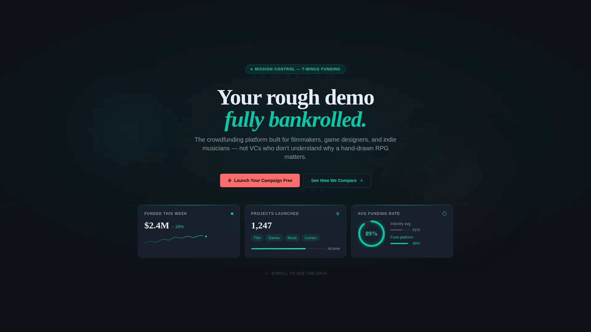
Fund is a hub-and-spoke landing page template designed for creative project crowdfunding campaigns. It opens with three frosted Dark Glass Panel metric cards, then guides visitors through five anchored spoke sections that build a data-driven case for the platform. The result is a page that feels like mission control: focused, alive, and already running.
Who this template is for
This template is built for creators who have something real to launch and need a page that does the convincing for them. It speaks directly to people who understand that a great project deserves a great pitch.
- First-time creators with a finished prototype but no existing audience or investor network
- Serial crowdfunders running a second or third campaign who want sharper comparison data in front of backers
- Small independent studios tired of pitching investors who do not understand creative-project value
What problem this template solves
Most crowdfunding landing pages ask visitors to take a leap of faith. Fund replaces that leap with a structured, evidence-stacked scroll that answers every objection before it forms. The page is designed so that by the time a visitor reaches the call to action, skepticism has run out of room.
- Visitors leave too early because generic pages lack proof that the platform performs better than alternatives
- Creators struggle to communicate fee structures, payout speed, and community size in a single readable view
- A weak visual hierarchy buries the most persuasive data instead of surfacing it at the right scroll depth
What you get with this template
You get a fully designed, single-page layout with a sticky anchor navigation bar, five spoke sections, and a consistent dark-glass visual system. Every component is built to carry real campaign data and comparison content without needing a redesign.
- A header with three live-styled metric panels showing funded totals, project count, and average funding rate
- Five anchor-nav spoke sections covering success rates, fee breakdown, creator tools, payout speed, and community size
- Coral-accented calls to action pinned to each spoke section and repeated in the sticky navigation bar
Feature list
This template ships with a carefully considered set of components. Each one serves a specific persuasion or clarity role inside the crowdfunding campaign context.
Dark Glass Panel Header
Three frosted, semi-transparent metric cards float over a near-black gradient at the top of the page. Each card displays a live-styled campaign stat, a supporting micro-sparkline or radial progress ring, and a faint teal edge-light that makes the data feel actively monitored.
Hub and Spoke Anchor Navigation
A sticky navigation bar appears after the first scroll and links directly to each of the five spoke sections. This keeps visitors oriented inside a long, data-rich page without losing momentum or requiring them to scroll back to the top.
Side-by-Side Comparison Tables
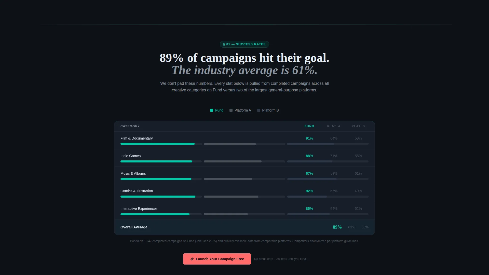
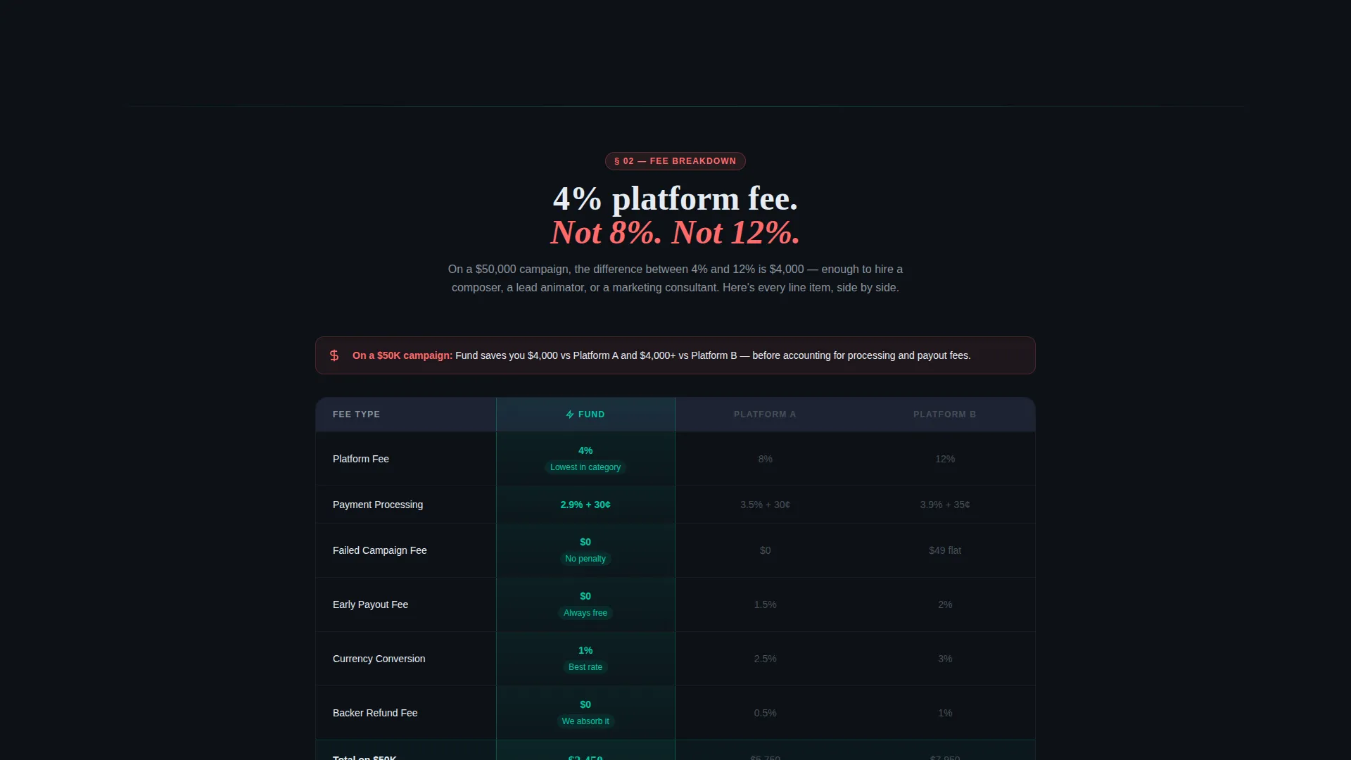
Each spoke section includes a comparison table with the home platform column highlighted in teal and two anonymized competitor columns rendered in muted gray. The layout lets creators show fee percentages, funding timelines, and satisfaction scores in a single scannable view.
Scroll-Triggered Animated Bar Charts
Bar chart fills animate on scroll-enter inside each spoke section. This pacing matches the Industry Report creative direction, giving each data point a moment to land before the next one arrives.
Dual Call-to-Action System
The primary call to action, "Launch Your Campaign Free," appears in coral at the bottom of every spoke section. A secondary path, "Download the Full Platform Report," sits behind a single-field email gate for visitors still weighing their options.
Teal Catalyst Color System
Progress bars, navigation highlights, and data visualizations use primary teal throughout. Coral appears only for alerts, comparison callouts, and call-to-action pulses, keeping its visual weight sharp and its impact reserved.
Page sections overview
| Section | Purpose |
|---|---|
| Dark Glass Header | Displays three live-styled campaign metrics to establish platform credibility immediately |
| Anchor Nav Bar | Sticky hub navigation linking to all five spoke sections for easy orientation |
| Success Rates | Opens with a bold stat headline and a comparison table showing funding success data |
| Fee Breakdown | Presents platform fee percentages against two grayed-out competitor columns |
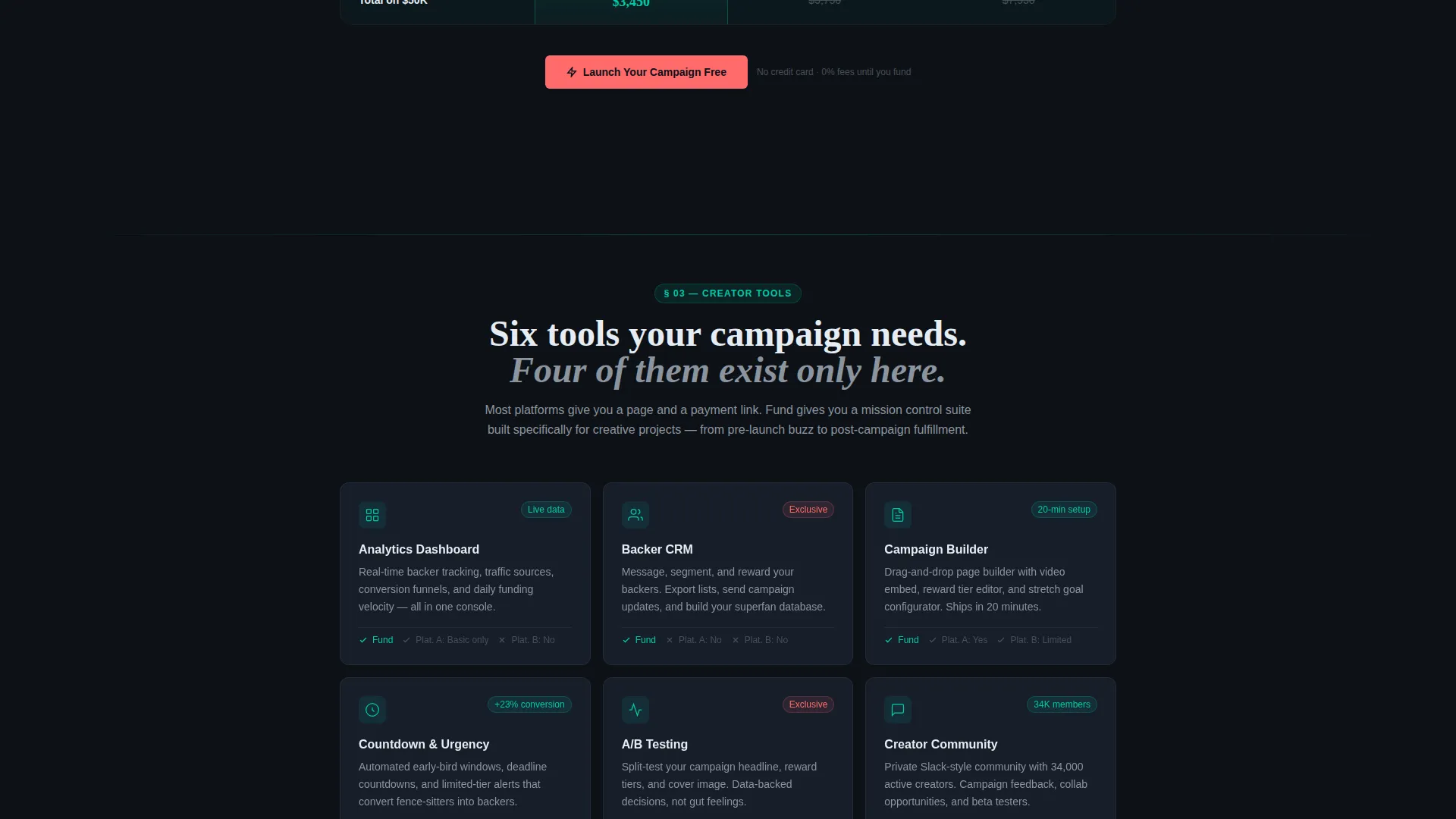
| Creator Tools | Highlights platform-specific tools with comparison data supporting the home column |
| Payout Speed | Compares funding-to-payout timelines to demonstrate a practical creator advantage |
| Community Size | Shows backer community scale alongside competitor figures to close the evidence stack |
| Report Email Gate | Offers a downloadable platform report behind a single email-field form |
| Sticky call to action Bar | Repeats the primary call to action across the full scroll journey |
Design & branding system
The visual identity follows a Dashboard Pro theme built on the Teal Catalyst color system. The overall feel is a submarine control room lit only by instrument screens: dark, focused, and humming with live data energy.
- Core palette: deep command-center black (#0D1117) for backgrounds, primary teal (#00C9A7) for active user interface elements, muted slate (#1C2333) for card surfaces, and sharp coral (#FF6B6B) reserved for alerts and call-to-action pulses
- Teal dominates progress bars, navigation highlights, and chart fills; coral surfaces sparingly to create adrenaline-level contrast without visual noise
- No hero image and no stock photography; the metric data itself acts as the visual anchor, reinforcing that the platform is already active and producing results
Mobile & speed optimization
The template layout is structured to remain readable and functional at smaller viewport sizes. The dark-glass card system and comparison tables are designed to reflow cleanly without losing the visual hierarchy that drives the conversion sequence.
- Anchor navigation collapses into a compact sticky bar that keeps spoke-section links accessible on narrow screens
- Comparison tables use a horizontal-scroll pattern at mobile widths so no data column is hidden or truncated
- Animated bar chart fills are triggered by scroll-enter events, keeping visual pacing intact regardless of screen size
How this template helps you convert
The entire page is structured as a Comparison/Versus conversion flow. Each design and layout decision is made to move a skeptical visitor toward one of two actions: launching a campaign or entering the research funnel through the email gate.
- The Dark Glass Panel header opens with platform-level proof before the visitor reads a single word of body copy, anchoring trust before any claim is made
- Each spoke section escalates the narrative from landscape overview to competitor failure points to platform proof, stacking evidence in a sequence that leaves objections nowhere to land
- The coral call-to-action pulse appears at the close of every spoke section and in the sticky nav bar, so the moment a visitor is convinced, the next step is always one visible click away
Other information about this template
This template is categorized under Startup and Launch, with a specific focus on the crowdfunding campaign subcategory and the creative project crowdfunding niche. It carries an intersection match score of 13, reflecting a strong alignment between its design system and its intended use case.
- The template style is Hub and Spoke with Anchor Navigation, making it well suited for long-form persuasion pages that need clear wayfinding
- The creative direction follows an Industry Report format, which positions the platform as a credible, research-backed authority rather than a promotional pitch page
- This template is designed to support both first-time campaign creators and experienced crowdfunders who need a sharper, data-forward presentation
Theme
Dashboard Pro
Creative direction
Industry Report
Color system
Teal Catalyst
Style
Hub & Spoke (Anchor Nav)
Direction
Comparison/Versus
Page Sections
Dark Glass Panel Header
Hub and Spoke Anchor Navigation
Side-by-side Comparison Tables
Scroll-triggered Animated Bar Charts
Dual Call-to-action System
Teal Catalyst Color System
Related questions
Who is this landing page template designed for?
What are the five spoke sections included in this template?
Can I use this template to collect email addresses from undecided visitors?
Does this template use real data or placeholder content?
What makes the visual design different from a standard crowdfunding page?



